Last week I dropped into an online auction to see what was for sale.
The auction house uses the LiveAuctioneers software/service to conduct the online auctions.
This is what I saw:
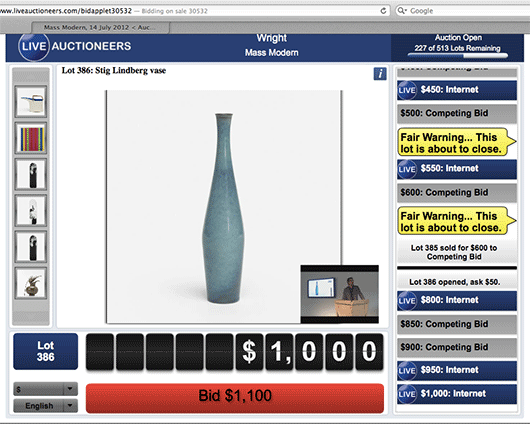
At first, it’s easy to unfairly judge this UI by its cover. There are a lot of font sizes, colors, and shapes competing for your attention. It’s also clear that this design isn’t going to win any type direction awards.
But I ripped off my designer hat, gave it five minutes, and followed along as dozens of items were auctioned off live. I even jumped in on a few and ended up winning a couple.
And I have to tell you, this is really good interface design.
You may not be able to tell from looking at the still image I posted above, but if you’re in there, watching the items go up for bid, watching the bids flow by on the right in real-time, watching the auctioneer on live video, seeing the big yellow flags pop up when an item is about to close, and having a big fat red button that you can click to instantly place your bid, it’s all very clear. There’s a lot going on, but it’s all in the right place at the right time, and it worked flawlessly. I was very impressed.
Yes, it could look better, but it works great. And the works great part is the harder part of the UI to get right. A real-time live auction is a complicated task, and LiveAuctioneers made it work well with no learning curve. I look forward to using this service again.