You’re reading Signal v. Noise, a publication about the web by Basecamp since 1999. Happy !

Jason Fried

About Jason Fried

Jason co-founded Basecamp back in 1999. He also co-authored REWORK, the New York Times bestselling book on running a "right-sized" business. Co-founded, co-authored... Can he do anything on his own?

Launch: Basecamp Classic Mobile

Jason Fried
Jason Fried wrote this on 129 comments

Today we launch Basecamp Classic Mobile for phones and devices with WebKit browsers. This includes the iPhone 3GS, iPhone 4, iPad, Motorola Droid X, Motorola Droid 2, Samsung Galaxy S, HTC Incredible, HTC Evo, Palm Pre 2, BlackBerry Torch, or any other device running iOS 4+, Android 2.1+, webOS 2, or BlackBerry 6.
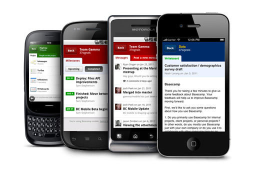
Basecamp Classic Mobile is not an native app, it’s a web app. All you have to do is visit http://basecamphq.com on your mobile phone. No apps and nothing to install – it just works.

A mobile version of Basecamp Classic has been a top customer request for some time now. We’re thrilled to finally be able to deliver. We put a ton of work into it. We hope you love it as much as we do.

Why a web app and not a native app?

Back in July we put up a job ad for an iOS developer. We had decided to dive into native apps for the iPhone. We contracted out the back-end development of our iPhone app for Highrise. The project went well, but we felt like we had to have someone in-house to continue the development of the Highrise app and future apps we wanted to build.

And then Android really began to make a run. Android market share increased and more and more customers were asking for Android apps for our web apps. So we stopped and thought about it for a bit. Do we want to have to hire an iOS developer and an Android developer? That’s a lot of specialization, and we’re usually anti-specialization when it comes to development.

Eventually we came to the conclusion that we should stick with what we’re good at: web apps. We know the technologies well, we have a great development environment and workflow, we can control the release cycle, and everyone at 37signals can do the work. It’s what we already do, just on a smaller screen. We all loved our smaller screens so we were eager to dive in. Plus, since WebKit-based browsers were making their way to the webOS and Blackberry platforms too, our single web-app would eventually run on just about every popular smartphone platform.

Comfortable and confident in our decision, we set out to build the best possible mobile web app for our Basecamp Classic customers.

This is version 1.0

A big part of this initial release was nailing the basics that mattered the most. We had to make a bunch of hard calls about what was important enough to make version 1. That meant leaving some things out and not bringing full functionality to other things. For example, you can view Milestones but you can’t add new ones. But you can view, add, change, and assign to-dos. We plan on rounding out the functionality as time goes on.

More to share soon

We have a lot of material and lessons to share regarding the design and development of Basecamp Classic Mobile. Technical decisions, design decisions, explorations, stuff on the cutting room floor. Lots to share. Stay tuned.

Credit

Basecamp Classic Mobile is here today because of the hard work and extraordinary creativity of Jason Zimdars, Sam Stephenson, and Josh Peek. These guys worked their asses off on this project. They made it happen. We couldn’t be happier with the results.

Thanks to our customers

To all our customers: Thanks for being patient while we developed Basecamp Classic Mobile. It took a while, but we wanted to get it right. We now have a completely modern, fantastic foundation upon which we can continue to make the mobile experience better and better. Plus, we’ll be able to reuse some of the new technology in the desktop versions of our web apps. We’re already working on something big right now that’s only possible because of our work on mobile.

We leave you with a fun little video starring some of the hands of 37signals:


Music by Sudara. Listen to more from him and other independent artists in Issue #02 of Ramen Music, the online music magazine he curates.

And if the whole world’s singing your songs / And all of your paintings have been hung / Just remember what was yours is everyone’s from now on / And that’s not wrong or right / But you can struggle with it all you like / You’ll only get uptight.


What Light, Wilco
Jason Fried on Jan 27 2011 6 comments
no-go.png

Rejected design idea. Required someone to think too far ahead. Made something simple appear complex.

Jason Fried on Jan 18 2011 16 comments

Looking for two more people to join our customer support team

Jason Fried
Jason Fried wrote this on 14 comments

We’re looking for two more people to join our customer service team. This time we’re looking for people who live in the Chicagoland area.

You’ll provide “it was so good they couldn’t stop talking about it” customer service via email for Basecamp, Highrise, Backpack, and Campfire. You’ll also be responsible for chiming in on 37signals Answers, updating and improving the articles in our help section, writing tutorials and how-tos. We’ll also be exploring phone support and in-person training shortly, so that should be something you’d like to do as well.

You’ll be expected to answer about 75 emails per day once you’re fully up to speed (2-3 months on-ramp). This is a significant volume, so be sure that you’re ready and able to deal with that kind of challenge.

We’re looking for someone who loves to help others, someone who can keep smiling even when dealing with tough customers (empathy is important), and someone who has a passion for our products and company. You should enjoy the process of making an anxious customer a happy customer.

In addition, you have to be an excellent writer who enjoys writing. Our customers love when we get back to them within 10 minutes with a clear, concise, and friendly answer. Great writing is key.

How to apply

Please submit a cover letter explaining:

  1. Why you want to work in customer support.
  2. Why you want to work at 37signals and not somewhere else.
  3. A description of a great customer service/support experience you had recently, and what made it great.

Also, attach the following writing samples:

  1. Explain in 3 paragraphs or less why a customer would pick Basecamp vs Highrise.
  2. Respond to a customer asking for Gantt charts in Basecamp that it’s not something we offer, but suggest using the Milestone section instead.
  3. A company using our job board failed to find to find a suitable candidate and wants a refund. Respond that we don’t offer refunds for job postings.

We offer health-care coverage, a 401K with a generous match, a Flexible Spending Account, plus a progressive work environment. Starting salary is $45,000 with a review in a year. You must live in the Chicagoland area.

Email everything to [email protected]. Include “Customer Support” in the subject line. If you’re attaching a resume, please send it as a PDF. Note: We look favorably on people who get creative with their applications.

We look forward to hearing from you.

A bad design is a good reminder

Jason Fried
Jason Fried wrote this on 53 comments

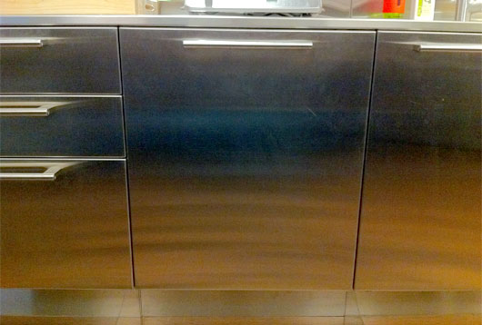
Our new office has a dishwasher. It’s sleek, modern, and silent. It blends into the stainless cabinets and countertops just perfectly. It has the same handle style as the drawers and doors to the left and right. It has no buttons or lights or anything on the outside. You don’t even know it’s there.

And this is why it’s bad.

This is it, right there in the middle:

Looks great, right? Well that depends.

At least once a week when I open it up to add a dirty cup or plate I get sprayed. Water shoots out the sides and splashes me and the floor. It’s on, but there’s no indication it’s on. It’s so good that you can’t even hear it. That’s actually bad. It’s so integrated that it doesn’t look like a dishwasher. That’s actually bad.

I used to curse it, but now I’ve made peace with it. I actually like having it around. Every time I see water on the floor, or on my shirt, I’m reminded of the subtle differences between good and bad design.

Subtle because sometimes all it takes is the smallest little thing to turn bad to good (or good to bad). A tiny bright LED light in the upper right corner could indicate ON. When the light’s on, don’t touch. When’s its off you don’t even see it. It doesn’t interfere with the overall design. That little light would make everything else — the visual design, the silence, the integration with the rest of the kitchen — worth it.

Or it could lock when it’s on, unlock when it’s off. You wouldn’t be able to unlock it once it’s on because there’s no exterior lock handle, but that seems like a small sacrifice to stay dry.

Or…

The best visual description of a company I've ever seen

Jason Fried
Jason Fried wrote this on 15 comments

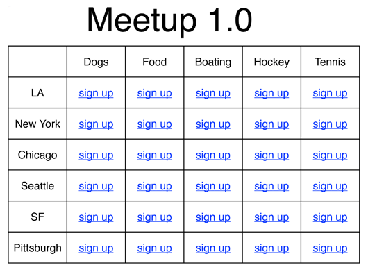
Andrew Mason’s talk at Startup School 2010 included a slide that really blew my mind. The slide wasn’t about Groupon (Andrew’s company), it was about Meetup.com.

Andrew heard Scott Heiferman (CEO of Meetup.com) describe the initial version of Meetup.com as a matrix of cities and interests. He put it in spreadsheet format and here’s how it came out:

It doesn’t matter how many rows or columns – it works at all scales. It’s such a simple representation of what is ultimately a simple idea (meeting up with people in your city who share a similar interest), but it could just as easily been diagrammed in a complex way.

I’ve come back to this slide over and over for inspiration when thinking about new concepts or product ideas. It’s a great exercise in clarity. Can I boil down the idea into something as simple as a column and a row?