March 20th was the one-year anniversary of the Jason Calacanis interview of David Heinemeier Hansson on This Week in Startups. Our industry could use more public debates like this.
About Jason Fried
Jason co-founded Basecamp back in 1999. He also co-authored REWORK, the New York Times bestselling book on running a "right-sized" business. Co-founded, co-authored... Can he do anything on his own?
Summer internships at 37signals
For the first time we’re looking to bring on two interns this summer. We’ve always wanted to explore internships, but we never really had the space to make it happen. Now that we have our own office, it’s go time.
The summer internships are paid ($3000/month) and last ~3 months. You must live in Chicago or be willing to relocate to Chicago for duration of the internship. For those who haven’t been to Chicago in the summer, it’s a beautiful place to be.
Designer Internship
We’re looking for a student who wants to work on real design projects this summer at 37signals. The projects will involve designing user interfaces for web apps and/or marketing sites for these web apps. You’ll design, write copy, and be thoughtfully mentored by the design team at 37s. Apply for the designer internship.
Programmer Internship
We’re looking for a student who wants to work on real programming projects this summer at 37signals. The projects will involve using Ruby, Rails, and JavaScript. You’ll develop applications from scratch and/or work on existing applications while being thoughtfully mentored by the programming team at 37s. Apply for the programmer internship.
Welcome Kristin Aardsma to the team
Kristin is the latest addition to our stellar customer support team. She joins Michael, Merissa, Ann, and Jason R. in making our customers happy everyday. Kristin works out of our Chicago office. Welcome Kristin, it’s great to have you on the team.
Trying to whittle down an inbox of 130 to 0 is intimidating. You can knock off 20 and it doesn’t feel like you made any progress. It would be useful if an email app had a “help you to get to inbox zero” mode where it would only show you 20 emails at a time. Once you knocked those out, 20 more fill in. This way you can see the progress you are making on a small scale (from 20 to 18 to 13 to 7 to 0) and stay motivated to keep knocking them out on a large scale.
How an Illinois rest stop inspired a web page
Last summer I was driving back to Chicago from Wisconsin. On the Illinois side there are a couple of rest stops over the tollway. It’s a great place to get some gas, grab some caffeine, and stretch your legs a little before the final 50 miles home.
The rest stop usually has a booth where you can buy a iPass so you don’t need to stop and pay tolls all the time. During the day the booth is manned by someone to help answer any questions you have.
It appears that a lot of the same questions are asked over and over. Enough, in fact, that the dude who answers them is sick of giving the same answer. That answer is “Yes”.
So he jumped on a computer somewhere and put together what I can only describe as one of the smartest formats for an FAQ I’ve ever seen. A single answer on top, and all the questions below. The answer is always YES!! YES, YES. YES!! Then he taped it to the outside of the booth. You can’t miss it.
I thought this was brilliant. I just love it. Yeah, it’s full of passive aggression and spelling errors and formatting problems, but the idea in itself is so refreshing. It’s folk information art.
Inspired by this, we whipped up our own version of a YES! page for Highrise. It was a fun exercise in messaging and design.
Continued…The fairest rules are those to which everyone would agree if they did not know how much power they would have.
Four new people join the 37signals family
We’ve just added four new people to our 37signals team. This brings us to 25 people which is both a little scary and also incredibly comforting. We’re growing without having to sacrifice quality. Being able to work with 25 world-class people every day really is an honor and a pleasure.
Merissa Dawson, Support
Merissa joins us from Austin, Texas. Merissa will be working with Michael, Jason, and Ann to make our support team the best in the universe. Merissa is one of those people who loves helping people with a smile. She wants to make everyone around her happy. It’s great to have her on the team. She’s in Chicago for the next couple weeks for training.
Andrea LaRowe, Assistant
We’ve been looking for months, and we’re beyond thrilled to have someone of Andrea’s caliber joining our team. Andrea will be helping everyone out with administrative tasks, research projects, basic HR, event planning, general organization, and keeping everything at the company running smoothly. Before 37signals Andrea worked as a executive assistant at a non-profit here in Chicago. She starts on February 28th.
Javan Makhmali, Programmer
Javan is based in beautiful Ann Arbor, MI. We really enjoyed getting to know him when he came to Chicago for his interview. He’s going to fit in perfectly here. Really curious guy who asks all the right questions and is focused on all the right problems. Before 37signals, Javan was a rails developer at Inkling Markets. Javan starts on March 7th.
Will Jessop, System administrator
Will has increased the European wing of 37signals to three people. He joins us from Manchester, UK and has been working with Joshua, John, and Taylor since December. He came from Engine Yard with deep knowledge of running Rails applications and we’re thrilled to have him.
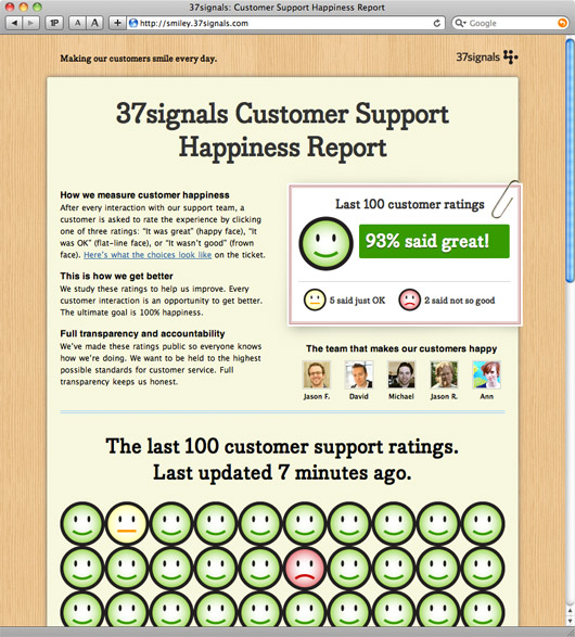
Smiley goes public: Now everyone can see how our customers feel about our customer support
Back in September we launched Smiley, an internal tool we built to measure customer happiness as it relates to our customer service and support.
Smiley has had a tremendous positive impact on our overall customer service. We’ve learned a lot about what it takes to make a customer happy. And our customers are happier as a result. As it goes, if you want to improve something, measure it.
Inside 37signals, everyone can see our customer service ratings. We have a dashboard that shows how we’re doing. It’s great. I look at the page a dozen times a day to see how we’re doing. When I pitch in on support I’m very conscious of my ratings. Knowing how you’re doing helps you do better.
Going public
However, we want to go even further. We want to be held to even higher standards of excellence when it comes to our customer service. So we’ve decided to expose our customer service ratings to the world. If you want to see how we’re doing, visit http://smiley.37signals.com. It’s a real-time scorecard of our last 100 ratings.
Please keep an eye on us and keep us honest. We’re working hard every day to try to make 100% of our customers happy.
Basecamp Mobile: Who's using it so far?
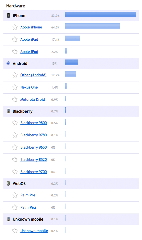
It’s been about 24 hours since we launched Basecamp Mobile. We wanted to share the platform/device stats so far.
iOS is dominating with 84%. Android is coming in around 15%. Blackberry and webOS combine for about 1%.

We’re using Clicky to generate these stats.
It will be interesting to see how these change over time (we’ll post them every few months or whatever ultimately seems interesting).
CSA: A fantastic web site
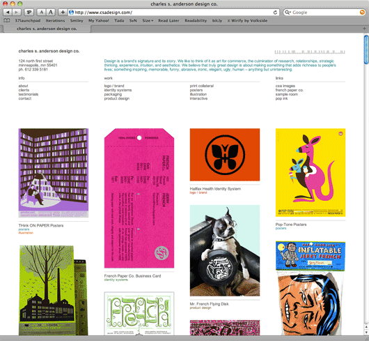
The new Charles S. Anderson Design Co. site is near perfect*.
It’s a beautifully simple and clear departure from the overtly complicated designs that you’ll often find when you browse design firms, architecture firms, and, most notably, photographers’ sites.
The new CSA site confidently says: We know what we’re doing. When you’re this good you don’t have to show off.
No hovers, no lightboxes, no scrolling images, no flash, no unnecessary clicks, nothing fancy at all. It’s presented clearly, directly, and without stuffy ceremony. The latest fad, technique, or technology is nowhere to be found. They’re comfortable in their own skin and it shows.
It’s effortless. I just love it.
Click on a project and you get a straightforward page with the work down the middle and the details in the margin. Each project has its own URL and is easily sharable and printable. CSA’s address and phone number is on every page. Just plain smart.
The copywriting is clear and it has purpose. It’s not too serious, too clever, or too cute. It’s plain english, yet colorful where it matters. It wants to be read. This kind of writing respects the reader.
Whenever someone asks me for an example of a site designed by someone who understands the fundamental strengths of the web, I will point to CSA’s site. This is the example.
* I’d bump up the font size a bit.


