You’re reading Signal v. Noise, a publication about the web by Basecamp since 1999. Happy !

Jason Fried

About Jason Fried

Jason co-founded Basecamp back in 1999. He also co-authored REWORK, the New York Times bestselling book on running a "right-sized" business. Co-founded, co-authored... Can he do anything on his own?

Creating a design library

Jason Fried
Jason Fried wrote this on 132 comments

We’ve got some bookshelves in the new office.

We want to fill them with inspirational pictures of design, landscapes, architecture, objects, ideas, industrial design, automotive design, type, materials, layouts. Nothing web-related. Anything that would inspire a spark by flipping through the pages. Words not required.

Got any winners?

Opinionated: Francesco Bertelli

Jason Fried
Jason Fried wrote this on 14 comments

Francesco builds beautiful bikes in New York City. Even though he’s building a bike for you, his rules rule. He’s not afraid to say no.

His about page explains what he likes and doesn’t like in a bike.

He likes bikes with…

  • No logos and stickers
  • Lugged steel
  • Skinny tubes
  • Quill stems
  • Vintage cranksets
  • Track geometry
  • Leather and wood
  • Unusual handlebars
  • Chrome forks

He doesn’t like bikes with…

  • Visible logos and stickers
  • Threadless forks
  • Clamp stems
  • MTB handlebars
  • Sponge grips
  • Fake leather saddles
  • Machined rims
  • Flip-flop wheels

He’s only going to make you a bike if your likes and dislikes align with his. There may be a couple of exception along the way, but his opinions are his business rules.

Bertelli is a great example of a company that knows where it stands. The best way to know where you stand is to figure out what you won’t do. What will you say no to? Francesco puts his no’s right out in front. It makes the experience better for everyone.

More businesses could benefit from putting their no’s right up front.

Our new office includes a 37-seat theater-style classroom. We intend on having conferences, master classes, workshops, and talks in this space. We’re about to get started thinking about the first few events. What sort of conference/class would you be interested in attending? The events will be related to the things we’ve learned about design, programming, and business over the last ten years. Any topic suggestions?

Jason Fried on Jul 20 2010 61 answers

Office: Details

Jason Fried
Jason Fried wrote this on 32 comments

Five days to go until we begin working in the new office. It won’t be completely done for another 10 days or so, but it’s workable so we’re going to work it.

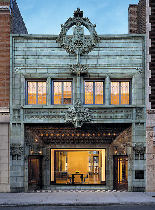
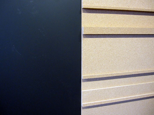
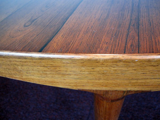
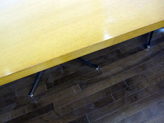
Here are some details of some of the materials in the space.

Continued…

Basecamp home page redesign

Jason Fried
Jason Fried wrote this on 46 comments

A few weeks ago we decided to take a stab at redesigning the Basecamp home page. We liked the current design, but we wanted to see if we could do better. Specifically we were interested in more visuals, less text, and a generally simpler and less dense presentation.

Started with a sketch

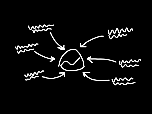
As we usually do, we start with a very low-fi sketch of the big idea behind the design. No details, no words. Just a very rough idea. In this case the idea was a series of scenarios all pointing back at the Basecamp logo. The original sketch, done in Draft and shared in Campfire:

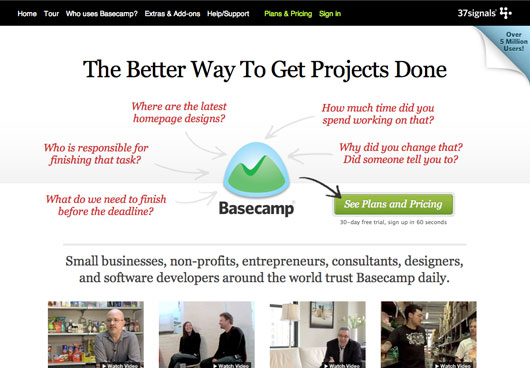
From this sketch we ended up with something that looked like this:

We messed around with the words, subheads, and other copy. We tweaked a few small things, but while we loved the general concept we still felt like it wasn’t communicating clearly enough at first glance.

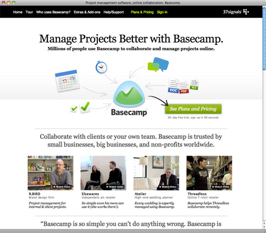
So we decided to replace the phrases with icons representing the major features/benefits of Basecamp.

After a few rounds of tweaks, we ended up with this:

After we were pretty happy with the top, we moved down the page and redesigned the rest. We can talk about those decisions in a future post.

A/B test

Once the page was ready, we decided to run an A/B test against the current (now the old) design. The test wasn’t sophisticated – we just wanted to test clickthroughs to the sign-up page. That’s where most people land on their second hop, so we wanted to see if the new design took more people to that page. We didn’t test actual signup numbers – just clicks to the signup page. We know how the signup page converts (and continues to convert) and we didn’t change anything there.

The new design sent 14% more people to the signup page. We were thrilled with that performance. We recognize it’s not absolutely definitive (signups are more important than clicks to the sign up page), but it was enough evidence for us to put the new design into production.

Continued…
FaceTime.png

Call Apple to have a FaceTime chat and learn a few things about your new iPhone 4. Great idea.

Jason Fried on Jun 25 2010 10 comments

Launch: Draft for iPad

Jason Fried
Jason Fried wrote this on 180 comments

Draft, our first app for the iPad, is now available in the App Store. Draft is a straightforward, basic sketch app for the iPad with email and Campfire sharing built in. We use it every day. We hope you will too.

The backstory

When we design interfaces, we start on paper with a really rough sketch (usually with a Sharpie). The low resolution, thick-point sharpie forces us to focus on big picture ideas — the lines — instead of all the little details that just don’t matter yet.

However, when we sketch something on paper, there’s a three step process to share it with the rest of the team. First, we sketch. Then we scan. Then we either email or upload to Campfire. And since we often use huge pieces of paper, scanning is a bit of a hassle. There’s just too much overhead to share a quick sketch.

So when the iPad came out we knew we had to make a very simple sketch app that mimicked our paper and a sharpie process, but improved on the sharing part. That’s where Draft comes in.

Draft makes it very easy to quickly sketch a concept in broad strokes and share it via email or Campfire. It only comes in black with red and white ink. There’s only one pen weight meant to emulate a standard sharpie. Draft is a “just draw and share the damn thing quickly” tool. It’s not for fine art, it’s not for tinkering with colors or weights. It’s the quickest way we know how to share a quick visual idea with the rest of our crew no matter where they are.

Campfire integration makes it extra special

We work in Campfire all day long. It’s where we share, show, debate, and create. And it’s the place where most of our first drafts — our sketches — show up.

So we wanted to make sure Draft made sharing a sketch in Campfire dead simple. You draw something, click the “Share” button, you see a list of your Campfire rooms, you pick one, and a few seconds later it shows up right in the room. Now everyone else in the room can see what you drew.

It’s yours for $9.99

Draft is priced at $9.99. You can get it in the App Store today. We hope you find it useful.