You’re reading Signal v. Noise, a publication about the web by Basecamp since 1999. Happy !

Jason Fried

About Jason Fried

Jason co-founded Basecamp back in 1999. He also co-authored REWORK, the New York Times bestselling book on running a "right-sized" business. Co-founded, co-authored... Can he do anything on his own?

Oldie But Goodie: Sketching with a Sharpie

Jason Fried
Jason Fried wrote this on 29 comments

I’ve always preferred sketching UIs with an as-thick-as-I-can-find Sharpie over a thin ballpoint pen or finely sharpened pencil.

Ballpoints and fine tips just don’t fill the page like a Sharpie does. Fine tips invite you to draw while Sharpies invite you to just to get your concepts out into big bold shapes and lines. When you sketch with a thin tip you tend to draw at a higher resolution and worry a bit too much about making things look good. Sharpies encourage you to ignore details early on.

If you sketch, try a thick Sharpie next time. You may find you’re better able to focus on the concept and less on the drawing. That’s a good thing.

Design Decisions: Results from the Basecamp account screen redesign

Jason Fried
Jason Fried wrote this on 14 comments

Just about two weeks ago we launched the a redesign of the account chart in Basecamp. This is where people can upgrade or downgrade their accounts.

The goal was to increase overall upgrade conversions and encourage people who are on Basic plans or lower to upgrade to the Plus plan (our lowest priced full-feature plan).

Results

I’m glad to report our design hunches appear to have paid off. We’re only about two weeks in, so we don’t have a ton of data yet, but we can compare the 14 days since the upgrade with the 90 days prior to the upgrade.

  • Average upgrades/day: up 13%
  • Average Plus upgrades/day: up 33%
  • Average $ value increase per upgrade: up 8%

We’re thrilled with these numbers. We’ve moved the new design to the Highrise account chart as well. We’ll watch and see if we see the same improvements with Highrise as we have with Basecamp.

Nickel and diming

Jason Fried
Jason Fried wrote this on 61 comments

Over the years I’ve seen a lot of proposals from professional services firms. Designers, architects, lawyers, consultants, and others.

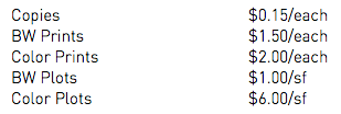
Many of them included a small price list at the end. Here’s one from a recent proposal I received from a landscape architect I’m considering hiring:

These nickel and dime items have always rubbed me the wrong way. I’m about to pay someone many thousands and they’re about to bill me $0.15 for a copy.

Plenty of people bitch about ATM fees, but these copy and print fees feel even more obscene to me. I recognize paper costs money and toner costs money and machines cost money, but come on – isn’t this just part of the cost of doing business? It feels like they’d charge for bandwidth used to email you a file if they were sophisticated enough to track it.

Further, many of these professional services get annoyed when their clients cut back budgets or say they can’t afford this or that. But then the professional services themselves pinch pennies even tighter by trying to pass the cost of a piece of paper on to their client. The disconnect couldn’t be more obvious.

I can’t recall if I’ve ever actually been billed for any of these items, but it just seems unnecessary. Perhaps they are worried about clients that require thousands of pages or hundreds of plots. If that’s the case, ok – how about saying “After 100 copies, we will bill $0.15/copy” or something like that. Absorb the routine costs and bill the excessive costs. That feels reasonable and respectful on both sides.

At the end of the day another $15 here or $36 there isn’t going to break a client’s bank, and complaining about $0.15 feels petty – and in some ways it is – but these nickel and dime fees put up a sign that says “we’re passing every little cost on to you, no matter how insignificant.” That just doesn’t seem like the right way to start a business relationship.

How we use Backpack to keep track of our email newsletters

Jason Fried
Jason Fried wrote this on 9 comments

This post kicks off a series of posts designed to share how we use our own products for our own business. It’s something we don’t talk that much about, but it’s something a lot of people have asked about. So here goes.

PROBLEM: We didn’t have a simple, accessible-company-wide list of email newsletters we’d sent out.

SOLUTION: Make a Backpack page.

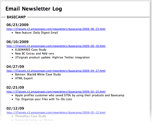
We use Campaign Monitor to send out our email newsletters. While Campaign Monitor does keep a list of previous newsletters, it’s not convenient for everyone else at 37signals to log in and go through the overhead of another app just to see a list of previous newsletters. So we made a Backpack page instead. We’ve made the page public so you can see it for yourself.

Dead simple, one page, quick summaries of every newsletter, grouped by product, direct links to the HTML versions of the newsletters. The page is shared with everyone at 37signals. It’s also tagged “37signals” “Newsletter” so anyone can find it quickly if they haven’t added it to their Backpack sidebar.

Whenever Jamie sends a newsletter he takes about 60 seconds to add the link and brief description to the Backpack page. We use Backpack page dividers to group the newsletters for different products and add each newsletter as a note. The note subject is the date and the note body is a link to the newsletter plus a summary of the main points.

And that’s it. Not rocket science, but who needs rocket science? Backpack is anti-rocket science.

It’s just a shared Backpack page with a list of stuff grouped up, linked up, and summarized up. In one place all the time so everyone knows where it is.

Reminder: Know what you're measuring

Jason Fried
Jason Fried wrote this on 14 comments

Yesterday David and I met with Sarah and Michael for a bit to get an update on how customer support/service is going. We recently switched from using Gmail to HelpSpot and we were curious how the transition felt. Basically, how was the workflow and were we learning anything?

Why the switch?

One of the reasons we switched to HelpSpot was so we could do a better job tracking which requests and issues were top requests. Sometimes support will say “People have been having a hard time uploading files this week” but it’s hard to know what “people” means. Is it two people? 10 people? Dozens? If we made changes to the app, would we reduce support demands and customer frustration? Gmail couldn’t really give us specifics, and HelpSpot could, so we switched to HelpSpot.

Knowing but not learning

In our review yesterday we discovered that were were tracking everything in detail, but not really learning anything. Why? We were tracking for the sake of tracking, not tracking for the sake of learning. We weren’t really sure why we were tracking what we were — but we kept on doing it because, well, momentum is a powerful force. It became an exercise in seeing how organized we could get in spite of what we actually needed.

Our extensive use of categories and tags and custom fields and pulldowns could give us a whole lot of report-friendly information, but it didn’t give us any useful information. Information without insight is junk. That’s what we had. Plenty of it.

Going back to simple

So yesterday we decided to change everything. Let’s point the ship towards simple. Every mistake we’ve made as a company has been because we tried to do too much, not because we didn’t do enough. So let’s apply that lesson to how we track support requests too.

What really mattered?

Instead of neatly categorizing every request, we’d just roughly categorize them. So instead of multi-level categorizing like “Milestones > Editing > How to move milestones between projects” we’d just track the “How do move milestones between projects” part. The “Milestones” and “Editing” categories didn’t matter. We didn’t need the hierarchy or extensive organization. All that mattered was the bottom line: The question/issue.

Basically as questions/issues came in, we’d create new long tags that paraphrased the question/issue. And whenever another question/issue came in that was roughly the same as the paraphrased question, we’d tag the actual question with the paraphrased question. This way we could get a count on these paraphrased questions and see how many people were basically asking “how can I update my password” or “how do I move information between projects?”.

We could run a report that would simply give us the top 10 questions this week. Are they the same as last week’s top 10? Are we seeing a pattern? What’s up? What’s down? Now we have specifics that we can act on. In the past we’d know there were 60 questions in the “milestones” tag, but that doesn’t really give us anything to act on. But now we’d know there were 23 questions about “How do I add more than 10 milestones at a time”, 21 about “Can I move milestones between projects?”, and 16 about “Can I add times to milestones?”. Now we’ve learned something.

Obvious isn’t always obvious

Looking back at this it seems obvious. We should have done this from the start. But like many things, it’s easy to get carried away. This new tool gave us all sorts of tracking options. Categories, tags, custom fields, lookups, etc… So we got excited and confused enthusiasm with priority. We did a lot of busy work but didn’t learn anything.

So just a reminder: Know what you’re measuring. Data for the sake of data can be a fun intellectual exercise, but practicality is usually what you’re after.

A reminder of how simple business can be when you don't make it complicated

Jason Fried
Jason Fried wrote this on 68 comments

Yesterday I found a flyer on my front door.

I’ve been staring at a project in my backyard for a few weeks. Staring hasn’t gotten it done. So I figured I’d see what it would cost to have these guys do it.

I called them. 10 minutes later the guy came by. He was down the street on another job. We walked out back. I told him what I needed done. He looked around for 20 seconds and said $300. I said “deal.”

That’s it. No proposal. No “I’ll get back to you tomorrow”. No “Let me see how much the materials will cost and I’ll drop an estimate in your mailbox next week.”

Just $300. Deal. When can you start? Wednesday. How long will it take? A few hours for a few guys.

He knows his business. I know what my time is worth. End of transaction. It was so damn refreshing.

I know everything can’t be done like this, but often it seems like we’ve slid down a path of formality with so many things that really don’t need it. Extensive contracts, delays, red tape, precise cost estimates based on precise amounts of materials, “let me think about it and I’ll get back to you,” etc. Essential? Sometimes yes, but most of the time probably not.

I remember the tail end of our time as a web design company. When we started we did 20 page proposals. I remember pulling all nighters getting a proposal ready. Pages and pages of stuff. What a waste of time.

Towards the end we were doing one page proposals. It didn’t seem to matter. We were going to get the job or we weren’t. Over six years I never saw a connection between length and detail of proposal and winning a job.

Same thing with contracts. Sometime we hire an outside contractor or specialist to give us a hand on a project. Our contractor agreement used to be 8 pages long. Lawyers wrote it. Our current contractor agreement is one page long. I wrote it then showed it to our lawyers. They said it was fine. Done.

I know it seems like a stretch to compare lessons from a door flyer for a small landscaping job to 10 page legal contracts for 3 month long expensive web design projects. But maybe it isn’t.

The moment a man begins to talk about technique that’s proof that he is fresh out of ideas.


Raymond Chandler
Jason Fried on Jun 5 2009 25 comments

What does a Community Manager do? I see a lot of job postings and mentions of this position, but I’m not entirely sure what the role is. How does it different from customer support/service? Is it a component of that role? A dedicated role? Would love to hear from anyone who does it or who has hired for it in the past. Thanks!

Jason Fried on Jun 3 2009 28 answers

The Deck readership survey

Jason Fried
Jason Fried wrote this on 34 comments

The Deck has put together a readership survey for sites that are part of the network. We’d love if you take a moment to fill it out.

If you do persevere and make it through to the end we’ll ask you for an email address. We’re only doing that so we can randomly choose twenty people and send them some Field Notes Brand Memo Books and a free year of 37signals’ Highrise in appreciation.

Thanks for participating.