You’re reading Signal v. Noise, a publication about the web by Basecamp since 1999. Happy !

Ryan

About Ryan

Ryan's been getting to the bottom of things at Basecamp since 2003.

A well-designed text will seem weightless after a time.


Mandy Brown. What a word for good design: weightless. It’s true for UI too. There’s a moment when you’ve cut the junk away and balanced whatever there is to be balanced. Suddenly the content just floats in front of you. Weightlessness, lightness, transparency. As designers of clarity, these feelings tell us when we’ve hit the nail where we should hit it.

New in Backpack: Read-only sharing, updated "All Pages" design, and more

Ryan
Ryan wrote this on 16 comments

Today we announce a new way to share pages in Backpack. Now when you share a page you can decide who may edit the page and who may only view the page. This allows certain people to be responsible for editing pages and to allow others to read their pages without allowing the others to make changes. It’s a very useful feature, especially for larger teams.

Here’s how read-only pages work. When you click “Make a new page” you’ll see a link below the people checkboxes that says “Specify who can make changes to this page.”

New link on the 'Make a new page' screen

The checkboxes are replaced by a table when you click the “Specify…” link. The people on your account appear on the left-hand column with the familiar checkboxes to give them access to the page. Then to the right of each person you can set whether they can “change the page” or “only view the page.” Two links above those right-hand columns allow you to apply the same setting to all people at once. By default everyone can change the page.

Checkboxes with permission options

In this example we want to allow David, Jason and Sarah to change the page. Everyone else will have read-only access. The settings look like this:

Continued…

New in Backpack: Page notifications and up-front share settings

Ryan
Ryan wrote this on 7 comments

Last weekend we released two updates to Backpack to help your team share and collaborate on pages.

Set sharing options up-front

Before this update, every page you created was shared with everyone in your account by default (unless you were the only person on your account). This meant that if you wanted to share with only certain people, or if you wanted to make a private page, you couldn’t do it without first saving a page shared with everybody and then changing the sharing settings after the fact. The result was that your private page title could be exposed to people in your account in that brief period between when the page was first created and when you clicked to change the sharing settings.

We’ve fixed that situation with a new “Make a new page” form. Now you can set the page title and sharing options together in the same step, before the page is ever created.

Page notifications

Another new feature allows you to notify people in your account that you created or updated a page. Now when you create a new page, you’ll see a yellow button at the bottom that says “Tell the others I created this page.”

You can click the button to reveal a notification form. Check the people you want to notify and type an optional personal message and then Backpack will send those people an email with a link to your new page.

That last checkbox is for administrators only. Admins can check “Add this page to each person’s sidebar” and the page will automatically be added to each person’s list of links in their sidebar. Now when you want people to check up on an important page you can be sure they have easy access to it whenever they log in to Backpack.

Page creators aren’t the only ones who can send notifications. Anybody who is sharing a page inside a Backpack account will see a button to “Tell the others I’ve updated this page” at the bottom of the page. Clicking that button displays the same form as the one above.

We hope these new features make it easier for you to share Backpack pages with your team!

Rather than survey a bunch of users on every decision, the Mac team decided each issue among themselves, invariably going for the option that might amuse a user the most, that would give a user the most pleasure, and therefore imbue the Mac with personality.


Why Apple is great at interfaces when others are not. I like how Nick draws a connection between good UI and ‘fun’. We don’t talk much about fun in usability circles, and I’ve been thinking about it more since I tried Spore on the iPhone.

The two guys at 2D Boy know a thing or two about fun as well. Just moving the mouse in their game World of Goo is a blast thanks to the way your cursor blob stretches and squashes with velocity and inertia. Check out David Rosen’s tour of the game for a nice analysis of the game’s design details.

There’s another nice quote from the TechRadar article: “absence of pain isn’t the same as pleasure.” In other words, it’s not just enough to strip away all the complexity. There should be some frosting in the mix to also make it a pleasure.

Jason Polan explains with a sharpie

Ryan
Ryan wrote this on 6 comments

The new Criterion Collection website features a cool introductory video in the upper-right corner. A pair of anonymous hands draw on white paper with a sharpie as a narrator introduces the site.

Turns out the hands and voice belong to artist Jason Polan. A Google video search revealed he’s done more of these sharpie videos. He also sells a couple on his site, like How to Draw a Giraffe and How to Draw an Apatosaurus. Too bad those last two don’t have preview clips.

Check out this video he did for the State Bar of Texas:

Love this stuff.

One thing to remember in economics is that you can’t do one thing in economics. There are always other effects that come out of it.


Warren Buffett. This issue of interconnectedness often comes up in software design too. Today’s performance tweak or new feature is tomorrow’s design constraint. Also reminds me of side-effects in functional programming and why ‘purity’ in code can be such an attractive windmill.
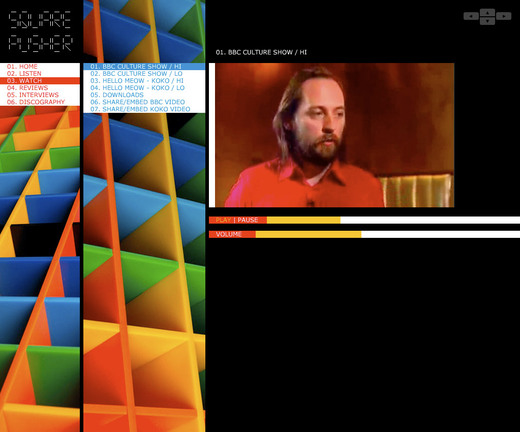
squarepusher-site.jpg

Flash hiccups aside, the latest incarnation of Squarepusher’s website is still bold, fresh and interesting. I like the trend that’s grown steadily over the last couple years toward background elements that stretch to reach the vertical or horizontal bounds of the browser window. The combination of stretchy elements and fixed elements produces a figure/ground relationship that adds depth to the site and makes it more immersive.

Crusty Gold: Basecamp's footer badge

Ryan
Ryan wrote this on 14 comments

A few weeks ago at our Maine meet-up, David was telling a story about preparing for his latest RailsConf keynote. His plan was to talk about bad code from our own apps, and we were cracking up when he explained his hunt for all that “crusty gold” buried in our repos. I ran into my own nugget of crusty gold today while taking a peek at Basecamp’s footers.

The footer of each page in Basecamp may show a badge that says “Managed with Basecamp.” I wanted to figure out when and why that badge is displayed. So I found my way to the relevant template and saw this:


<div class="Footer">
  <% if @account.free? || @account.show_footer_badge?%>
    <a href="<%= @account.free? ? "http://www.basecamphq.com/?ref=free" : affiliate_link %>" target=_blank>
      <img align="right" width="112" height="30" src="/images/poweredbybasecamp.gif" alt="Powered by Basecamp" border="0" align="absmiddle" style="margin-right: 8px;" />
    </a>
  <% end %>
</div>

The first order of business was the question: Under what conditions do we show the badge? The first condition, @account.free? is clear enough (it means the account is on a Free plan). But what’s up with the second condition: @account.show_footer_badge?

Since the method is on @account, the first place I checked was our Account model. But it turned out that show_footer_badge? isn’t a method. It’s a column on the database. That meant I had to find where that value was being set by the user and saved into the DB to figure out what it really ‘means’.

Some grepping revealed that show_footer_badge? is actually a relic from our first BC affiliate program. People on this old program had the choice to check a box to hide or show the footer badge to all their employees and clients using their Basecamp account. What’s crusty about this? The problem is that @account.show_footer_badge? gave me no indication that this is really about affiliate settings. A simple change to the name of the method would have really clarified that:


  <% if @account.free? || @account.affiliate_wants_to_show_badge? %>

This comes back to a favorite design pattern: Intention Revealing Interfaces. @account.show_footer_badge? says what to do, but it doesn’t reveal the original author’s reason or intention.

To round out this nugget, let’s improve that nasty anchor and image tag from the first excerpt above. We’ll use a Rails helper and some CSS to clean things up:


<div class="Footer">
  <% if @account.free? || @account.affiliate_wants_to_show_badge? %>
    <%= link_to basecamp_url_with_affiliate_code, image_tag('poweredbybasecamp.gif'), :class => 'affiliate_badge' %>
  <% end %>
</div>

The next time we go digging into Basecamp’s footers, this code will be a lot easier to understand.

Related: Behind the scenes: Redesigning and coding the Highrise sidebar modules, What belongs in a helper method?

This promo video for SoundCloud shows how much style you can inject into a screencast. You can tell they are speaking directly to a certain audience through their attitude, visuals and music. I particularly like how they intentionally show some purple desktop background around the browser window. Screencasts often look the same when you don’t see anything beyond the edges of the browser window. Well done guys!