Two very different approaches, both with their own charms…
New school: The Libraria da Vila bookstore in Sao Paulo. [via KV]


Old school: Libreria Acqua Alta in Venice. [thx JL]


You’re reading Signal v. Noise, a publication about the web by Basecamp since 1999. Happy !
Two very different approaches, both with their own charms…
New school: The Libraria da Vila bookstore in Sao Paulo. [via KV]


Old school: Libreria Acqua Alta in Venice. [thx JL]


Want something to blow up? Tell the world about it on a Tuesday morning. Avoids the Monday avalanche people face and gives you the rest of the week to get play.
Want something to fade away? Tell the world about it on a Friday afternoon. It’ll fade into the weekend.
(Note: Once you realize this, it’s also fun to start noticing what news gets released on Friday afternoons — politicians are especially good at using this technique.)
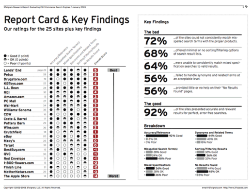
From the archives… It’s always fun to stumble onto old work when you’re reorganizing your folders. This was the summary page from the E-Commerce Search Report [PDF] we did back in 2003. I think we sold close to 1000 of these PDF reports at $79 a pop. I think this was our first foray into selling self-published PDFs. It paved the way for us to self publish Getting Real as a PDF 3 years later. (I designed the report in InDesign, for those who are curious)
There’s a lot of talk about change being hard, but sometimes it’s harder to keep your mind than change your mind.
Some recent posts at the 37signals Product Blog:
Backpack
New in Backpack: Improved “All Pages” screen
We’ve just improved the way pages are listed on your “All Pages” screen in Backpack. The redesigned list’s clear alphabetical groupings make it easier to find the page you’re looking for.
Campfire
New in Campfire: Better hospitality over spotty Internet connections
We built a new feature to keep track of any messages that didn’t send. If for some reason your messages, pastes or images don’t send correctly, Campfire will now try again another time. If Campfire still can’t send your message, it will show a red notice below your message to notify you that the message wasn’t sent. This helps to make sure nobody miscommunicates or misses out in the event of a troublesome Internet connection.
Basecamp
5 Basecamp tips from creator of web design bootcamp that teaches Basecamp 101
On September 17th, Ivan Stegic will be conducting the following workshop in Minneapolis: Web Design Bootcamp – Web 101, Drupal 101 & Basecamp 101 (“a full day seminar of everything you should know before you design your first website”). We asked Ivan to give us a few Basecamp tips.

American Apparel is now selling a Bag-O-Scraps. Great example of selling your by-product.
How many of these supposedly important blog posts and industry articles actually make me better at what I do?
Configuration management doesn’t sound sexy, but it’s the single most important thing we do as sysadmins at 37signals. It’s about documenting an entire infrastructure setup in a single code base, rather than a set of disparate files, scripts and commands. This has been our biggest sysadmin pain point.
Recently we hit a milestone of easing this pain across our infrastructure by adopting Chef, the latest in a long line of configuration management tools.
We struggled with a few other tools before settling on Chef. We love it. It’s open source, easy to hack on, opinionated, written in Ruby and has a great community behind it. It’s really changed the way we work. I think of it as a Rails for Sysadmins.
Here’s a snippet of all the data required to make Chef configure a bare Ubuntu Linux install as a Basecamp application server.
:basecamp => {
  :gems => ['fast_xs', ['hpricot', '0.8.1'], 'aws-s3', 'ruby-prof',
            ['net-ssh', '1.1.4'], ['net-sftp', '1.1.1'], ['tzinfo', '0.3.9']],
  :packages => ['imagemagick', 'elinks', 'zip'],
  :apache_modules => ["auth_token", "xsendfile", "rewrite"],
  :passenger => { :tune_gc => true }
}
As an early adopter, we’ve helped Chef grow and opened our repository of Chef recipes. If you’re interested in using Chef, take a look there for some example uses. Please fork and provide feedback on Github.
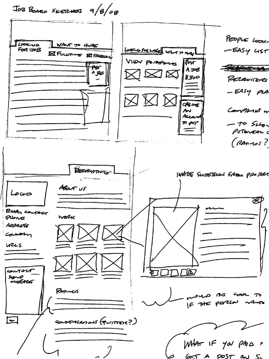
Thought it would be fun to share the very different sketch styles of the designers at 37signals. They range from very neat to a mess (mine).
Jamie’s sketches are neat, well organized, and readable. They’re fairly high resolution and anyone who’s looking at them can decipher them without assistance. They also often contain supporting materials – ideas, questions, explanations, and goals.
A few days ago Matt posted a chart of copyediting marks that we’re encountering while we review the copyedited version of REWORK.
Originally I had the same reaction as many others: “Wow, so old school. Isn’t there software for that? What about Word/Pages track changes functionality?”
But as I’ve been going over the marked up version of the paper manuscript, I’ve really come to appreciate the handwritten red pen edits. I find them more informative and ultimately more readable than the made-by-machine track changes edits.
For example, here’s a scan of one of the marked up pages of REWORK:
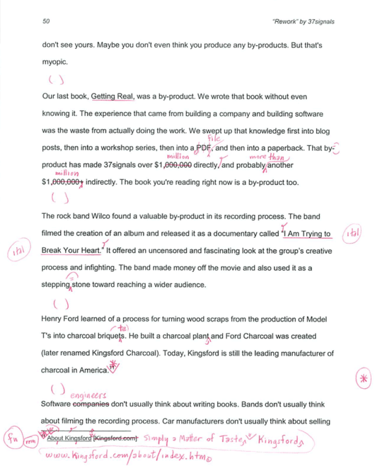
I like that the original text isn’t obscured or changed inline. It’s marked up. The edits are, for the most part, overlaid on top of the original text. Any changes are distinctly different than the original text. This isn’t the case with traditional machine-made track changes edits. Those changes look the same as the original. They’re on the same layer. I find that distracting.
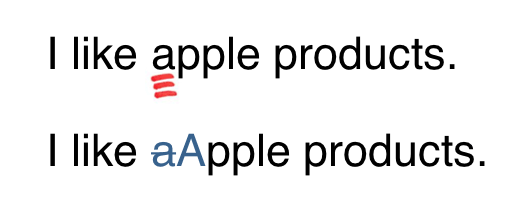
For example, to suggest a capitalized “A”, you’d triple-underline the letter by hand. But on a computer you’d actually replace the lowercase “a” with an uppercase “A”, but the remnant “a” would remain. Over the course of many sentences and many changes, the machine-made track changes edits blend in too much with the original text. It becomes hard to quickly spot changes. And it becomes hard to actually read the original to the changes.
I find the top example (by hand) clearer and easier to read than the second example (by machine).
Lesson learned: Don’t be so quick to dismiss the old in favor of the new just because the new seems like it should be better. There’s a lot of subtlety that can be communicated in a pen stroke that can’t be fit into a rigid digital rule.