Yesterday we launched the redesign of the signup form used by Basecamp, Highrise, Backpack, and Campfire. This is one of the last phases of the marketing site redesign project we started earlier this year.
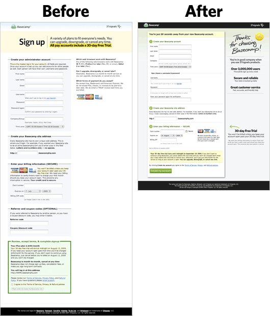
The new signup form design pulls from the look, feel, and language of the new marketing sites. The previous form, which pulled more from the previous generation’s site design, was dated and too long.
We’ve been watching a lot of Clicktale recordings of form usage and we noticed that just about everyone scrolls down to the bottom of the form, then back up, before they start filling out the form. So we wanted the redesigned form to be markedly shorter than the one it was replacing.
By moving instructions, shifting the header to the sidebar, widening the form field content area, rewording long blocks of text, and hiding elements that were infrequently used, we were able to save a good bit of vertical space. We also redesigned the error states and moved most of the error checking to the client side to prevent unnecessary reloads.
The images below provide a rough estimation of compared height. They aren’t resized to perfect scale, but they’re close enough to demonstrate the space savings. The number of fields, and the order of the fields, are the same.
Continued…
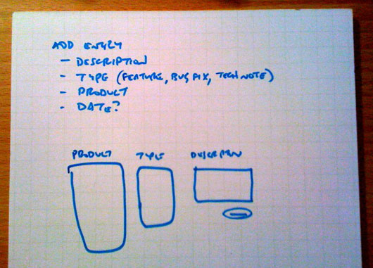
Today I started the UI for a new 37signals internal tool called ‘Champagne.’ It’s a central app for announcing changes to our apps so improvements to our products can be displayed in many places: inside the apps, on our marketing sites, and so forth. The epicenter of Champagne is actually on the consuming end, when the changelog data gets displayed within the app at certain times. That’s already designed. Today I started on the second-most-important screen, the “new entry” screen. Here’s a look at the process from sketch to markup to final design. The whole thing took about thirty minutes.
First I sketched a short list of the elements and sketched a layout. There was more detail in my head, but this little sketch was enough to concretize the main idea.
After sketching, I always jump straight to markup.
Continued…
 A few weeks ago I posted a teaser of something we’ve been working on. I said it was a little something, but it’s actually a big something. We’ve been working on it for over a year. It will lay the foundation for a lot of great stuff in the future.
Over 150 people guessed what it was, and to our surprise, the seventh guess was spot on:
Looks like a identity card or license to me. I’m going to guess unification of user accounts across all apps into a single “37signals id” for each user. If I’m right I will be very happy. Been waiting for years.
It’s been hard to keep this bottled up. We’re really pumped to introduce this major improvement across our paid product line. We’re still working on it, but we wanted to begin to share what we’ve been working on with you.
Continued…
| Mark I. |
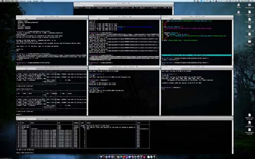
This is why I <3 my 30" monitor: |
| Mark I. |
|
| Jamis B. |
head explodes |
| Mark I. |
The 7 main windows are cmd 1-7. |
| Mark I. |
Super handy. |
| Josh P. |
Do you have a program that titles those windows for you? :P |
| Mark I. |
|
| Mark I. |
I have hotkeys for each window position. |
| Mark I. |
So I open a window and hit ctrl-cmd-uparrow then hit a-g, depending on the location. |
| Mark I. |
Once I had them all laid out, I just saved a window group in Terminal. |
| Mark I. |
And it’ll open them all in the same spots. |
From our internal 37signals Campfire chat room.
Some recent posts at the 37signals Product Blog:
Highrise
Import Your Highrise companies and deals into Pulse
Pulse is a web-based cash flow management tool that just added the ability to import Highrise companies and deals.

New in Highrise: Improved contact editing
We’ve just improved editing and adding contacts in Highrise. The new edit contact screen is shorter, less cluttered, and better organized. It lets you focus on only the pieces of information that are important for each contact without cluttering the screen with empty text fields.

Continued…




 A few weeks ago