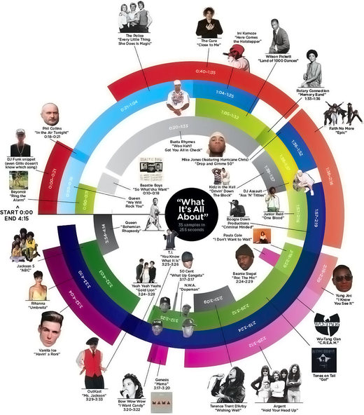
Neat infographic: A beat-by-beat breakdown of a single track by “mashup DJ” Girl Talk.
You’re reading Signal v. Noise, a publication about the web by Basecamp since 1999. Happy !

Neat infographic: A beat-by-beat breakdown of a single track by “mashup DJ” Girl Talk.
As the new designer at 37signals, I am working on a series of short-term projects, much like the old 37express projects and my recent Highrise contact screen exploration. The idea is to work through some long-standing areas of the apps with a fresh eye and an outsider’s perspective. It also allows us to revisit some areas that we know can be better, but for various reasons haven’t had the time to rework.
So the goal is for me to tackle one of these design challenges a week for the next 8 weeks or so. We may get sidetracked like we did on this first one, but that’s the plan for now. I’ll be looking at solutions that we can implement immediately, but also digging in to see where else the process might take us. I’ll also be documenting these explorations for all to see.
The first exploration was of the “Account (Upgrade/Billing)” tab in Basecamp and my write-up of the process is live. Not only that, but we went ahead and implemented the final design into Basecamp. It was pretty cool to get in here, get to work, and have my design live all in the first 10 days or so as a signal.
Yesterday David and I met with Sarah and Michael for a bit to get an update on how customer support/service is going. We recently switched from using Gmail to HelpSpot and we were curious how the transition felt. Basically, how was the workflow and were we learning anything?
One of the reasons we switched to HelpSpot was so we could do a better job tracking which requests and issues were top requests. Sometimes support will say “People have been having a hard time uploading files this week” but it’s hard to know what “people” means. Is it two people? 10 people? Dozens? If we made changes to the app, would we reduce support demands and customer frustration? Gmail couldn’t really give us specifics, and HelpSpot could, so we switched to HelpSpot.
In our review yesterday we discovered that were were tracking everything in detail, but not really learning anything. Why? We were tracking for the sake of tracking, not tracking for the sake of learning. We weren’t really sure why we were tracking what we were — but we kept on doing it because, well, momentum is a powerful force. It became an exercise in seeing how organized we could get in spite of what we actually needed.
Our extensive use of categories and tags and custom fields and pulldowns could give us a whole lot of report-friendly information, but it didn’t give us any useful information. Information without insight is junk. That’s what we had. Plenty of it.
So yesterday we decided to change everything. Let’s point the ship towards simple. Every mistake we’ve made as a company has been because we tried to do too much, not because we didn’t do enough. So let’s apply that lesson to how we track support requests too.
Instead of neatly categorizing every request, we’d just roughly categorize them. So instead of multi-level categorizing like “Milestones > Editing > How to move milestones between projects” we’d just track the “How do move milestones between projects” part. The “Milestones” and “Editing” categories didn’t matter. We didn’t need the hierarchy or extensive organization. All that mattered was the bottom line: The question/issue.
Basically as questions/issues came in, we’d create new long tags that paraphrased the question/issue. And whenever another question/issue came in that was roughly the same as the paraphrased question, we’d tag the actual question with the paraphrased question. This way we could get a count on these paraphrased questions and see how many people were basically asking “how can I update my password” or “how do I move information between projects?”.
We could run a report that would simply give us the top 10 questions this week. Are they the same as last week’s top 10? Are we seeing a pattern? What’s up? What’s down? Now we have specifics that we can act on. In the past we’d know there were 60 questions in the “milestones” tag, but that doesn’t really give us anything to act on. But now we’d know there were 23 questions about “How do I add more than 10 milestones at a time”, 21 about “Can I move milestones between projects?”, and 16 about “Can I add times to milestones?”. Now we’ve learned something.
Looking back at this it seems obvious. We should have done this from the start. But like many things, it’s easy to get carried away. This new tool gave us all sorts of tracking options. Categories, tags, custom fields, lookups, etc… So we got excited and confused enthusiasm with priority. We did a lot of busy work but didn’t learn anything.
So just a reminder: Know what you’re measuring. Data for the sake of data can be a fun intellectual exercise, but practicality is usually what you’re after.

LessEverything’s UI Test Results #3: Flipping “See the Tour or Try Less Accounting Free” so button is on the right improved conversions from 12.3% to 13.8%.
I don’t care how good you are at programming, finding bugs, whatever. If you’re rude, or if you speak poorly to people who don’t understand your… quirks…. you will wind up being shunted to the side. No one wants to work with someone who makes them feel beat down all the time, or someone who they simply can’t understand, or someone whose reaction to every issue is to start wailing about the end of the world.
I have a couple of technical presentations coming up that I wanted to let everyone know about. I’ll be talking about a couple of things that have been holding my interest for the past few months: Chef and Erlang.
For the first talk, I’ll be giving an overview of Chef, a tool that we’ve been using for few months to automate our system administration tasks. If you’re in or around the Raleigh, NC area tomorrow night (June 16th), come out to the Raleigh.rb meetup and join us.
The second talk will be at Erlang Factory in London next week. I’ll be talking about our use of the Erlang programming language in the Campfire poll server that we recently discussed right here on SvN. I had the good fortune to attend the first Erlang Factory in the United States at the beginning of May in Palo Alto and it was one of the best conferences I’ve been to in years. If you’re at all interested in Erlang, it would be worth your while to think about attending the conference.
So the Lakers win another NBA championship. I haven’t always been a fan, but I’ve got to admit it was really fun to watch Kobe Bryant this season. He seemed to have an almost maniacal determination to win another championship. People compare him to Michael Jordan and, while they’re both incredibly talented, you get the feeling that what really separates them from the pack is how badly they want to win.
Along those lines, a great documentary to check out is Spike Lee’s Kobe Doin’ Work (Netflix). Bryant gave the filmmaker unprecedented access to his life for one game. He’s mic’d up, 30 cameras follow him, and coach Phil Jackson lets the crew into the locker room before the game, at halftime, and after the game too. Here’s a preview:
It’s fascinating to watch even though the game was a blowout. Also, there’s a great storytelling lesson here too: Tell a story about less. See, the impulse is to go for a grand tale. In this case, it’d be to prove how great Kobe is by profiling his entire career or trailing him for an entire season. Along the way, you’d interview teammates, experts, etc. And you’d come up with a pretty generic piece.
By focusing on just a single game, Lee put a magnifying glass on how Kobe plays. Cameras trail his every move so during every timeout and every play, you get to see and hear how Kobe guides his teammates. It completely changes the way you view both the player and the game. There’s no filler or outside input. It’s just a laser focus on this one subject during this one day.
Sometimes it’s easier to get a big message across if you narrow your scope. It’s what we tried to do with our Behind the scenes at 37signals series which presented a look at one week of 37signals’ Campfire usage. Not as exciting, perhaps, but the idea was similar: To tell the big story of how integral Campfire is to us, it was best to focus on a short period of time. Sometimes the perfect way to explain a universal truth is through an individual example.
Also, if you watch the documentary, Lee is incredibly loose with how he asks his questions. It means that Kobe is really relaxed and open with his answers too. If you’re ever doing interviews, it’s something to note: Go in with stiff questions and you’ll probably get stiff answers. Go in loose and you’re more likely to get your subject to open up and admit things to you they probably wouldn’t otherwise.
This new animated YouTube logo is super distracting. How are you supposed to concentrate on a video when there’s this flashing static/rainbow thing in the corner? It’s like the site is trying to force you to go fullscreen mode now. If your branding gives customers a headache, it’s not really such great branding.
Update: Apparently it’s a one-day thing to commemorate the change of TV from analog to digital. But still…
Click “Continued” to see the animation.
Continued…We blame bureaucracy for being wasteful and taking too long when things like the Denver International Airport or Boston’s Big Dig arrive years overdue and billions over budget. But it’s not just huge organizations and the government that mess up planning. Everyone does. It’s the “planning fallacy.” We think we can plan, but we can’t.
Studies show it doesn’t matter whether you ask people for their realistic best guess or a hoped-for best case scenario. Either way, they give you the best case scenario. It’s true on a big scale and it’s true on a small scale too.
We just aren’t good at being realistic. We envision everything going exactly as planned. We never factor in unexpected illnesses, hard drive failures, or other Murphy’s Law-type stuff.
If you believe 100% in some big upfront advance plan, you’re just lying to yourself. There’s a good side to this too though: You’re liberated. That messy planning stage that delays things and prevents you from getting real is, in large part, a waste of time. So skip it. If you really want to know how much time/resources a project will take, start doing it.
For my first project since joining 37signals I’ve been working on an update to the venerable Account (Upgrade/Billing) screen in Basecamp. We’ll post more about that update and the process to get there soon, but I wanted to share an experience I had as part of this design.
We had decided to include a few short handwritten phrases as graphic elements. Sometimes in the perfect world of web design, elements that have an organic, handmade look can soften the message and draw the eye. These phrases enhance the message but don’t convey any hard data that is intrinsic to the upgrade decision. That makes them a good place to have a little fun and lighten things up.

So, I wanted to make them look as if they’d been casually written directly on the page. They needed to look casual and authentic so no fonts. It can be tempting to use a script or handwriting font for an application like this, but they never fool the eye. I learned a long time ago that you can’t fake it — if you want something to look handmade, make it by hand.
But what I found is that this task was a lot tougher than it sounds. I must have written and re-written some of these phrases more than 50 times trying to get just the right flow, the perfect amount of flair, and a cohesiveness with the other phrases. But “perfect” was exactly the wrong approach here. Handwriting isn’t perfect and the irregularity is where the character and charm I was going for would come from. So I settled for “good enough”, which turned out to be ideal.
So instead of carefully drawing each letter and placing them together, I practiced a few times and just wrote each one out as quickly and naturally as if I was writing in my notebook.
My fingerprints — almost literally — are going to start showing up in 37signals products in the coming weeks. I’ll be sharing more of the process as we go.