
Elbo.ws puts a special message at the top of the page for visitors who wind up there via Google.
You’re reading Signal v. Noise, a publication about the web by Basecamp since 1999. Happy !

Elbo.ws puts a special message at the top of the page for visitors who wind up there via Google.
In Artistic Value of Thriller [via JS], “Scorpeze” writes that many overlook Michael Jackson’s role as a songwriter and producer on his landmark albums and tend to overestimate Quincy Jones’ role. The post includes links to demos (Billie Jean, The Girl Is Mine) that MJ created for those records. Assuming they’re legit, it’s pretty amazing how close they are to the final product.
From a biz/marketing perspective, it’s also interesting to note how many risks MJ took on Thriller. There were so many things on there that people said you couldn’t do on a R&B record. But he did ‘em anyway and created the biggest selling album of all time.
people glaze over it now…but what soul/R&B figure could create a hit rock record that was embraced across the board…AND considered authentic by the rock audience?(the snobs may have been pissed off, but they werent the ones buying the records)…what soul/R&B cat was collaborating with Van Halen….and have it WORK?
it wasnt Prince….w/out Beat It, could you have a Let’s Go Crazy?
what other soul/R&B cat could get one of the Beatles on Black radio in the 80’s?
what soul/R&B cat would get Vincent Price to drop spoken word in the middle a funk/R&B cut cum horror movie?
who was else at the time was incorporating African chants and percussion at a time when everyone was whitening it up sonically(including MJ)…and who would reference Soul Makossa in the 80’s?
listen to the fact that a Black artist who was considered strictly soul/R&B decided to do a stylistic tour de force in one album when it hadnt been done before…
Thriller had: Funk straight R&B Quiet Storm MOR Pop Rock
…all in one album by a Black aritst when such a thing was not only unheard of but frowned upon…..
futhermore, on Thriller he spoke abt teen preganancy, gang violence, challenging the social constructs of manhood, the culture of gossip, emotional blackmail, obsession, false accusations of paternity, and belief in one’s self…
fluff?
these are ARTISTIC RISKS….they could have gone horribly awry, but they didnt….he did the record HIS way….and in a rare occurence that we will only see once in a lifetime, hit the bulls-eye and pleased EVERYBODY…the effects of that had both deep positive and negative effects on his work and the entire music industry after that….
Looking back, it all seems perfectly logical. It’s easy to forget how much of a singular vision it took to pull off that unique combo of ideas.
Yesterday we pushed an update to the Basecamp global milestone view. This is the calendar-style view of all milestones on all projects over the next 3 months. The goal was to make this screen cleaner and more useful.
The old milestone calendar looked like this:
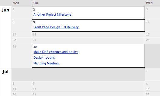
It did a great job of effectively using the space with empty days that collapsed to a very small size. This made it easy to get a good quick view of the whole picture. But it was hard to dig-in further. You couldn’t tell which project each milestone belonged to or who was responsible for completing it. The pull-down at the top right did filter by person assigned, but even in that view it was hard to see which project the milestones applied to.
So, one of the first things we knew we wanted was to add the project name and person responsible for each milestone. Each milestone now shows both without adding a lot of visual clutter. We think this instantly makes this screen more useful, but wanted to explore more ways to make it better.
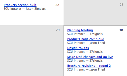
When we thought about how people use this screen it became clear that the empty days could be just as important as the days that have milestones. One reason to check this global view was to find the holes — the places where new milestones could fit.
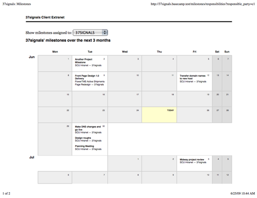
So we explored sizing each calendar day to an equal width — much like a more traditional calendar. This had the added benefit of making the whole screen more understandable simply because it looks like a traditional calendar. It is more clear what you’re looking at and what you can do here. This is the revised look with equally-sized days and some small visual tweaks:
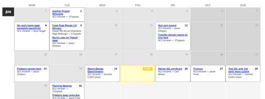
We added a subtle visual style for the days that fall on weekends to differentiate from weekdays. It then occurred to us that some businesses operate almost exclusively on a regular Monday–Friday schedule. For them it was a waste to have almost 30% of the available space each week used to show empty weekend days. So we brought back some of the table collapsing for weekends. If there are no milestones on any weekend day in the current view they simply shrink to a minimal width, allowing more space for the weekdays. However, if any weekend day has a milestone, then weekends become full-fledged citizens again. Here’s what it looks like when weekends aren’t being used:
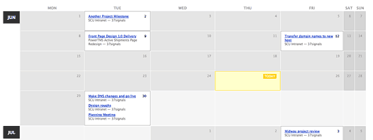
While re-working the CSS for this particular screen, we noticed that we hadn’t defined any print styles. So we spent a little time adding some CSS to our print stylesheets for the global milestones calendar. Now when you print it will look something like this:
Here’s a sampling of available Design and Programming jobs.
Some have doubted our advice that you should hold on to your day job and start something on the side. They argue building a business requires such persistent effort that you need to devote all your time to it to do it right.
And it’s true that building a business requires plenty of time and effort. But the idea that you need to quit your job to do it right is misguided. If you quit your job, you shift everything. You don’t gain time, you lose it. You put a shot clock on your business. You box yourself into a position where you have to profit immediately or the whole thing goes under. You’ve got to make it work now or give up forever.
Hanging on to your day job gives you a longer period of time to build your idea. It lets you give a sustained effort over time. There’s no get rich quick option. You build it slowly, one day at a time.
Yes, you need to find time to do both your side business and your normal gig. But there’s always enough time if you spend it right. Instead of watching TV or playing Grand Theft Auto, work on your idea. Instead of going to bed at 10, go to bed at 11. We’re not talking about all-nighters or 16 hour days – we’re talking about squeezing out a few extra hours a week. That’s enough time to get something going and then keep giving it gas.
Let your side business evolve into a full-time business naturally. Go for organic growth. Start as a side project. Build it slowly. Keep putting time into it. As pickup of your project grows, then you can justify devoting more resources to it. Eventually, if everything goes according to plan, you’ll be able to quit your job and devote all your time to it (if that’s what you want). But doing so right out of the gate is putting the cart before the horse.
Think how evolution happens in nature. There aren’t huge leaps. Things incrementally change. That’s the model to shoot for.
Over the years I’ve seen a lot of proposals from professional services firms. Designers, architects, lawyers, consultants, and others.
Many of them included a small price list at the end. Here’s one from a recent proposal I received from a landscape architect I’m considering hiring:
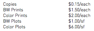
These nickel and dime items have always rubbed me the wrong way. I’m about to pay someone many thousands and they’re about to bill me $0.15 for a copy.
Plenty of people bitch about ATM fees, but these copy and print fees feel even more obscene to me. I recognize paper costs money and toner costs money and machines cost money, but come on – isn’t this just part of the cost of doing business? It feels like they’d charge for bandwidth used to email you a file if they were sophisticated enough to track it.
Further, many of these professional services get annoyed when their clients cut back budgets or say they can’t afford this or that. But then the professional services themselves pinch pennies even tighter by trying to pass the cost of a piece of paper on to their client. The disconnect couldn’t be more obvious.
I can’t recall if I’ve ever actually been billed for any of these items, but it just seems unnecessary. Perhaps they are worried about clients that require thousands of pages or hundreds of plots. If that’s the case, ok – how about saying “After 100 copies, we will bill $0.15/copy” or something like that. Absorb the routine costs and bill the excessive costs. That feels reasonable and respectful on both sides.
At the end of the day another $15 here or $36 there isn’t going to break a client’s bank, and complaining about $0.15 feels petty – and in some ways it is – but these nickel and dime fees put up a sign that says “we’re passing every little cost on to you, no matter how insignificant.” That just doesn’t seem like the right way to start a business relationship.
This post kicks off a series of posts designed to share how we use our own products for our own business. It’s something we don’t talk that much about, but it’s something a lot of people have asked about. So here goes.
PROBLEM: We didn’t have a simple, accessible-company-wide list of email newsletters we’d sent out.
SOLUTION: Make a Backpack page.
We use Campaign Monitor to send out our email newsletters. While Campaign Monitor does keep a list of previous newsletters, it’s not convenient for everyone else at 37signals to log in and go through the overhead of another app just to see a list of previous newsletters. So we made a Backpack page instead. We’ve made the page public so you can see it for yourself.
Dead simple, one page, quick summaries of every newsletter, grouped by product, direct links to the HTML versions of the newsletters. The page is shared with everyone at 37signals. It’s also tagged “37signals” “Newsletter” so anyone can find it quickly if they haven’t added it to their Backpack sidebar.
Whenever Jamie sends a newsletter he takes about 60 seconds to add the link and brief description to the Backpack page. We use Backpack page dividers to group the newsletters for different products and add each newsletter as a note. The note subject is the date and the note body is a link to the newsletter plus a summary of the main points.
And that’s it. Not rocket science, but who needs rocket science? Backpack is anti-rocket science.
It’s just a shared Backpack page with a list of stuff grouped up, linked up, and summarized up. In one place all the time so everyone knows where it is.
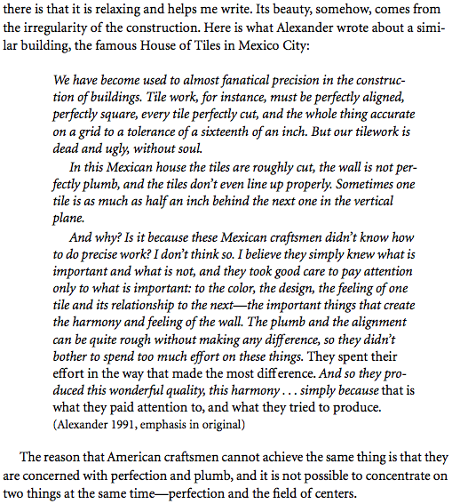
Christopher Alexander on the beauty and sense of wholeness that comes from the irregular construction of buildings such as La Casa de los Azulejos in Mexico City. From his 1991 essay “The Perfection of Imperfection,” as cited by Richard Gabriel in Patterns of Software (1.2 MB PDF).

In retrospect, all revolutions seem inevitable. Beforehand, all revolutions seem impossible.
You’re working on some new UI and there are multiple states that could be displayed based on some conditions. How do you communicate the possible states to a programmer? You could mock them all up separately as wireframes. Or you could comment them out in your HTML mockup and then walk through them face to face, explaining each one. Both of these methods work, but they leave a gap between your intentions as a designer and the programmer’s interpretation. The best way to ensure the conditions are understood and agreed upon between both of you is to actually write them into your template using stubbed Rails helpers.
Here’s an example from Basecamp. We want to improve performance on comment threads with a very high number of comments. The idea is to paginate comments. We’d display the most recent n comments, (let’s say 50) and earlier comments could be fetched dynamically with a “show more” link. Here’s a sketch:
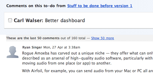
The template for that sketch looks like this:
<h2 class="paginated_comments_header">
<strong>These are the last 50 comments</strong> out of 160 total — <%= link_to "Show 50 more" %>
</h2>
But that’s not the end of the story. What do we display if there are no more comments to show? What if we are showing fifty out of sixty comments, so “Show 50 more” wouldn’t apply? The best way to communicate and test these conditions is to stub out some helpers. First I’ll write what I want to happen even though the helpers don’t exist:
<h2 class="paginated_comments_header">
<% if showing_all_comments? %>
<strong>Showing all 60 comments</strong>
<% else %>
<strong>These are the last 50 comments</strong> out of 60 total —
<% if more_than_one_page_of_comments_left? %>
<%= link_to "Show 50 more" %>
<% else %>
<%= link_to "Show remaining 10 comments" %>
<% end %>
<% end %>
</h2>
Look carefully at the code to see how it reflects the different edge cases mentioned above.
Next I’ll write the helpers so that the template works. Since I’m only mocking the helpers, I can just make them return “true” or “false” depending on the condition I want to demonstrate.
module CommentsHelper
  ...

  def showing_all_comments?
    false
  end

  def more_than_one_page_of_comments_left?
    true
  end
end
All I have to do to test the different states is toggle those “true” and “false” values. The code communicates directly to the programmer when and why the different parts of the template should render. When it’s time for the programmer to implement, all he or she needs to do is replace the boolean with the actual conditions.
Even if the final template is going to be implemented differently, like in Javascript instead of ERB, it’s still helpful to deliver the template in ERB with the mocked helpers because the conditions are completely nailed down. I hope this technique helps you navigate that communication gap the next time you mock a template with more than one possible state.