You’re reading Signal v. Noise, a publication about the web by Basecamp since 1999. Happy !

A graphic novel inspired by noir film directors

Matt Linderman
Matt Linderman wrote this on 5 comments

Finding fresh inspiration [SvN] advised looking to a different medium for inspiration, the way Tony Bennett imitated musicians rather than other singers.

Another example to add to the list: Hannah Berry’s debut graphic novel, Britten & Brülightl (she spent 2.5 years hand-painting each panel of the story). In this interview, Berry explains how she used cinematic influences to guide her work on the novel. [via Flavorpill]

Being a film geek, illustrational challenges were tackled with cinematic elements, often with a nod to directors I really rate (I’m thinking in particular of ‘neo-noir’ types like David Fincher, Christopher Nolan and the Coen brothers, and ‘old-school noir’ Carol Reed). It’s probably not ideal – I know I’m not using comics to their full potential while I’m echoing film, but it’s a good place to start.

A recurring problem while working on the book was finding ways of illustrating dialogue that are animating but unobtrusive. I love writing dialogue, and I tend to write staccato conversations that cross backwards and forwards a lot, which for the sake of the format I have to edit down pretty heavily. To save the scene from getting bogged down in words I had to introduce some level of movement, and as movement is obviously something that’s lacking from the comic world, I needed to compensate in other ways. A lot of the films of Jeunet and Caro (especially Delicatessen) use composition and angle to make static shots appear quite dynamic, and theirs sprang to mind as a good example to follow.

Turning to film influences to get ideas for a graphic novel is a great example of how a different medium can provide inspiration. Whatever you’re working on, using different influences than the rest of the pack is a great way to sound like an individual instead of just a member of the chorus.

Check out a couple of pages from the book after the jump.

Continued…

Product Blog update: Improvements to time tracking and HTML export in Basecamp, Backpack and a cleaner inbox, etc.

Basecamp
Basecamp wrote this on 3 comments

Some recent posts at the 37signals Product Blog:

Basecamp
Time Tracking in Basecamp gets a fresh coat of paint
“If your Basecamp plan includes Time Tracking (Plus or higher) then you’ll notice some improvements to your Time tab today. We swept through the time tracking screens to make them a bit sharper and work a bit better. We also fixed some bugs along the way. You’ll notice that actions like editing a time entry or creating a time report are noticeably smoother now.”

New-time-tab

New in Basecamp: Export your account in easy-to-read HTML format
“Basecamp has always offered account owners the chance to export their accounts in XML format. The trouble is that XML is a technical file format that only programmers can make use of. We wanted to offer an export designed for everybody—something account owners can download, open in their web browser, and print. That’s exactly what we did with the new “HTML export” option.”

Export options

Continued…

The method still works

Ryan
Ryan wrote this on 20 comments

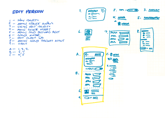
While I might use some different language today, this technique I posted in 2004 (inspired by Alexander) is still a major help when I’m designing a UI with many elements to juggle. The reason I come back to it is that it helps me design with language first instead of empty templates. Too often a design starts top-down with empty content areas (maybe a main column and a sidebar) and then we fill those boxes in until its “done.” Filling in the boxes would work fine, except having a bunch of stuff on the page doesn’t mean we served the design goals.

Here’s a refresher:

  1. List all the things a screen should do. What should the customer be able to accomplish? What information are you sure should be displayed? Which affordances are necessary for customers to start a process or reach a goal? Label these things with numbers.
  2. Look for any numbered items that relate to each other, conceptually or spatially. Label these groups of numbers with a letter.
  3. Sketch a design (or multiple designs) for each number or letter group.
  4. Combine the individually sketched blocks into a unified design. Let the pieces fall together into a whole.

And don’t forget, the next step isn’t a polished wireframe. It’s code you can click on!

Seen any great ads lately? Video, still, paper, whatever. Post ‘em if you got ‘em.

Jason Fried on Apr 17 2009 33 answers

Album art revival at We Are Hunted

Ryan
Ryan wrote this on 9 comments

A Wired article this morning led me to We Are Hunted. It’s an awesome example of the difference UI makes. There are tons of music sites out there, but most are 90% chrome. Compare We Are Hunted to Rush Hour or Sounds of the Universe. The other sites are a lot of text and navigation with tiny postage-stamp album covers. We Are Hunted flips the formula by focusing on album art and the result is like standing in a record store. There’s art in your face everywhere. Scenes and styles and provocation and “howtf is this record going to sound?” all lurk in an album cover. Clicking a cover to play the linked track gives you the familiar feeling of taking a CD home and examining the art while the first track streams through the speakers.


We Are Hunted

A coventional music store UI

Aesthetics aside, this comes back to UI design. Music sites have mostly the same elements. A cover image thumbnail, a play link, the artist name, the track name, etc. The difference comes in the triage. How do you decide what’s important? What do you focus on? What do you want your customer to see first? To see second? We Are Hunted gave album art the top slot and the result sets their site apart and gives their customers a markedly different experience.

J. Peterman: Selling stories, not just products

Matt Linderman
Matt Linderman wrote this on 14 comments

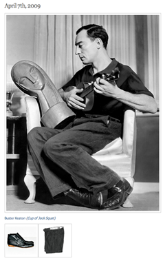
nerd bfNerd Boyfriend is surprisingly compelling. Pictures of vintage “nerds” along with links to buy modern-day versions of what they’re wearing. (Like Buster Keaton, right, wearing corduroys along with a link to get a similar pair at J. Peterman.) It feels like a peek at the future of clothes shopping — a way to nail the sensibilty of clothes through personality.

Speaking of The J. Peterman Company, it’s a great example of a company that has used storytelling to set apart its products (long before it was hip to do so too).

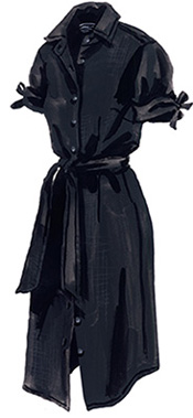
Sure, the descriptions are silly — to the point where it became a running gag on Seinfeld. But that’s part of the charm. Like the hand-drawn illustrations instead of actual photos. It’s setting its own tone that is a world away from department store genericness. Some examples below.

Italian Shirttail Dress (aka Ms. Indiana Jones):

ms. jonesAt the Colosseum in Rome, the toe of your sandal kicks over a chunk of marble, revealing a mint silver denarius from the reign of Emperor Hadrian.

Dinner at La Pergola is on you.

Then, there’s that innocent stroll into the jungle during your stay at an eco-resort in Belize.

Next thing you know, you’ve discovered the fabulous lost city of Xupu Ha…dozens of acres of temples and statuary and steep-sided sacrificial lakes, concealed by centuries of vines.

Your Mayan is rusty, but the natives seem to refer to you as “She Who Has Bows on Her Sleeves.”

Italian Shirttail Dress (No. 2318), found by serendipity in Florence. Upper-calf cut of soft, pre-washed linen, fashionable and favored by adventurers who want to keep cool. Rounded shirttail hem. Self belt. Point collar.

Bust darts, shaping seams, and those bow-tie roll-up sleeve tabs eliminate any possible confusion with Mr. Jones.

Continued…

The difference between truly standing for something and a mission statement

Matt Linderman
Matt Linderman wrote this on 47 comments

Being an opinionated company is great. Great companies have a point of view, not just a product.

But there’s a world of difference between truly standing for something and having a mission statement that says you stand for something. You know, those “providing the best service” statements that are created just to be posted on a wall. The ones that sound phony and disconnected from reality. The ones that come off like a press release, not an actual directive.

For example, let’s say you’re standing in an Enterprise rental car office. The room’s cold. The carpet is dirty. There’s no one at the counter. And then you see a tattered piece of paper with some clip art at the top of it pinned to a bulletin board. And it’s a mission statement that says this:

Our mission is to fulfill the automotive and commercial truck rental, leasing, car sales and related needs of our customers and, in doing so, exceed their expectations for service, quality and value.

We will strive to earn our customers’ long-term loyalty by working to deliver more than promised, being honest and fair and “going the extra mile” to provide exceptional personalized service that creates a pleasing business experience.

We must motivate our employees to provide exceptional service to our customers by supporting their development, providing opportunities for personal growth and fairly compensating them for their successes and achievements.

And it drones on. And you’re sitting there reading this crap and wondering, “What kind of idiot do they take me for?” It’s just words on paper that are clearly disconnected from the reality of the experience.

It’s like when you’re on hold and a recorded voice comes on telling you how much the company values you as a customer. Really? Then maybe you should hire some more support people or offer email support so I don’t have to wait 30 minutes to get help. Or just say nothing. But don’t give me an automated voice that’s telling me how much you care about me. It’s a robot. I know the difference between genuine affection and a robot that’s programmed to say nice things.

Standing for something isn’t just about writing it down. It’s about believing it and living it.

Santa Monica BMW's Checkmate

Jason Fried
Jason Fried wrote this on 104 comments

Brilliant move by a local BMW dealer in responding to a national Audi ad. Audi’s 2009 A4 ad on the left side of the street says “Your move, BMW.” Santa Monica BMW comes back with an M3 ad across the street that says “Checkmate.” Now that’s advertising.

What do you do if you’re Audi?