I’m really liking Google’s design lately. Even though people would say, “It’s ugly and stripped down or whatever.” The decisions they’re making I think are really wise. Everything’s based on speed. And the more you use it, the more you realize speed trumps aesthetics in most cases. If you can be fast and good looking, that’s great. But I think I’d almost prefer fast.
And so, I like some of the decisions they’re making about that. And I think that’s starting to influence us a little bit in terms of picking up some speed here and there by maybe doing things that are a little bit less fancy than we might want to do, a little less arty than what we might want to do, but really just are better because they’re faster…
The way I tend to do it is I’ll design something the way I like it, and then I’ll figure out how I can pull stuff out of it. So, for me, it’s more an editing process. Speed is about editing for me. I want to get the idea out there first and then I can start peeling back.
Suggested formula for figuring out how long online videos should be: 1 minute of a web video = 1 hour of a feature film. So keep web videos under 2-3 minutes unless you’ve got a really compelling reason to go longer.
Shakespeare's word inventions

The Words episode of Radiolab (iTunes link) features an interesting segment on how Shakespeare behaved like a language chemist, combining words like elements. The relevant story starts at 22:00 in of the episode.
According to James Shapiro, a Shakespeare scholar at Columbia, the un- prefix is something Shakespeare created (at least he was the first to use it in print or on stage). That means he invented the words unaware, uncomfortable, undress, uneducated, unwillingness, unsolicited, and unreal. Also, words like madcap and eyeball. That’s right, the word eyeball didn’t actually exist until Shakespeare came up with it.
Plenty of Shakespeare phrases have stuck with us too. Some examples mentioned by Shapiro:
Truth will out.
What’s done is done.
Dead as a doornail.
Every dog will have its day.
Fool’s paradise.
The game is afoot.
It’s Greek to me.
Kill with kindness.
Love is blind.
All’s well that end’s well.
See more of Shakespeare’s coinages (via EL). It’s neat to think about one person sitting down and actually creating so many of these words and phrases which now seem ubiquitous.
This week in Twitter

A few of this week’s 37signals staff posts at Twitter.
![]() jasonfried: The reason you can’t get it done in one day/week/month is because you’re making it take two days/weeks/months.
jasonfried: The reason you can’t get it done in one day/week/month is because you’re making it take two days/weeks/months.
![]() rjs: For fans of Christopher Alexander’s recent books, Nikos Salingaros’ “A Theory of Architecture” is a must read http://amzn.to/cGOdBg
rjs: For fans of Christopher Alexander’s recent books, Nikos Salingaros’ “A Theory of Architecture” is a must read http://amzn.to/cGOdBg
![]() longstride: Calling in GMail is pretty cool. Add it as one your Google Voice lines and you get inbound calls, too.
longstride: Calling in GMail is pretty cool. Add it as one your Google Voice lines and you get inbound calls, too.
![]() mattlinderman: Sparklines:Graphic designers = Windmills:Don Quixote
mattlinderman: Sparklines:Graphic designers = Windmills:Don Quixote
![]() dhh: The Ruby future goes through 1.9.2 and you come along. It’s never been easier to work with multiple versions w/ RVM: http://bit.ly/15h0ax
dhh: The Ruby future goes through 1.9.2 and you come along. It’s never been easier to work with multiple versions w/ RVM: http://bit.ly/15h0ax
![]() sstephenson: I wish more Mac utilities used prefpanes instead of menu bar icons.
sstephenson: I wish more Mac utilities used prefpanes instead of menu bar icons.
[Podcast] Episode #20: Programming roundtable (Part 1 of 3)
Time: 19:38 | 09/02/2010 | Download MP3
Summary
Three members of the 37signals programming team — Jeffrey Hardy, Jamis Buck, and Jeremy Kemper — answer questions from readers of Signal vs. Noise. Topics include Rails, Git, Mocha, Vim, nginx, Passenger, and more.
More episodes
Subscribe to the podcast via iTunes or RSS. Related links and previous episodes available at 37signals.com/podcast.
Sometimes the problem has to mature before the solution can mature.
A couple of interesting UI techniques at Flickr
1) Interesting use of unicode characters for the UI on Flickr:
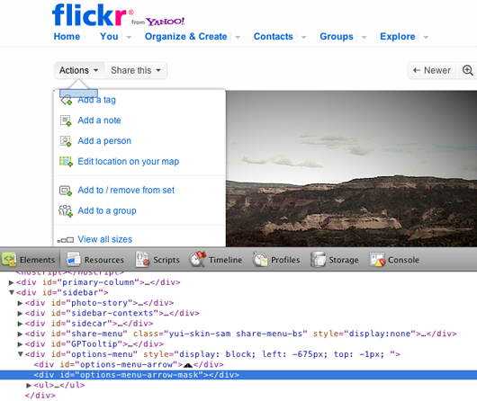
That triangle up top is actually two triangle characters side-by-side. Sucks that we still have to resort to such hacks for such a common UI shape — but this is a smart solution.
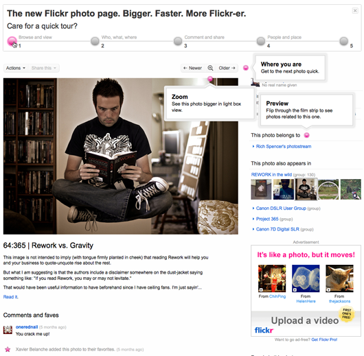
2) Also interesting is this inline tour of the new photo pages. Rollover a number and bubbles pop up to show you what’s fresh for that section.
Smiley: An app in 24 hours
Late Monday afternoon David, Kiran, and I were discussing how we could begin to measure how our customers felt about our customer service. We’re already measuring things like response time, average tickets per day per person, average tickets in a thread, etc. Those stats are helpful for measuring internal efficiency and speed, but they don’t measure quality from a customer’s perspective.
The idea
We talked about it for a bit and came up with this basic goal: Let’s make it really easy for our customers to quickly rate our customer service every time we talk to them. It’s not rocket science, and it’s not a breakthrough idea, but it wasn’t something we were doing. It was time we experimented with the concept. We’d write some software and try it out. We’d call the app Smiley.
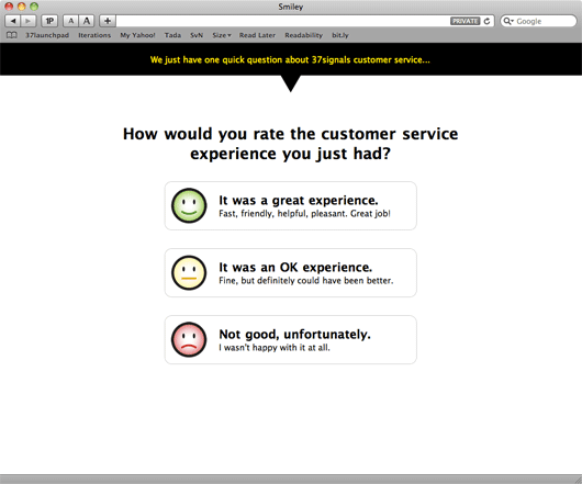
The key
The whole feedback process had to be easy, it had to be fast, and it couldn’t be a burden on our customers. We didn’t want to put people in front of some long-winded complicated survey — no one likes filling those out. We just wanted to ask them one quick question and that was it. The whole thing should take about five seconds and it should be entirely optional. We’d start there and see how it went.
Linked from the email signature
We decided we would add a short link to each support person’s email signature. The link would encode the support person’s ID along with the ticket number for the support request. When someone clicked the link they’d go to our site where they’d be asked to answer one question about the customer service experience they just had. That’s all.
Starting on the design
The next morning I went off and started designing some screens. After a few minutes I had the basic structure. There were five screens total: Three customer facing (and two of those were optional), two internally facing.
- (Customer facing) One screen which asked a customer a single question with three possible answers.
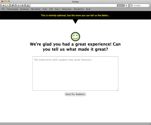
- (Customer facing – optional) One screen with a single text field where someone could choose to elaborate on their answer. This was entirely optional.
- (Customer facing – only seen if someone provides freeform text feedback) One thank you screen someone would see after they submitted their feedback.
- (Internal) One screen that showed all our customer service people along with their most recent ratings, their overall average rating, and a link to see all their ratings and feedback.
- (Internal) One screen that showed all of someone’s ratings along with any feedback a customer left on a particular rating.
About an hour or so later I had the customer facing screens done. We went back and forth on a few iterations, and experimented with two options (“great” and “not great”) vs. three options (“great”, “fine”, and “not very good” – we picked this version), but overall the design was settled in about an hour. Originally I used some stock photo smiley faces for the mockup, but I asked Jamie to design some custom smileys for the design (you’ll see these below).
The screen the customer sees after clicking a link in the email signature.
The optional screen a customer sees if they answer the first question.
Hooking it up
Next David took the UI and began writing the Rails back-end to make it all work. While David was working on this, I started working on the internal facing admin screens. I spent a few hours messing around with some ideas, but eventually settled on the simplest version:
Continued…If you ask an artist why, the greatest artists will tell you, “Well, it was beautiful. It inspired me. It touched me. It reminded me of this or that.”
But you ask a designer why and he says, “Well, I’ve got these 15 different things that all have to coexist in this 800×600 pixel area. And if I do this, that doesn’t work. If I do this, it breaks the other thing. So in order for these three things to be in harmony, I have to do that…”
That points more and more to the challenge to somebody who’s trying to get into or who’s trying to get a job doing UI design, that it’s not about looking at screen shots. Because then you’re putting yourself in the graphic design box.
It’s about your ability to describe problems and your ability to show how it is that a design that you did worked. And if you can show the reasoning and the different relationships between the elements, then you can show that you really know something.