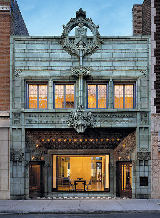
The Krause Music Store, the last commission by Louis Sullivan. Designed in 1922. If you’re in Chicago, don’t miss Louis Sullivan’s Idea at the Chicago Cultural Center. If a book is more your style, check out Sullivan’s City.
You’re reading Signal v. Noise, a publication about the web by Basecamp since 1999. Happy !
The Krause Music Store, the last commission by Louis Sullivan. Designed in 1922. If you’re in Chicago, don’t miss Louis Sullivan’s Idea at the Chicago Cultural Center. If a book is more your style, check out Sullivan’s City.
With all the recent talk about the fabulous new office space that the Chicago crew just moved into, I wanted to share a little bit about another long term move that is nearing completion. For the last four years our infrastructure has been hosted with Rackspace. As of last weekend, the vast majority of our traffic is now being served out of our own colocated server cluster.

Francesco builds beautiful bikes in New York City. Even though he’s building a bike for you, his rules rule. He’s not afraid to say no.
His about page explains what he likes and doesn’t like in a bike.
He’s only going to make you a bike if your likes and dislikes align with his. There may be a couple of exception along the way, but his opinions are his business rules.
Bertelli is a great example of a company that knows where it stands. The best way to know where you stand is to figure out what you won’t do. What will you say no to? Francesco puts his no’s right out in front. It makes the experience better for everyone.
More businesses could benefit from putting their no’s right up front.
A few of this week’s 37signals staff posts at Twitter.
![]() markimbriaco: The 6 week cycle for Chrome releases with incrementing major version numbers has my bullshit detector going nuts.
markimbriaco: The 6 week cycle for Chrome releases with incrementing major version numbers has my bullshit detector going nuts.
![]() asianmack: I wonder why newspapers are designed the way that they are. Big format, different sections, fold-over to read. Tradition? It’s unwieldy!
asianmack: I wonder why newspapers are designed the way that they are. Big format, different sections, fold-over to read. Tradition? It’s unwieldy!
![]() mattlinderman: I enjoy Netflix’ collection of Classic Albums documentaries. http://bit.ly/bijDyD
mattlinderman: I enjoy Netflix’ collection of Classic Albums documentaries. http://bit.ly/bijDyD
![]() uptonic: Great interview with Dieter Rams. “Good design is as little design as possible.” http://bit.ly/bUaq0Z
uptonic: Great interview with Dieter Rams. “Good design is as little design as possible.” http://bit.ly/bUaq0Z
![]() kiranmaxweber: “We generally air on the side of clarity vs. aesthetic. The simplicity that we try to achieve is an aesthetic in itself.” http://ow.ly/2dDXT
kiranmaxweber: “We generally air on the side of clarity vs. aesthetic. The simplicity that we try to achieve is an aesthetic in itself.” http://ow.ly/2dDXT
![]() rjs: Design up front always disappoints. The best revisions come in later stages, but they don’t come unless you leave room for them.
rjs: Design up front always disappoints. The best revisions come in later stages, but they don’t come unless you leave room for them.
![]() jasonfried: Dan Pink on speaking human at work: http://bit.ly/9FDt3G
jasonfried: Dan Pink on speaking human at work: http://bit.ly/9FDt3G
![]() uptonic: Attention cereal manufacturers: I get it. You sealed the bag. Good for you! Now let me open the package without destroying it.
uptonic: Attention cereal manufacturers: I get it. You sealed the bag. Good for you! Now let me open the package without destroying it.
If you have no critics, you’ll likely have no success.
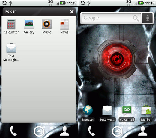
Motorola’s new Android phone truncates “Text Messaging” to “Text Messagin…” and “Text Mess.”
Typography guru Jan Tschichold on indenting paragraphs:
The indent of the paragraph should be the em of the fount body.
Omit indents in the first line of the first paragraph of any text and at the beginning of a new section that comes under a sub-heading. It is not necessary to set the first word in small capitals, but if this is done for any reason, the word should be letter-spaced in the same way as the running title.
If a chapter is divided into several parts without headings, these parts should be divided not only by an additional space, but always by one or more asterisks of the fount body. As a rule, one asterisk is sufficient. Without them it is impossible to see whether a part ends at the bottom of a page or not. Even when the last line of such a part ends the page, there will always be space for an asterisk in the bottom margin.
Of course, the web is in the process of killing off the indented paragraph. But not everywhere. Some examples of indenting can be found at the following sites:
The Subversive Copy Editor blog
Even back in the day, these rules were often ignored. Why? According to Tschichold, it was because typists were trained by business schools, who were “utterly incompetent when it comes to questions of typography.”
The perfect book and page
Tschichold also came up with a system for the perfect book and the perfect page. Yes, perfect.
No matter the page size, you will always end up with a 9×9 grid, with the textblock 1/9th from the top and inside, and 2/9ths from the outside and bottom.
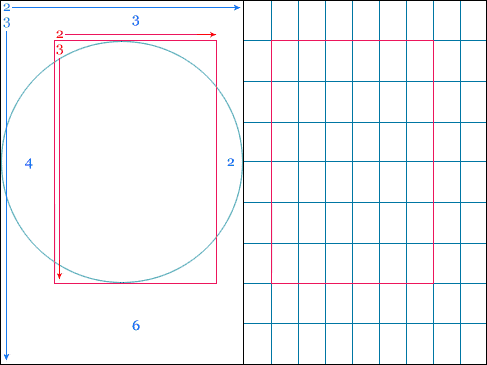
It all goes back to the Golden Ratio:
The page ratio is best at 2:3…His reasoning was that it sits within the Fibonacci Sequence, as well as the Golden Ratio, and establishes that the textblock will be harmonious and proportional to the page — it’s how the height of it equals the width of the page.
Here’s an example layout:
More details/examples at The Secret Law of Page Harmony.
Related: Tschichold and the golden section [Wikipedia]
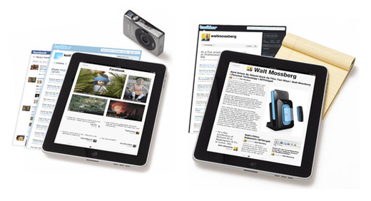
This is a cool visual metaphor on the Flipboard for iPad site. Screenshots from websites are rendered like pieces of paper in a stack under the iPad.
Our new office includes a 37-seat theater-style classroom. We intend on having conferences, master classes, workshops, and talks in this space. We’re about to get started thinking about the first few events. What sort of conference/class would you be interested in attending? The events will be related to the things we’ve learned about design, programming, and business over the last ten years. Any topic suggestions?
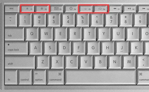
Macbook Pro keyboard. Two icons right next to each other that are exactly the same, except one is ~15% larger than the other. Does this qualify as effective difference?