You’re reading Signal v. Noise, a publication about the web by Basecamp since 1999. Happy !

Levels of aspiration

David
David wrote this on 31 comments

Debates over technology, technique, and process often go nowhere because the participants are arguing from different levels of aspiration.

You’re unlikely to convince someone they should switch to programming Ruby for its beauty, if they’re merely looking to make a living as a single consultant serving local businesses in Schaumburg, Illinois.

Questions such as “does this run on my existing web host?” or “will my clients want something their nephew web designer hasn’t even heard of?” matter far more. Their aspirations are local, finding something that (sorta) works, and getting paid.

It’s easy to snub your nose at that if you have grander aspirations, but there’s a lot of software to be written in this world, and we need all sizes and shapes to get it done.

The third largest landscaper in Schaumburg is probably operating from the same level of aspiration as our single consultant, so there’s a great fit.

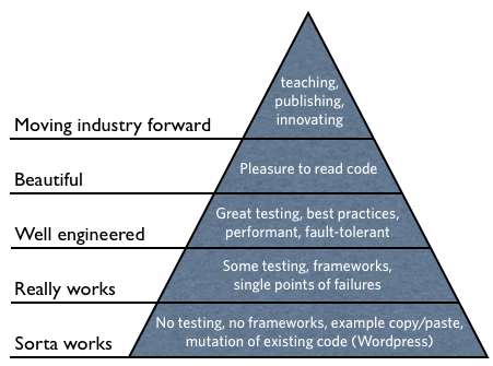
You can think of these levels of aspiration in terms of both geographical and technical hierarchies. Here’s a take on what a hierarchy of technical aspirations could look like for programming:

You can imagine a similar hierarchy for the geographical angle with the levels being Local, City, Regional, National, Global.

The key to a fruitful debate is to first establish at what level the person you’re talking to resides, and then use arguments from the next level up. But if they’re entirely content with where they are, then it’s probably better to live and let live.

To help someone move up the hierarchies, they have to have an intrinsic desire to do so. Arguments like “but it works” or “it gets the job done” are tell-tale signs of someone happy at the lowest level of the technical hierarchy and your cue to just quietly back out of the debate.

Picking the right analysis to solve the real problem

Noah
Noah wrote this on 21 comments

My job is to gather, study, and understand data and its implications, and then make recommendations to help the business improve – in short, to deliver business value from data.

One of the things you learn when you work in analytics is that there’s an endless depth to virtually any problem – you can keep digging deeper and deeper forever. One of the most valuable skills you can learn is deciphering what’s needed to solve the real problem – when has the bulk of the business value been delivered, and when are you doing things that are just intellectual interesting but not actually valuable?

I’ve found that I end up performing analyses in one of four different levels of detail:

  1. The quick ‘n dirty: These are short and simple – for example, a designer wants to know what the distribution of the number of posts on a project is because they’re designing a new screen, or David or Jason wants to know how our support ticket response time is trending. These are some mix of data retrieval and analysis, but the results don’t need a lot of explanation or interpretation. Most of the time, the results are communicated via IM or Campfire, and I end up spending between 30 seconds and 30 minutes.

  2. The basic look: The most common analysis I do is a moderate depth one – something like a look at conversion rates and retention by traffic source, or a basic overview of how people are using a specific feature in the new Basecamp compared to how they used a similar feature in Basecamp Classic. The results here are more involved and need some interpretation or “color commentary”, and may come with specific recommendations. This sort of analysis gets written up in a post on one of our Basecamp projects, and usually takes somewhere between a couple hours and a day.

  3. The deep dive: When it comes to understanding root causes and developing significant recommendations, a more in depth analysis is called for. For things like understanding the root causes of cancellation or support cases, the bulk of the work tends to be on analysis, interpretation, and then actionable recommendations to address those causes. Frequently, there’s some instrumentation or reporting project that spins off from this as well – I may add a report to our dashboard on the topic so we can more easily track it over time. These analyses usually get written up in a longer document with significantly more detail, and sometimes come with a live or recorded video explanation and discussion as well. This sort of analysis usually takes between 1 and 3 weeks.

  4. The boiled ocean: If you want to understand a substantive issue from every single possible angle, try every statistical technique in the book, and write a report with every possible visualization, then you’re probably looking at investing multiple months in a problem. We haven’t done anything like this in the 18 months I’ve been here at 37signals, and that’s by design: in most cases, this type of analysis ends up providing essentially the same business value as a deep dive that takes a fraction of the time.

Next time you’re faced with an analytical problem, ask yourself what the real underlying problem you’re trying to solve is, and figure out what depth of analysis is the required to deliver the bulk of the business value; after all, your job is probably really about improving the business.

Backstage: Using Basecamp to build the Basecamp calendar

Jason Fried
Jason Fried wrote this on 15 comments

Last week we shared a behind the scenes look at how we used Basecamp to design the new export feature. This week we wanted to share the Basecamp project we used to design and develop the Basecamp calendar.

The Basecamp calendar

The Basecamp calendar was the last major feature we designed before releasing the all new Basecamp to the world. I wrote a bit about this in the April issue of my my monthly Inc. column.

Kicking off the project

We kicked off the project back in December with a series of sketches on the chalkboard. We then uploaded those sketches to Basecamp so those who weren’t in the initial kick off session could see what was discussed/sketched.

Initial concepts for adding an event

Here’s a post from Scott sharing some of his initial design ideas for the new event bubble. As you scroll down you’ll see the discussion involves feedback from a few different designers. Some feedback is purely text, some are questions, and others are design “volleys”.

Interacting with the UI

Here’s a thread that starts off with a screencast showing how the UI would work. We often share screencasts when designing UIs so people don’t have to imagine an interaction. The fewer abstractions the better. A screencast is direct and direct is better.

“Involvements”

One of the trickier parts of the calendar UI was figuring out how to add people to an event. And did adding someone to an event mean they were notified about the event or were they responsible for the event? Here’s a discussion where we started to hash this out.

To sheet or not to sheet

Since the calendar is a “global” item (not part of any specific project), we discussed if it should live flat on the background or if it should live on a white sheet like a project. This discussion ended with punting the decision down the road – we wanted to see real content on the calendar before making the final call.

Creating a new calendar

Here’s a meaty discussion with ideas, screenshots, copywriting tweaks, and sketches relating to the UI for creating a new calendar. You’ll see how most discussions about design include a design. Design discussions always benefit from show and tell.

All the discussions in one place

One of the great things about the all new Basecamp is that it keeps all the discussions about a project on a single page. It doesn’t matter if the discussion starts as a message, or a comment on a to-do, or a new design idea, or an event on the calendar – if there’s discussion about it it shows up in the Discussions area. In this project there were 116 separate discussions in all.

All 208 images, files, and movies

Here are all 208 file attachments in the calendar project. You’ll find screenshots, prototypes, screencasts, and sketches.

One “feature”, 180 completed to-dos across 29 lists

And lastly, here’s the nitty gritty – 180 completed to-dos across 29 lists.

More soon!

We have dozens of additional projects we’ll be sharing with everyone over the next few months. Stay tuned for more inside looks at how we used the all new Basecamp to make the all new Basecamp.

Patrick Giusiano’s animation process for a short scene in the movie John Carter.

Sortfolio lives!

Jason Fried
Jason Fried wrote this on 29 comments

After fielding over a dozen offers for Sortfolio, we finally came to an agreement this weekend with a couple of entrepreneurs who will be the new owners of Sortfolio.

This is big news for our Sortfolio customers. Back in May we said we’d either be selling Sortfolio for $480,000 or retiring the site on July 1. And now it’s all good news: Sortfolio has been sold to a great team.

This means Sortfolio lives on!. Sortfolio’s unique visual search will remain the best way for web designers to find clients and clients to find web designers.

We’ll be transitioning the site to the new owners over the next couple of months. We’ll post more details once the transition is over. There will be no interruption of service for current customers, and we’ve turned signup back on so new customers can list their web design firms on Sortfolio.

We’re especially happy that Sortfolio’s found a new home because over the last week or so we’ve been getting emails from people saying how important Sortfolio has been to their business. Emails like:

...All of my leads and livelihood flow through Sortfolio. It’s how I pay for my health insurance, groceries, mortgage, etc…

and

...I can honestly say that Sortfolio changed our lives. Sortfolio brought in the best leads ever and we were able to crawl out from the financial hole we landed in. It actually does that even now, on daily basis.

So here’s to a second lease on life, Sortfolio!

Backstage: An inside look at how we use Basecamp

Jason Fried
Jason Fried wrote this on 39 comments

A lot of people over the years have asked us how we use Basecamp to manage our projects and collaborate at 37signals.

Knocking down the wall

We’ve given tours, we’ve shown screenshots, we’ve shared excerpts, but that’s like peering through a tiny hole in the wall. You’d have a much better view if there was no wall at all.

So we built in a special feature that’s unique to our Basecamp account that allows us to make one of our projects completely public. It’s read-only, it can’t be changed, but you can see all the discussions, to-dos, files, etc., just as they happened.

The project

Whenever we work on a new feature in Basecamp, we create a new Basecamp project. We keep all the discussions, to-do lists, assignments, relevant files, relevant text docs/notes, and any related schedules in the project.

Recently we added the ability to export your Basecamp projects and files into a tidy, self-contained web site you can download to your computer and view in your web browser. This way you can take your data with you, make a backup, or send a copy to a client.

So to get started we created a new project in Basecamp called “BCX: Exporting”. Note: We put “BCX” in front of any new project that’s related to the all new Basecamp. This way, at a glance, we know that this project is for this product, and not for something else we’re working on.

Here’s a link to that project.

You can see all the discussions we had around the export feature. Here’s a meaty discussion (38 comments) that involved ops, dev, and data. And for the designers/writers out there, here’s a design discussion about a specific to-do.

Every file and screenshot we shared in this project is stored on a single page. And you can see a list of every to-do we completed before deploying the feature.

And if you want to see exactly what happened, day-by-day, check out the super-useful Catch Up view. You can step back in time, one page/day at a time. For example, May 22nd was a particularly busy day with 10 people contributing feedback to the project. And May 9th saw a nice handful of important to-dos completed by Jeff.

Lastly, here’s an FAQ that Jeff put together for the support team. It’s super helpful to use Basecamp Text Documents for things like this.

More public projects soon

We hope a look at one of our real Basecamp projects helped give you an idea how we use Basecamp to centralize discussions, files, to-dos, and decisions.

We’ll be opening up more of our projects to public view in the coming weeks. We’ll share different kinds of projects too – some heavier on the design side, some heavier on tech, etc.

After seeing this, do you have any questions about how we use Basecamp? We’d be happy to share any tips/tricks or best practices we’ve come up with along the way.

Interface inspiration at the office

Jason Fried
Jason Fried wrote this on 34 comments

When you design for the screen, it’s easy to think the screen is where you should go for inspiration. It’s definitely one place – there are some amazing people doing some amazing work in pixels. But you’d be cheating yourself if you only looked to your own industry, or medium, for inspiration.

I’ve always found inspiration looking at parallel industries. I love looking at physical objects for interface design inpsiration. Designing interfaces for physical interfaces requires more discipline because, unlike the virtual world which has no shape, edges, or boundaries, the physical world has strict limitations. How designers deal with those limitations and tough choices makes for a wonderful library of ideas.

I wanted to start our own 37signals library of physical interfaces from which we could draw inspiration. So I hired Object Design League here in Chicago to seek out, source, and begin building our physical interface library.

The initial collection was just installed last week. It’s near the entrance of our office so you can’t miss it when you walk in:

There are buttons, measuring tools, indicators, timers, and lots of other interesting physical interfaces.

We put together a short video highlighting the start of the collection. Over time we hope to expand the collection and find more inspiration for manipulating the physical, and virtual, world.

Announcing Pow 0.4.0 with xip.io support

Sam Stephenson
Sam Stephenson wrote this on 34 comments

We’ve just released version 0.4.0 of Pow, our zero-configuration web server for Rails development on OS X.

There are several new features in this release, including port proxying and better support for zsh users, but my favorite is a tiny addition that makes a huge difference when testing your apps on mobile devices.

Pow has always made it easy to access Rails apps on your computer with its built-in .dev domain. Just symlink your app into the ~/.pow directory and visit http://myapp.dev/ in your browser.

But what about testing your apps on mobile devices, or in IE? Pow’s .dev domain only works on your local machine.

Until now, testing on other computers required modifying /etc/hosts or setting up a custom DNS server on your router. Now we’ve fixed that, too.

Introducing xip.io, the magic domain name

Pow 0.4.0 has built-in support for xip.io, a free service from 37signals that provides wildcard DNS for any IP address.

With xip.io you can access your Rails apps from devices on your local network, like iPads, iPhones, Windows VMs, and other computers. No configuration required.

Say your development computer’s LAN IP address is 10.0.0.1. With the new version of Pow, you can now access your app at http://myapp.10.0.0.1.xip.io/. And xip.io supports wildcard DNS, so any and all subdomains of 10.0.0.1.xip.io resolve too.

Read more about xip.io at http://xip.io/ or check out the full source code on GitHub.

Installing and upgrading

See the full 0.4.0 release notes and install or upgrade with one simple command from your terminal:

curl get.pow.cx | sh

As always, the user’s manual and annotated source code are available for your perusal.