You’re reading Signal v. Noise, a publication about the web by Basecamp since 1999. Happy !

Sneaking into the Fortune 500 through the back door

Jason Fried
Jason Fried wrote this on 31 comments

We’ve always been about the Fortune 5,000,000 – the small businesses of the world. The mom and pops, the freelancers, the small shops, and the small businesses with fewer than 10 people are our bread and butter.

However, recently we’ve been seeing more emails and signups from people who work at bigger companies and organizations. Lots of governmental agencies are showing up on our customer radar, too.

So about a week ago we dug into the data and discovered some interesting stats:

Basecamp is being used at…

  • 35 of the Fortune 50
  • 68 of the Fortune 100
  • 321 of the Fortune 500

Highrise is being used at…

  • 23 of the Fortune 50
  • 41 of the Fortune 100
  • 127 of the Fortune 500

Remember, we don’t have any salespeople here, so just about all of these signups are self-service/self-discovery or through word of mouth referrals.

We often hear from folks inside these companies. They’re beyond frustrated with the software/solutions they’re supposed to use. So they turn to our products because they just plain work. Sometimes they expense them, but often it seems a team or department head just pays out of their own pocket. The cost is insignificant compared to the productivity they receive in return.

We salute these insurgents!

Now just to be clear, we’re not suggesting that 35 of the Fortune 50 use Basecamp company-wide. We’re just saying that there are people or teams at these companies that are using Basecamp. Also, we’re using email addresses for the matching so it may not be perfectly precise.

The Economist on the iPad: Perfect

Ryan
Ryan wrote this on 32 comments

I was just reading the Economist on my iPad at lunch, and I’ll be damned if that’s not one of the best-executed apps on the platform. I’m impressed over and over by how simple and perfect it is.

The experience is massively superior to print. No issues piling up, no guilt when you only read half an issue, nothing extra to stuff in your bag, new issues available to download the second they are released, and so on.

And the app doesn’t have any of the downsides of other magazine apps. The typography and layout and illustrations look beautiful and they exactly match the print magazine. It feels 100% like the real Economist, not a digital imitation. The app is lightning fast and just the tiniest amount of chrome frames the page for navigating.

I don’t get to say this often: it’s a perfect execution.


Tap an issue to read it.

The world this week.

Layouts just like the magazine.

Beautiful features stories.

Link: The Economist on the App Store.

The problem with the Internet startup craze isn’t that too many people are starting companies; it’s that too many people aren’t sticking with it. That’s somewhat understandable, because there are many moments that are filled with despair and agony, when you have to fire people and cancel things and deal with very difficult situations. That’s when you find out who you are and what your values are.

So when these people sell out, even though they get fabulously rich, they’re gypping themselves out of one of the potentially most rewarding experiences of their unfolding lives. Without it, they may never know their values or how to keep their newfound wealth in perspective.


Steve Jobs. Sourced from Steve Jobs’ Best Quotes.
Jason Fried on Aug 25 2011 18 comments

Eron Nicholson joins 37signals as Sysop

Taylor
Taylor wrote this on 7 comments

Yesterday Eron Nicholson joined John, Will, and me on our operations team!

Recently Eron’s work included building and maintaining several multi-data center installations for a green energy startup. In addition to wearing the hardware hat, Eron was responsible for networking, monitoring and systems administration. As if those duties weren’t enough, Eron also developed internal tools and did other software design (including embedded systems).

We are really looking forward to Eron’s work on our monitoring and high availability systems.

Welcome Eron!

PS Hat tip to Nic at Newrelic for introducing us to Eron.

PPS Eron hails from North Carolina and enjoys racing … of a different variety (24 Hours of Lemons).

Behind the scenes: A/B testing part 3: Finalé

Jamie
Jamie wrote this on 56 comments

I was an A/B test skeptic. Maybe we don’t want to be second-guessed. Maybe we don’t want to cater to the lowest common denominator. Designers are taught—explicitly and implicitly—to follow certain visual rules and the final design will work great. The whole A/B testing concept probably came from from “strategy analysts” or “MBAsses”. Anyway, now I’m a believer in A/B testing.

How I Learned to Stop Worrying and Love the Bomb
Designers, you’ve been in critiques where Clients, Art Directors, Creative Directors, Project Managers, Copywriters, Executive Assistants, and other Designers have picked apart your work. You listened with agony when they questioned your choice of this shade of red or this typeface. You winced when they said that photograph wasn’t “right”. Your vision is already changing based on a series of opinions!

Next time say, “I hear your concern about the shade of red. Why don’t we test that? I feel strongly about the color red, but it sounds like you need to be convinced it won’t affect X.”

Increasing our Signups through A/B Testing
A few weeks ago Noah and I talked about the testing we’ve been doing with the Highrise marketing site. Here’s a summary of the findings we posted:

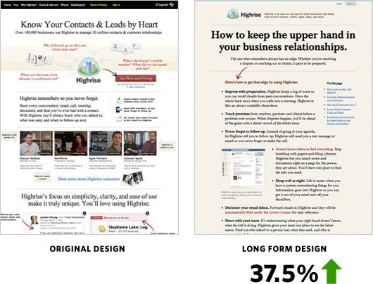
37.5% more people signed up for Highrise with the Long Form design.

Jason Fried’s mantra while testing was: We need to test radically different things. We don’t know what works. Destroy all assumptions. We need to find what works and keep iterating—keep learning. (I’m paraphrasing here…) We tried out a radically different design with these results:

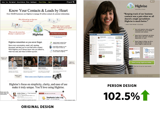
The Person Page was far shorter. There was less information about Highrise. However it had a 47% percent increase in paid signups than the Long Form design. Why exactly was the Person Page working? What might happen if we added more information to the bottom?

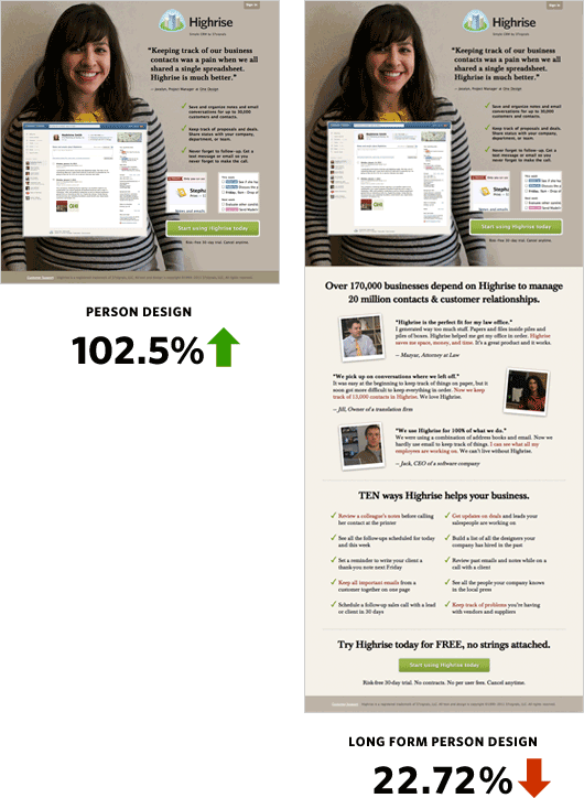
The crazy thing was when we added more information to the bottom of the Person Page it performed over 22% worse than the original design!

Changing People
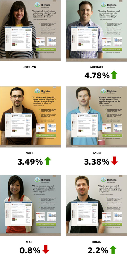
Jocelyn from One Design—a Chicago design company—could also be the secret sauce to the effectiveness of the design. Her quote is direct and simple. She looks friendly and very non-techie and approachable.

I got in touch with more of our wonderful Highrise customers to see if some would be interested in posing for our homepage. Michael, an accountant at MWC Accounting; Will, a programmer at Tall Green Tree; John, founder of Revolution Management; Mari, owner of Foiled Cupcakes; and Brian, owner of Nutphree’s were gracious enough to have me interview them for the site.

I was curious to see if Jocelyn was the key to the winning design. Here’s how she fared:

Conclusions

  • Big photos of smiling customers work
  • A specific person didn’t quite matter among the set of people we tested

I hope you gained some insight from our series of behind the scenes articles. Please try to roll in A/B testing into your schedule! If you work in an internal Design Department then this is a no brainer. It’d be interesting to see Interactive Agencies add testing to the design process.

We’re still testing too. You may not notice such drastic changes to the Highrise site anymore, but trust me we’re tweaking and measuring behind the scenes. We’ll also be applying some of these findings to future marketing efforts. However, as Jason says, we will always test, improve, and learn. I want to be the first to come up with a design that beats our Person Page. Thanks for reading!

Please note: What works for us may not work for you. Please do your own testing. Your conversion rates may suffer if you copy us.

preferred-internet-password.jpg

While setting up an account at the National Archives, in order to request a document, I found this rather original challenge question.

Great customer service from the Mission Bicycle Company

Jason Fried
Jason Fried wrote this on 40 comments

I recently purchased a bike from Mission Bicycle Company. I wanted to share a great experience I had when something went wrong. Shit happens – how companies deal with the shit is what sets apart the great ones from the other ones.

Mission Bicycle Company is based in San Francisco. I placed the order online using their easy build your bike configurator. Since I’m in Chicago, they had to ship the bike UPS.

When I received the big box, there was a 4” hole/tear in the side. I didn’t think much of it at the time, but after I finished removing all of the well-packed packaging around the bike frame itself, I noticed a large and deep gash in the paint all the way down to the metal down tube. The tear in the box lined up with the gash on the bike. The bike was clearly damaged in shipping.

I sent an email to Mission with some pictures of the box and the damage and asked them what to do next. They wrote back quickly and asked me to give them a day to think about how best to handle the situation.

The next day I got an email from them. They said sending the whole bike back would be overkill since the only thing that was damaged was the frame. Further, the bike was ridable – it was just a paint problem – so sending the bike back would mean I didn’t have a bike for a week or so. They didn’t feel good about that.

So here’s what they did: They called up a local shop (On The Route) and arranged to ship a new frame to them. Then one of their bike techs would drive down to my office and swap the frames and reassemble the bike for me while I waited. All of this at Mission’s expense.

They went above and beyond and took care of the problem with virtually no disruption or inconvenience on my end. That’s incredible customer service. I’m a happy customer for life. If you’re in the market for a great custom bike, check out the good people and products at Mission Bicycle Company.

I thought Internet Explorer 9 was supposed to be an awesome browser. Why does my markup and CSS look perfect in Safari, Chrome, and Firefox yet still manages to be “off” in IE? I still need to add conditional CSS. WTF.

I’m sorry for the rant, but it’s a legitimate question: Why can’t IE be as good as WebKit-based browsers?