You’re reading Signal v. Noise, a publication about the web by Basecamp since 1999. Happy !

An alternative to employee options/equity grants

Jason Fried
Jason Fried wrote this on 68 comments

A few years ago at one of our annual company meetups, the topic of options/equity came up. We’ve never had an options/equity program, but some employees were wondering if we could explore the idea.

So David and I started thinking about it. We consulted some other business owners, Jeff Bezos (our sole investor), and our accountants and lawyers. We wanted to get a pretty full picture of the implications of an equity program.

The more people we talked to, the more complex it started to sound. The complexity was both psychological (company dynamics) and economic (options/equity doesn’t really mesh well with an LLC corporate structure). And since we have no intention of selling 37signals or going public – the two scenarios where options/equity really make sense – the complexity became too hard to justify.

However, we were determined to come up with another way so everyone could participate in the unlikely event of a sale or IPO. You never know, so we wanted to have a system in place just in case.

Some of the considerations included:

  1. It needs to be simple to administer. The closer we could get to zero administration, the better.
  2. It should be easy to understand and explain.
  3. It should reward current employees. This was about who was at the company at the time of a sale/IPO, not people who worked here years ago.
  4. It should reward seniority. The longer you’ve been here the more you would participate in the upside.
  5. The plan would be consistent from day one until the last day. Some companies grant lots of options in the early days and then barely trickle them out later. We wanted the same opportunity for all new employees forever.
  6. We didn’t want to discriminate by position. Every employee, no matter the position, participates in the same way.

There were other considerations as well, but those were the key things we kept in mind as we developed the program.

Here’s what we came up with in the event of a sale or IPO:

  • At least 5% of the ultimate sale price (or, in the case of an IPO, the fair market value of the capital stock) would be set aside for an employee bonus pool.
  • Each current employee will be credited with one unit for every full year they’ve worked at 37signals, starting after the first full year. The maximum amount of units one person could earn would be five units. So if you worked at 37signals for two years you’d get two units. Three-and-a-half years, three units. Four years, four units. Five years, five units. Seven years, five units. Etc.
  • We would divide the total employee bonus pool dollar amount by the total number of units held by all employees. This would determine the unit value.
  • Each person would receive the unit value multiplied by their units.

We’re pretty happy with how this turned out. We think it’s a simple, clear, and fair system. And it’s a great alternative to the organizational complexity of option grants, acceleration, strike prices, conversion into shares, private markets vs. public markets, dilution by outside parties, partial vesting, etc.

One other thing: We treat this entire idea purely as a bonus in the unlikely event of a future sale/IPO. We don’t even discuss it with new hires. It’s not part of the overall compensation package (we don’t pay a smaller salary and try to make it up for it with this program). I wouldn’t be surprised if many employees have forgotten about it or don’t even know about it at all.

Behind the scenes: A/B testing part 2: How we test

Noah
Noah wrote this on 19 comments

A few weeks ago, we shared some of what we’ve been testing with the Highrise marketing page. We’ve continued to test different concepts for that page and we’ll be sharing some of the results from those tests in the next few weeks, but before we do that, I wanted to share some of how we approach and implement A/B tests like this.

Deciding what to test

Our ideas for what to test come from everywhere: from reading industry blogs (some examples: Visual Website Optimizer, ABtests.com), a landing page someone saw, an ad in the newspaper (our long form experiments were inspired in part by the classic “Amish heater” ads you frequency see in the newspaper), etc. Everyone brings ideas to the table, and we have a rough running list of ideas – big and small – to test.

My general goal is to have at least one, and preferably several A/B tests running at any given time across one or more of our marketing sites. There’s no “perfect” when it comes to marketing sites, and the only way you learn about what works and doesn’t work is to continuously test.

We might be simultaneously testing a different landing page, the order of plans on the plan selection page, and wording on a signup form simultaneously. These tests aren’t always big changes, and may only be exposed to a small portion of traffic, but any time you aren’t testing is an opportunity you’re wasting. People have been testing multiple ‘layers’ in their sites and applications like this for a long time, but Google has really popularized this lately (some great reading on their infrastructure is available here).

Implementing the tests

We primarily use two services and some homegrown glue to run our A/B tests. Essentially, our “tech stack” for running A/B tests goes like this:

  1. We set up the test using Optimizely, which makes it incredibly easy for anyone to set up tests – it doesn’t take any knowledge of HTML or CSS to change the headline on a page, for example. At the same time, it’s powerful enough for almost anything you could want to do (it’s using jQuery underneath, so you’re only limited by the power of the selector), and for wholesale rewrites of a page we can deploy an alternate version and redirect to that page. There are plenty of alternatives to Optimizely as well – Visual Website Optimizer, Google Website Optimizer, etc. – but we’ve been quite happy with Optimizely.
  2. We add to the stock Optimizely setup a Javascript snippet that is inserted on all pages (experimental and original) that identifies the test and variation to Clicky, which we use for tracking behavior on the marketing sites. Optimizely’s tracking is quite good (and has improved drastically over the last few months), but we still primarily use Clicky for this tracking since it’s already nicely setup for our conversion “funnel” and offers API access.
  3. We also add to Optimizely another piece of Javascript to rewrite all the URLs on the marketing pages to “tag” each visitor that’s part of an experiment with the experimental group. When a visitor completes signup, Queenbee – our admin and billing system – stores that tag in a database. This lets us easily track plan mix, retention, etc. across experimental groups (and we’re able to continue to do this far into the future).
  4. Finally, we do set up some click and conversion goals in Optimizely itself. This primarily serves as a validation—visitor tracking is not an exact science, and so I like to verify that the results we tabulate from our Clicky tracking are at least similar to what Optimizely measures directly.

Evaluating the results

Once we start a test, our Campfire bot ‘tally’ takes center stage to help us evaluate the test.

We’ve set up tally to respond to a phrase like “tally abtest highrise landing page round 5” with two sets of information:

  1. The “conversion funnel” for each variation—what portion of visitors reached the plan selection page, reached the signup form, and completed signup. For each variation, we compare these metrics to the original for statistical significance. In addition, tally estimates the required sample size to detect a 10% difference in performance, and we let the experiment run to that point (for a nice explanation of why you should let tests run based on a sample size as opposed to stopping when you think you’ve hit a significant result, see here).
  2. The profile of each variation’s “cohort” that has completed signup. This includes the portion of signups that were for paying plans, the average price of those plans, and the net monthly value of a visitor to any given variation’s landing page (we also have a web-based interface to let us dig deeper into these cohorts’ retention and usage profiles). These numbers are important—we’d rather have lower overall signups if it means we’re getting a higher value signup.

Tally sits in a few of our Campfire rooms, and anyone at 37signals can check on the results of any test that’s going on or recently finished anytime in just a few seconds.

Once a test has finished, we don’t just sit back and bask in our higher conversion rates or increased average signup value—we try to infer what worked and what didn’t work, design a new test, and get back to experimenting and learning.

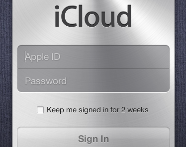
iCloud2weeks.png

I wonder if anyone knows the origin of the dreaded “2-weeks only” pattern for login cookies? We used to do that until we realized that we were cargo culting and that we couldn’t come up with a single solid reason for the time restriction (but plenty of reasons why not!).

REWORK sales: Paper ain't dead yet

David
David wrote this on 69 comments

If you had asked me to guess, I would have said that 60-70% of REWORK sales came from ebooks. It’s a book targeted towards starters, people eager to jump on new trends and technologies, and our natural sphere of influence is with web people. Surely most would be springing for the Kindle or iBookstore versions, right? Wrong.

We’ve sold about 170,000 copies of REWORK across all media. Only 16% of those sales came ebooks. That’s only slightly higher than the 11% of buyers who went for the audio book. In other words, about three quarters of sales came from good ol’ hardcover books.

Lately, things have been improving somewhat for the ebooks. Our most recent statement shows that 19% of new sales came from ebooks. So things are changing, but not nearly as fast as I would have guessed.

Perhaps a lot of people are gifting REWORK to others (I’ve heard from many employees handing it to their boss!) and it’s easier to give a physical book than an electronic one. Perhaps people are smitten with the beautiful drawings of Mike Rohde and want them in the beautiful print. Perhaps physical books are just still a great way to read.

We're looking to hire a filmmaker

Jason Fried
Jason Fried wrote this on 29 comments

We’re looking to hire a full time filmmaker at 37signals. An all-in-one video shooter, editor, and producer. We want someone who’s expert at telling creative stories with a video camera. This is what you should love to do.

Initially you’ll be focused on capturing our most interesting customers on video. We want to film, edit, and produce at least 20 creative and unique 3-5 minute customer interviews and features over the next 12 months. Testimonials are usually boring – we want to be sure to avoid anything boring. You’d be in charge of making this happen.

On top of that we have a variety of interesting internal video projects we’d like to explore. Everything from documenting how we work at 37signals to guided personal tours of our apps to filming guest speakers, workshops, and events in our theater.

We’d like to break new ground here – most videos about software are sleep-inducing or cringeworthy. We’re looking for creative leadership. What’s possible? What would be interesting and entertaining to get on camera? We want videos that people watch from beginning to end.

To get a feel for the level of quality we’re after, here’s an example of a customer video that our friends at Coudal Partners filmed, edited, and produced for us: Atelier Wedding Planners. And here’s another about how Threadless uses Basecamp. We’re not looking to mimic these – you should bring your own eye, style, and ideas to the table. For additional reference, we really admire the stuff that Adam Lisagor has been putting out.

This is job full of freedom, exploration, and creativity, but at the end you need to deliver practical, effective, and beautifully polished and produced videos. From behind the camera you should know how to get the best of someone who’s in front of the camera.

You should also have experience vetting interview candidates. We’ll have hundreds of customers who are interested in telling their stories, so we’ll need your help to figure out which ones will make the best subjects.

How to apply

Send an email to [email protected] with the subject [VIDEO]. Send us examples of your work, why you want to work at 37signals, and anything else you think will help you stand out. We typically get 100+ applications for a position at 37signals, so we look favorably upon those who make it easy for us to see how good they are.

Also, this is a Chicago-based position. We’re going to be doing a lot of spontaneous filming at the office so it’s important you’re in town. You’ll work out of our office.

We’re excited to hear from you.

CSS tip: Spot unsized images during development

Sam Stephenson
Sam Stephenson wrote this on 31 comments

Have you noticed that software feels cheap when UI elements move around on the screen without notice? Web applications are particularly vulnerable to this problem. Browsers give image elements a default size if they do not have explicit width and height attributes. Once these images have loaded, they expand or contract to their full size, causing all other elements on the page to reflow in response.


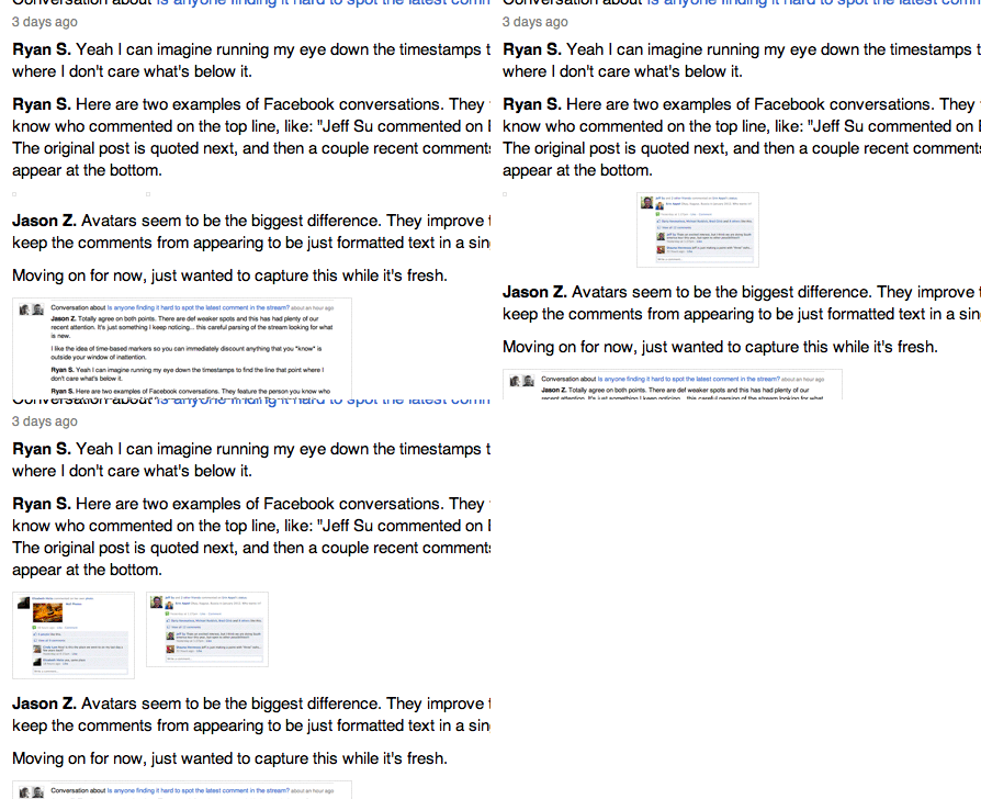
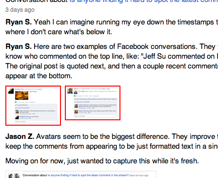
Unsized images reflow the page when they load

We try to avoid this in our applications, but it’s easy for an image tag to slip through the cracks. That single tag might be repeated many times in a loop, each instance causing the on-screen furniture to shift around in an unseemly way.

Here’s a tip for catching unsized images during development. Add this CSS rule somewhere in your stylesheet:

img:not([width]):not([height]) {
  border: 2px solid red !important;
}

Then any images without width and height attributes will be drawn with a red border so they’re easy to spot.

Behind the scenes: Highrise marketing site A/B testing part 1

Jamie
Jamie wrote this on 51 comments

We’ve been testing design concepts at highrisehq.com since this past May. I want to share with you the different designs and their impact on Highrise paid signups (“conversions” for the jargon inclined).

We have assumptions about why some designs perform better than others. However we don’t know exactly why. Is it the color of the background? Is it the headline? We hope more iterative testing of the winners will help us get that information. If you have any theories please add them in the comments.

Note that designs that win for us may not necessarily win for you. I encourage you to do your own A/B testing. There are many tools online that make it easy to do.

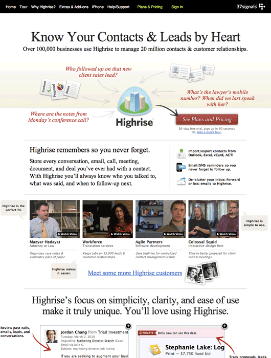
The original page
The original design had served us well for the past year. Signups were going well, but we were worried that customers still couldn’t get the gist of what Highrise did and why they needed the product.

This page would be our baseline for the first round of A/B tests.

Long form sales letter
Ryan Singer posted a link to Visual Website Optimizer’s “Anatomy of long sales letter” blog post in our Campfire chat room one day. We were fascinated by this technique. If I remember correctly there was a heated debate about whether it would work for us.

We decided that in the amount of time we took to debate the technique we could have made an A/B test to prove it right or wrong. The original page had some long form sales letter techniques, but the copywriting wasn’t as strong as it could be.

Ryan and I worked together on the long form approach. Here’s what we came up with.

Continued…

Bret Victor thinks math needs a new UI

Ryan
Ryan wrote this on 9 comments

I’ve been a fan of interface and software designer Bret Victor’s work since Craig (one of our designers) tipped me off about him. Bret made a splash a while back with his Magic Ink paper. Now Fast Company has profiled him and his Kill Math series. “Kill Math” is all about using smartly designed interfaces to make math tangible and playful, something you can experience instead of just think about.

Have you ever tried multiplying roman numerals? It’s incredibly, ridiculously difficult. That’s why, before the 14th century, everyone thought that multiplication was an incredibly difficult concept, and only for the mathematical elite. Then arabic numerals came along, with their nice place values, and we discovered that even seven-year-olds can handle multiplication just fine. There was nothing difficult about the concept of multiplication—the problem was that numbers, at the time, had a bad user interface.

It’s a nice piece (I only wish it was longer) and Bret surely deserves your attention if you are a fan of innovative UI design.

Sam talks Javascript on The Changelog

Ryan
Ryan wrote this on 2 comments

The Changelog posted a podcast interview with our very own Sam Stephenson. He talks about CoffeeScript, the Rails 3.1 asset pipeline, open source projects Pow and Sprockets, and the development of Basecamp Mobile.

The key difference to me is that when I look at a piece of Javascript code, I see parentheses and braces and semicolons and line noise. And when I look at CoffeeScript, I can see the code that I’ve written.

When I’m writing CoffeeScript I’m still thinking in Javascript—I just have to type less.

One of my favorite things is the ending: the interviewers ask “Who do you look up to?” That’s a great question to ask anyone who is doing good work.

The Slicehost Story

Basecamp
Basecamp wrote this on 35 comments

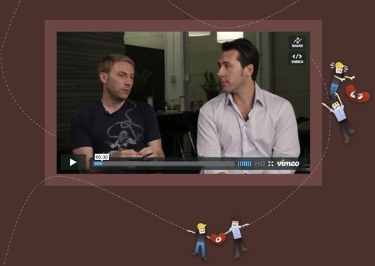
Slicehost—a scrappy web company bootstrapped with $20,000—cashed out for big bucks in 2008. How did they do it? More importantly, was it worth it?

We had a growing wait-list of people that wanted to give us money but couldn’t.

David Heinemeier Hansson chats with the founders of Slicehost, Jason Seats and Matt Tanase, to find out.

Found Stories

In a big company you have to construct artificial ways to get information.

Watch the complete interview at 37signals.com/founderstories/slicehost.