You’re reading Signal v. Noise, a publication about the web by Basecamp since 1999. Happy !

Basecamp tips, new Extras, and plenty of case studies (Product Blog update)

Basecamp
Basecamp wrote this on 5 comments

Here’s a look at what’s been going on at the 37signals Product Blog lately:

Tips and Extras
Basecamphq.com/tips offers over 20 quick tips to help you be more productive in Basecamp.

Basecamp_tips_tricks

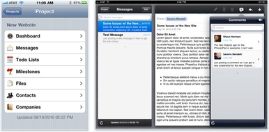
Macworld talks about the latest upgrade to Outpost, Enormego’s third-party iPad/iPhone client for Basecamp.

shots

Parachute is a third-party extra that lets you backup all your Basecamp project files to your hard drive. It will also rebuild your HTML export to include a files page and links from the original messages so you have all your project information in its original context.

Blueprint is a planning tool — conceived after trial and error creating a plan with spreadsheets — that integrates with Basecamp.

Case studies
tdrCase study: The author of The Typographic Desk Reference (right) talks about how he used Basecamp to edit the book.

The working process with the publisher was simple. We used to-dos for edits and then messages for PDF reviews — rinse and repeat. Once we had a rhythm going, the multiple rounds of edits were done in no time. I can’t imagine orchestrating reference book collaboration without being able to pinpoint attention to the smallest details as Basecamp does. We actually started editing the TDR on Basecamp just after to-do commenting was added. This enabled us to dig deep on the details.

Case study: Red Pony is an Australian company that provides writing, editing, and training services to businesses.

As our business grew, our project management needs also became more complex, including collaborating on projects with editors, proofreaders, graphic designers and other suppliers who were working remotely. Inevitably we found that we needed a more sophisticated solution that would enable us to exchange files, maintain version control and collaborate online with clients and suppliers. After a year with Basecamp, we think we’ve found it.

Red_pony_home

Case study: The C&S Community Involvement Team uses Basecamp to organize projects for the largest food wholesaler in the USA.

It allows our team to manage tasks between our headquarters and field locations, from New Hampshire to Hawaii. We are able to maintain consistency while coordinating with many different people and departments to achieve successful results. Basecamp ensures that our small team of three people is able to operate in the most effective and efficient manner possible.

Continued…

How do you keep up interest in a programming project?

Basecamp
Basecamp wrote this on 18 comments

The transcript from Episode #22: Programming roundtable (Part 3 of 3) of the 37signals Podcast is now available. Here’s an excerpt.

Question from SvN reader: “How do you keep up your interest in a project or product? Generally I get bored with projects after a few months.”

Jamis: Our team structure, I think, really helps that because we aren’t stuck on anything for more than about two months…Generally we work on small things, quick iterations, two or three weeks maybe for a single feature and then you move on to another product even to add something there. There’s not a lot of opportunity now for getting bored with what you’re working on.

Jeff: Even before the team structure, we sort of naturally would do things in small chunks. If you’re getting bored then you’re not doing good work, you’re not motivated. And none of us want that. So, we sort of have this built in desire to keep things small and achievable so that we can move on to something more exciting. So, I don’t really give myself much of a chance to get bored. If I find myself starting to get bored, it means that I’ve got to stop and be like: “What can I ship now and how can I go on to the next thing that feels new?”

Jeremy: I think that that feeling of being bored, there’s a little bit of self-entitlement…If you’re bored, you’re boring. You need to think about what you’re doing and find excitement in it. It takes motivation, it takes energy and you’ve got to pour it in. And if you’re not feeling it, you’re not feeling motivated, the answer probably isn’t in the product you’re working on or the code you’re working on. It’s in your approach to it, how you think about it, and how you think about your life.

Read the full transcript.

Apple changes words in order to change the debate

Matt Linderman
Matt Linderman wrote this on 58 comments

Google likes to characterize Android as “open” and iOS/iPhone as “closed.” That puts Apple in a tough spot. Arguing for a closed system when the competition is offering an open one makes you seem like the bad guy.

But change the words being used and it becomes an entirely different debate. Closed vs. open is one thing, fragmented vs. integrated is something else. Look at how Steve Jobs reframes the issue during this conference call with analysts:

We think the open versus closed argument is just a smokescreen to try and hide the real issue, which is, “What’s best for the customer – fragmented versus integrated?” We think Android is very, very fragmented, and becoming more fragmented by the day. And as you know, Apple strives for the integrated model so that the user isn’t forced to be the systems integrator. We see tremendous value at having Apple, rather than our users, be the systems integrator. We think this a huge strength of our approach compared to Google’s: when selling the users who want their devices to just work, we believe that integrated will trump fragmented every time.

...So we are very committed to the integrated approach, no matter how many times Google tries to characterize it as “closed.” And we are confident that it will triumph over Google’s fragmented approach, no matter how many times Google tries to characterize it as “open.”

Reframing in politics
Reminds me of how politicians use words to reframe issues. Consultant Frank Luntz advises Republicans to use phrases like “death tax” instead of “estate tax.”

Look, for years, political people and lawyers — who, by the way, are the worst communicators — used the phrase “estate tax.” And for years they couldn’t eliminate it. The public wouldn’t support it because the word “estate” sounds wealthy. Someone like me comes around and realizes that it’s not an estate tax, it’s a death tax, because you’re taxed at death. And suddenly something that isn’t viable achieves the support of 75 percent of the American people. It’s the same tax, but nobody really knows what an estate is. But they certainly know what it means to be taxed when you die.

Meanwhile, George Lakoff, a Professor of Linguistics at UC Berkeley, pushes liberals to reclaim terms like life, patriot, and family values.

Consider progressives across the country consistently saying something like this: “I am for life. That’s why I support the right of all women to receive prenatal care and the right of all children to receive immunizations and to be treated when they are sick. That’s why I believe we must safeguard the planet that sustains all life.”

Or perhaps this: “I am a patriot. That’s why I am compelled to oppose the government’s spying on American citizens without court order and in defiance of Congress.”

Say it again
At least Luntz and Lakoff agree on one thing: It’s all about repetition. Lakoff writes, “Repetition of such articulations is the key to redefining these words and reclaiming them.” Luntz says, “There’s a simple rule: You say it again, and you say it again, and you say it again, and you say it again, and you say it again, and then again and again and again and again, and about the time that you’re absolutely sick of saying it is about the time that your target audience has heard it for the first time.”

So don’t be surprised if we hear more “fragmented vs. integrated” talk coming out of Cupertino.

Join our customer service and support team

Jason Fried
Jason Fried wrote this on 6 comments

We’re looking for a fourth person to join our customer service team. You’ll join Sarah, Michael, and Jason in making our customers as happy as possible. Sarah, Michael, and Jason are great at what they do — you’ll be joining a top shelf team.

You’ll provide “it was so good they couldn’t stop talking about it” customer service via email for Basecamp, Highrise, Backpack, and Campfire. You’ll also be responsible for chiming in on 37signals Answers and updating and improving the articles in our help section. We’ll also be exploring phone support and in-person training shortly, so that should be something you’d like to do as well.

You’ll be expected to answer about 75 emails per day once you’re fully up to speed (2-3 months on-ramp). This is a significant volume, so be sure that you’re ready and able to deal with that kind of load day after day.

We’re looking for someone who loves to help others, someone who can keep smiling even when dealing with tough customers (empathy is important), and someone who has a passion for our products and company. You should enjoy the process of making an anxious customer a happy customer.

In addition, you have to be an excellent writer who enjoys writing. Our customers love when we get back to them within 10 minutes with a clear, concise, and friendly answer. Great writing is key.

How to apply

Please submit a cover letter explaining:

  1. Why you want to work in customer support.
  2. Why you want to work at 37signals and not somewhere else.
  3. A description of a great customer service/support experience you had recently, and what made it great.

Also, attach the following writing samples:

  1. Explain in 3 paragraphs or less why a customer would pick Basecamp vs Highrise.
  2. Respond to a customer asking for Gantt charts in Basecamp that it’s not something we offer, but suggest using the Milestone section instead.
  3. A company using our job board failed to find to find a suitable candidate and wants a refund. Respond that we don’t offer refunds for job postings.

We offer health-care coverage, a 401K with a generous match, a Flexible Spending Account, plus a progressive work environment. We’d prefer someone in Chicago, but we’re open to hiring the best person no matter where they live.

Email everything to [email protected]. Include “Customer Support” in the subject line. If you’re attaching a resume, please send it as a PDF. Note: We look favorably on people who get creative with their applications.

We look forward to hearing from you.

Twitter's UX: Separate the hits from the geekhacks

Ryan
Ryan wrote this on 27 comments

Twitter nailed a few important things in their user experience compared to alternatives like Facebook. Posts are public by default, so there aren’t debates or surprises about privacy. Streams are built out of subscriptions (“following”), not “friendship”—a word that loses meaning when your friends are 500 strangers. And the 140 char limit gives the stream of updates a distinctive rhythm.

But some serious flaws are holding Twitter’s usability back. A collection of hacks that were initially cool and clever among the geekset have turned into de facto features. Why should users have to know what a URL shortener is? Why does attaching a photo to a tweet require third-party tools and diminish your character count?

Twitter’s recent redesign doesn’t address these fundamental user experience problems. Twitter would be easier to use, easier to explain, and easier to expand if they focused on their hits. Following is better than friendship. Public by default is better than public-by-surprise. 140 chars keeps things sharp and rhythmic. A true redesign would separate these genuine insights from the clever geekhacks and make Twitter simpler to use and easier to understand.

We are in the people business. It doesn’t matter if you’re in the banking business, your customers, you’re in the people business, and it’s how you treat people. I grew up with the thought that I wanted to treat people the way I’d like to be treated, and I think if you do that, it’s pretty hard to go wrong.


Nolan Ryan on comparing his cattle ranch business with working with ballplayers.

Behind the scenes: Customer Wall

Jamie
Jamie wrote this on 21 comments

The idea
Jason Fried sent me a text Saturday morning a few weeks ago: “Pumped about an idea for a ‘meet our customers’ page. In on Monday??”

The idea, I learned Monday, was pretty cool. First we’d ask customers (on our blog and on Twitter) to send in photos of themselves. These photos would be printed out and pinned to a Customer Wall in our new office — an entire wall covered with the smiling faces of our customers. Then we’d create a page on our website that would simulate this office Customer Wall for everyone to see. Within 5 minutes of our discussion, Jason asked customers on the blog to send their photos and bios to me. The photos and bios started arriving immediately. I started designing.

Design and production
The design of the Customer Wall page is pretty simple. There are only 3 real elements: a photo, a map, and a block of copy.

Making sure that the balance and proportions were right was the tricky part. I used real customer photos and bios for my designs as the emails started coming in. Here are all of my iterations of the customer bio design. Some of the changes from iteration to iteration are seemingly minor, but extremely important for arriving at a tight page layout.

#1 and #2

The first challenge was determining the size of the photo in relation to the size of the map. Some customers submitted long copy and others short copy. Clearly #1’s photo and map were too small based on the copy that was submitted. Here experimented with making the map do a little more work by not spelling out the city and state within the copy. #2’s photo was much too large and the map seemed arbitrarily placed. There was also a huge gap between the imagery and the copy. It all feels too disconnected.

#3 and #4

I thought that I could just set the map at a constant height and the copy could be edited to fit. I attempted this in #3. The photo and the copy seemed to align perfectly. However the map felt like an afterthought. #4’s balance started to feel better. The copy was close to the map. The image size felt right in proportion to the map size.

The problem

Jason’s feedback, however, was that there was still too much whitespace (illustrated by the red oval above). It is true that some people have longer names, so some of that whitespace was necessary. However there must be a way to tighten up that area.

The solution

To shrink the whitespace I reduced the width of the customer bio block by about 100 pixels. I also faded the map background slightly into the customer’s name so that the whitespace felt shorter. Jason also had the great idea of treating the “city, state, country” like a newspaper article. That saved another line. For the final design we even cut out the website link and made the customer’s company name clickable.

Great results
Seeing the Customer Wall come to life has been a blast. It is a great reminder that people all over the world — from our hometown Chicago to Beijing, China to Manchester, UK to Commerce Township, Michigan — depend on our products.

I’ll be adding new customers each week. We’d love to have you on our customer wall! Send us your name, title, company, location, a brief description about what you do, and a list of 37signals products you use — along with a photo — to [email protected] with the subject “Customer Wall.”

©2010 Google, Map data ©2010 Google, Tele Atlas

Blob Motility is an attempt of actuated shape display using fluid programmable matter. We have developed an environment where we can program the shape of gel geometrically and topologically using our unique magnetic fluid called pBlob. This enables us to experience organic shape changes in real space, like a metaball in the CG world. The control hardware is composed of electromagnets arranged in the honeycomb structure and their control circuits. We describe the method of blob creation, details of the mechanism and the language for transformation control, and propose some applications we are developing at present.
via Make:

Jason Z. on Oct 15 2010 3 comments