You’re reading Signal v. Noise, a publication about the web by Basecamp since 1999. Happy !

Jason Fried

About Jason Fried

Jason co-founded Basecamp back in 1999. He also co-authored REWORK, the New York Times bestselling book on running a "right-sized" business. Co-founded, co-authored... Can he do anything on his own?

The New Office: The Idea and the Floor Plan

Jason Fried
Jason Fried wrote this on 84 comments

About a month ago we shared a video of our new office space under construction. There’s been a lot of progress since (new video soon).

I thought it would be a good time to share some more details about the new office. We’re aiming to move in the first week of July.

Why?

First, why are we getting a new office space? For the past seven or eight years we’ve been sharing an office with Coudal Partners. It’s their office, we just rent a strip of desks and share the the common areas (conference room, kitchen, etc.). It’s been great in every way. Everyone at Coudal have been remarkably good hosts. We’ve made good friends, worked on some great projects together, and started a company together (The Deck). We hope all that will continue.

But it’s time for us to move into our own space. We’ve got 9 people in Chicago now, and only 5 desks at the office. We’re getting in Coudal’s way (they haven’t said this, but we definitely feel like we are). And we need privacy — currently we have to leave the office and talk in the hallway whenever we have a private call to make. It’s just time.

Also, this is a luxury item for us. When we launched 37signals in 1999 we shared an office space for about two years. Then we got on our own temporary raw space for a few years. That space was right up against the train and we used doors for desks. Since then we’ve been sharing the current office with Coudal for the past 7 years. So in many ways this is a luxury purchase for us. We don’t need this space — we could continue to work the way we work today. It’s definitely getting cramped, and people don’t have the privacy they need, but we could have continued to get by with what we had. But we decided that eleven years into our business we could afford to experiment with a dedicated space built out just the way we wanted. We believe it will pay off.

The idea

When we started thinking about what we wanted out of our own space, we realized we didn’t just want a place to work. We wanted a place to share our ideas and learn from others. We used to give workshops a few times a year, but we stopped because it was a hassle to book venues and deal with all that crap. We wanted to get back into the flow of doing semi-regular workshops and master classes. And we wanted to invite others to come in and teach us. We wanted our own venue.

We also wanted to make sure the work environment followed our general principles: Open in general, quiet when we need it, and easy group collaboration without interrupting other people. We also wanted to set up dedicated spaces for private phone calls, recording audio/video/screencasts, and room for expansion – specifically for our customer service/support team.

So those were the big picture ideas. We selected Brininstool + Lynch as our architect and worked with Grubb & Ellis to help us find a space. We looked at a variety of spaces – everything from house-like spaces to raw floors in empty loft buildings. In the end we took an empty floor so we could build out the space exactly as we wanted. We got a lovely corner space with tons of natural light.

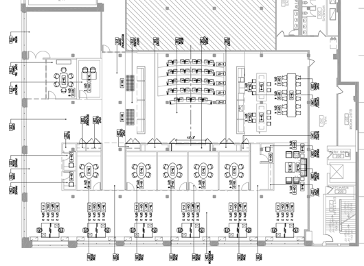
The floor plan

View full size

The wall of windows on the bottom faces north. We have 12 desks lined up against those windows. Along that window wall there is a built-in full-length credenza for extra desk space and storage for each desk.

Continued…
stingray.jpg

1959 Chevrolet Corvette Sting Ray. Photo credit: Peter Harholdt / High Museum of Art in Atlanta

Jason Fried on May 18 2010 4 comments

Launch: Job Board redesign

Jason Fried
Jason Fried wrote this on 18 comments

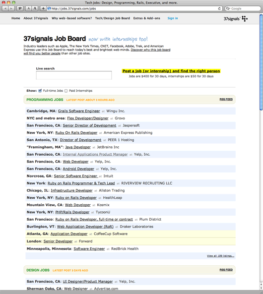
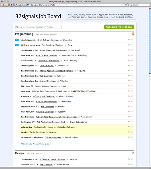
We just launched a redesign of the 37signals Job Board. From start to finish we spent 10 days on the project. Jamie Dihiansan designed it and Josh Peek programmed it. We love how it turned out.

We had a few goals for the redesign:

  1. A fresh coat of paint. We didn’t want to add or remove any key functionality, but we wanted to redesign the look and feel to freshen it up. Modernized, cleaner, and clearer. We also experimented with Typekit for the first time.
  2. Remove distractions and make our Job Board customers the stars. With our product logos, a big black footer, and our standard header, the old design was too much about us and not enough about the companies listing their jobs on the Job Board.
  3. A better purchasing process. We wanted to make the purchasing flow friendlier and easier to use – especially the preview step.
  4. WYSIWYG. We wanted to add WYSIWYG editing to the job description field. This gives people the tools to make their ads — especially ads with bullet lists — look nicer.
  5. A proper thank you. The old Job Board dropped people back on the home page after they posted their job. The thank you only came in the form of an email. The new design thanks them properly and gives them some helpful information and tools to promote their position.

Job listings BEFORE the redesign:

Job listings AFTER the redesign:

Continued…

Diaspora's curse

Jason Fried
Jason Fried wrote this on 113 comments

Diaspora, the “open Facebook alternative” (NYT story for background if you aren’t familiar), has raised Over $170,000 from over 4600 people in just a few weeks. All for an idea.

That’s an impressive start if victory was measured in press coverage, cash, and cool. Here’s the problem: Diaspora has all the wrong things at the wrong time. Competition that kills isn’t pre-announced — it catches an unsuspecting incumbent by surprise.

They have too much money

They’re at $170,000 today (Sunday, May 16, 2010). They’ll likely continue to pile up the donations until their Kickstarter campaign ends 16 days from now. All this money without an actual product is a liability. Money gives them too much time and too much comfort to take on a fast moving incumbent like Facebook. Their cash to code ratio is out of whack. A good enough first version will take longer to produce with $170K than it would have with $0K.

The spotlight is on too early

You want attention after you’re good, not before. Obscurity is your friend when you’re just starting — especially when you don’t even have a product yet. You don’t need the pressure of outside opinion or the press breathing down your neck before you have anything to show. Millions of eyes — including your competition — watching you every step of the way doesn’t help. All this attention is a distraction. Ship, then seek the spotlight.

Expectations are too high

Some people are really pissed at Facebook right now. Those people are looking for a way to channel this negative energy into a movement. Along comes Diaspora. Diaspora becomes their horse in the race. They want that horse to win. They believe it can win. Their unlimited hopes and dreams of the anti-Facebook are transferred to Diaspora. Diaspora becomes everything and anything to anyone who wants to believe. How can anyone deliver on boundless expectations? Diaspora can’t match the fantasy of Diaspora.

I love the underdog, but I fear for the product-less underdog that has all the wrong things at the wrong time.

I think they would have been better off releasing something first. Let people play with it. Let people see that it’s possible. Then drum up press and public support. Until there’s something real to use, fantasy will just get in the way.

Design Decisions: New Basecamp blank slates

Jason Fried
Jason Fried wrote this on 36 comments

We’ve been talking about designing blank slates for a long time. In fact, here’s a post from September 2003 about blank slates that pre-dates Basecamp (the web-based application being developed/discussed in that post was, in fact, Basecamp).

What’s a blank slate?

The blank slate is a screen you see when a data-rich app has no data. For example, if you’re using a tool to manage your projects, but you don’t have any projects in the system yet, you’d be looking at a blank slate. It’s important that the application designer consider this state carefully — you don’t want people staring at an empty screen. A blank slate should help someone get started.

Basecamp’s blank slates have been through many iterations. Here are some screenshots from March 2004 (just about a month after Basecamp launched).

Blank slates, redesigned

A few weeks ago we decided to redesign the blank slates inside each Basecamp project. Each section in Basecamp (messages, to-dos, milestones, time tracking, etc.) has a blank slate. The blank slate lets you 1. know there are no messages, to-dos, milestones, etc. in a project, and 2. gives you an option to get started by adding the first one.

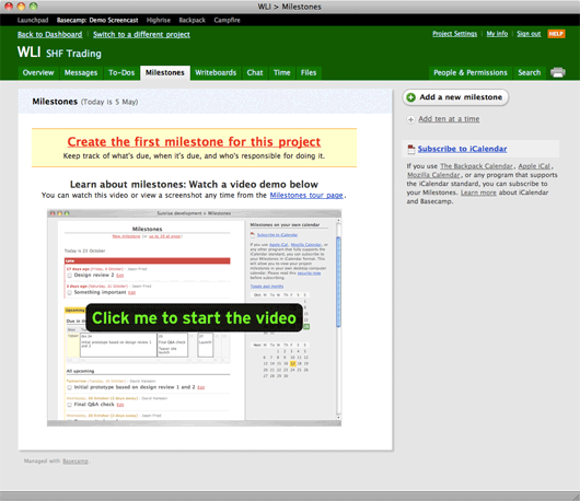
This is what the Milestones blank slate looked like before we rolled out the update last week:

I think this design served us well, but it’s also pretty loud. In fact, it doesn’t look blank, it looks full which can be a little confusing. There are quite a few elements on the screen including:

  • The shadowed page
  • A “Milestones” header with today’s date
  • A yellow bar saying “Create the first milestone for this project” along with a brief list of features/benefits below the headline.
  • A second headline that says “Learn more about milestones…” with another line below that.
  • A big image with a “Click me to start the video” button.
  • An “Add a new milestone” button at the top of the sidebar.
  • A link to “Add ten at a time” below the button.
  • A “subscribe to iCalendar” link with a paragraph of text below (also containing four more links).

Nine links, lots of images, a main section, a sidebar, multiple headlines, a pile of different colors, numerous font sizes/treatments, etc. That’s a lot going on. There’s a lot to consider and absorb just to get started. All these elements make milestones feel hard. That’s not the message we want to send.

What we really want to do here is quickly let someone know 1. what milestones are, and 2. how to add their first milestone. There’s a better way to do this than to hit them over the head with a lot of visuals, headlines, descriptions, and links.

So we started with a sketch.

Continued…

Price is what you pay. Value is what you get.


Warren Buffet by way of Benjamin Graham
Jason Fried on May 5 2010 13 comments

Oyster Hotel Reviews: A wonderfully executed site

Jason Fried
Jason Fried wrote this on 15 comments

I’ve been waiting for a site like Oyster for a long time. I’ve seen a few attempts at the concept, but Oyster really nails it.

Oyster gives you a real look at a hotel. The more hotels you stay at the more you realize that the photography presented on the hotel’s site rarely matches up with the reality available at the hotel location.

For example, here’s what The Superior Room at the Lucerene in NYC really looks like. Everything from the what’s on the dresser to the type of phone to the bedside clock to the plastic cups in the bathroom. There are 96 photos in total of a single hotel room. All the details are there.

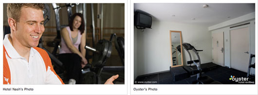
If you’re still not sold, check out Oyster’s Photo Fakeouts section. This is where they compare marketing shots with actual shots. No models, no perfect lighting, no crops, no just-right angles — this is what it really looks like when you’re standing there.

Here’s what the pool at this hotel in Jamaica really looks like. Here’s a more realistic shot of another pool at a hotel in Hawaii. While we’re on the topic of pools, check out this crop at the Sofitel hotel in LA.

This fakeout at the Hyatt Regency in DC is criminal. Color me sad shows what this room in Vegas really looks like. Details like this matter when you are paying big bucks for a room.

There’s a ton more to explore on Oyster. The site is really well done — one of the best executed sites I’ve seen in a long time. They get all the little things right. It’s fast, clear, and easy to get around. The photos are big and easy to browse, the copywriting is generally excellent too. It’s a model.