You’re reading Signal v. Noise, a publication about the web by Basecamp since 1999. Happy !

Jason Fried

About Jason Fried

Jason co-founded Basecamp back in 1999. He also co-authored REWORK, the New York Times bestselling book on running a "right-sized" business. Co-founded, co-authored... Can he do anything on his own?

Learning from failure is overrated

Jason Fried
Jason Fried wrote this on 96 comments

You’ve heard it over and over: “Learn from your mistakes.” Or maybe you’ve heard “fail early and often.” There are plenty of catchy quotes about failure. Most of them end with a clever little twist that makes it sound like it’s a good thing. Is it?

I don’t understand the cultural fascination with failure being the source of great lessons to be learned. What did you learn? You learned what didn’t work. Now you won’t make the same mistake twice, but you’re just as likely to make a different mistake next time. You might know what won’t work, but you still don’t know what will work. That’s not much of a lesson.

Instead, put most of your energy into studying your successes. What have you done right? What worked? Why did it work? How you can repeat it? Instead of making something worse a little better, how about making something good a little better? Don’t spend so much time looking down. Look up more.

There’s a significant difference between “now I know what to do again” and “don’t do that again.” The former being better than the latter.

It’s true: Everything is a learning experience. Good and bad, there’s something to be learned. But all learning isn’t equal. I’ve found that if you’re going to spend your time pondering the past, focus on the wins not the losses. The lessons learned from doing well give you a better chance at continuing your success.

Patterns: Great self promotion

Jason Fried
Jason Fried wrote this on 21 comments

The 37better Project (archive from 2001 – some links may not work) was one of the best promotional things we ever did for our company. It brought us tremendous exposure. The 37betters were linked up everywhere and discussed at length in all the right places.

The goal of 37better FedEx wasn’t to win FedEx’s business, it was to win someone else’s business. Someone else who saw what we did and said “That is better. We could use better ourselves.”

Further, it showed people that we weren’t just designers, we were thinkers. We were curious about solving problems not just painting pictures. You may have disagreed with our solutions, but we explained what we thought was wrong and why we thought our design was better.

I’m surprised I haven’t seen more designers/firms try to make a name for themselves this way. It works. Take on a few brands, redesign a few pages or flows, explain in detail why you did it and why it’s better. It’ll spread like wildfire today. Back in 2001 there weren’t many outlets to get the word out. Blogging was in its infancy. There was no Twitter or public Facebook, etc. Today it’s different. Take advantage of it.

A modern case in point: Patterns by R.BIRD

R.BIRD primarily designs physical packaging for consumer products. In the last few years they’ve been churning out Patterns — “a series of professional observations about package design practices within specific product categories.” Patterns are free PDFs anyone can download.

They have Patterns on tea, women’s razors, sliced bread, energy drinks, among others. They’re insightful and well executed.

They’ll look at a category, study it, compare it, dissect it, and share their findings. It’s a competitive analysis without the us vs. them. If you’re looking to hire a brand design firm, wouldn’t you want to consider a company that likes this stuff enough to do it for free?


Unclaimed colors in the children’s cold medicine market.

Continued…

How we reduced chargebacks by 30% (as a percentage of sales)

Jason Fried
Jason Fried wrote this on 39 comments

We’ve never had a lot of chargebacks (a chargeback is when a customer calls their credit card company to dispute a charge they don’t recognize), but last year we made a simple change that reduced our chargebacks by 30% as a percentage of sales.

I can’t be certain the reduction is entirely due to this technique, but we didn’t change anything else related to how we deal with chargebacks.

Background

One of the issues we have at 37signals is that many people know our product names better than they know 37signals. They sign up for Basecamp or Highrise without knowing that there’s a company called 37signals behind the product.

So sometimes people see a charge on their card from 37signals but they don’t know what it’s for. And even if they did remember 37signals, they still may not recognize the charge.

We also sell more than just our web apps. We sell job ads on the Job Board and Getting Real as a $19 PDF. So we sell a lot of different things at a lot of different price points, but the line item on people’s credit card statements always look the same.

We’ve recently gained the capability to change the charge statement entry to reflect the product being charged (“Basecamp” for a Basecamp charge instead of “37signals, LLC.”), but for various reasons we haven’t enabled it yet.

2007

When we charge someone’s credit card, “37signals, LLC” used to appear on their card statement. We also included a phone number that played a recording explaining the charge. This was alright, but it didn’t feel good enough. Ideally we’d have a live phone number, but we’re just not set up to take customer support calls at this time. (we’re entirely email based).

2008

I was thinking about how we could do a better job explaining a charge, but we were only allowed a limited number of characters on the customer’s billing statement.

According to the merchant/card rules:

Your company name/DBA section must be either 3, 7 or 12 characters and the product descriptor 4, 8 or 13 characters.

That means we could do something like:

37signa*Basecamp 800.xxx.xxxx IL

or even…

37s*Basecamp 800.xxx.xxxx IL

But that doesn’t help a whole lot either. It’s definitely better than just 37signals or just Basecamp, but it’s still not as clear as I’d like it to be.

If you don’t use a product descriptor (“Basecamp” or “Backpack”), you get 22 characters. So I decided to register 37signals-charge.com, redirect it to 37signals.com/charge, write up a page explaining why there’s a charge on your card, and put that URL on people’s charge slips instead of “37signals, LLC” or “Basecamp” or “Highrise” etc.

Now when someone buys something from us, this line item shows up on their credit card statement:

37signals-charge.com 800.xxx.xxxx IL

Visiting that URL takes you to this page where we explain the charge, the products, some suggestions if you don’t recognize the products, and a link to our billing support form someone needs additional help.

Quick win for 30% less chargebacks

So while chargebacks in raw dollars are up because sales are up, chargebacks as a percentage of total sales were down 30% in 2008.

And the best part about it is that it only took one day to implement this change. Register a new domain, then call the merchant card company to update the message on our customer’s statements, write up a page explaining the charges, and set up a redirect on the server. Simple.

Writing Decisions: Saving space without losing meaning

Jason Fried
Jason Fried wrote this on 36 comments

As we continue to make tweaks to the Highrise marketing site, I wanted to share the writing process I went through last week.

The goal was to fit the same amount of information into roughly the same horizontal space, but one-third less vertical space without just shrinking and cramming everything together.

I didn’t want to shrink the icons or the font sizes. This meant the actual copy was on the chopping block. Almost every paragraph on every page on every piece of paper or every screen can be edited down without losing meaning. I love the challenge.

The process

The first thing I do when I want to cut out some words is not read the original version. I just write a new one. I don’t want to be influenced by what I thought I had to say before. I want to think about what I want to say now. After I’ve written a new one I go back to the old one to see if there was anything critical I missed.

Continued…

Writing Decisions: Headline tests on the Highrise signup page

Jason Fried
Jason Fried wrote this on 83 comments

We’ve been rotating some headlines and subheads on the Highrise signup page to see if they have an effect on signups. Answer: They do, sometimes significantly.

The test

Here’s how the test works. We used Google Website Optimizer to randomly rotate five different headline and subhead combinations on the signup page. We’re measuring the number of clicks on any green “Sign Up” button. We’re not measuring any specific plan, just that “someone picked a paying plan.” We ran the test for 4000 page views. Why 4000? The numbers didn’t change much after about 3000 page views, so we stopped at 4000.

Note: We recognize that switching both the headline and the subhead isn’t quite as informative or scientific as just switching the headline or the subhead. We’re OK with this. This experiment was part learning how to use Google Website Optimzer, part curiosity, and part conversion research. More detailed tests will follow.

The original: Worst performer

This is the headline we launched with. The headline asked people to “Start a Highrise Account.” “30-day free trial” was centered bold in the subhead. The rest of the subhead highlighted that Highrise is a pay-as-you-go service and that there are no hidden fees.

The winner: 30% better conversion than the original

This combo put the emphasis on the 30-day free trial by making that the headline. The subhead let people know that signup was quick (less than 60 seconds). The second part of the subhead asked someone to “pick a plan.” This was also the only combo to feature an exclamation mark. Would be interesting to run this headline against itself — one with a period and one with an exclamation mark.

Second place: 27% better conversion than the original

This one also promoted the “30-day Free Trial” in the headline, but instead of highlighting signup speed, we highlighted other benefits: Pay as you go, no long term contracts, no hidden fees, no surprises.

Third place: 15% better conversion than the original

This combo went back to the original “Start a Highrise Account” headline, but tacked on “Today” at the end. The subhead was the same as the second place finisher: Pay as you go, no long term contracts, no hidden fees, no surprises.

Fourth place: 7% better conversion than the original

This combo featured the winning “30-day…” headline, but replaced plan information in the subhead with quick customer testimonials plus a link to the buzz page. Even though this was the only design with a link away from the signup page, it still performed better than the original design.

What did we learn

We have some theories, but we’re curious to hear from you. Why do you think these combinations finished the way they did? What other combinations would you like to see us try? What other tests would you like to see run on this page? How else do you think we could increase conversion?

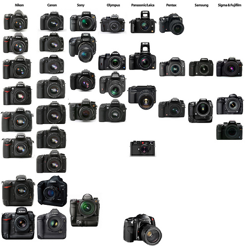
3177722200_e26b0fc399.jpg

My first thought after looking at this DSLR collage is: Why hasn’t anyone made a white SLR? Why are all SLR’s black or dark grey? Seems like an opportunity for someone to stand out. [via df]

Jason Fried on Jan 8 2009 61 comments
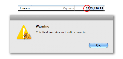
quickbooks-invalid.png

Peculiar error from QuickBooks Pro. You can’t enter a $ into an accounting app? Sure, the dollar may be invalid sometime in the near future, but…

Jason Fried on Jan 7 2009 22 comments

Design Decisions: Saying more in less space on the new Highrise site

Jason Fried
Jason Fried wrote this on 32 comments

Last week I took you through the Highrise signup chart redesign.

This week I want to talk about part of the Highrise home page redesign that we’ve already redesigned. The design is alive – we’re making a lot of small tweaks post launch.

Original: In the cards

When we launched the new Highrise site, we had a block in the middle of the page that looked like this:

Three “cards” as we call them. Each card highlighting a major feature of Highrise. The idea was to rotate these cards every once in a while. They looked good and gave the page a nice splash of color, but they didn’t communicate very well. We were using 163,566 pixels, but we weren’t really saying anything.

Redesigned: In the icons

So we decided to make a change. Instead of using all that space to advertise three features, we thought we’d try using it to communicate eight benefits instead. So in a couple hours we came up with this:

Eight benefits, concisely explained, each with an icon for some color and identity. Now that block says something. There’s more to swallow, but it’s easy going down. And it’s only 98 pixels taller than the cards design. Here’s the overlay (the red is the extra height):

Continued…

Where should we take 37signals Live? We’d like to do more live audio/video content, but what sort of topics or content or concepts would you like to see us cover in 2009?

Jason Fried on Jan 5 2009 41 answers