International versions are either out already or coming soon. Check with your local retailer. There’s also an audiobook version read by Mike Chamberlain (listen to a sample).
At the book site, you’ll now find a PDF that includes five essays and illustrations from the book:
And here’s the copy from the inside flap of the book, also a good primer on what you’ll find:
Most business books give you the same old advice: Write a business plan, study the competition, seek investors, yadda yadda. If you’re looking for a book like that, put this one back on the shelf.
REWORK shows you a better, faster, easier way to succeed in business. Read it and you’ll know why plans are actually harmful, why you don’t need outside investors, and why you’re better off ignoring the competition.
The truth is you need less than you think. You don’t need to be a workaholic. You don’t need to staff up. You don’t need to waste time on paperwork or meetings. You don’t even need an office. Those are all just excuses.
What you really need to do is stop talking and start working. This book shows you the way. You’ll learn how to be more productive, how to get exposure without breaking the bank, and tons more counterintuitive ideas that will inspire and provoke you.
With its straightforward language and easy-is-better approach, REWORK is the perfect playbook for anyone who’s ever dreamed of doing it on their own. Hardcore entrepreneurs, small-business owners, people stuck in day jobs they hate, victims of “downsizing,” and artists who don’t want to starve anymore will all find valuable guidance in these pages.
Fried and Hansson are the Henry David Thoreaus of entrepreneurship. They preach doing less and embracing constraints…Written with genuine voice — a sometimes cranky and profane voice at that.
This isn’t just a book about changing your business, it’s about changing how you think about business, and is, perhaps, one of the most important books you’ll read this year. Whether you’re admin or CEO, there are many things to learn, and this book offers some great insight into how we all can waste less time, offer people more value, and accomplish things we’ve not yet imagined.
Three terms that came up repeatedly during our San Diego retreat:
Slack
All the stuff that doesn’t fit neatly into bigger, concept-driven iterations. We save one of our programmer/designer teams for slack work — small scope things that build up, a bug that needs to be fixed, a quick support assist, etc.
YAGNI You ain’t gonna need it. It’s easy to get carried away discussing how you could possibly do this, that, or the other thing. It’s harder to step back and ask “Are we really gonna need this?” The answer is usually no.
Low ceremony
When it comes to workflow or policies, stay away from posturing. Just stick loosely to a few guidelines and let good judgement lead you the rest of the way.
A long take is a single, unbroken camera shot that lasts much longer than a typical shot. While the idea’s been around for a long time, it feels like it has extra impact in today’s world of hyper-editing and constant angle changes. Some examples below.
It feels almost cliché to be linking up an Ok Go video at this point, but ya gotta hand it to the band; They have really mastered the art of making “event” videos. Check out this amazing long take video featuring the Notre Dame marching band:
Film directors have long known the power of the long take (Daily Film Dose offers up this list of “The Greatest Long Tracking Shots in Cinema”). One of the best is this scene from “Goodfellas,” where Ray Liotta and Lorraine Bracco walk through the Copacabana.
Like this episode? Please share it with your friends:
The new business book from 37signals REWORK hits stores on March 9. This episode features an extended conversation all about the book. We discuss why we wrote it, what it was like working with our publisher, the writing process, the illustrations, the cover, and more.
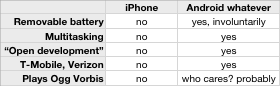
That simplicity has made Twitter a huge hit. But “simple” usually means “limited,” and Twitter is no exception. Your messages can’t be longer than 140 characters. There’s no text formatting. You can’t paste in photos or videos. There’s no filtering of messages. No way to rank or rate people or their utterances. No way to send messages out to canned groups of people, like Family or Co-workers.
There’s so much Google Buzz can do…
Google Buzz overcomes all of that. It’s a lot like Twitter (with huge helpings of FriendFeed.com thrown in), but there’s no length limit on your messages. You can search for messages, give certain ones a “thumbs up” (you click a button labeled Like as you do in Facebook). You can forward messages by e-mail. Comments and replies to a certain post remain attached to it, clumped together as a conversation. You can link to your Flickr, Picasa or YouTube accounts, making it easy to drop a photo or a video link into a Buzz posting.
You can also post messages to your Buzz account by e-mail, which is great when you’re on the move.
So a traditional feature checklist comparison would lead you to say Buzz is the clear winner. But then there’s the problem that comes with doing all that stuff: confusion.
In eliminating the Twitterish bare-bones simplicity, Google stepped right splat into the opposite problem: dizzying complexity. At the moment, it’s not so much Google Buzz as Google “Huh?”s.
Sometimes all that stuff your product does NOT do is exactly why people want it.
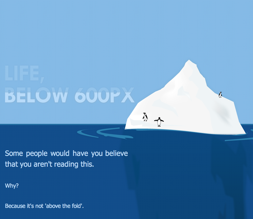
In “Life, below 600px,” Paddy Donnelly talks about “giving the fold the finger” (i.e. making visitors scroll isn’t really THAT bad) and uses the 37signals home page to support the cause. “What I’m proposing is for you to think twice about these ‘rules’ which are preached so often around the web and aim to create something original.”
Success, as measured by installed base or revenue, doesn’t strongly corrolate to quality. A lot of mediocre products are extremely successful, and a lot of extremely successful products are mediocre.
I can’t argue that Microsoft Word or Firefox haven’t been successful, and I won’t argue that they don’t deserve their success. They both try to be everything to everyone, and they’ve largely achieved that, hence their success.
But, like most independent or small developers, I have neither the resources nor the desire to be everything to everyone, and I don’t like the experience of using most products that were designed in that way. Being everything to everyone incurs huge costs in complexity, reliability, and efficiency that I can’t afford, that I can’t tolerate in products I use, and that can’t result in a product I can be proud of.
Later on he explains why he feels comments are a net loss for the vast majority of comment-enabled blogs.
In it, Marco talks about how features only get developed if he wants to use them. That means a big NO to the following: unread-count icon badge, tags, full-screen reading (where you tap to temporarily show the toolbars), comments, and Graphical Mode (“It’s one of those features that people say they want until they actually use it and realize that it’s not worthwhile at all.”)
Does this mean he’s not listening to customers? No, he’s just not letting them steer the product.
I try to minimize ways for my customers to shoot themselves in the foot…If I let users steer product decisions, the result would be a massive codebase producing a bloated, cluttered product full of features that hardly anyone used at the expense of everyday usability and polish on the features that matter. Like Microsoft Word. Or Firefox.
Great to hear about Marco’s strong point of view. And I can vouch personally for the results: Instapaper is the iPhone app I use the most.
On a related note, “Feature checklist dysfunction” is another post by Marco where he rails against checklist comparisons. Here he evaluates the iPhone to see whether it’s a good product:
“Sounds like a terrible product. I bet it will fail.”

 It’s kind of pretty here. Shot from
  A look at the conference table during company wide meeting. Yes, even we meet once in a while.
 Jamis brought peanut butter flavored marshmallows that he made at home.
 Sam’s got one of the cool
  We’re recording it all for the one team member who couldn’t make it.
 Lots of tea gets drunk.