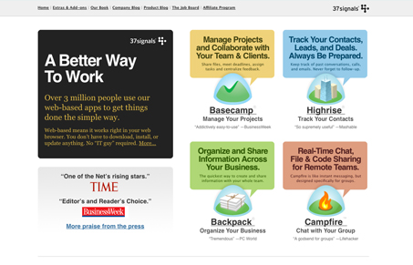
Sarah pointed out this book and said, “Amazing to me what awful covers business books have.”

They really do tend to be damn ugly…


Blech. A good first step toward business success: Realize design matters.
Alex Bogusky thinks scrappy small-agency entrepreneurs will lead us from recession. In the piece, he mentions Big Agency Defectors (or BAD), an agency that aims to develop big ad ideas quickly and efficiently without the baggage involved with big traditional agencies.
They have a simple fee structure called “20:20:20” that’s pretty neat:
Our fee structure is simple and transparent. We call it 20:20:20. There are three phases of creative development, each with a bite-sized fee attached. $20k for creative initial concepts. $20k for developing each into a full campaign. And a 20% commission on production costs to produce them…
If you don’t want to move forward from one phase to the next, that’s no problem. At the very least you’ll have some fresh thinking about your brand. But we think you’ll like what you see and want to go further. Our fee structure rewards us for getting the ideas into production. This means doing great work right from the start.
I sent an email to BAD’s Mark Simmons asking why they chose this pricing route. His response:
The traditional route is opaque. It takes so much time working out a fee arrangement between agency and client. We’re trying to cut through the bullshit and say up front exactly how much we charge so nothing is hidden. Our system means a marketer pays a reasonable amount at each stage and we’re incentivized to create work that actually sees the light of day.
Pricing can be usable too
We tend to think that only products can be more usable. But pricing can be usable too. Any time you can take something that’s normally complex for customers and make it a no-brainer, you’re closer to closing the deal.
Reminds me of when we did client work and launched 37express (1 page redesigned in 1 week for $2,500). It was our way of getting work done quickly while being as upfront as possible about pricing and deliverables. We eliminate the typical proposal documentation BS. We didn’t need a lengthy back and forth to get started. It was just “Here’s what we do and how much we do it for.” It wasn’t for everyone but some customers really loved the idea of getting down to business right away.
Years ago, Saturn turned the typical car dealer pricing model on end and made it “what’s on the sticker is the actual price.” The reason according to “Saturn: Secrets of the ‘no-haggle’ price”: Few people like the process of haggling for the best price on a new car. In fact, almost two-thirds of car shoppers in a survey said they would prefer to pay a single, set price. It’s no wonder then that people who buy Saturns generally love the no-haggle price.
Pricing is an easy place to fall into the “it’s always been done that way” trap. Next time you’re trying to make it easier for people to use your product or service, look at the way you price it and ask yourself if there’s a better (or easier or faster) way than the status quo.
Related: The early days: How 37signals built buzz out of the gate [SvN]
Jakob Nielsen says mega drop-down navigation menus work well.
Given that regular drop-down menus are rife with usability problems, it takes a lot for me to recommend a new form of drop-down. But, as our testing videos show, mega drop-downs overcome the downsides of regular drop-downs. Thus, I can recommend one while warning against the other.
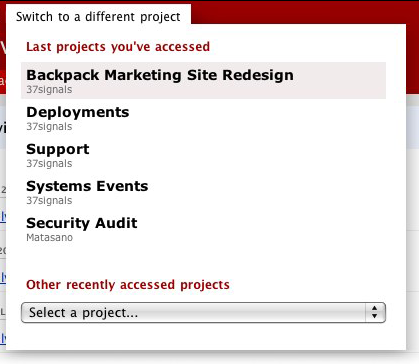
We’ll +1 that. A good, related example from our world: The project switcher in Basecamp.

Design Decisions: Basecamp Project Switcher [SvN] explains how we redesigned the project switcher from a normal drop-down to a mega drop-down.
Ryan adds this:
The original design was a single pulldown (a <select> tag). It was cramped and you had to scroll inside of it to find the project you wanted. Now the five most recently accessed projects have big easy-to-click targets, and you don’t have to scroll to see them. They’re all laid out in big type. The result is that you can navigate between the most recent projects without squinting and leaning close to your monitor. It’s really comfortable. Then since we had the free space inside the project switcher, we could also offer a big selection of more recent projects in a pulldown with a bigger font size. So in the cases where you need to dig beyond the last 5 projects, you can still do that. But most of the time it’s super fast to pop open the switcher and just click on one of those big targets without fussing around in a pulldown.
Another nice example of what Nielsen is talking about can be found at the Rails Guides site.
Continued…

