You can’t improve a design when you’re emotionally attached to past decisions. Improvements come from flexibility and openness.
About Ryan
Ryan's been getting to the bottom of things at Basecamp since 2003.
Twitter's UX: Separate the hits from the geekhacks
Twitter nailed a few important things in their user experience compared to alternatives like Facebook. Posts are public by default, so there aren’t debates or surprises about privacy. Streams are built out of subscriptions (“following”), not “friendship”—a word that loses meaning when your friends are 500 strangers. And the 140 char limit gives the stream of updates a distinctive rhythm.
But some serious flaws are holding Twitter’s usability back. A collection of hacks that were initially cool and clever among the geekset have turned into de facto features. Why should users have to know what a URL shortener is? Why does attaching a photo to a tweet require third-party tools and diminish your character count?
Twitter’s recent redesign doesn’t address these fundamental user experience problems. Twitter would be easier to use, easier to explain, and easier to expand if they focused on their hits. Following is better than friendship. Public by default is better than public-by-surprise. 140 chars keeps things sharp and rhythmic. A true redesign would separate these genuine insights from the clever geekhacks and make Twitter simpler to use and easier to understand.
Ryan's talk at Future of Web Apps 2010, London
I gave this talk at Future of Web Apps in London last week. In this talk I walk through the steps of creating a web app including modeling, sketching, HTML, Photoshop explorations and moving from static mockups to live running code. Each step is illustrated with a real example, including some live sketching and live HTML. I also wanted to give a sense of how we think about apps at 37signals, as a stack of different levels that we can iterate on individually.
Future of Web Apps, by the way, was a really great conference. Impressively well-organized, cool crowd, and plenty of substance. Thanks to Carsonified for inviting me again this year.
Related: Weaving Design and Development
Personality versus "professionalism"
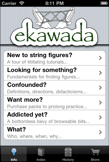
It’s interesting how much flavor and personality shows up in our side projects compared to our “professional” work. Jamis posted this screenshot into Campfire today to show an iPhone app he’s been developing on the side.

Check out the playful alliteration in those subtitles. I love the personality there. It’s interesting to think about how when a project is a hobby, it frees our mind up somehow to show more personality—to be more playful. Then when it’s time for “professional” work everything gets buttoned up and greyed out. (Unless you’re Wufoo or MailChimp.)
Next time I’m working on something, I want to ask myself: “How would I design this if it were just for fun?”
Sometimes the problem has to mature before the solution can mature.
Clever ads for TiVo
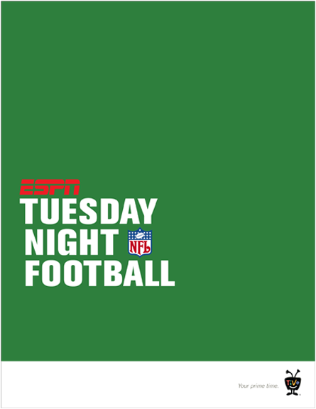
Some, er, research on social media strategy led me to Zach Golden’s copywriting portfolio. These ads for TiVo are great.


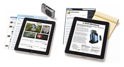
This is a cool visual metaphor on the Flipboard for iPad site. Screenshots from websites are rendered like pieces of paper in a stack under the iPad.

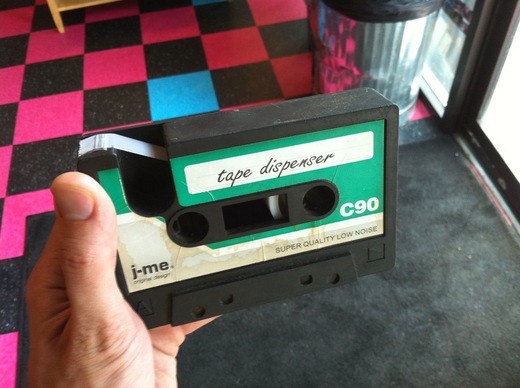
I saw this awesome tape dispenser by j-me yesterday at New Wave Coffee in Logan Square.
If it’s been done “except for this one thing” for days, there’s likely a design problem with that one thing.
