Recently in our Campfire room…
[Fly on the Wall] "Your HTML hand"
Recently in our Campfire room…
You’re reading Signal v. Noise, a publication about the web by Basecamp since 1999. Happy !
Ryan's been getting to the bottom of things at Basecamp since 2003.
Recently in our Campfire room…
Here’s a quick anti-pattern (an anti-pattern is something you want to avoid) that I occasionally catch in our markup and CSS.
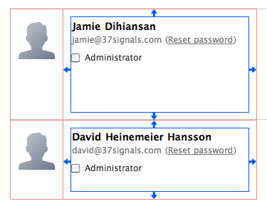
I opened some code for a new user management screen we’re working on. This excerpt of the users screen shows an avatar, the user’s name, their email address and a reset password link.
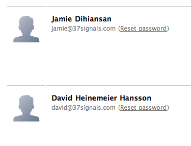
The avatar is in a container, and the user info is in a container.
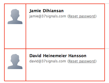
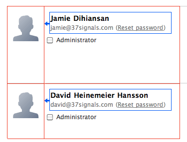
I wasn’t familiar with the code when I opened it, so I assumed the interior white space came from padding on the container. I wanted to add an “admin” checkbox below the user info on the right, and I expected it to align flush left with the name and email. But that’s not what happened.
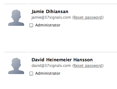
The checkbox didn’t line up with the text above it. It turned out that the container didn’t have any padding. The text was in its own nested container with a left margin.
This is one of those cases where “it worked” at the time, but as soon as the design needed to change, it broke. This kind of thing makes change painful because you can’t just pop in an element. You pop in an element, but then you have to dig around to see what the margins are supposed to be, move the margins in the right place, and shuffle styles around until the block looks how it should.
To prevent this, I advise thinking about styles as “rules” and “exceptions.” If an element inside a container has padding or margin assigned to it via a CSS selector, that implementation is telling me that the element is a special case. It’s not following the default flow. For some special reason, it needs different spacing. On the other hand, if no elements inside a container are going to look right without the spacing adjustment, that styling should be a “rule” on the container. It should be a constraint for whatever goes inside that container so the design naturally handles additions and future changes.
It also helps to think: which parts of this design are the “room” and which parts are the “furniture”? You should be able to move furniture around without worrying about the walls and volumes of the space. The CSS should be set up in such a way that your space is a constant and you can easily move elements around as you improvise and improve a design.
Back to my project, a quick refactoring moved padding to the container, and going forward this element will handle anything we put into it. Future designers won’t have to think about the containers.
Try keeping these distinctions in mind the next time you’re styling a layout so that future changes are easier to make.
Last year we released a single sign-in system called 37signals ID. It was a massive project for us, and when you do big projects you can’t make every detail perfect. “37id” (as we called it internally) would never launch if it had to be perfect. So since launch we’ve been fixing rough spots as we identify them.
One rough spot had to do with sign-ups. When you sign up for our products, you can either create a new account from scratch or you can identify yourself as an existing customer. Existing customers can use the same username, see their 37signals apps in one place (Launchpad), re-use their avatar and so on. Basically it’s a big time saver and a big convenience. The problem was very few customers took advantage of the feature. Our support staff often heard from customers with multiple accounts who had no idea that they could link their accounts into a single 37signals ID. So we had a design problem on our hands. Why weren’t people logging in on the sign up screen?
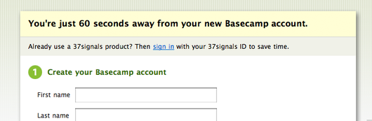
Let’s have a look at the original signup screen. The form was completely geared for new customers, except there was a strip at the top of the screen just below the header. The strip called out to new customers with a link to “sign in” if they already use our products.
We figured there were two reasons why people weren’t signing in with this link. One: it could be that they didn’t notice the callout. And two: maybe people were noticing the link, but the language wasn’t compelling enough to make them click. We took these explanations one at a time and focused first on the placement of the callout.
Our basic intuition was that the callout should detach from the header block. When it’s attached to the header, the callout and header glom into a single unit and it’s easy to skip past both of them. Does detaching the callout help?
Continued…Over the last few months I’ve noticed a ton of inspiring websites. Camerion.io, Art Lebedev, n+1, Show of Force, and on and on. And everytime I look at one of these sites, I think to myself “Oh I’m so inspired. Look at how they did this. Look at that paragraph style. Look at that header. I feel so full of ideas.”
Then it’s time to work on a new project, and did all the inspiration make a difference? Actually, no. Most of the work I do is looking like all the other work I’ve done for months and months and years. Apparently looking at cool stuff isn’t enough to increase your skill. It’s easy to look at some stuff and say “oh that’s inspiring, that gives me ideas” without moving an inch.
So I got thinking. How did I develop the basic skills I have right now? Mostly by copying heroes. When you’re fresh starting out, you have no fear of diving in and copying something directly. It’s like playing guitar. When you start playing guitar all you want to do is play the first verse of your favorite song. Big success! You don’t need to write the next great guitar symphony or a hit single. It’s totally satisfying to learn to play something somebody else can already play. And you get better by doing it.
And it was the same way with design. I was totally psyched to copy a Müller-Brockmann poster, a Designgraphik composition, or an Apple UI. Merely executing the copy was a thrill. But now every design is supposed to be the next great thing. And as days and weeks and months go by, the design level stays the same while the aspiration goes higher and higher.
So maybe it’s time to take one of these Fridays off and just copy something.
An imagined monologue by Scott Vrooman.
“We need to focus on results, and achieve the breakthroughs that will launch us into the realm of exactitude.”
There’s been buzz in UI circles about the end of hovers since the iPad’s debut. I’ve mentioned in talks that touch tablets pose a design challenge for web apps that rely on hovering with a mouse. But the fact that hovers don’t work on touch devices doesn’t spell their doom. If we step back from hovers to the wider picture, comparing the desktop’s vocabulary with the limits of “tap, hold, and drag” can give us a handle on the gradually differentiating roles and equally bright futures of desktops and touch tablets.
As touch tablets wax in popularity, they illuminate the role and utility of desktops (including laptops, which belong on a desk anyway). Take the desktop’s arsenal of gestures. Besides click and right-click, you have shift-click, command-click, command-tab, command-space, ctrl-a, ctrl-e, command-~, command-w, and on and on and on to even include, yes, the hover.
I always felt like computers were meant to be used with at least a hand poised on the home row, because without that arsenal of verbs things just take too long. As a power user, watching someone who isn’t familiar with all the shortcuts can put your patience under observation. To some folks, everything about the desktop is a hindrance, like swimming in molasses.
But to the geeky or trained, the desktop is a fount of power and speed. Documents are side by side, text flies from here to there, IMs are answered and dismissed, mockups reloaded, batches processed, all with tiny movements of the fingers. For those of us who work all day on computers, touch interfaces are not an impending disruption.
While the future of the desktop is bright, like some maturing stars it also becomes more concentrated. If I place a bet, it’ll be that the desktop negotiates its place among tablets to settle on a role we haven’t seen in a while: the workstation. As for interface designers, we will sometimes shift out of the one-size-fits-all mindset to ask ourselves: Which device is this app really for? The workstation or the tablet?
Sometimes a design isn’t working because you think you can’t change the one element that needs to be changed.
How did Windows become ubiquitous?
A force of self-interest throughout the industry made Windows ubiquitous. Compaq and all these different vendors made Windows ubiquitous. They didn’t know how to spell software, but they wanted to put something on their machines. That made Windows ubiquitous.
So it just kind of happened.
No, it was sort of an algorithm that got set in motion when everyone’s self-interest aligned toward making this happen. And I claim that the same sort of self-interest algorithm is present on the Web. Everyone has a self-interest in making this Web ubiquitous and not having anyone own it.
I think there’s a benefit to being one of six people that no one knew. No VCs would return our calls and we were broke and bootstrapping it and operating under the radar so we could focus on the most important things: the product, the users, what we were building. There’s all this noise, the tech-crunch, which you have to tune out if you want to build a good product. None of that stuff is additive; it all takes away from building a product.