So much complexity in software comes from trying to make one thing do two things.
About Ryan
Ryan's been getting to the bottom of things at Basecamp since 2003.
I teach the way that I wish I was taught.
—
Sal Khan, Khan Academy
Sal Khan, Khan Academy
"Designing with Forces" – How to apply Christopher Alexander in everyday work
A couple weeks ago I gave a talk at the MFA in Interaction Design program at the School of Visual Arts in NYC. The video for the talk and Q&A session is online now. When Liz Danzico invited me to speak at the SVA, I thought it would fit the university setting to share some theory behind our design process at 37signals.
One book that heavily influenced my approach to design is Christopher Alexander’s Notes on the Synthesis of Form. Many designers cite the book as an influence, but few really explain what it’s about or teach how to apply the ideas in everyday work. So I took the opportunity to explain the key points of the book and show how we use Alexander’s model to do design at 37signals.
Here’s the video of the talk:
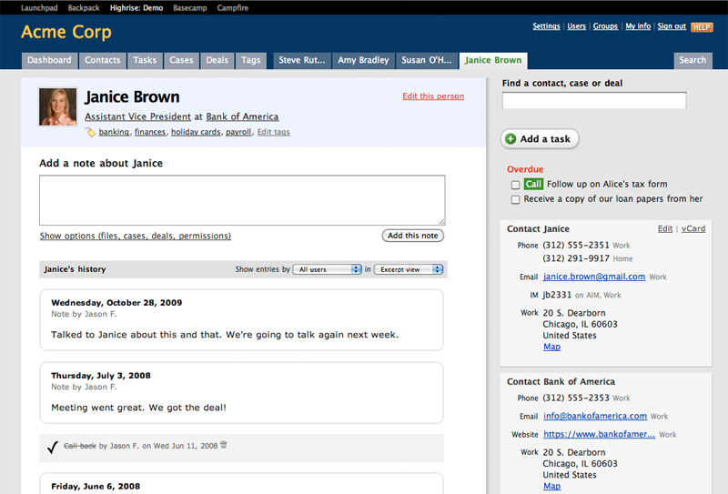
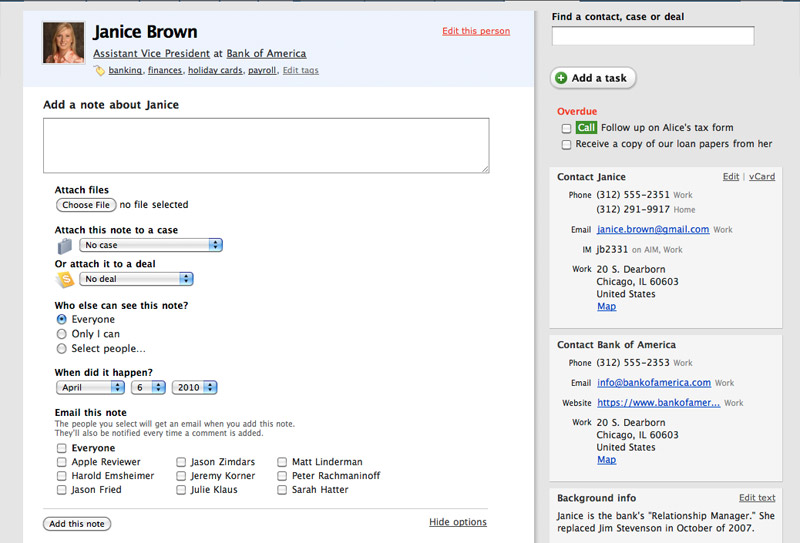
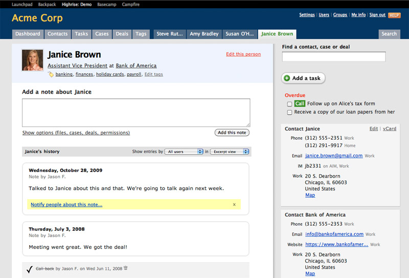
Some of the screenshots are hard to see around 38:30. Check the images below if you’d like to see those screens more clearly.
 |
 |
 |
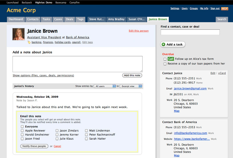 |
| Highrise history | Options behind a link | A new link to notify | Embedded notification form |
The talk was followed by a Q&A session. The Q&A touches on customer feedback, design vs. evolutionary selection and trusting your intuition.
Here are some things to check out if you liked the talk.
- Notes on the Synthesis of Form – The book by Christopher Alexander.
- An Introduction to Using Patterns in Web Design – An early article I wrote on Alexander’s technique when I first ran into it in 2004.
- Domain-Driven Design by Eric Evans – Mentioned at the end of the talk.
- UI Fundamentals for Programmers – A talk I gave at WindyCityRails in Chicago.
I’d love to know if people are interested in this material. Post a comment here or write me at ryan at 37signals dot com with your thoughts.
An alarm clock in Ginza
I recently spent a couple weeks in Japan, which is an amazing place for designers. There were thoughtful details everywhere I went. One example is the custom alarm clock in my Tokyo hotel (the Courtyard Marriott in Ginza).

This alarm is beautifully simple. There are only three buttons: decrement alarm time, increment alarm time, and on/off. The bottom row of buttons control the lighting of the room. (The white cable is from my iPhone charger, not part of the alarm).

I really like how the alarm time isn’t hidden behind a mode. The alarm time appears beside the current time in orange LED whenever the alarm is on. It doesn’t replace the current time, so you don’t have to track which mode is active. The two times look different from each other. The orange letters also give confirmation that the alarm is in fact set (which can be a concern when you rely on an unfamiliar device to wake you up).
When the increment/decrement buttons are held, the current time disappears to focus on the alarm time.

One of my favorite details is something you can’t see in these photos. The alarm is a solid brick of metal. It’s black and heavy, with no branding or seams visible anywhere. Solid, unobtrusive, and perfectly optimized—that’s a good design.
The fact that I set little store by certain postulates (often deemed to be fundamental) of our present-day biology the reader will have discovered and I have not endeavored to conceal.
A little sketching is an exploration. A lot of sketching is a procrastination.
Zappos pranks itself for new ads
Ad agency Mullen chose to focus on Zappos’ famous customer service for their new ad campaign. The twist is, behind the puppets and comedy are recordings of actual customer service calls. Mullen’s making of video explains how they basically pranked Zappos to get the audio for the ads. The results are funny, fresh, and true to the experience of calling Zappos. Awesome stuff.
Two different worlds
I walked into a Sprint store today to check out the Palm Pixi. AT&T has been bad enough lately that, while I’m not ready to chuck the iPhone, I’m at least growing curious. Unfortunately “walking in” is about all I could do.
Every smartphone in the Sprint store was locked under glass cabinets. The untouchable phone displays were covered in fake screenshot stickers. Two weary looking gentlemen in polo shirts manned the back counter and a queue of six customers (shoppers?) aimlessly paced the floor, waiting for something to happen.
It took about 30 seconds to realize there was nothing to gain from my store visit. After a quick round to be sure I didn’t miss a demo unit somewhere, I turned back to the street. Is this typical of Sprint stores?
Compare this experience to the Apple store. iPhones and iPods are less than six feet away from the entrance door. All you have to do is reach out and grab one. Salespeople meander around you, instead of you around them. A total Apple newbie can go from curious to salivating in about 90 seconds in that environment.
Can you imagine if Apple locked their products under glass cabinets? Or put stickers with screenshots over their displays? Who makes these decisions?
See Ryan talk about Christopher Alexander in NYC
I’m excited to give a talk at the School of Visual Arts in New York City. I’m going to walk through Christopher Alexander’s design theory and explain how to apply it to everyday web app UI work. Alexander’s book Notes on the Synthesis of Form had a huge influence on me early in my career at 37signals. It’s going to be a lot of fun to share key points from that book with an audience for the first time. I hope you can come out to see it.
Where:
MFA Interaction Design Department
132 W 21st Street, 6 Floor
New York City
When:
Wednesday, April 7
6:30-8:30PM
See the event page at the SVA’s MFA in Interaction Design program to RSVP.
UPDATE: The talk is now sold-out.