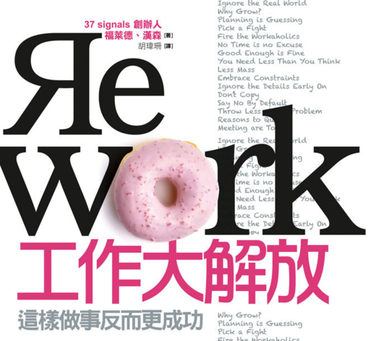
Cover of REWORK, Taiwan edition (Traditional Chinese). FYI, we have no influence over the cover of international editions. Each publisher can work up their own cover. (via Zero Credibility).
You’re reading Signal v. Noise, a publication about the web by Basecamp since 1999. Happy !
Cover of REWORK, Taiwan edition (Traditional Chinese). FYI, we have no influence over the cover of international editions. Each publisher can work up their own cover. (via Zero Credibility).
Our new office has a dishwasher. It’s sleek, modern, and silent. It blends into the stainless cabinets and countertops just perfectly. It has the same handle style as the drawers and doors to the left and right. It has no buttons or lights or anything on the outside. You don’t even know it’s there.
And this is why it’s bad.
This is it, right there in the middle:
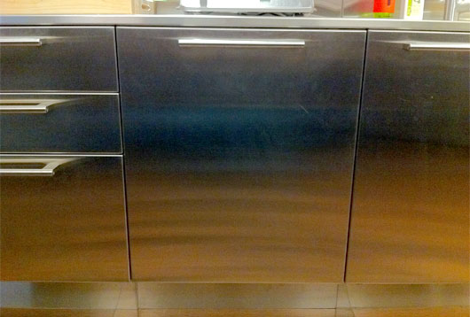
Looks great, right? Well that depends.
At least once a week when I open it up to add a dirty cup or plate I get sprayed. Water shoots out the sides and splashes me and the floor. It’s on, but there’s no indication it’s on. It’s so good that you can’t even hear it. That’s actually bad. It’s so integrated that it doesn’t look like a dishwasher. That’s actually bad.
I used to curse it, but now I’ve made peace with it. I actually like having it around. Every time I see water on the floor, or on my shirt, I’m reminded of the subtle differences between good and bad design.
Subtle because sometimes all it takes is the smallest little thing to turn bad to good (or good to bad). A tiny bright LED light in the upper right corner could indicate ON. When the light’s on, don’t touch. When’s its off you don’t even see it. It doesn’t interfere with the overall design. That little light would make everything else — the visual design, the silence, the integration with the rest of the kitchen — worth it.
Or it could lock when it’s on, unlock when it’s off. You wouldn’t be able to unlock it once it’s on because there’s no exterior lock handle, but that seems like a small sacrifice to stay dry.
Or…
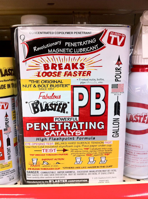
PB Penetrating Catalyst by the B’laster Chemical Company of Ohio.
Thank you for your recent e-mail inquiry to Qwest. I apologize for the delay in responding to your e-mail. I apologize for your frustration but you must call 1-866-283-0043 for assistance with your VoIP service.
The question: What’s an app that you’ve started using in the past year and are digging a lot? Below, answers from the 37signals team.
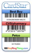 Cardstar (right)
Michael Berger: “I like Cardstar, It’s great because you don’t need to carry around your preferred cards for all the places you shop (like CVS, Dominick’s, etc.) And sometimes you get weird looks from the sales clerks, which is fun.”
Jumpcut
Jason Rehmus: “I’ve been using Jumpcut lately, a simple clipboard manager for OS X. I copy and paste email and web addresses all day and Jumpcut lets me easily navigate through most everything I’ve copied using keyboard shortcuts.”
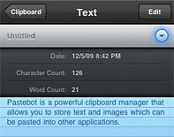 Pastebot (left)
Jason Zimdars: “Surprisingly this is one of my most-used iPhone apps. It’s lets you copy/paste both directions between your Mac and your iPhone or iPad. Very handy for getting things like addresses, map links, passwords and anything else it sucks to type onto your phone. You can even copy/paste images—so it’s faster than syncing if you need to get a photo or screenshot off of your phone in a hurry.”
BucketWise
John Williams: “Our family has been using the envelope budget system for quite a while. We found Mvelopes’ flash interface to be difficult to use and it has no mobile support. BucketWise [created by 37signals’ Jamis Buck] is easy to use and has all the features we need.”
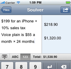 Soulver (right)
Jason Zimdars: “Soulver replaced the built-in calculator on my iPhone. What’s cool about Soulver is the way keeps all of your previous calculations and even lets you reference previous values by line number. You can even write equations in English like. “50% of 3,100” or ”$25 a month for 6 months” and it’ll solve them. It’s especially great for figuring out scale or proportion ratios which are common in design.”
Divvy
Jason Fried: “Been using Divvy to keep windows organized and nicely tiled.”
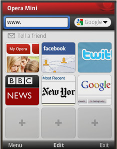 Opera Mini (left)
Ann Goliak: “I use Opera Mini on my iPhone. It’s a faster browser than Safari and it’s much easier to navigate web pages. One tap zooms you in, and the Back button zooms back out to the full view. You can set favorites for quick linking when you launch. I don’t do a whole lot of web browsing on my phone (because I’m usually playing Angry Birds), but Opera is my go-to.”
Mailplane
Michael Berger: “I love Mailplane which is like a wrapper for the Gmail web client. I like archiving messages and using labels, which isn’t really supported in Mac Mail. You can use either the Gmail or Mac Mail keyboard shortcuts with Mailplane, and it can be easily configured to access several different Gmail (or Google apps) email accounts. Since it’s a standalone app it can be configured as your default email client to automatically handle ‘mailto’ links. It also support Growl notifications (and a handy ‘do not disturb’ mode to temporary disable the alerts).”
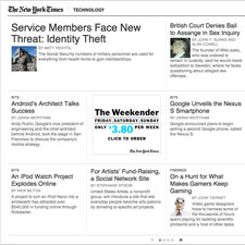 NYTimes app for the Chrome Web Store (right)
Scott Upton: “I’ve started using the Chrome ‘app’ for the NY Times as a replacement for reading their normal site. It seems much easier to scan and works in Safari as well as Chrome.”
PeepOpen
Sam Stephenson: “One new app I’ve been using is PeepOpen. It’s an improved version of TextMate’s ⌘T window for quickly jumping between files in a project, with two big advantages: it works in other editors (I’m using it with Emacs), and it lets you scope your search by directory, not just filename.”
 OmniFocus (left)
Ryan Singer: “I started using OmniFocus this year to keep track of all my personal projects and tasks. It’s been a big help. I use the iPhone client too.”
Dropbox
Scott Upton: “A vote for Dropbox. I hadn’t used until this year but am already finding it invaluable.” [Dropbox allows you to sync your files online and across your computers automatically.]
1password
Will Jessop: “1password (OS X, iPad, iPhone) with dropbox syncing across all platforms. I have hundreds of passwords and being able to securely store a really long random password for each app is invaluable.”
 Tweetie (right)
Matt Linderman: “Tweetie is great for managing multiple Twitter accounts. I like how you can set different alerts for different accounts. Lots of nifty, subtle UI stuff in it too.”
The apps we don’t use
It’s also worth noting what apps we’re NOT using. Scott Upton comments:
This has also been a year of trying new apps and reverting back to what I had before. I wanted to use Coda instead of the aging TextMate, but couldn’t be as productive with that newer editor. I’ve also attempted to use Adium several times because iChat seems so flaky—no dice there, either. I keep drifting back toward the simplest option.
Sam Stephenson says:
I got rid of a couple of apps this year. I uninstalled Knox, because you can just drop disk image files onto the Login Items preference pane instead. I also uninstalled LaunchBar, an app I’ve used since 2001, because Spotlight works well enough with an SSD.
After looking at the submissions, Jeremy Kemper summed it up well:
People are curious about how we work, often in a looking-for-the-special-sauce way. “If only I had that Nordic Track machine, I would be able to get in shape.”
We should slay this “if-only” thinking about tools. Especially considering our new favorites are all utilities/helpers, not core work apps.
In other words: look at all the apps we’re not using!
While we have determined that there is not a strategic fit at Yahoo!, we believe there is a ideal home for Delicious outside of the company where it can be resourced to the level where it can be competitive.
[Yahoo!] killed a lot of good startups, wasted a lot of engineers’ time, etc. Perhaps I spent too much time inside that particular sausage factory…
I wish I had not sold it to them. The cash and freedom do not even come close; I would rather work on a big, popular product.
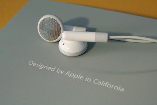
Photo: Marcus Jeffrey
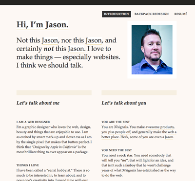
“I think that ‘Designed by Apple in California’ is the most brilliant thing to ever appear on a package,” I wrote on the application-site that was mentioned in yesterday’s post on sites that landed jobs at 37signals. SvN reader Michael P. Mills asked:
I agree, that line is brilliant and I remember the first day I ever saw it.
I am very curious to hear why you believe that “it is the most brilliant thing to ever appear on a package”.
This simple tag has appeared on nearly every Apple product or package in at least the last decade. (I couldn’t find any definitive answer as to how long it’s been in use, but I remember it distinctly on the iPod packaging in early 2000’s.)
What’s great about this phrase is that it’s powerful on more than one level.
Designed by Apple in California is usually presented dramatically and in isolation. Often you see it after opening a flap or unfolding a panel. It stands alone as a single line of type on a solid field. There is never anything that distracts from it. The early cube-shaped iPod packages were the best at this. You’d remove the sleeve, unfold two panels, and there it was. The next fold revealed the device. That I still remember this sequence says a lot about how powerful the experience was.
The copy itself, evokes feelings of artistry. Like this object was meticulously crafted, carefully wrapped, and bought safely to your door. It feels human, as if you received it directly from the person who so lovingly made it. Craftsmen sign their work. Master Bladesmith Bob Kramer puts his name on all his knives. Vermont Furniture Designs puts its name inside each dresser it makes. Edward Tufte advises designers to always put their name on what they make — it shows that you care about the finished product and take responsibility for it. That’s the feeling I get from this line.
Also, it wasn’t “Made by Apple in California,” it was Designed. I can’t think of another company that holds design in higher esteem or even one that touts every product as designed, not made. This might be the best expression of the company’s mission available.
The design comes from Cupertino, from people who obsess over it. Items may be manufactured in China, but they’re designed by Apple headquarters. And that matters to people. Plus, California evokes magic for many people — especially the California of the mid-1970’s that gave birth to Apple Computer and really, the entire personal computer revolution. Warm weather, surfing, celebrity and a free-wheeling easy lifestyle in the age of American Graffiti are not such bad things to associate your company with.
There is an adage in graphic design that goes something like this:
If you want to make something stand out in your design, make it big. If it needs to stand out even more, make it bold. Still not enough? Make it red.
Big and bold and red epitomize the lazy designer because it always works but shows no imagination. Marketing is usually full of big and bold and red.
Yet here, Apple goes subtle. The careful design makes the statement even more powerful. Apple conveys the importance of this phrase by isolating it, so it never can be missed. It never has to compete with other elements. It’s small and elegant, just like the devices themselves. It is revealed dramatically and unexpectedly. All of these devices make this statement loud and clear without Apple ever having to raise its voice. By doing that, it sets the tone for the actual product and experience contained within.
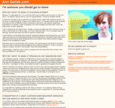
Re: the new job openings at 37signals, seems like a good time to remind those who are interested of these creative “application-sites” that helped previous candidates land jobs with 37signals:
