You’re reading Signal v. Noise, a publication about the web by Basecamp since 1999. Happy !

Nate Otto

About Nate Otto

I like to draw cities and little people. I am a regular contributor to Basecamp as an illustrator and an artist. I have pitched in since Basecamp was Spinfree.

Basecamp HQ Mural

Nate Otto
Nate Otto wrote this on 6 comments

When I painted a mural on the wall of the first 37signals office back in ‘99, or 2000, I didn’t have a camera phone in my pocket. That’s why I took pictures of the wall with a disposable camera. If back then I was the competent human being I am now, I would have gotten those pictures developed, but I was an idiot then, and I have no documentation of that mural. I remember that it had monsters in it. I was into painting monsters.
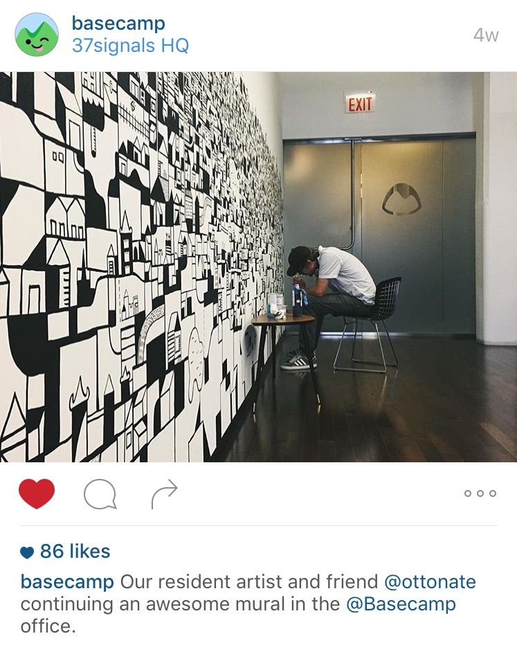
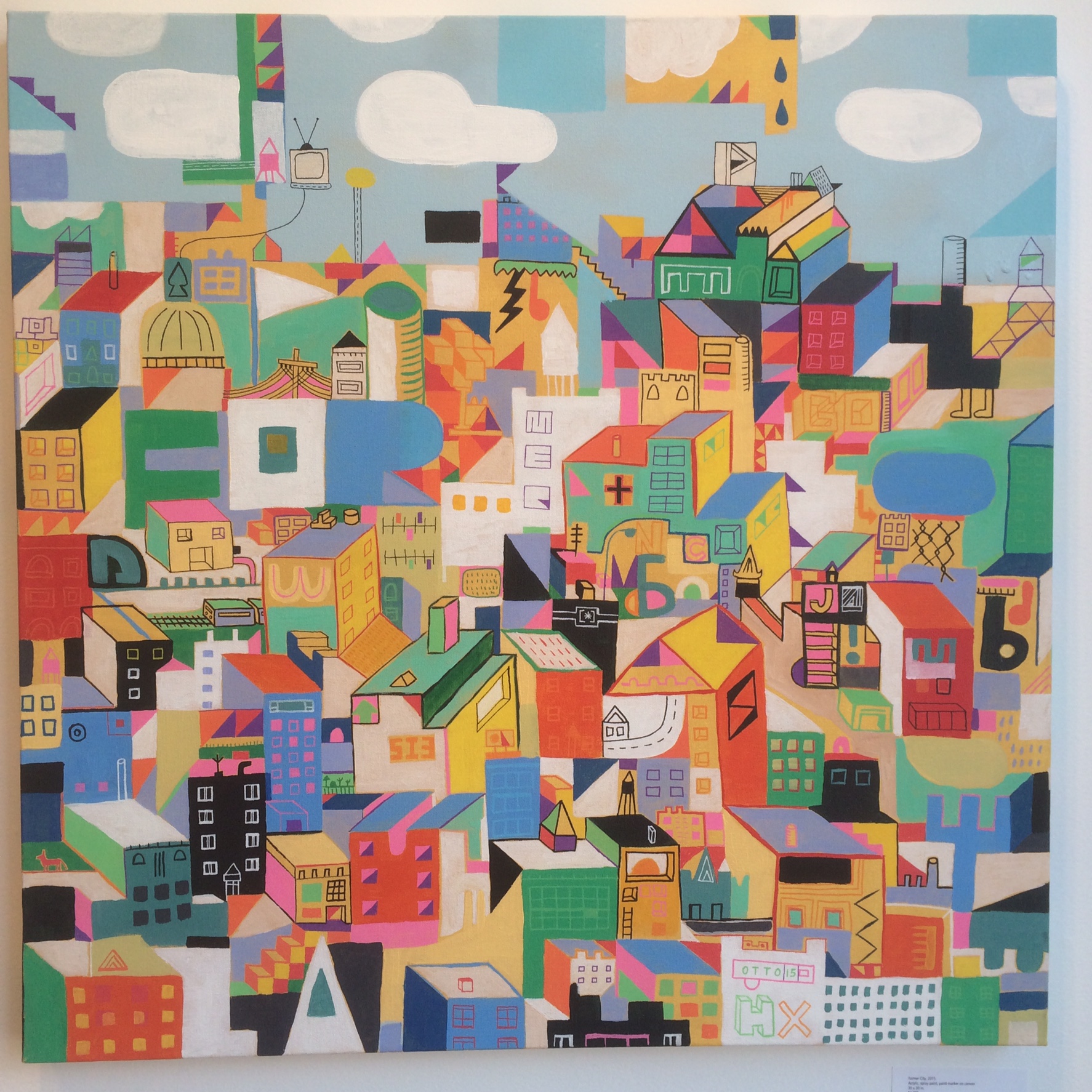
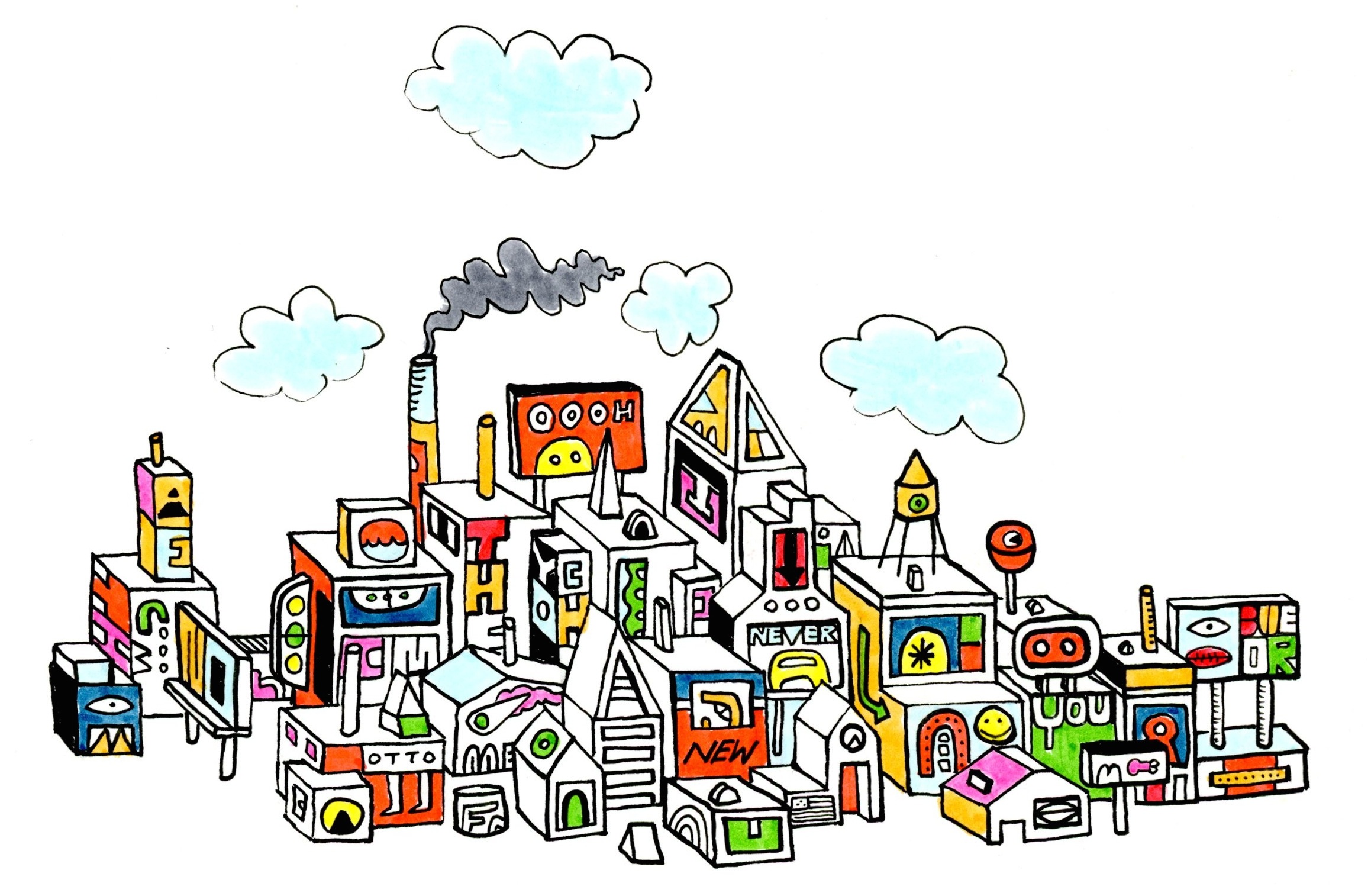
About a month ago I completed a new mural in the front entrance hallway of the Basecamp Headquarters. Luckily I have a camera on the thing I browse Facebook with, and I keep it in my pocket. I was on a black and white abstract cityscape kick when I pitched the idea to Jason and Michael Berger. Jason had some ideas but gave me the license to do whatever I wanted. Doing whatever I want is what I do best. I’m really proud of the results, and grateful for the opportunity. I’ve done several murals, but this one might be my favorite. It was Jason’s idea to go around the corner.

I put a few Easter eggs in there. It says Basecamp. It also says 37signals and Spinfree. There is something that looks like a ruby on some rails. Jason didn’t want it to be too Basecamp specific, and I agreed with that, so those things are all somewhat hidden.

By the way, I love doing murals, and I especially love doing them in offices. It gives me a chance to soak up a company’s culture for a few days or a week while I work, and tech companies always have snacks. I’m down to fly to Germany (or wherever) and do a mural in your office. Basecamp is a fifteen minute bike ride from my house, I’m already familiar with the culture and the people, and I have a fob, so this was a fun one. Say the word and I’ll paint the whole place!

Continued…
Extra Drawings for The Distance

Nate Otto
Nate Otto wrote this on 1 comment

Last year I shared some extra drawings I made for the Basecamp marketing site that for a variety of reasons never went live or were seen by anyone outside of Basecamp. There have also been many drawings for The Distance that have never seen the light of day until now.

For just over a year, The Distance was dedicated to longform articles about long standing businesses. Under the editorship of Wailin and the art direction of Mig, I made a header illustration for each article and a building drawing that served as the footer. In recent months, The Distance has morphed into a podcast. I still illustrate the cover for each issue, but the header illustration is no longer needed. I like to tell people that I illustrate a podcast, and then I wait to see their reaction. There were a few issues that were both a podcast and a longform article. Here are some of the extra drawings made for those articles and then a link to each corresponding podcast. I’m also hoping to show some of the collaborative process and how we use Basecamp together as a team.

World’s Largest Laundromat

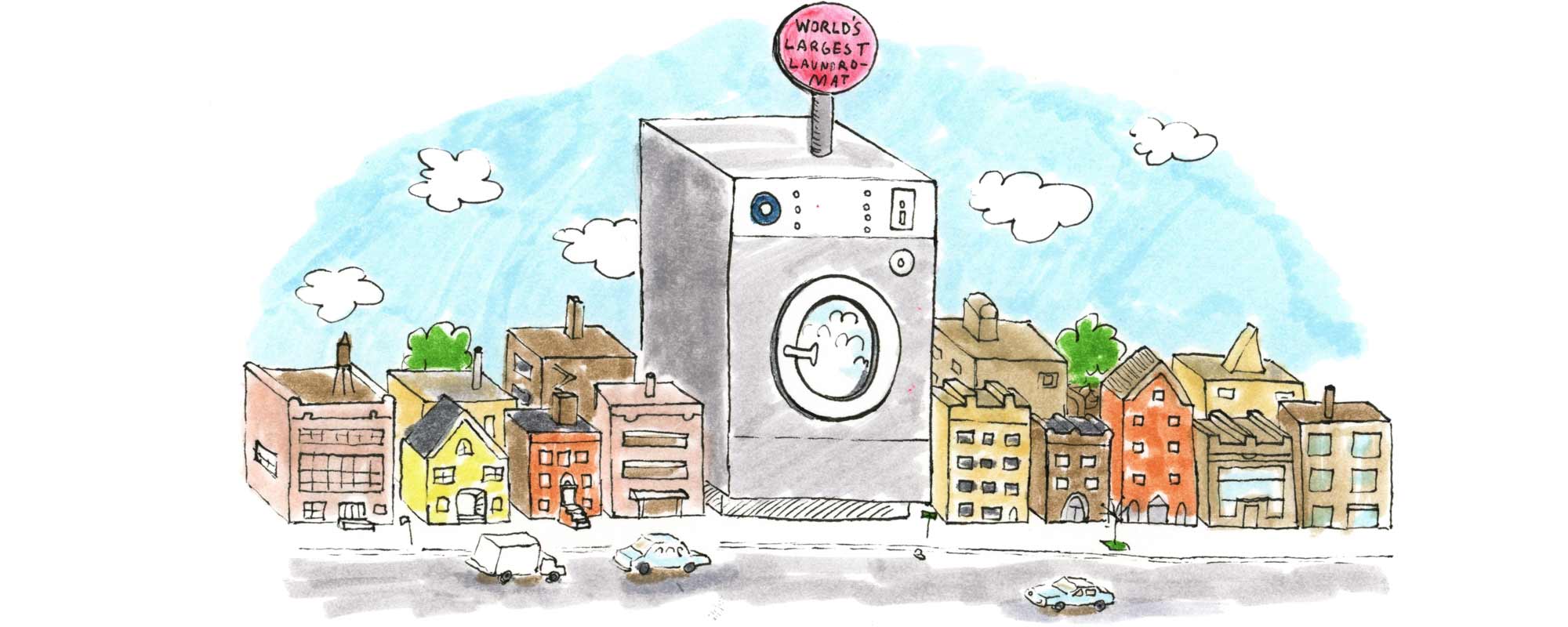
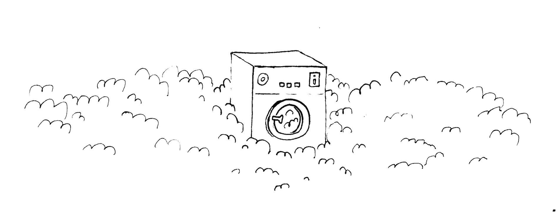
The finished header looked like this. I got a creative brief from Mig with some of the concepts of the story that he wanted to see in the header, and he also shared some visual inspiration, including some anthropomorphic washers and an animated gif of spiraling bubbles. The theme that I latched onto was that this is the world’s largest laundromat, so I knew I wanted to draw a big washing machine. The first image I drew was of a washer amidst a field of bubbles, but that didn’t read well and it didn’t really say anything.
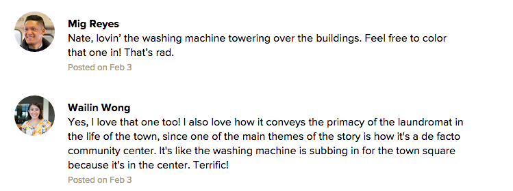
I tried another one with a washing machine looming large on a street with residential buildings. Drawing buildings is my jam so I was playing to my strengths here, and I thought it worked conceptually. I shared it on Basecamp and…

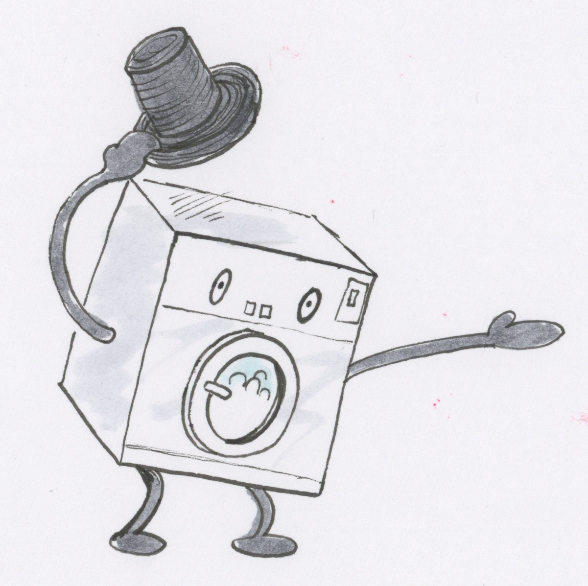
I was ecstatic that they liked the drawing, and that the header came together so quickly. As you will see, it doesn’t always happen that way. I colored in the drawing and that became the final image. I had some time and I was still thinking about washing machine people, so I made the additional drawing of a washer with a top hat!

Ideal Box Company

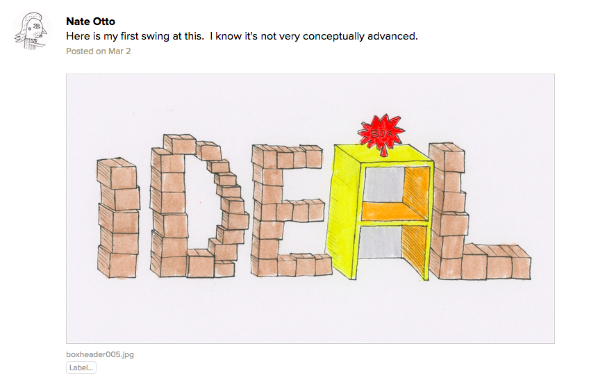
The final header looks like this.

This article is about a box company that makes a lot of point of purchase displays. I kicked off the to-do with a drawing.

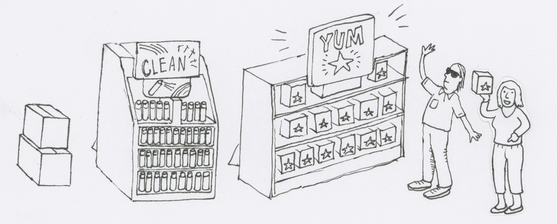
Wailin shared a copy of the story then and she broke down some of the key points and themes. She also shared a few ideas for me to try. I did this drawing but I knew that it didn’t hit on many of the themes (even though I initially tried to champion it).

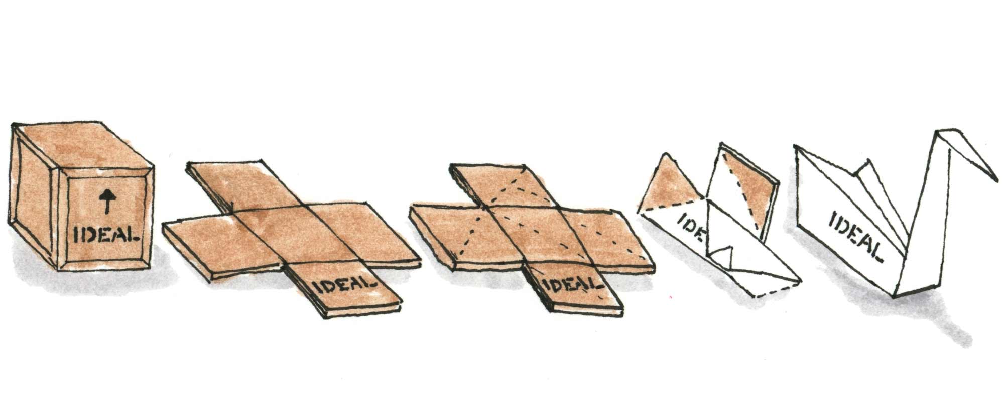
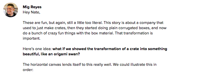
Mig then chipped in with a winning idea followed by some other points, but I latched on to his origami concept.

Even though I’m relatively inexperienced in editorial illustration, that doesn’t always stop me from being overly opinionated about their purpose. I ranted about that on the thread a little bit. Artists are the worst. In the end Mig is usually right.

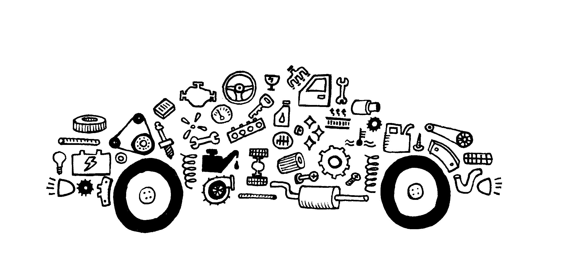
Victory Auto Wreckers

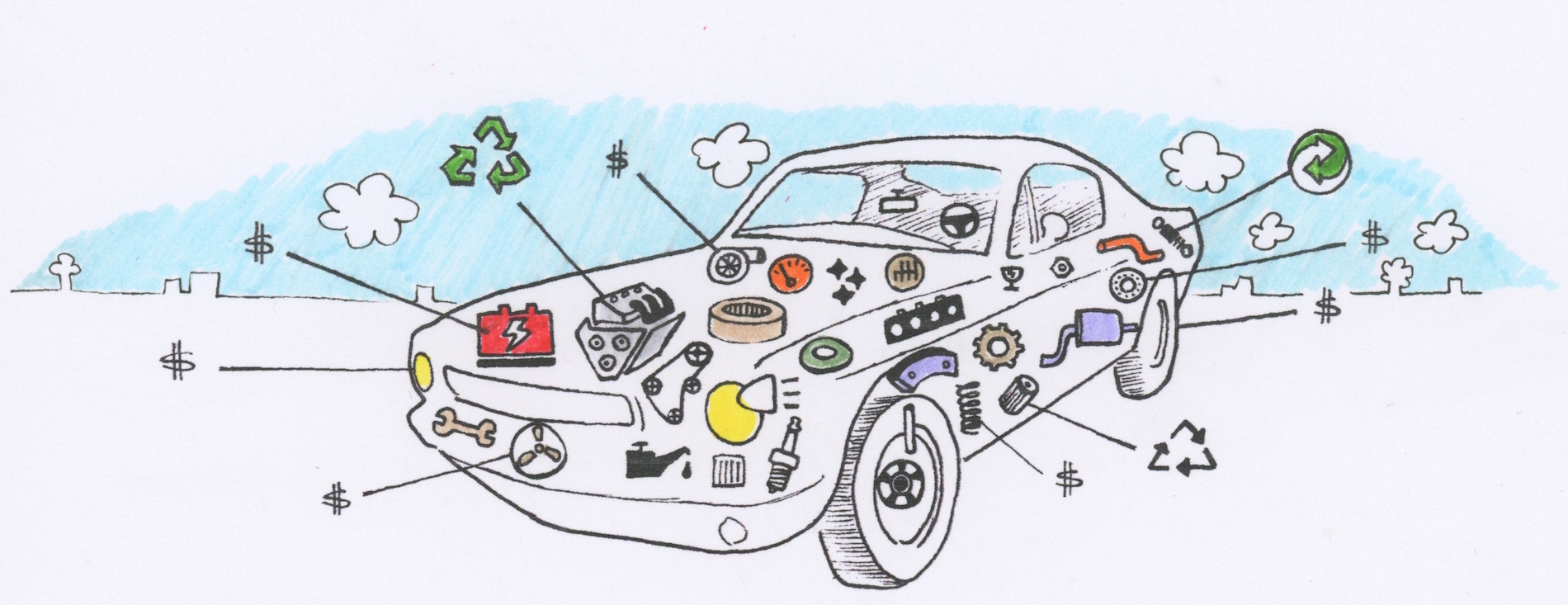
The final header looks like this.

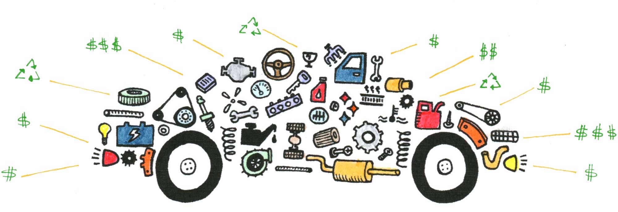
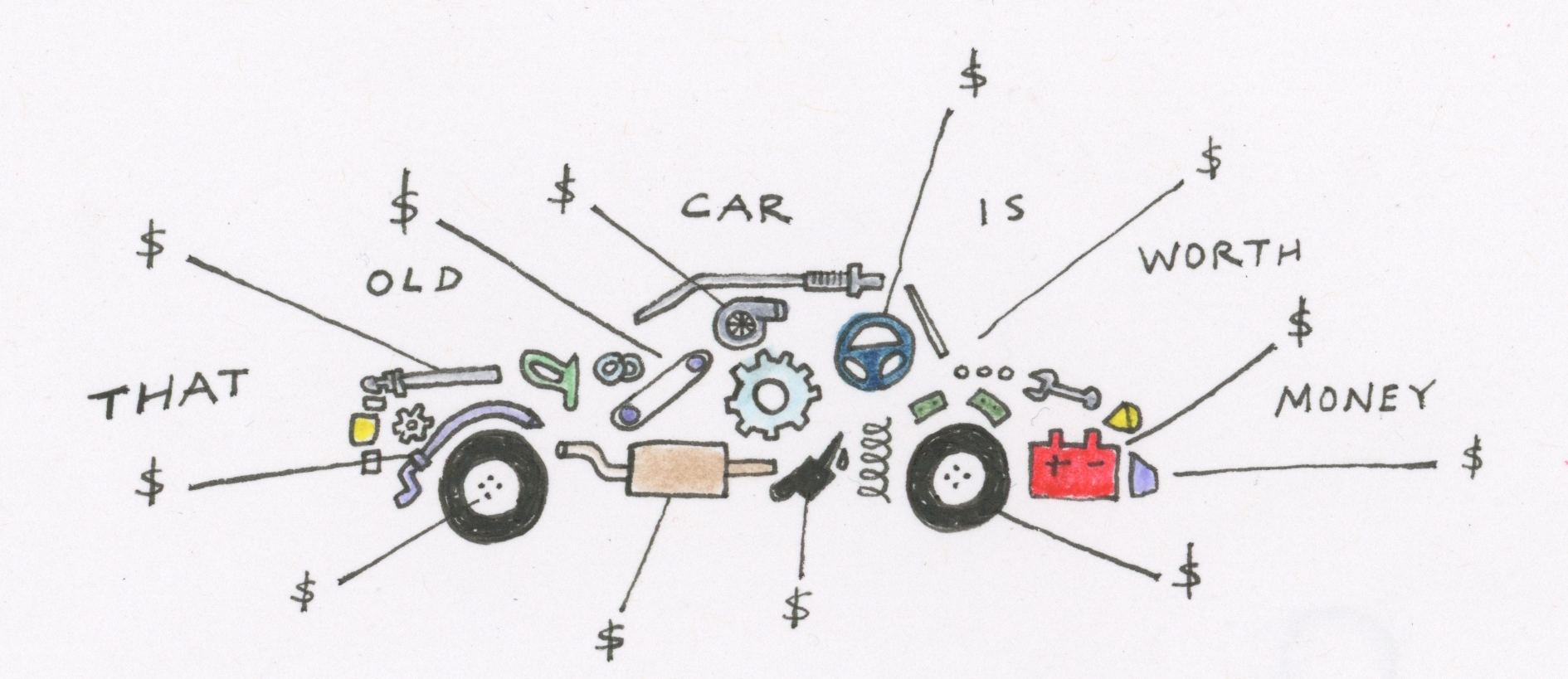
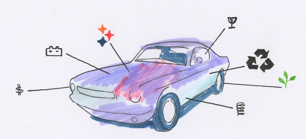
I got a copy of the story and some thematic ideas from Wailin: the afterlife of a car; use every part of the animal; from junkyard to recycling center; and new commercial. That gave me enough to sketch out some ideas.

Mig liked that idea but he wanted to see it more dense with car parts.

Mig wasn’t sure about the car in 3D space, so he wanted me to try one flat but with more parts.

I drew up this, and it evolved into the final image.

Continued…

Solo

Nate Otto
Nate Otto wrote this on 6 comments


About five years ago I consciously willed an art career into existence. At that point I had been working a social services job for about five years. I initially took the job because it wasn’t specifically art related. It was a job I could feel good about — helping people with disabilities — but it wouldn’t tap my creative juices. I had learned many years before when I got a job doing graphic design that being creative at work drained my creative life bars during my down time. This social services job would leave me with enough creative energy to work on my art when I got home, but in reality that wasn’t really happening. Furthermore, the job itself was becoming a frustrating dead end. I had learned that working in a large organization with seven direct bosses wasn’t an environment in which I would thrive. What would my next move be? I was grown up and competent. I felt as though I could do pretty much anything.

Continued…

Basecampy?

Nate Otto
Nate Otto wrote this on 13 comments

If there was a buddy cop movie starring the Geico gecko and the Aflac duck, I’m pretty sure it would outperform “Edge of Tomorrow” at the box office.

We love our anthropomorphized branding mascots. Shortly after Basecamp hatched its own such character, I was watching a big event on TV, and it seemed as though every product in every commercial had sprouted arms and legs. I guess we are part of the zeitgeist.

While I would love to take credit for inventing our Basecamp creature because he came out of the tip of my Micron, the fact is Jason asked me to create it, and it’s pretty hard to go wrong by adding humanoid features to the Basecamp logo. The results are bound to be adorable. Shawnimals had made a similar character months before with the Happy Sherpa, and our design intern this summer, Julia, also made a nice version. That said, I’m proud of the character I helped create, and I’m glad to see it gain momentum. What started as an experiment seems to have taken hold.


At Basecamp, our marketing is more intuitive than contrived. We don’t have dedicated marketing or sales staff. We pay attention to data but it doesn’t own us (take that Noah). I think the philosophy has been that the best marketing is a superior product. Basecamp sells itself, but it doesn’t hurt to have something cool to print on T-shirts. That is where this mascot comes into play. Internally we have been calling it “Basecampy,” and I heard someone call it “Mr. Basecamp” the other day. Let it be known, however, that it is genderless. It reproduces through binary fission. A creation myth is in the works. Basecampy may stick as the name, but we are open for suggestions. Leave your thoughts in the comments.

Extra Drawings

Nate Otto
Nate Otto wrote this on 6 comments


For the last ten months at Basecamp I have been the guy that draws stuff. After making occasional contributions at 37signals over the years, they tapped me to make hand drawn images for the Basecamp marketing site that first appeared in February. Since then my drawings have crept into the app itself, into email blasts, onto banners at Pitchfork, all up in The Distance, plastered on the walls of the office, and into several employee’s avatars. We came up with a creative contract that allows me time to work on my other career as an artist while still providing substantial input at Basecamp.

Continued…

Drawing Trouble

Nate Otto
Nate Otto wrote this on 13 comments

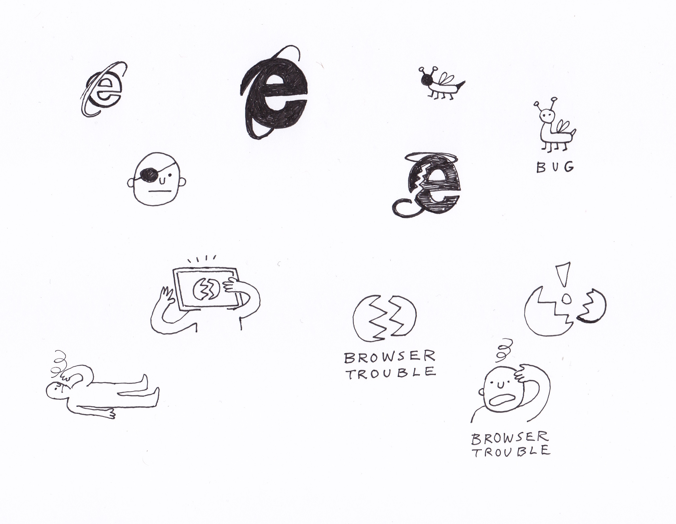
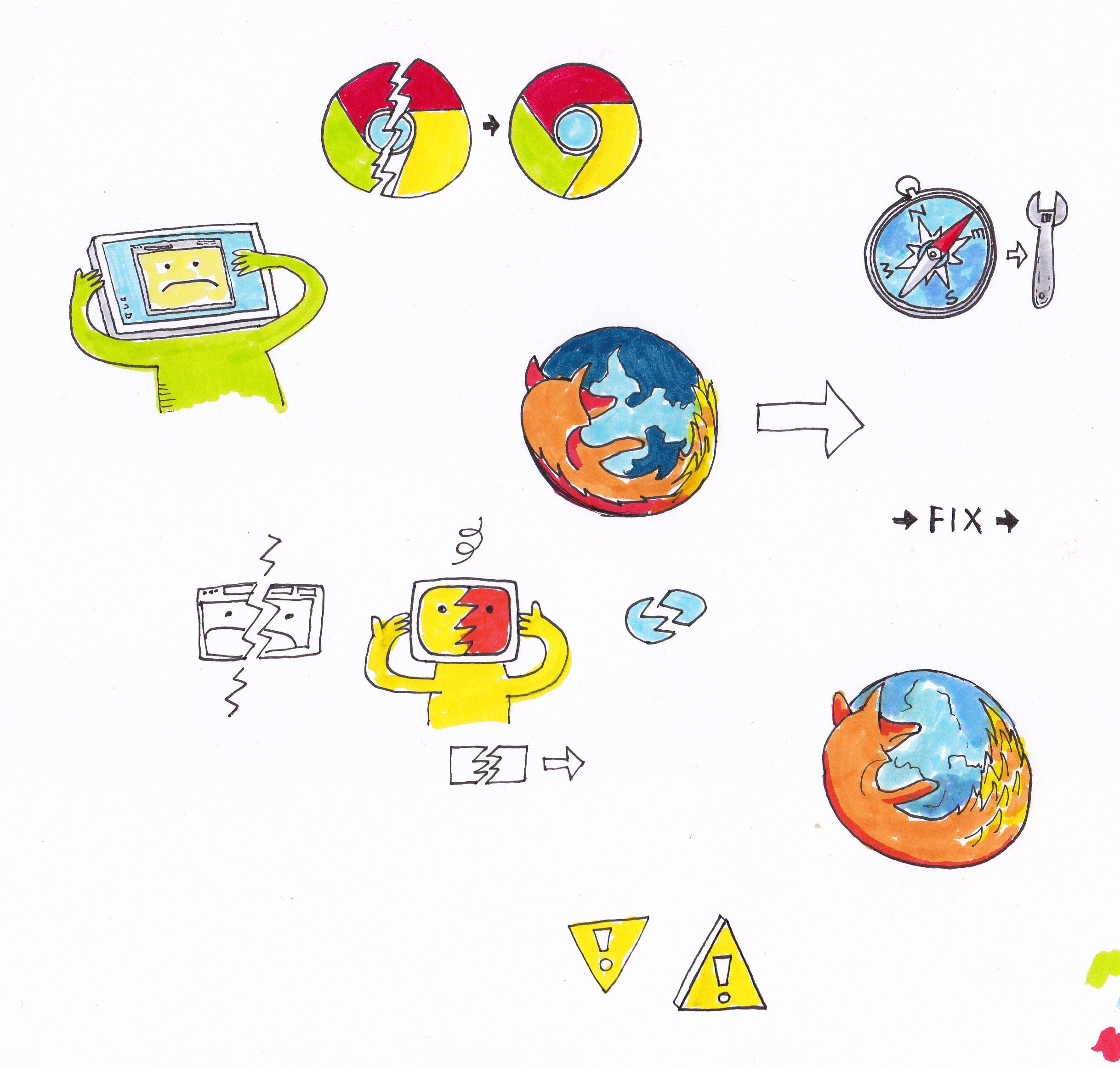
One of the fun aspects of illustrating for the new basecamp.com marketing site is getting assignments from Jamie, Jason, and Mig. One of my favorite briefs I got was “can you illustrate browser trouble?”

Upon getting art requests, I usually search to see if there’s a standardized image for the concept. In this case I didn’t find any imagery that rose to the level of iconic, or was particularly interesting or clear. I opted to start from scratch.

Hmmm, browser trouble

Broken windows, bugs, injuries, cracked screens, dizzy people? I drew a page of visual brainstorms and posted it on our Basecamp project.

Whoever assigns me a drawing—in this case, Jamie—reviews my explorations and then ask me to flesh out one of the directions. Jamie liked the guy with the computer head and suggested that there be a browser window with a frown face.

I drew up another page with color.

With that, Jamie got back to me with “Awesome.”

I waited to see how the image would be implemented. Working with the Basecamp design team is great for me because I’m not particularly strong in Photoshop or Illustrator—those guys are all ninjas. I like to draw, and that is how my time is spent most efficiently.

Usually I have no idea how the images are going to be used until they are implemented live on the website, which is fine by me. I like the surprise of finding a fully rendered web page with my drawings.

Hopefully it is a page you will never have to find.

Million Dollar Art

Nate Otto
Nate Otto wrote this on 22 comments

I have always struggled with the dark art of pricing artwork. Weird magic is involved. I have seen an interested buyer lose interest when I quoted a price that was too low. Oops, I mean… All of a sudden the aura of the work was gone. How could I be a serious artist if I was willing to sell for that price? Could it be that it certain cases, raising the price actually increases the demand?
I was talking about this recently with a friend and he told me an anecdote about a wine seller who had an overstock of a particular wine. When putting the wine on sale didn’t help it move, he greatly inflated the price and suddenly it began flying off the shelves. Does more expensive wine taste better? This Freakonomics podcast explores this question with surprising results. I thought my unsophisticated palette was to blame for the fact that I can’t tell the difference between five dollar and fifty dollar bottles of wine. Turns out I’m not alone. In blind taste tests, the experts may be just as clueless. I think wines with cool labels taste best.
I have discovered that there is something in economics called a Veblen Good, a luxury item for which price equates quality. Art can fit into this category. Economists in the house, please comment. My knowledge of the subject is confined to my recent Google history, but I’m happy it has a name.
At any rate I’m trying to make the best paintings I can. Below is a painting I recently completed. It can be yours for ONE MILLION DOLLARS.

Multitasking

Nate Otto
Nate Otto wrote this on 24 comments

I made this drawing over the weekend while watching football on television, listening to an audiobook, and intermittently using my computer. Multitasking such as this is pretty common these days. Does anyone think that is a good thing?

Everyone Should Make a Painting

Nate Otto
Nate Otto wrote this on 13 comments

Read that headline carefully. Note that I didn’t say everyone should start calling themselves artists and try to sell their paintings for thousands of dollars. I do, however, think the exercise of making a painting is a good one for all human beings.

Painting has been around almost as long as hunting and gathering, and there are very few activities that are so innate to our species. Resolving a painting is a puzzle, a maze, a riddle, a quest, all that. It is a process requiring a billion decisions. Want to try a great game? Put down that electronic device and pick up a brush. Get in touch with your human part. Even Michael Jackson’s former pet chimp, Bubbles, is doing it. Elephants do it. It’s a genus thing.

Getting started, the gathering part

You are going to need some paint, some instruments to paint with, and an object to paint on. Got a $100 bucks? That should be enough to get you started.
First off, don’t use really crappy paint. It is not impossible, but it is significantly harder to make a good painting with student grade paint. Get a set with eight to ten colors. This will cost you 35-50 bucks. Here’s one.
(Note: I’m spreading the links around between Blick, Utrecht, Amazon, and Cheap Joes. All are good options, as is Mom and Pop’s down the street. Look for sales.)
Next, get some brushes. Brushes can be crazy expensive. You don’t need fancy sable brushes to get started, but you shouldn’t get kid stuff either. Get a decent synthetic set with a variety of shapes: 20 – 30 bucks. I like long handles because they can also be used to kill vampires.
Get something to paint on. Canvas works. Do you have your own woodshop and like to make things ten times more complicated than they need to be? No, then don’t stretch your own canvas. There are some great options at the store. Get a few canvasses so you can make mistakes. One of my former instructors told me that you always make your best paintings on shitty canvasses, and I have found that to be true wisdom.
Rig up an easel. You can paint on a tabletop or on the floor, but I think it is really important to learn how to paint from a vertical position. If you have the option, hanging a canvas on the wall and working from there is preferable to working horizontally on a table. There are Easels that cost as much as a ‘04 Lexus ES300. You don’t need that one. Start out with a $20 tabletop easel. If you have more room and this pursuit is going to be lasting, get a real easel. Later on you can store it with the treadmill.
One more thing. You will also need a palette and a cup. Paper towels and newspaper may also be useful. For a palette I recommend a sturdy, disposable, plastic plate. Anything non-porous and solid will do. Glass, marble, old electronics, sealed cardboard, or even another painting will work as a palette. For a cup use something substantial enough in size and stable enough in shape to hold brushes. Old soup cans work. So do plastic beer cups. I have even sawed off the top of a Gatorade bottle and used that. This cup will hold dirty paint water. Choose a cup that you will never want to drink out of again. You don’t want to drink dirty paint water.

Getting started, the hunting part

Let’s paint. If you are painting on the counter with a tabletop easel, put some newspaper or something else down so you don’t ruin the counter, you idiot. Also, take off that expensive suit. Next, put the blank canvas on the easel, raise it to a comfortable height, and take in the intimidating blankness of it all.
Now what? Well you haven’t finished setting up yet. You are going to have to find a place to set some stuff down. Find a little side table, or a stool, if you aren’t already working from a table, and put it on the right or left side of the canvas, depending on your dominant hand. Now, go fill the cup 72% of the way with water and set it on your table. Also find some space for your palette and some tubes of paint. Take out those brushes and drop two of them, bristles first, into the water.
You are ready to paint.

A few things…

Continued…