You’re reading Signal v. Noise, a publication about the web by Basecamp since 1999. Happy !

Noah

About Noah

Noah Lorang is the data analyst for Basecamp. He writes about instrumentation, business intelligence, A/B testing, and more.

The curse of compressing reality

Noah
Noah wrote this on 11 comments

When I’m not analyzing data, I like to make things from wood—furniture, cutting boards, etc. Making something physical after sitting at a computer all day is relaxing and rewarding, and I’m never short on gifts for family and friends.

My woodworking isn’t totally detached from technology, and I rely heavily on forums, websites, online magazines, and YouTube both for inspiration and to learn how to do things. I’ve learned most of what I know about woodworking from people on the Internet, and I’ve been inspired to tackle things that I never would have thought of otherwise.

There’s a downside to seeing all this creation on the Internet—you aren’t seeing the reality of the process. You see someone make an amazing bowl or cutting board in 6 or 12 minutes. Even on the long side, it’s rare to see something creative boiled down to more than an hour of footage or a couple dozen photographs and a few thousand words.

When you compress things down to a shareable size, you miss a lot. What you don’t see is the unglamorous parts: the sharpening of the chisels, the unclogging of your glue bottle, or the parts that don’t fit together. You don’t see the days where you are too tired or unmotivated to go down and work on anything at all, or those cases where life interferes and a “easy one weekend project” ends up stretching to six or twelve months.

This same phenomenon appears in sharing about web design and software. You see a major new version of a mobile app compressed into a few thousand words or an animation in a dozen GIFs, but you don’t see the day lost to fighting Xcode issues or waiting for things to render. You don’t see the mornings where you end up reverting the previous day’s commits entirely.

Any creative endeavor is highly non-linear, but the sharing of it almost always skips a lot of the actual work that goes into it. That’s ok; a clear progression makes for a good story that’s easy to tell. But don’t judge your reality against someone else’s compressed work. It’s ok if it takes you a day to make a cutting board like one that someone made in six minutes on YouTube; the truth is it probably took them a day too.

Are you using your data to write a reference book or tell a story?

Noah
Noah wrote this on 1 comment

I’ve been working on some analysis about the usage of our various mobile applications for Basecamp in advance of our next company-wide get together. As I’ve been going through the process of gathering and analyzing various sources of data, I was reminded yet again of a fundamental question you have to ask yourself before you can really do anything with all that data. Are you writing a reference book or are you trying to answer a question?

Reference books like encyclopedias or statistical abstracts contain many facts about a topic with little or no higher level analysis. The point is to take raw data and summarize it in a form that’s easier and faster to refer to for future analysis, not to break new ground. They’re wonderful to have (I happen to have copies of The Statistical Abstract of the United States ranging from 1880 to 2013 on my bookshelf), particularly if someone else compiles them. That’s because making a reference book is thankless work; the goal is to create accurate summaries of data, and comprehensiveness is valued over creativity.

Analysis to answer a question is far more interesting. Instead of writing an encyclopedia of facts you get to tell a story. You start with a hypothesis that you seek to prove or disprove, and because of that you’ll end up looking at data in a different way than if your goal is just to catalog it. Sharing a story with others is far easier and more impactful than sharing a compendium—people like hearing stories more than they like reading a thesaurus, and they’re far more likely to remember the story. Most importantly, if you choose the question you’re trying to answer properly, you can deliver real and immediate value to a company instead of delivering a work product that may someday be used to answer a question.

It’s hard to go from making an abstract to telling a story, but it’s even harder to tell a story without knowing what question you’re trying to answer. Sometimes it takes a little bit of abstract making to figure out how to articulate the problem you’re really trying to solve. Eventually though, you need to find that key question to tell your story around if you want to be relevant. Think about where people keep their reference books: do you want your analysis to go on a high shelf next to the dictionary, or sit on the top of someone’s desk?

I’m forever thankful for people who produce reference books, but I’ll choose to spend my time and energy telling a story over compiling a fact book any day of the week. Hopefully I have an interesting story to share with the rest of Basecamp in a couple of weeks, but I’m certainly more likely to have an impact than if I just set out to give them a catalog of facts.

The performance impact of "Russian doll" caching

Noah
Noah wrote this on 7 comments

One of the key strategies we use to keep the new Basecamp as fast as possible is extensive caching, primarily using the “Russian doll” approach that David wrote about last year. We stuffed a few servers full of RAM and started filling up memcached1 instances.
A few times in the last two years we’ve invalidated large swaths of cache or restarted memcached processes, and observed that our aggregate response time increases by 30-75%, depending on the amount of invalidation and the time of day. We then see caches refill and response times return to normal within a few hours. On a day-to-day basis, caching is incredibly important to page load times too. For example, look at the distribution of response time for the overview page of a project in the case of a cache hit (blue) or a miss (pink): 
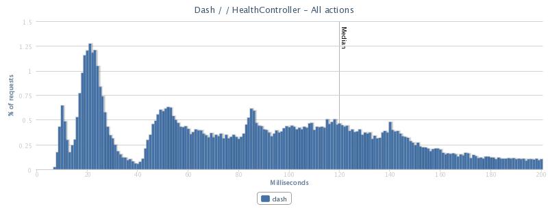
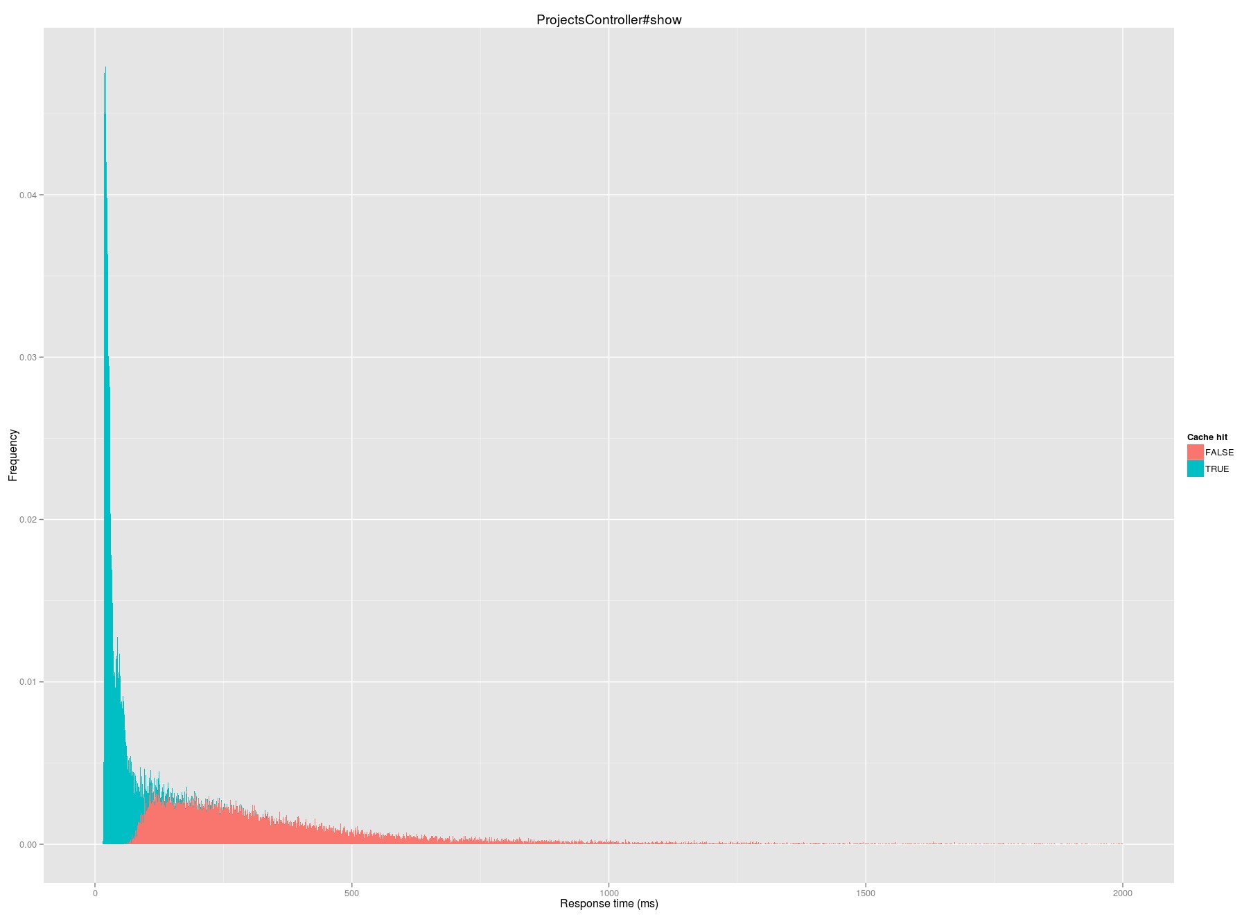
Median request time on a cache hit is 31 milliseconds; on a miss it jumps to 287 milliseconds.
Until recently, we’ve never taken a really in-depth look at the performance impact of caching on a granular level. In particular, I’ve long had a hypothesis that there are parts of the application where we are overcaching; I believed that there are likely places where caching is doing more harm than good.

Hit rate: just the starting point

From the memcached instances themselves (using memcache-top), we know we achieve roughly a 67% hit rate: roughly two out of every three requests we make to the caching server has a valid fragment to return. By parsing2 Rails logs, we can break apart this overall hit rate into a hit rate for each piece of cached content.
Unsurprisingly, there’s a wide range of hit rates for different fragments. At the top of the heap, cache keys like views/projects/?/index_card/people/?3 have a 98.5% hit rate. These fragments represent the portion of a project “card” that contains the faces of people on the project:

This fragment has a high hit rate in large part because it’s rarely updated—we only “bust” the cache when someone is added or removed from a project or some other permissions change is made, which are relatively infrequent events.
At the other end of cache performance with a 0.5% hit rate are views/projects/?/todolists/filter/? fragments, which represent the filters available on the side of a projects full listing of todos:

Because these filters are based on who is on a project and what todos are due when, the cache here is busted every time project access or any todo is updated. As a result, we rarely have a cached fragment available here, and 99 times out of 100 we end up rendering the fragment from scratch.
Hit rate is a great starting point for figuring out what caching is likely effective and what isn’t, but it doesn’t tell the whole story. Caching isn’t free – memcached is blazingly fast, but you still incur some overhead with every cache request whether you get a hit or a miss. That means that a cache fragment with a low hit rate that is also quick to render on a miss might be better off not being cached at all — the costs of all of the misses (the fruitless memcache request) outweigh the benefits of a hit. Conversely, a low hit rate isn’t always bad—a template that is extremely slow to render might still benefit on net even if only 10% of cache requests are successful.

Calculating net cache impact

Continued…

June was a great month

Noah
Noah wrote this on 6 comments

The 37signals Report Card was launched a few months ago, and this month it brings good news across the board.

Our support team made customers happier faster than ever

With 22,000 emails and 7,000 tweets handled in June, the support team blazed a speedy path, with 93% of emails received during our extended business hours answered within an hour. The average email was replied to in just 6 minutes. Chase recently wrote about how we keep those response times down.
The support team also kept customers happy: 94% said they had a great experience in June.

Our applications got a little faster

A few months ago we decided to replace one of the core pieces of our infrastructure: the firewall and load balancer appliances that all of our applications pass through. As we’ve been working on expanding into a second datacenter, we had the opportunity to try out some new equipment that offers dramatic simplification and performance improvements, and we decided to pull the trigger on rolling them out everywhere.
In mid-May, we switched over to our new F5 BigIP appliances in our primary datacenter in Chicago, and customers started to see the performance benefits we’d seen in our testing. The exact impact varies depending on the application and where you are in the world, but most customers are seeing between a 5% to a 25% improvement in overall page load times (overall, we’re running at about a 12% improvement across all of our customers and applications in the six weeks since we rolled these out). This speedup is especially noticeable when downloading large files.
We’re working on a handful of other projects that we hope will bring further speed improvements to our applications in the coming months.

Basecamp got a load of new features

Basecamp continues to improve. Just this month, we saw:

  • A whole new approach to documents, including mobile support and visual tracking of changes.
  • A new and clean look to the emails that Basecamp sends out about your projects, todos, and events.
  • Improvements to the event history throughout Basecamp. There’s less noise and more useful information throughout comment threads, people pages, and the timeline.
  • A ton of bug fixes and upgrades. In all, we deployed Basecamp 207 different times this month.

We’ve got a ton of other great features lining up to launch in the next few months. Stay tuned for future announcements and keep an eye on our performance to see how we’re doing every month.

We answered your questions for an hour live on a Google Hangout. Missed it? You can watch the whole thing here, and stay tuned for more of these in the future.

Ask us anything Thursday at 12:30 p.m. Eastern

Noah
Noah wrote this on 17 comments

Have a question about one of our products, our technology, how we work, or anything else? Here’s your opportunity to ask.

We’ll be answering your questions live on a Google+ Hangout on Air tomorrow (Thursday, June 27th) from 12:30 to 1:30 p.m. Eastern time.

Check out the event here, where you’ll find the video link tomorrow. You can submit questions via Google Moderator or leave them in the comments here.

We’ll have a range of people from 37signals participating to answer your questions, from designers to support and everyone in between. Almost anything is fair game to ask (we’re a private company, so won’t be divulging any financial information, nor will we spill the beans on future features).

We hope you’ll join us. If you can’t make it tomorrow, keep an eye out for future events!

What does mechanical engineering have to do with data science?

Noah
Noah wrote this on 6 comments

Engineering school is about learning how to frame problems. So is data science.

I have a degree in mechanical engineering from a good school, but I’ve never worked a day in my life as an engineer. Instead, I’ve dedicated my career to “data science” — I help people solve business problems using data. Despite never working as a mechanical engineer, that education dramatically shapes how I do my job today.
Most baccalaureate mechanical engineering programs require you to take ten or fifteen core classes that are specific to the domain: statics, stress analysis, dynamics, thermodynamics, heat transfer, fluid dynamics, capstone design, etc. These cover a lot of content, but only a tiny fraction of what you actually face in practice, and so by necessity mechanical engineering programs are really about teaching you how to think about solving problems.
My thermodynamics professor taught us two key things about problem solving that shape how I solve data problems today.

“Work the process”

On the first day of class, rather than teach us anything about entropy or enthalpy, he taught us a twelve step problem solving process. He said that the way to solve any problem was to take a piece of paper and write in numbered sections the following:

  1. Your name
  2. The full problem statement
  3. The ‘given’ facts
  4. What you’ve been asked to find
  5. The thermodynamic system involved
  6. The physical system involved
  7. The fundamental equations you will use
  8. The assumptions you are making
  9. The type of process involved
  10. Your working equations
  11. Physical properties or constants
  12. The solution

The entire course was based on this process. Follow the process and get the wrong answer? You’ll still get a decent grade. Don’t follow the process but get the right answer anyway? Too bad.
Some of these steps are clearly specific to thermodynamic problems, but the general approach is not. If you start from a clear articulation of the problem, what you know, what you’re trying to solve for, and the steps you will take to solve it, you’ll get to the right answer most of the time, no matter how hard the problem looks at the start.

“There is no voodoo”

The other thing that this professor taught us right away was that there was no “voodoo” in anything we were going to study, and that everything can be explained if you take the time to understand it properly.
I’d argue that the fundamental reason why data science is a hot topic now is that businesses want to understand why things happen, not just what is happening — they want to peel back the voodoo. There’s always a fundamental reason: applications don’t suddenly get slow without an underlying cause, nor do people start or stop using a feature without something changing. We may not always be able to find the reasons as well as we’d like, but there is fundamentally an explanation, and the job of a diligent engineer or data scientist is to look for it.

It was totally worth it

People sometimes ask me if I feel like I wasted my time in college by not studying statistics or computer science since the career I’ve ended up in is more closely aligned to those. My answer is a categorical “no” — I can’t imagine a better education to prepare me for data science.

My mother made me a scientist without ever intending to. Every other Jewish mother in Brooklyn would ask her child after school, “So? Did you learn anything today?” But not my mother. “Izzy,” she would say, “did you ask a good question today?”
That difference – asking good questions – made me become a scientist.


Isidor Isaac Rabi, Nobel laureate

Three charts are all I need

Noah
Noah wrote this on 18 comments

The last few years have seen an explosion in new ways of visualizing data. There are new classes, consultants, startups, and competitions. Some of these new and more “daring” visualizations are great. Some are not so great – many “infographics” are more like infauxgraphics.
In everyday business intelligence (the “real world”), the focus isn’t on visualizing information, it’s on solving problems, and I’ve found that upwards of 95% of problems can be addressed using one of three visualizations:

  1. When you want to show how something has changed over time, use a line chart.
  2. When you want to show how something is distributed, use a histogram.
  3. When you want to display summary information, use a table.

These are all relatively “safe” displays of information, and some will criticize me as resistant to change and fearful of experimentation. It’s not fear that keeps me coming back to these charts time and time again: it’s for three very real and practical reasons.

Continued…

Why I learned to make things

Noah
Noah wrote this on 19 comments

Two years ago this week, I started working at 37signals. I couldn’t make a web app to find my way out of a paper bag.

When I started working here, my technical skills were in tools like Excel, R, and Matlab, and I could muddle my way through SQL queries. I had the basic technical skills that are needed to do analytics for a company like 37signals: just enough to acquire, clean, and analyze data from a variety of common sources.
At the time I started here, I knew what Ruby and Rails were, but had absolutely no experience with them – I couldn’t tell Ruby from Python or Fortran. I’d never heard of git, Capistrano, Redis, or Chef, and even once I figured out what they were I didn’t think I’d ever use them – those were the tools of “makers”, and I wasn’t a maker, I was an analyst.

I was wrong.

Continued…