You’re reading Signal v. Noise, a publication about the web by Basecamp since 1999. Happy !

Noah

About Noah

Noah Lorang is the data analyst for Basecamp. He writes about instrumentation, business intelligence, A/B testing, and more.

Behind the Scenes: Twitter, Part 3 - A win for simple

Noah
Noah wrote this on 4 comments

This is the final part of a three part series on how we use Twitter as a support channel. In the first part, I described the tools we use to manage Twitter; in the second part, we built a model to separate tweets into those that need an immediate response or not.

In the arc of a three part series, the final part is supposed to be either a story of triumph or an object lesson.
The triumphant story would be about how we implemented the model we built previously in production, integrated it with our Rails-based Twitter client, and saw massive quantifiable improvements resulting from it. I would look smart, competent, and impactful.
The object lesson is that sometimes practical concerns win out over a neat technological solution, and that’s the story here.

Sometimes good isn’t good enough

The model we built had a false positive rate of about 7%. That’s fair, and in many applications, that would be just fine. In our case, we want to be very confident we’re not missing important tweets from people that need help. Practically, that means that someone would have to check the classification results occasionally to find the handful of tweets that do need an immediate response that slipped through.
After talking to the team, it became pretty clear that checking for mis-classified tweets would be more work than just handling the full, unclassified feed with the manual keyword filtering we have been using. This is a great example of a case where absolute numbers are more important than percentages: while the percentage impact in terms of filtering out less urgent tweets would be significant, the actual practical impact is much more muted because we’ve optimized the tool to handle tweets quickly.
Part of the reason why we’re able to get away with keyword filtering rather than something more sophisticated is because of just how accurate it is with essentially no false positives. There’s actually a surprising amount of duplication in tweets—excluding retweets, the last 10,000 tweets we’ve indexed have only 7,200 unique bodies among them. That means that when a person looks at the first tweet using a phrase they can instantly identify that there’s a keyword that’s going to reoccur (for example, as soon as I started this series, we added “Behind the Scenes: Twitter” to the keyword list) and add it to the keyword list.

Most of the benefit with little effort

Continued…

Behind the Scenes: Twitter, Part 2 - Lessons from email

Noah
Noah wrote this on 4 comments

This is the second in a three part series about how we use Twitter as a support channel. Yesterday I wrote about how we use Twitter as a support channel and the internal tool that we built to improve the way we handle tweets.

One of our criteria in finding or building a tool to manage Twitter was the ability to filter tweets based on content in order to find those that really need a support response. While we’re thrilled to see people sharing articles like this or quoting REWORK, from a support perspective our first goal is to find those people who are looking for immediate support so that we can get them answers as quickly as possible.
When we used Desk.com for Twitter, we cut down on the noise somewhat by using negative search terms in the query that was sent to Twitter: rather than searching just for “37signals”, we told it to search for something like “37signals -REWORK”. This was pretty effective at helping us to prioritize tweets, and worked especially well when there were sudden topical spikes (e.g., when Jason was interviewed in Fast Company, more than 5,000 tweets turned up in a generic ‘37signals’ search in the 72-hour period after it was published), but had it’s limitations: it was laborious to update the exclusion list, and there was a limit placed on how long the search string could be, so we never had great accuracy.
When we went to our own tool, our initial implementation took roughly the same approach—we pulled all mentions of 37signals from Twitter, and then prioritized based on known keywords: links to SvN posts and Jobs Board postings are less likely to need an immediate response, so we filtered accordingly.
Using these keywords, we were able to correctly prioritize about 60% of tweets, but that still left a big chunk mixed in with those that did need an immediate reply: for every tweet that needed an immediate reply, there were still three other tweets mixed in to the stream to be handled.
I thought we could do better, so I spent a little while examining whether a simple machine learning algorithm could help.

Lessons from email

While extremely few tweets are truly spam, there are a lot of parallels between the sort of tweet prioritization we want to do and email spam identification:

  • Have some information about the sender and the content.
  • Have some mechanism to correct classification mistakes.
  • Would rather err on the side of false negatives: it’s generally better to let spam end up in your inbox than to send that email from your boss into the spam folder.

Spam detection is an extremely well studied problem, and there’s a large body of knowledge for us to draw on. While the state of the art in spam filtering has advanced, one of the earliest and simplest techniques generally performs well: Bayesian filtering.

Bayesian filtering: the theory

Continued…

Behind the Scenes: Twitter, Part 1

Noah
Noah wrote this on 7 comments

This is the first in a three part series looking at how we manage Twitter as a support channel. In the parts 2 and 3, I’ll discuss some of the finer points of how we sort through hundreds of tweets each day to get people answers quickly.

Since the launch of the new Basecamp back in March, we’ve been encouraging the use of Twitter as a support channel. On our help form we encourage people with simple questions to use Twitter rather than sending an email, and we monitor mentions of 37signals throughout the day. We’ve always gotten support requests via Twitter and answered them, but it’s only this year that we’ve actively encouraged and focused on it.
Our Twitter presence has grown substantially: in October of this year, 37signals was mentioned an average of 443 times every weekday, roughly double what it was in October 2011. Not all of these need an immediate reply from our support team – many are people sharing links or things that they found interesting. The 60 or so replies we do send a day in response to immediate support requests represent a little less than 10% of our total support “interactions”.
One of the things I spend part of my time working on is how to improve the speed and quality of the responses that we provide to customers, and part of that involves providing advice on the best tools and processes for the support team to do their job. As far as Twitter goes, the biggest pain point is the actual tool used to monitor and send tweets.

The search for a Twitter tool

Since we got serious about Twitter, we’ve mostly used the built in Twitter functionality that our support tool (Desk.com) provides. When I asked the team how it was working for them a couple months ago, the general reaction was tepid. The consensus was that while it gets the job done, it was rather slow to use, and the large number of retweets and links to SvN posts mixed in makes it hard to get people with urgent questions answers promptly. Most of the team was using it, but no one was happy about it.
What did we want in a tool?

Continued…

How I came to love big data (or at least acknowledge its existence)

Noah
Noah wrote this on 10 comments

“Big data” is all the rage these days – there are conferences, journals, and a million consultants. Until a few weeks ago, I mocked the term mercilessly. I don’t mock it anymore.

Not a “big” data problem

Facebook has a big data problem. Google has a big data problem. Even MySpace probably has a big data problem. Most businesses, including 37signals, don’t.
I would guess that among our “peer group” (SaaS businesses), we probably handle more data than most, but our volume of data is still relatively small: we generate around a terabyte of assorted log data (Rails, Nginx, HAproxy, etc.) every day, and a few gigabytes of higher “density” usage and performance data. I’m strictly talking about non-application data here – not the core data that our apps use, but all of the tangential data that’s helpful to improve the performance and functionality of our products. We’ve only even attempted to use this data in the last couple of years, but it’s invaluable for informing design decisions, finding performance hot spots, and otherwise improving our applications.
The typical analytical workload with this data is a few gigabytes or tens of gigabytes – sometimes big enough to fit in RAM, sometimes not, but generally within the realm of possibility with tools like MySQL and R. There are some predictable workloads to optimize for (add indexes for data stored in MySQL, instrument in order to work with more condensed data, etc.), but the majority aren’t things that you ordinarily plan for particularly well. Querying this data can be slow, but it’s all offline, non-customer facing applications, so latency isn’t hugely important.
None of this is an insurmountable problem, and it’s all pretty typical of “medium” data – enough data you have to think about the best way to manage and analyze it, but not “big” data like Facebook or Google.

Technology changes everything

Continued…

The business intelligence scorecard

Noah
Noah wrote this on 9 comments

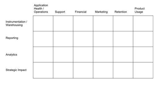
One way I like to think about the different aspects of “business intelligence” is as an organizational scorecard. It helps to maintain a mental model of what you’re doing and why when prioritizing investments of time or money.

On this scorecard, the rows represent analytical competencies of growing sophistication from top to bottom. I classify these competencies as:

  1. Instrumentation / Warehousing – can you measure things, and can you store that data in a clean, retrievable format?
  2. Reporting – can you get the data out of your warehouse and into the hands of people who can use it?
  3. Analytics – can you add value to raw data with analytics, benchmarks, etc.?
  4. Strategic Impact – do the results of your data and analysis impact the direction of the organization in a meaningful, accretive way?

The columns represent different functional areas of relevance to your organization. For our purposes, I use ‘Application Health/Ops’, ‘Support’, ‘Financial’, ‘Marketing’, ‘Retention’, and ‘Product Usage’. This taxonomy isn’t completely clean, and there’s some overlap, but they’re roughly distinct areas.

When you draw this grid out, you end up with something that looks like the below.

I’ve drawn my columns in what I generally think of as increasing long-term strategic importance. Every column on here is critically important, but our long-term success comes from people getting value from using our products, and so I put that at the far right. You could make an argument for ordering them differently, but the general idea is the same.

My aspiration is always to spend most of my time and energy in the bottom right few boxes—doing analytics and having impact on things like retention and usage.

The reality is that in order for those to matter at all, you have to have rock solid instrumentation and reporting across the board, and some of the functional areas on the left side of the chart are more pressing – if your applications are falling over and you don’t know why, or your team is buried under thousands and thousands of support tickets, all the wonderful analytics in the world on usage probably won’t keep your company heading in the right direction.

Take a minute and give your organization a letter grade in each of these boxes. Think about what you would have given yourself in each box a year or two ago, and where you’d like to be a year or two from now. Have you made progress? Do you still have work to do?

Picking the right analysis to solve the real problem

Noah
Noah wrote this on 21 comments

My job is to gather, study, and understand data and its implications, and then make recommendations to help the business improve – in short, to deliver business value from data.

One of the things you learn when you work in analytics is that there’s an endless depth to virtually any problem – you can keep digging deeper and deeper forever. One of the most valuable skills you can learn is deciphering what’s needed to solve the real problem – when has the bulk of the business value been delivered, and when are you doing things that are just intellectual interesting but not actually valuable?

I’ve found that I end up performing analyses in one of four different levels of detail:

  1. The quick ‘n dirty: These are short and simple – for example, a designer wants to know what the distribution of the number of posts on a project is because they’re designing a new screen, or David or Jason wants to know how our support ticket response time is trending. These are some mix of data retrieval and analysis, but the results don’t need a lot of explanation or interpretation. Most of the time, the results are communicated via IM or Campfire, and I end up spending between 30 seconds and 30 minutes.

  2. The basic look: The most common analysis I do is a moderate depth one – something like a look at conversion rates and retention by traffic source, or a basic overview of how people are using a specific feature in the new Basecamp compared to how they used a similar feature in Basecamp Classic. The results here are more involved and need some interpretation or “color commentary”, and may come with specific recommendations. This sort of analysis gets written up in a post on one of our Basecamp projects, and usually takes somewhere between a couple hours and a day.

  3. The deep dive: When it comes to understanding root causes and developing significant recommendations, a more in depth analysis is called for. For things like understanding the root causes of cancellation or support cases, the bulk of the work tends to be on analysis, interpretation, and then actionable recommendations to address those causes. Frequently, there’s some instrumentation or reporting project that spins off from this as well – I may add a report to our dashboard on the topic so we can more easily track it over time. These analyses usually get written up in a longer document with significantly more detail, and sometimes come with a live or recorded video explanation and discussion as well. This sort of analysis usually takes between 1 and 3 weeks.

  4. The boiled ocean: If you want to understand a substantive issue from every single possible angle, try every statistical technique in the book, and write a report with every possible visualization, then you’re probably looking at investing multiple months in a problem. We haven’t done anything like this in the 18 months I’ve been here at 37signals, and that’s by design: in most cases, this type of analysis ends up providing essentially the same business value as a deep dive that takes a fraction of the time.

Next time you’re faced with an analytical problem, ask yourself what the real underlying problem you’re trying to solve is, and figure out what depth of analysis is the required to deliver the bulk of the business value; after all, your job is probably really about improving the business.

A/B Testing: It's not about the results, and it's definitely not about the why

Noah
Noah wrote this on 8 comments

In college, I worked for a couple of years in a lab that tested the effectiveness of surgical treatments for ACL rupture using industrial robotics. Sometimes, the reconstructions didn’t hold. The surgeons involved were sometimes frustrated; it can be hard to look at data showing that something you did didn’t work. But for the scientists and engineers, all that mattered was that we’d followed our testing protocol and gathered some new data. I came to learn that this attitude is exactly what it takes to be a successful scientist over the long term and not merely a one-hit wonder.

Occasionally, when we’re running an A/B test someone will ask me what I call “success” for a given test. My answer is perhaps a bit surprising to some:

  • I don’t judge a test based on what feedback we might have gotten about it.
  • I don’t judge a test based on what we think we might have learned about why a given variation performed.
  • I don’t judge a test based on the improvement in conversion or any other quantitative measure.

I only judge a test based on whether we designed and administered it properly.

As an industry, we don’t yet have a complete analytical model of how people make decisions, so we can’t know in advance what variations will work. This means that there’s no shame in running variations that don’t improve conversion. We also lack any real ability to understand why a variation may have succeeded, so I don’t care much whether or not we understood the results at a deeper level.

The only thing we can fully control is how we set up the experiment, and so I judge a test based on criteria like:

  • Did we have clear segmentation of visitors into distinct variations?
  • Did we have clear, measurable, quantitative outcomes linked to those segments?
  • Did we determine our sample size using appropriate standards before we started running the test, and run the test as planned, not succumbing to a testing tool’s biased measure of significance?
  • Can we run the test again and reproduce the results? Did we?

This might sound a lot like the way a chemist evaluates an experiment about a new drug, and that’s not by accident. The way I look at running an A/B test is much the same as I did when I was working in that lab: if you run well-designed, carefully implemented experiments, the rest will take care of itself eventually.

You might hit paydirt this time, or it might take 100 more tests, but all that matters is that you keep trying carefully. I evaluate the success of our overall A/B testing regimen based on whether it improves our overall performance, but not individual tests; individual tests are just one step along what we know will be a much longer road.

Mini tech note: MySQL query comments in Rails

Noah
Noah wrote this on 13 comments

One of the things we’ve added to our applications in the last few months is a little gem that (among other things) adds a comment to each MySQL query that is generated by one of our applications.

Now, when we look at our Rails or slow query logs, our MySQL queries include the application, controller, and action that generated them:

Account Load (0.3ms)  SELECT `accounts`.* FROM `accounts`
WHERE `accounts`.`queenbee_id` = 1234567890
LIMIT 1
/*application:BCX,controller:project_imports,action:show*/

When we’re trying to improve a slow query, or identify a customer problem, we never have to go digging to understand where the query came from—it’s just right there. This comes in handy in development, support, and operations – we used it during a pre-launch review of unindexed queries in the brand new Basecamp which launched a couple months ago. If you combine this with something like pt-query-digest, you end up with a powerful understanding of how each Rails action interacts with MySQL.

It’s easy to add these comments to your Rails application in a relatively unintrusive way. We’ve released our approach that works in both Rails 2.3.x and Rails 3.x.x apps as a gem, marginalia.

marginalia (mar-gi-na-lia, pl. noun) — marginal notes or embellishments
Merriam-Webster

We’ve been using this in production on all of our apps now since December, ranging from Rails 2.3.5 to Rails master and Ruby 1.8.7 to 1.9.3. You should be able to have it running in your application in a matter of minutes.

It’s worth acknowledging that anytime you modify the internals of something outside your direct control there are risks, and that every function call adds some overhead. In our testing, these have both been well worth the tradeoff, but I absolutely encourage you to consider the tradeoff you’re making for yourself every time you instrument or log something. You may certainly have a different set of tradeoffs, and you should absolutely test on your own application.

Have a suggested improvement to our sample code or another way to do this? We’d love to hear it.

Thanks to Taylor for the original idea, and to Nick for helping to extract it into its own gem.

How's the new Basecamp doing so far?

Noah
Noah wrote this on 15 comments

About three weeks ago we launched the all new Basecamp, and it’s been an exciting few weeks.

Since I’m a numbers kind of guy, I wanted to share some things I’ve seen in looking at the new Basecamp that are particularly exciting:

  • This has been our strongest product launch ever. The new Basecamp is our fifth “big” product launch, and it’s our strongest yet in terms of signups in the period immediately after launch. With two weeks in the books, we had more than 3x more signups than we had in the same period after our last brand new product launch (for Highrise back in 2007). If you go all the way back to Basecamp’s original launch in 2004, signups for the new Basecamp were more than 30 times higher.

  • We’ve brought in lots of new customers. About a third of new Basecamp accounts immediately after launch were from people who migrated their existing account, and about half were from people who previously held some sort of 37signals account before. While we’re thrilled to see so many of our loyal customers enjoying the new Basecamp, we’re even more excited to see so many new people trying Basecamp for the first time.

  • Usage is fantastic. On a per account basis, new Basecamp accounts are creating twice as many projects and todo items as on Basecamp Classic, as well as more attachments, messages, comments, calendar events, and more.

  • We have a great new marketing site. Jamie, Mig, and Jason F. really knocked it out the park with our new public site at basecamp.com. We’ve sustained substantially higher traffic levels from all kinds of sources more than two weeks after launch, and conversion rate is up 76%. We’re always testing new ideas here, but the early results are bright.

  • Basecamp Classic continues to perform well. Plenty of existing customers continue to use Basecamp Classic. Retention rates haven’t dipped, and usage levels are right where they were before we launched the new Basecamp. This is great news – our strategy of maintaining two separate Basecamps (Classic and new) seems to be working so far with no ill effects.

We’re excited and encouraged by the first few weeks of the all new Basecamp. We have lots of great improvements planned for it in the coming weeks and months – we’re hard at work on a few already.

If you don’t have an account, get started with a 45-day free trial now, or join us for a free introductory class about the new Basecamp.