You’re reading Signal v. Noise, a publication about the web by Basecamp since 1999. Happy !

Ryan

About Ryan

Ryan's been getting to the bottom of things at Basecamp since 2003.

Rediscovering Jakob Nielsen

Ryan
Ryan wrote this on 49 comments

When I was first getting serious about web design I discovered Jakob Nielsen’s Alertbox and was totally inspired. There was something about the ascetic style, black verdana type, yellow header and scattershot of bold that just fascinated me. I pored over the site and stayed up late at night reworking projects with fresh inspiration and higher standards. I even found a company to work for that was as nerdy about this stuff as I was. And then somehow—I don’t know how—I just forgot about the guy.

Today my forgetfulness took a kick in the seat when Jason linked me to this Alertbox article. This site just doesn’t look old. It’s still fresh and clear and distinctive. And the content? Show numbers as numerals. The F-Pattern. Active versus passive voice. The first two words. It’s all rock solid. It still has that new car smell. There’s no fad in here.

Jakob Nielsen's Alertbox

Timelessness is a mark of mastery. And few things are healthier than being reminded of how your best work rests on the shoulders of people who inspired you through their example. So I’m glad I took some time today for a usability refresher from Mr. Nielsen.

Hindsight on default styles in Basecamp

Ryan
Ryan wrote this on 36 comments

In Basecamp’s early days “semantic HTML” was all the rage. It still is in some ways, but we were hitting the kool-aid a lot harder than we are today. One area where this has bitten us is in our default styles for the UL element.

When we started styling Basecamp we were mostly working with interface elements, not text documents. True to the semantic kool-aid we used UL tags mainly for tabs, category links, lists of project links, attached files etc. Everything but actual plain-jane bullet lists.

It all worked fine, but just now I wanted to include a bulleted list in some copy I’m sketching for a dialog. Check out how the unordered list looks in this draft using default styles:

That list in the middle is actually a UL. There are no bullets, the font size is wonky, the margins are different. This default must have made sense when all of our ULs followed a certain pattern for interface use. But here in the future, I wish we would’ve been more selective about those styles and left the default alone. Or better yet, we could’ve used DIVs in the first place for those tabs, attachments, and category links. I’ll surely keep this in mind the next time we start a fresh project.

Coding style: Helpers that return params

Ryan
Ryan wrote this on 20 comments

I was digging in some old Basecamp code today while working on a new feature and I ran into this bit of view code:

<div class="rss">
  <%= rss_link :icon %>
  <p><%= rss_link "Project RSS feed" %></p>
</div>

This code renders an RSS icon wrapped in a link and a text link beside it:

I wanted to add a class to the linked RSS icon. If the template used the standard Rails link_to helper to render the linked image I would know how to provide the class with an options hash. But rss_link isn’t a standard helper, so I had to dig up the definition to see what’s possible. It wasn’t very pretty:

def rss_link(body, options={})
  if body == :icon
    body = image_tag("feed-icon-14x14.png", :size => "14x14", :alt => "RSS Feed",
                     :border => "0", :align => "absmiddle")
  end

  link_to(body, { :controller => "project", :action => "rss_confirm",
      :return_to => request.request_uri }, options)
end

It turned out we were using a single helper to render either a text link or a linked icon for the RSS feed depending on the ‘body’ param. It works fine, but I would have never been able to guess how it works without looking inside the method definition. Now I can see that it is possible to pass an options hash, but I had to look to find that out.

It would have been better in this case to use the standard link_to in the template and delegate the truly unique stuff to helper methods. The unique bits that I don’t want to repeat are the long url_for hash and the image tag params. Here’s a refactoring that splits the helper into two methods to return only those special parts:

def rss_path
  { :controller => "project", :action => "rss_confirm",
    :return_to => request.request_uri }
end

def rss_icon
  image_tag("feed-icon-14x14.png", :alt => "RSS Feed", :class => "rss_icon")
end

These helpers allow me to stick with link_to, which is a helper that I and my team already understand:

<div class="rss">
  <%= link_to rss_icon, rss_path, :class => 'image' %>
  <p><%= link_to "Project RSS feed", rss_path %></p>
</div>

It’s much easier to tell at a glance what this code is doing and it’s easier to make changes because the link_to helper is standard.

The next time we want to change this bit of view code, we won’t have to dig into the helper to check if it takes an options hash. It’s clear from the call to link_to that we’re simply providing method calls as params. I hope this tip helps to make your view code a bit more readable and more predictable to maintain.
Giving the trick away gave nothing away, because you still couldn’t grasp it.


Magic and the Brain: Teller Reveals the Neuroscience of Illusion — This reminds me of how great chefs give away their recipes without fear of competition. The explanations you get about how things work are just concepts and pointers to get the ball rolling. The actual skill, performance, or understanding comes from the long haul of practice toward mastery.

The method still works

Ryan
Ryan wrote this on 20 comments

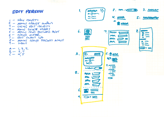
While I might use some different language today, this technique I posted in 2004 (inspired by Alexander) is still a major help when I’m designing a UI with many elements to juggle. The reason I come back to it is that it helps me design with language first instead of empty templates. Too often a design starts top-down with empty content areas (maybe a main column and a sidebar) and then we fill those boxes in until its “done.” Filling in the boxes would work fine, except having a bunch of stuff on the page doesn’t mean we served the design goals.

Here’s a refresher:

  1. List all the things a screen should do. What should the customer be able to accomplish? What information are you sure should be displayed? Which affordances are necessary for customers to start a process or reach a goal? Label these things with numbers.
  2. Look for any numbered items that relate to each other, conceptually or spatially. Label these groups of numbers with a letter.
  3. Sketch a design (or multiple designs) for each number or letter group.
  4. Combine the individually sketched blocks into a unified design. Let the pieces fall together into a whole.

And don’t forget, the next step isn’t a polished wireframe. It’s code you can click on!

Album art revival at We Are Hunted

Ryan
Ryan wrote this on 9 comments

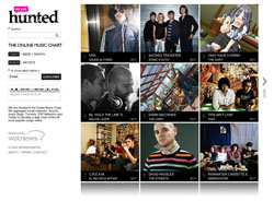
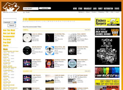
A Wired article this morning led me to We Are Hunted. It’s an awesome example of the difference UI makes. There are tons of music sites out there, but most are 90% chrome. Compare We Are Hunted to Rush Hour or Sounds of the Universe. The other sites are a lot of text and navigation with tiny postage-stamp album covers. We Are Hunted flips the formula by focusing on album art and the result is like standing in a record store. There’s art in your face everywhere. Scenes and styles and provocation and “howtf is this record going to sound?” all lurk in an album cover. Clicking a cover to play the linked track gives you the familiar feeling of taking a CD home and examining the art while the first track streams through the speakers.


We Are Hunted

A coventional music store UI

Aesthetics aside, this comes back to UI design. Music sites have mostly the same elements. A cover image thumbnail, a play link, the artist name, the track name, etc. The difference comes in the triage. How do you decide what’s important? What do you focus on? What do you want your customer to see first? To see second? We Are Hunted gave album art the top slot and the result sets their site apart and gives their customers a markedly different experience.

Product Decisions: Why did we spend time on a color picker for Backpack?

Ryan
Ryan wrote this on 20 comments

Last week we introduced custom color schemes to Backpack. While our customers love the new feature, we’ve also gotten questions about why we chose to build a color picker for Backpack. Aren’t there other things we could spend our time on? Why was customizing colors a priority? Actually custom colors were the latest push in a series of updates to take Backpack a level up. Here’s a look at the string of updates and how custom colors fit in to the story.

In late 2008 we decided Backpack was due for some development. The last major push was “BPMU”—Backpack Multiuser—in February ‘08. The multiuser capability gave businesses and small teams the chance to organize their lives and work with Backpack. Adding multiple users to Backpack was a big effort. As usual, we did the bare minimum necessary, but there were still a lot of details, edge cases, and challenges. By the time we launched in February ‘08, we were glad to be finished and also really excited to use Backpack together as a team.

Marinating with multiple users

The best part of building ‘as little as possible’ comes after launch. Every feature you skipped or held off on is free open space in the app for later development. Instead of a lot of baggage and maintenance, a bare-minimum release means new possibilities for feedback. After we launched BPMU in February, the customer feedback and personal experience we accumulated became a magnetic field that gradually pointed our compass for development. By late 2008, we knew where to go next.

Continued…

New in Backpack: Customize your color scheme

Ryan
Ryan wrote this on 18 comments

We just released a really great update to Backpack. Now you can completely customize your color scheme! Whether you want to personalize your individual account or brand your business account, this feature is a lot of fun.

You can set your own colors for the header, the links in the header, the sidebar, and also the general link color. The color customizer uses the same beautiful picker we released for Basecamp last year. And you can preview each color choice live, so you can be sure each color fits perfectly with the rest.

To customize your color scheme, just click the “Settings” link. Once you’re there you’ll also find a new selection of preset color schemes (by our designer Jamie) to give you inspiration. Thanks for your continued support and enjoy customizing your colors in Backpack!

weather underground.png

Weather Underground’s iPhone-optimized version is the best weather experience out there. I love how their forecast explains today’s weather relative to yesterday’s weather. I highly recommend bookmarking it on your iPhone home screen.