Love this desk by Warren Platner. Bronze base, rosewood millwork, leather top. It’s so heavy, but with a chair in front it looks like it’s floating.
You’re reading Signal v. Noise, a publication about the web by Basecamp since 1999. Happy !

Love this desk by Warren Platner. Bronze base, rosewood millwork, leather top. It’s so heavy, but with a chair in front it looks like it’s floating.
If you’re interested in adding retina image support to your website or app and you happen to be using SCSS, here’s a handy shortcut that makes it dead simple.
Just include this SCSS mixin in any rule and specify the high resolution image’s path and device independent pixel dimensions. Here’s an example:
div.logo {
  background: url("logo.png") no-repeat;
  @include image-2x("logo2x.png", 100px, 25px);
}
Putting the high resolution alternative in the same rule as the normal image instead of putting it in a separate @media query rule or in different stylesheet altogether is a big win in terms of clarity in our CSS. It’s easier to read, easier to understand and easier to maintain.
The image-2x mixin detects high resolution displays like this:
@mixin image-2x($image, $width, $height) {
  @media (min--moz-device-pixel-ratio: 1.3),
         (-o-min-device-pixel-ratio: 2.6/2),
         (-webkit-min-device-pixel-ratio: 1.3),
         (min-device-pixel-ratio: 1.3),
         (min-resolution: 1.3dppx) {
    /* on retina, use image that's scaled by 2 */
    background-image: url($image);
    background-size: $width $height;
  }
}
The mixin not only makes development easier, but it centralizes the definition of high resolution displays so it can easily be changed globally as more devices come to market. The @media query is based on the one in Thomas Fuchs’ Retinafy book but, for example, we’ve already modified it to define the Google Nexus 7 with it’s 1.3 pixel ratio as a retina-capable device.
A key insight here is that with SCSS, @media queries can be nested inside other rules. Such that these both work the same:
@media print {
  body {
    // print styles
  }
}

body {
  @media print {
    // print styles
  }
}
Purists of hand-crafted CSS may rail that this method results in the rule being repeated in the compiled CSS each time we use this mixin and that’s true. Basecamp is light on images so we’re talking about a handful of repetitions, not dozens or hundreds. It also seems likely that as SCSS continues to improve, these rules will be smartly combined. For now that trade-off is worth the improved clarity and convenience in our code.
Speed is a core value for 37signals and it’s easily Basecamp’s most important feature. When you have the luxury of that kind of focus, decisions about the product are easier to make because you have something to measure against. Will this feature make Basecamp slower? Is it worth that trade-off? So when we designed the mobile web version of Basecamp we knew that speed would be just as important as it was in the full desktop version. What was different was how we got there.
On the desktop, Basecamp’s speed is the result of some nifty tech that minimizes network requests, reduces page rendering and aggressively caches content. Moving through a Basecamp project is nearly instant as new content appears in real-time without re-loading the page. It’s great! I typically keep Basecamp open in my browser all day long as my co-workers’ activity streams in on the Progress screen.
When it came to the mobile version the goal that Basecamp should be super-fast was the same, but there were new forces at work: low cellular bandwidth, small touch-enabled screens, slow JavaScript performance, and context considerations (what’s useful and functional on mobile). It was tempting to turn to responsive design techniques on this project. Basecamp was already functioning fine on mobile browsers, but it required a lot of pinching, swiping, and zooming. CSS media queries would have let us craft a mobile layout for all kinds of devices with a limitless array of screen configurations. We’d be on the exact same codebase with all the same features – and new features would automatically be available on mobile when they launch as long as we remembered to test and optimize them.
Only using responsive design for Basecamp mobile would have been like fitting a Prius body to a Hummer… under-the-hood it would have been all wrong.
On the surface it sounded great, but there were some big problems. The JavaScript that powers the real-time feel of Basecamp is heavy both in terms of file size and resource usage. This is no problem on the desktop where bandwidth is abundant and CPUs are excessively fast, but mobile browsers aren’t nearly as capable of processing JavaScript and the initial download would have been oppressive.
Not only would the browser have to download and process all that code, but much of it would have gone unused. Making a design responsive generally means taking things away. You hide features, menu items, sidebars – anything that isn’t needed in the mobile context. They’re still present in the document and the mobile browser still has to download and load into memory all the CSS and JavaScript that defines them. Not to mention the additional CSS overrides that you added to the stack in order to define the responsive layout in the first place. Only using responsive design for Basecamp mobile would have been like fitting a Prius body to a Hummer. It might have looked like a mobile web app, but under-the-hood it would have been all wrong.
Continued…Don’t worry about a style. It will creep up on you and eventually you will have to undo it in order to go further. Be like a river and accept everything.
Some of my most beloved products are those that make ME amazing at something that matters to me, even if I am kicking and screaming and swearing at the product while using it. Of course if I am kicking and screaming and swearing, I’m obviously having a compromised experience… One that might prevent me from producing something wonderful. But I’ll still take a poor UX that makes me truly better at something I care about, than the beautiful, artful, exquisite “Who Cares” product.

Attack of the prophylactic warning dialog. The net effect is an advertisement that my account may be corrupted.
Shades of the old e-commerce warning: “Do not press the back button or your card may be charged twice!!!”

This has been a top request in the new Basecamp since launch and we’re really thrilled to finally deliver. It’s live for every Basecamp account today.
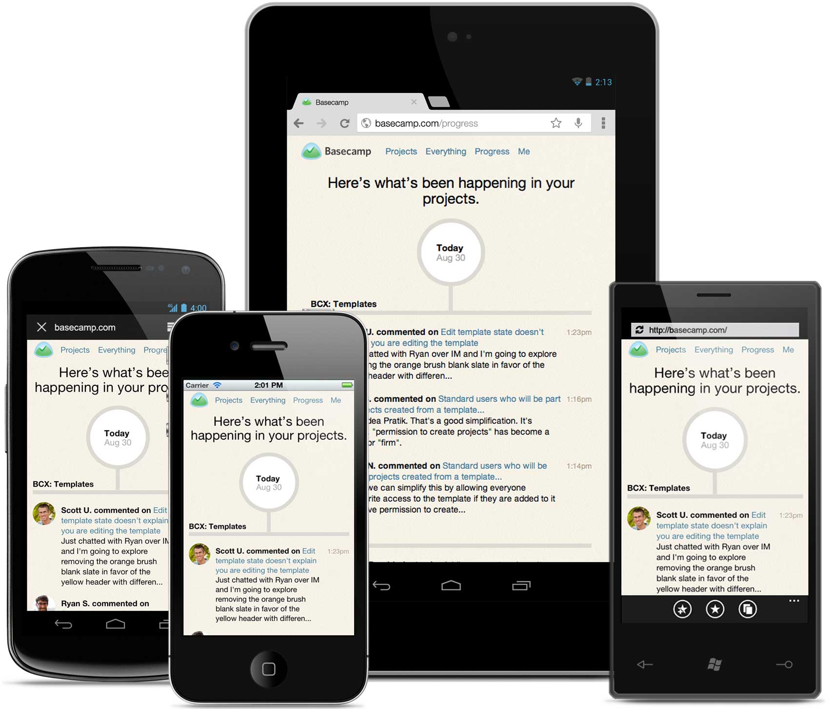
The project started from a simple need. Up until now the mobile experience on Basecamp has really meant one thing: email. Email notifications from Basecamp work great on the phone – you can even reply to them and your comment will show up in your project. But clicking a link to Basecamp on your phone was miserable. Tiny, slow and really tough to read. So we thought, What if you clicked to read a discussion on mobile and we served a nicely formatted mobile-optimized view? No navigation, no interaction, just a clean, readable page. So we set off to prove the concept. The result was an instant hit (read the discussion in our Basecamp project). The new mobile pages were even nicer to read than the email itself and, because they were plain HTML and CSS, they were wicked-fast.
So we kept proving and kept asking questions. If you’re reading the comments about a to-do you might want to see the entire to-do list, let’s see what that looks like. What if you want to see the all the Text Documents in a project – or even the project, itself? Can we try that? So we started to connect the dots, linking pages and optimizing views every time we missed something else. Pretty soon we had a fairly complete mobile version of Basecamp. It doesn’t do everything but it does a lot of what you want to do most on-the-go, without a bunch of stuff you don’t need.
We didn’t set out to build a feature-for-feature version of Basecamp that magically fits on a mobile phone screen. We built it for the job to be done on mobile. What you hire Basecamp to do when you’re using your computer at your desk isn’t is the same when you’re on your phone at the airport. In the evenings, I use Basecamp on my phone to see what I’ve missed. Checking the Progress timeline, adding my comments, searching for and viewing attachments – Basecamp for mobile is ideal for these tasks. By having the focus of a clear job to be done it was easy to make decisions about what to include in this mobile experience and what could be left out.
Continued…There are a bunch of ways to become a better designer. But here’s a way you probably haven’t thought much about: learn to program.
Design is about solving problems, making things clearer, and making things work better. However, your designs don’t help anyone until they work. This is usually where a programmer comes into the picture. They make your designs work. But don’t you want to be able to do that?
I do. That’s why I’ll be taking the all new Rails for Designers class this fall at The Starter League. It’ll be hosted at our offices in Chicago.
So if you’re a designer, you know HTML and CSS, but you don’t know how to turn your designs into real, live applications, I hope you’ll join me, as well as a few of the other designers at 37signals, for the intensive, two-day a week, 3-hours a day, Rails for Designers class. Let’s learn how to make our designs work.
Important: Applications are due by this Sunday, September 16th. Don’t procrastinate – don’t miss out.
We have a million fonts, a million colors, and a million piles of shit leaving our fingers all day long. It’s just sad to me, because when you look at this [vintage ephemera], it’s just about communication. One font and a thing called hierarchy.