If you ask an artist why, the greatest artists will tell you, “Well, it was beautiful. It inspired me. It touched me. It reminded me of this or that.”
But you ask a designer why and he says, “Well, I’ve got these 15 different things that all have to coexist in this 800×600 pixel area. And if I do this, that doesn’t work. If I do this, it breaks the other thing. So in order for these three things to be in harmony, I have to do that…”
That points more and more to the challenge to somebody who’s trying to get into or who’s trying to get a job doing UI design, that it’s not about looking at screen shots. Because then you’re putting yourself in the graphic design box.
It’s about your ability to describe problems and your ability to show how it is that a design that you did worked. And if you can show the reasoning and the different relationships between the elements, then you can show that you really know something.
Signal v. Noise: Design
Start with our Best Hits on Design
- ⋆ Reminder: Design is still about words
- ⋆ The Typography and Layout behind the new Signal vs. Noise redesign
- ⋆ Backstage: How we use Basecamp to collect, share, and discuss inspiration
- ⋆ Backstage: Using Basecamp to build the Basecamp calendar
- ⋆ Behind the scenes: Reinventing our Default Profile Pictures
- ⋆ Behind the scenes: Highrise marketing site A/B testing part 1
- ⋆ What happens to user experience in a minimum viable product?
- ⋆ Lessons learned from implementing Highrise's custom fields feature
- ⋆ Ten design lessons from Frederick Law Olmsted, the father of American landscape architecture
- ⋆ Flashback: Every time you add something you take something away
Our Most Recent Posts on Design
The first step is to start
Many people ask me, “How can I get started in web design?” or, “What skills do I need to start making web applications?” While it would be easy to recommend stacks of books, and dozens of articles with 55 tips for being 115% better than the next guy, the truth is that you don’t need learn anything new in order to begin. The most important thing is simply to start.
Start making something. If you want to learn web design, make a website. Want to be an entreprenuer and start a business selling web based products? Make an app. Maybe you don’t have the skills yet, but why worry about that? You probably don’t even know what skills you need.
Start with what you already know
If you want to build something on the web, don’t worry about learning HTML, CSS, Ruby, PHP, SQL, etc. They might be necessary for a finished product, but you don’t need any of them to start. Why not mock-up your app idea in Keynote or Powerpoint? Draw boxes for form fields, write copy, link this page to that page. You can make a pretty robust interactive prototype right there with software you already know. Not computer saavy? Start with pencil and paper or Post-it Notes. Draw the screens, tape them to the wall, and see how it flows.
You probably don’t even know what skills you need, so don’t worry about it. Start with what you already know.
You can do a lot of the work with simple sketches or slides. You’ll be able to see your idea take form and begin to evaluate whether or not it really is something special. It’s at that point you can take the next step, which might be learning enough HTML to take your prototype into the browser. The point is, go as far as you can with the skills and tools that you have.
Avoid self doubt
Many times the reasons we don’t start something have nothing to do with lack of skills, materials, or facilities. The real blockers are self-criticism and excuses. In the excellent book, Drawing on the Right Side of the Brain, the author, Betty Edwards, discusses how we all draw as kids but around adolescence, many of us stop developing that ability.
“The beginning of adolescence seems to mark the abrupt end of artistic development in terms of drawing skills for many adults. As children, they confronted an artisitc crisis, a conflict between their increasingly complex perceptions of the world around them and their current level of art skill.”
At that age kids become increasingly self-critical and equally interested in drawing realistically. When they fail to draw as well as they know is possible many give up drawing at all.
This feeling continues into adulthood. We want to design a website or build an application but if our own toolset doesn’t match up to the perceived skillset we never start. It doesn’t help that the internet gives us nearly limitless exposure to amazing work, talented individuals, and excellent execution. It’s easy to feel inadequate when you compare yourself to the very best, but even they weren’t born with those skills and they wouldn’t have them if they never started.
Do—there is no try
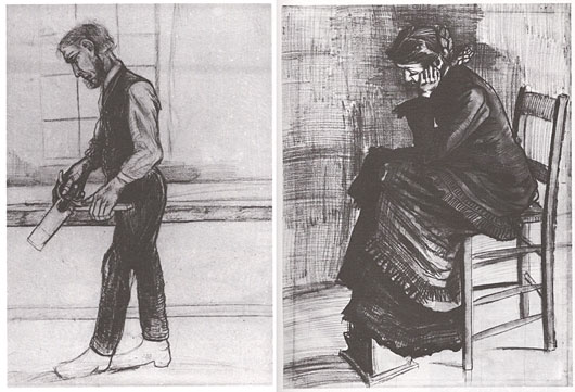
People who succeed somehow find a way to keep working despite the self-doubt. The artist, Vincent Van Gogh was only an artist for the last ten years of his life. We all know him for masterful works of art, but he didn’t start out as a master. Compare these examples from Drawing on the Right Side of the Brain showing an early drawing compared to one completed two years later:

Vincent Van Gogh Carpenter, 1880 and Woman Mourning, 1882
He wasn’t some child prodigy (he was 27 when he started painting), he learned his craft by hard work. If he’d listened to his own self doubt or despaired that his skills didn’t compare to Paul Gauguin’s it’s likely he never would have even tried.
This is all to say that there are many things that can get in the way of the things we should be creating. To never follow a dream because you don’t think you’re good enough or don’t have the skills, or knowledge, or experience is a waste. In fact, these projects where there is doubt are the ones to pursue. They offer the greatest challenge and the greatest rewards. Why bother doing something you already have done a hundred times, where there is nothing left to learn? Don’t worry about what you need to know in order to finish a project, you already have everything you need to start.
If you can’t draw as well as someone, or use the software as well, or if you do not have as much money to buy supplies, or if you do not have access to the tools they have, beat them by being more thoughtful. Thoughtfulness is free and burns on time and empathy.
Frank Chimero, What advice would you give to a graphic design student?
Signature designer?
A conversation about signatures (real ones, not digital) from our room in Campfire:
Jason F.: Don’t you think that would be a really cool niche side job for a designer? Custom designed signatures? The client would have to learn it, but I bet there’d be a decent market for a really cool signature.
Jamie D.: That is interesting, and actually w/ all the digital stuff you probably don’t even need to really sign it
Jason F.: Either way, I think it would be really cool to have a beautifully designed signature. One carefully considered, unique, and interesting.
Jason Z.: It’s actually surprising that never happened when calligraphy was in it’s hey-day. Surely everyone didn’t have a knack for graceful flourishes.
Matt L.: love the idea of a signature designer. wouldn’t even have to invoice you. he can just sign the check himself.
Great proportions melt away impurities in a design. So if you have buttons and there’s too much space between them, the space between them is another element that you have to comprehend.
So if you have two buttons, you now have three objects. You’ve got the button, the button, the space. But if things are the right proportions, you just have two items, the two buttons.
And I think over a big screen, if you get the proportions right, you could be eliminating 10 or 20 different extra negative space things and things that you just have to comprehend. So it’s very soothing.
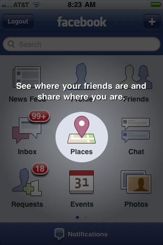
Facebook shows an interesting way to highlight new features

When screen loaded, animation dimmed down and this spotlight showed up.
The critical thing about the design process is to identify your scarcest resource. Despite what you may think, that very often is not money. For example, in a NASA moon shot, money is abundant but lightness is scarce; every ounce of weight requires tons of material below. On the design of a beach vacation home, the limitation may be your ocean-front footage. You have to make sure your whole team understands what scarce resource you’re optimizing.
Fred Brooks, author of The Design of Design.
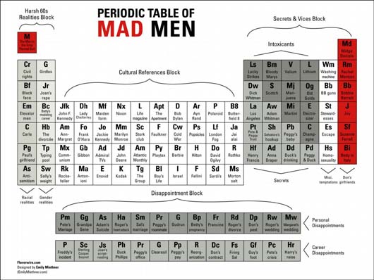
The Periodic Table avalanche
It is only a matter of time before we have a periodic table of periodic tables.

The Periodic Table of Irrational Nonsense.

The Periodic Table of Mad Men.

The Periodic Table of Swearing.
Also, the Periodic Table of Awesoments. [via JK]
Update: There already is a table of tables! [thx DG]. Internet, I was foolish to doubt you.
Clever ads for TiVo
Some, er, research on social media strategy led me to Zach Golden’s copywriting portfolio. These ads for TiVo are great.

Barcodes and pie charts from the window seat
As seen from the skies over the midwest. Endless farmland textures always make the window seat worth it.


