You’re reading Signal v. Noise, a publication about the web by Basecamp since 1999. Happy !

Signal v. Noise: Design

Our Most Recent Posts on Design

People want all the things the Holga doesn't do

Matt Linderman
Matt Linderman wrote this on 19 comments

The Holga: There’s no on-board flash. No PC connector for an external flash. There’s no shutter speed selection. You get (approx) 1/100 of a second and deal with it. It offers only two F stops: f. 11 and f. 8 (“sunny” or “less sunny”) — you switch a little plastic lever back and forth to choose which one you want. There’s no tripod socket (you can rubber band it or drill one in if you want). The lens is plastic and fixed at medium wide 60mm. The film advance is iffy at best. (The typical solution? Jam a folded piece of cardboard from your film’s box under the spool to hold the film tight.) Here are the focus options:

focus
Focus: 3 feet, 6 feet, 9 feet, or “infinity.”

So what’s the upside? It discourages fiddling around with camera-settings and encourages you to just shoot without thinking too much. The “problems” with the camera also create light leaks and vignetting that can create gorgeous, retro-looking shots.

Plus, it uses professional medium format film which yields dramatic results. David Burnett won top prize in a News Photographers’ award ceremony for this Holga shot of then presidential nominee Al Gore. Burnett said the Holga forces him to simplify, slow down, and “lets you concentrate on what’s really important in a picture.”

Backpacking with a Holga
I remember backpacking through Southeast Asia with a Holga back in 2002. I had another camera that I used for most of my shooting. But the Holga came out every once in a while.

holga

In fact, it started to take on extra meaning. It’s a genuine pain to load so you start to value every Holga shot. A scene would have to earn it’s way into Holgadom. When I came come across a great vista or interesting characters or cool shapes, I’d pull it out. Otherwise, it stayed in my backpack.

Continued…

SVA Dot Dot Dot Lectures: Jason Santa Maria on web vs. print. “These things might seem obvious, but they’re not the conversations we’re having.” (via RS)

Matt Linderman on Jul 28 2010 8 comments

Creating a design library

Jason Fried
Jason Fried wrote this on 132 comments

We’ve got some bookshelves in the new office.

We want to fill them with inspirational pictures of design, landscapes, architecture, objects, ideas, industrial design, automotive design, type, materials, layouts. Nothing web-related. Anything that would inspire a spark by flipping through the pages. Words not required.

Got any winners?

gmail-cleverness.png

Cute, but seems too clever. I got this when I forwarded a message where someone earlier in the thread had talked about attaching. Wonder if Google tracks false positives in the wild?

Design what you know

Matt Linderman
Matt Linderman wrote this on 18 comments

In “Actually, You Might Be Your User,” Jared Spool looks at the pros and cons of self design. That’s designing without relying on things like user interviews, contextual inquiries, surveys, card sorting, and usability testing.

He examines how 37signals gets by without using these things.

They design from their own perspective. If they want to add a feature, they look within themselves to figure it out. No usability testing or contextual inquiries needed.

Jared then looks at the pros and cons of working this way.

Another big disadvantage of Self Design is it only works if the designers use the product a lot. 37signals built Basecamp because they needed to manage their own projects. They use it every day. Their product, Campfire, is their main communication method, since they have team members all over the world. Apple’s team uses their phones every day, all day long.

When there is something frustrating that happens in the daily use of the design, it surfaces pretty quickly. The designers themselves experience that frustration and, because they control the design, focus on eliminating it.

Made me think back to the old adage “write what you know.” If you’re an Eskimo, it’s going to be tough for you to write a book about growing up in the Italian countryside. You’d have to spend months (or years) learning Italian. You’d have to learn the idioms. You’d have to visit your chosen locales repeatedly. You’d have to meet lots of locals and ask them questions. Even if you do a great job at all this research, no one will be surprised if the end result still winds up kludgy and full of mistakes.

Or you could just write a book about growing up as an Eskimo. Then you bypass all those discovery layers and just get to the doing. You already have the knowledge you need.

The same thing happens when you design what you know. You get to bypass the “learning the language” phase and get right to the “building something” phase.

I know it’s not always possible, but, when it is, pick something to work on that you’re around all the time. Something that bugs you. Something that you’ve been paying attention to for years. Solve a problem that you yourself experience. Design what you know.

Laver's Law of Fashion

Jamie
Jamie wrote this on 11 comments

James Laver was a museum curator for the Victoria and Albert Museum in London from the ‘30s through the ‘50s. He was also a fashion theorist and historian who conceived Laver’s Law — an attempt to make sense of the fashion trend lifecycle.

Here is Laver’s Law:

Indecent 10 years before its time
Shameless 5 years before its time
Outré (Daring) 1 year before its time
Smart Current Fashion
Dowdy 1 year after its time
Hideous 10 years after its time
Ridiculous 20 years after its time
Amusing 30 years after its time
Quaint 50 years after its time
Charming 70 years after its time
Romantic 100 years after its time
Beautiful 150 years after its time


Stanley Marcus, the former president of Neiman Marcus, recounts in his memoir Minding the Store how Laver’s Law was used by Neiman Marcus clothes buyers in the late 60’s. There was a heated internal debate on whether the trend for that next year would still be the mini skirt (which was the current fashion) or the longer midi skirt. Marcus asked Laver point blank if the mini skirt was dead. Laver told him that the mini skirt had at least another 2 years to go — against expert opinion at the time.

His forecast was right, the midi was a complete flop, many women continued to wear the miniskirt, and those who couldn’t or wouldn’t make up their minds went into the pants suit. Pants were bound to come, but the skirt-length controversy made pants acceptable at an accelerated rate.

The brilliance of this timeline is that it can be applied to nearly all creative mediums — not just fashion but also art, design, architecture, and even music. Smart, or Current Fashion, doesn’t have a particular time frame attached to it. Something can be smart for 1 year or a even few years.

Think back to some of the trendy things of the past and you’ll see how it applies: candy colored iMacs, Victorian wallpaper, Emigre fonts, Disco, Sears homes of the 1920’s, Preppy clothes, Atari video game box covers, and Braun products of the late-50’s early 60’s.

Hitting that sweet spot around Daring and Smart when you’re trying to design, create or sell something is crucial. There’s even a market for Dowdy too, right? Just look around at your local mall or shopping center. Just remember that in a few years it’ll start to look bad. In 10 years it’ll look REALLY bad. Then, after some time, it will be appreciated — or even revered — again. I take comfort that something like Comic Sans (theoretically) will have a shot at being beautiful in 100 years time.

Opinionated: Francesco Bertelli

Jason Fried
Jason Fried wrote this on 14 comments

Francesco builds beautiful bikes in New York City. Even though he’s building a bike for you, his rules rule. He’s not afraid to say no.

His about page explains what he likes and doesn’t like in a bike.

He likes bikes with…

  • No logos and stickers
  • Lugged steel
  • Skinny tubes
  • Quill stems
  • Vintage cranksets
  • Track geometry
  • Leather and wood
  • Unusual handlebars
  • Chrome forks

He doesn’t like bikes with…

  • Visible logos and stickers
  • Threadless forks
  • Clamp stems
  • MTB handlebars
  • Sponge grips
  • Fake leather saddles
  • Machined rims
  • Flip-flop wheels

He’s only going to make you a bike if your likes and dislikes align with his. There may be a couple of exception along the way, but his opinions are his business rules.

Bertelli is a great example of a company that knows where it stands. The best way to know where you stand is to figure out what you won’t do. What will you say no to? Francesco puts his no’s right out in front. It makes the experience better for everyone.

More businesses could benefit from putting their no’s right up front.

Jan Tschichold on the "perfect" way to lay out paragraphs, pages, and books

Matt Linderman
Matt Linderman wrote this on 12 comments

Typography guru Jan Tschichold on indenting paragraphs:

The indent of the paragraph should be the em of the fount body.

Omit indents in the first line of the first paragraph of any text and at the beginning of a new section that comes under a sub-heading. It is not necessary to set the first word in small capitals, but if this is done for any reason, the word should be letter-spaced in the same way as the running title.

If a chapter is divided into several parts without headings, these parts should be divided not only by an additional space, but always by one or more asterisks of the fount body. As a rule, one asterisk is sufficient. Without them it is impossible to see whether a part ends at the bottom of a page or not. Even when the last line of such a part ends the page, there will always be space for an asterisk in the bottom margin.

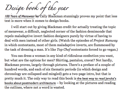
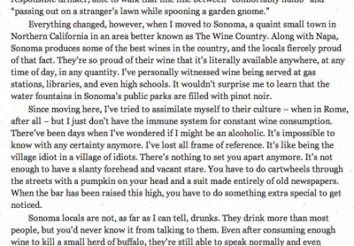
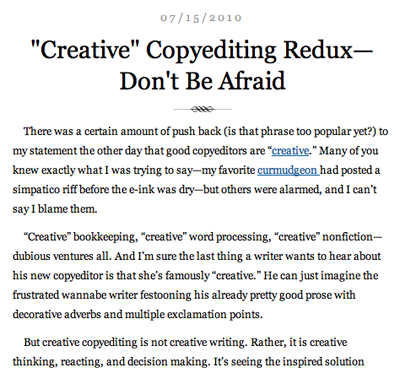
Of course, the web is in the process of killing off the indented paragraph. But not everywhere. Some examples of indenting can be found at the following sites:


Joe Clark’s blog


Fray


The Subversive Copy Editor blog

Even back in the day, these rules were often ignored. Why? According to Tschichold, it was because typists were trained by business schools, who were “utterly incompetent when it comes to questions of typography.”

The perfect book and page
Tschichold also came up with a system for the perfect book and the perfect page. Yes, perfect.

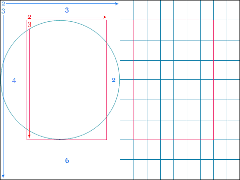
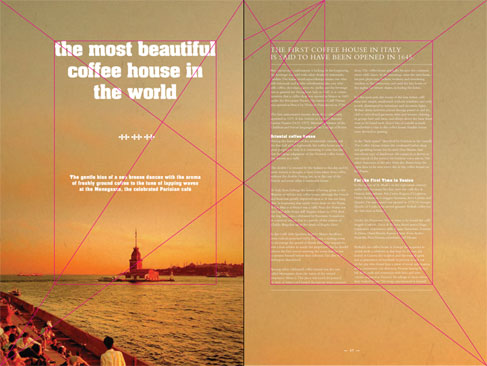
No matter the page size, you will always end up with a 9×9 grid, with the textblock 1/9th from the top and inside, and 2/9ths from the outside and bottom.

It all goes back to the Golden Ratio:

The page ratio is best at 2:3…His reasoning was that it sits within the Fibonacci Sequence, as well as the Golden Ratio, and establishes that the textblock will be harmonious and proportional to the page — it’s how the height of it equals the width of the page.

Here’s an example layout:

More details/examples at The Secret Law of Page Harmony.

Related: Tschichold and the golden section [Wikipedia]