
I really like Jeep’s text-based 7-bars + headlights subject lines in their marketing emails. Fun touch.
You’re reading Signal v. Noise, a publication about the web by Basecamp since 1999. Happy !

I really like Jeep’s text-based 7-bars + headlights subject lines in their marketing emails. Fun touch.
It’s pretty amazing how far you can take responsive design these days. Between the latest CSS tricks and a splattering of JavaScript, you can turn an elephant into a mouse, and make it dance on a parallax-scrolling ball. It’s time to reconsider whether you should, though.
There’s a point on the trade-off curve where rearranging everything, hiding half the page, and then presenting it as “the same template, just styled differently” is simply not meaningful. Nor is it simple. Nor is it efficient. A one-size-fits-all HTML base document is not a trophy-worthy accomplishment in itself, lest we forget.
The way we think about this at Basecamp is as a nip’n’tuck. If you’re just stretching or shrinking things a bit, then responsive can definitely be easier (we do that on this blog, for example). But the further you move towards a full make-over, the less it makes sense.
This is particularly true if your framework of choice doesn’t make it needlessly complicated to use separate templates for separate purposes. Rails 4.1 has a feature called variants that makes it trivial to share the controller and model logic of your application, but return different HTML templates when the devices call for it. It’s this feature we’re using for the Basecamp mobile views (which in turn are embedded in our mobile apps) instead of the prevailing responsive paradigm.
By going with dedicated templates, we don’t have to include needless data or navigation that’s going to be hidden by the responsive rules. We have less variables to think about on the individual page. It’s just a simpler workflow where it’s easier to make changes without considering a smather of side effects.
So the next time you’re marveling at a responsive design that’s able to make the best use of a 27” iMac at full screen and a fit neatly on a 3.5” iPhone as well, you might want to ask yourself why you’re trying to make one performer do so many tricks.
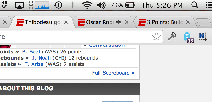
Great UI in Chrome here… I had about a dozen tabs open, and some audio was playing. It was an auto-play ad, so I didn’t initiate it and I didn’t know where it was coming from. I happened to look up in the tab bar and spotted a little speaker icon in one of the tabs (see the middle tab in the photo). I clicked it. Sure enough, that’s where the sound was coming from. When the video ended, the little speaker icon went away. Great little touch that answers a common question… “Where’s that sound coming from?”
“All that work, and that’s it?”
I remember thinking this to myself a few weeks ago. I’d been building a new homepage for Know Your Company. But I didn’t feel I’d made much progress.
I’d rewritten copy, collected stories from current customers, designed several new pages, made the site more mobile-friendly…
Yet despite these changes, the site didn’t look much different than before. I began to question if I’d accomplished much at all.
Luckily, as I started to feel this way, I happened to be chatting with Jonas, a designer at Basecamp. He’s also the original designer of Know Your Company, and has helped me transition the product into its own company.
Jonas said this to me:
“Claire, go read what the homepage had before.”
I went and did that.
“Okay. Go read it now with your changes.”
I went and looked at my new site.
“See? Before, people looking at your site didn’t know what customers thought about your product. Before, they couldn’t request a product demo as easily. Now, your revised design helps people do those things. So don’t get discouraged because your design doesn’t look different. If you read it, you’ll see it’s much better than it was before.”
What a great reminder.
I’d forgotten my progress simply because it didn’t look different. When you just look at the difference, you might not see much. Text looks like text, regardless of what it’s saying. But if you read the difference, you see how big your changes actually are.
Progress isn’t measured by how different something looks. It’s measured by how useful something has become. Is it making this person’s life easier? Is it doing the job you want it to do? Reading the difference, not just looking at it, reveals your progress.
So the next time you doubt how much progress you’ve made, don’t look at the difference. Read the difference.
You’ve probably accomplished more than you give yourself credit for.
Upon getting art requests, I usually search to see if there’s a standardized image for the concept. In this case I didn’t find any imagery that rose to the level of iconic, or was particularly interesting or clear. I opted to start from scratch.
Hmmm, browser trouble…
Broken windows, bugs, injuries, cracked screens, dizzy people? I drew a page of visual brainstorms and posted it on our Basecamp project.
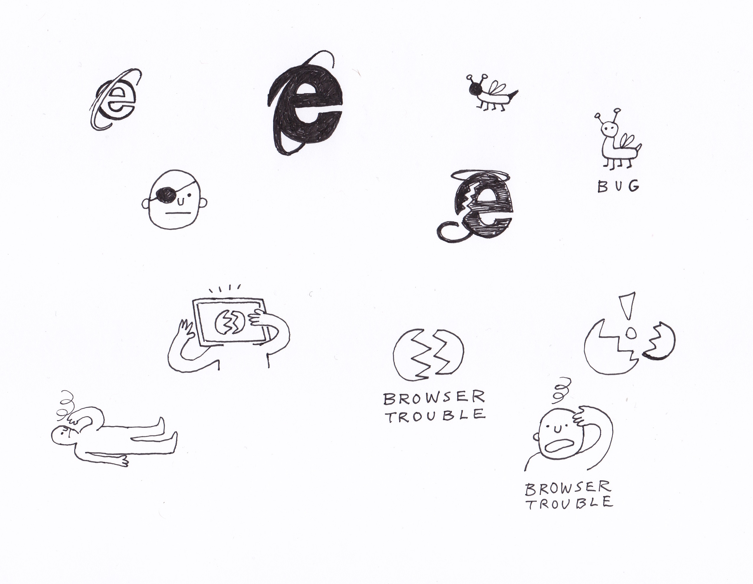
Whoever assigns me a drawing—in this case, Jamie—reviews my explorations and then ask me to flesh out one of the directions. Jamie liked the guy with the computer head and suggested that there be a browser window with a frown face.
I drew up another page with color.
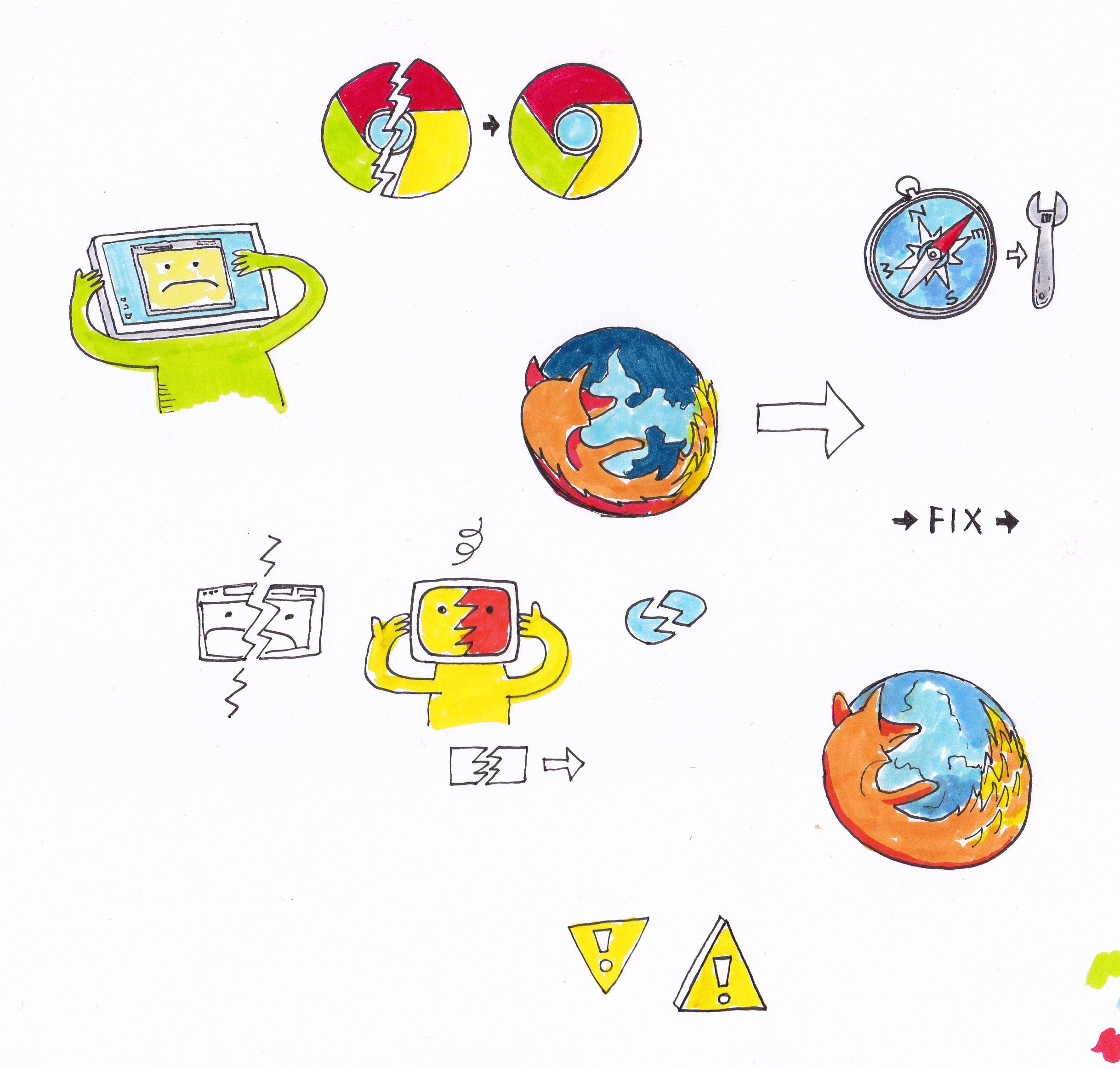
With that, Jamie got back to me with “Awesome.”
I waited to see how the image would be implemented. Working with the Basecamp design team is great for me because I’m not particularly strong in Photoshop or Illustrator—those guys are all ninjas. I like to draw, and that is how my time is spent most efficiently.
Usually I have no idea how the images are going to be used until they are implemented live on the website, which is fine by me. I like the surprise of finding a fully rendered web page with my drawings.
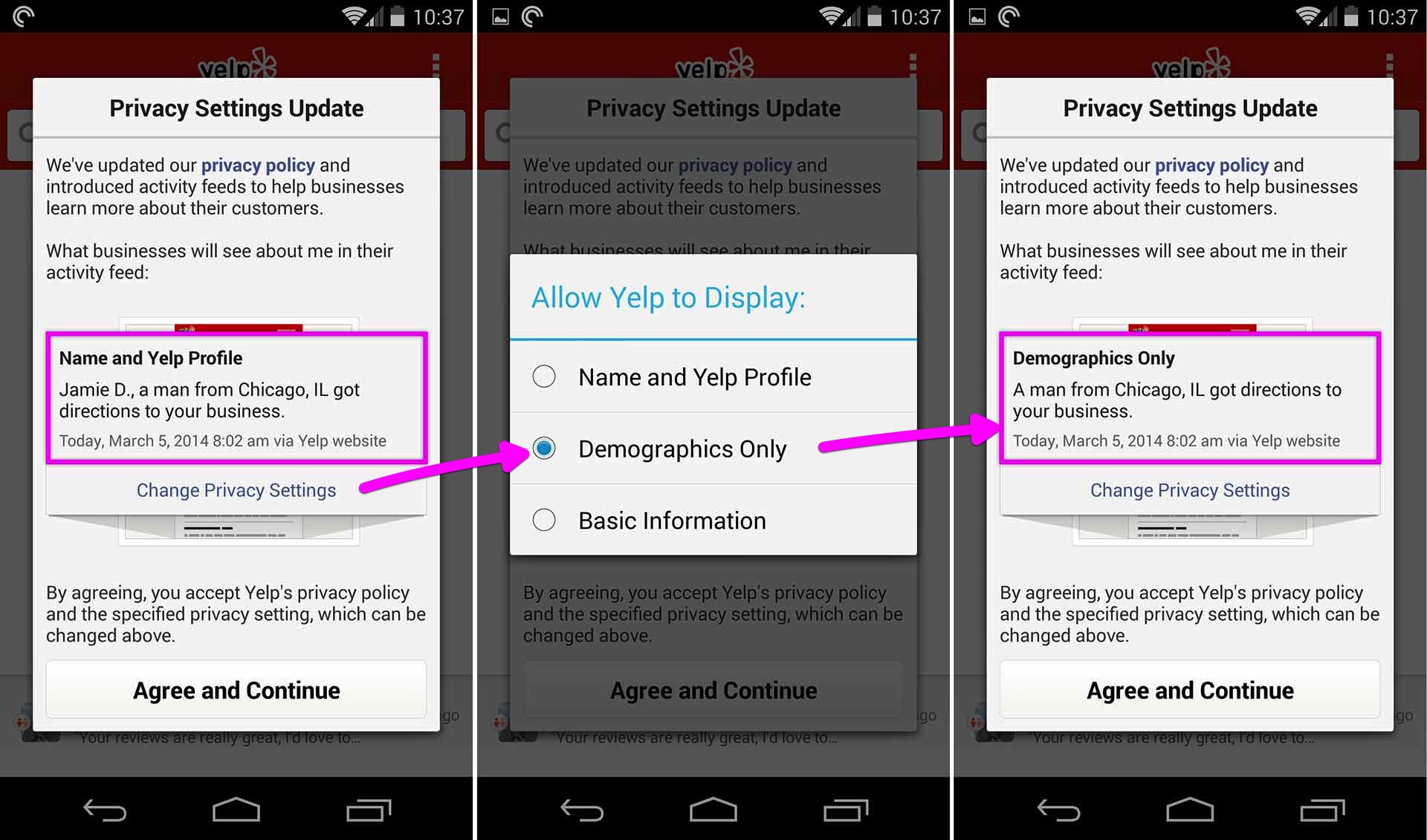
Yelp updated their Privacy Policy so now businesses can get some insight on their customers. The nice thing is Yelp gives you a preview of how your information would appear to these businesses.
You can Change Privacy Settings to toggle between how much info you want to reveal. As a Yelp user I’m not passive in this. I’m given a choice. I thought this was a pretty cool interaction—a nicely done modal.
We’re looking to add another product designer to our team! We don’t hire for this position often, so we really savor moments like these. We’re eagerly anticipating hearing from you.
Besides design, your job is to make an undeniably positive impact on our company, our culture, our products, and our customers. As long as you make your best effort, and you love to learn, we will do everything we can to support you creatively and help you do the best work of your life.
Product designers at Basecamp are always working on different things. You may be working on polishing up an existing feature, pitching and designing something brand new, or fundamentally rethinking how we do something. You could be working on the web or you could be exploring designs and interactions for a native mobile app. Projects at Basecamp always start with design, so you’ll constantly have the opportunity to lead us in new directions. Challenge us! Push us! Be original and show us the way!
Besides having great visual taste, talent, and the right sensibilities, you must write well-structured HTML/CSS. Basic Javascript or Rails skills are a plus, but not required. Experience designing for iOS and Android is also a plus. Great writing skills are required.
We are not looking for someone who’s already expert in everything they do. We’re looking for someone great who demonstrates the interest, drive, and desire to keep learning new things and continually get better.
At Basecamp you’ll be working with great people. Friendly, talented, original folks from dozens of cities around the world. The people who work here have a wide variety of interests and interesting life experiences. You’ll have a chance to learn from some of the best people you’ve ever met. And we’ll get to learn from you. We’d love for you be part of our patchwork.
Working as a product designer at Basecamp is a unique opportunity. We have a small team, so you won’t be one of dozens. You’ll be one of a few, so your impact will be felt inside and outside the company. You’ll be working on a product that is used by millions of people. You will help drive us in new directions. You’ll help us see things we haven’t seen before, consider things we’ve never considered before, and bring fresh perspective to our team. Brighten us up and put a big smile on our customers’ faces.
You love to write, too. You understand that copywriting is design. The words matter as much as the pixels. Great visuals with weak words are poor designs. You should care about how things are phrased as much as you care about how they look.
We’re open to hiring the best person no matter where they are. If you’re in Chicago we have an open desk for you in our office. But more than half of our company works remotely all over the world, so you’re welcome to be part of the team no matter where you live. If you do want to relocate to Chicago we’re open to that as well.
Send relevant work samples, and anything else that will make you stand out, to [email protected]. Extra effort and personal touches will be looked upon favorably. Show us how much you want this job and not just any job. Please include [DESIGN] in the subject of the email.
It doesn’t matter where you went to school, or if you even graduated. It doesn’t matter if this is your first job or your fifth. Doing great work and being driven to improve yourself and everything you touch is what matters.
If we think you’ll be a good fit, we’ll be back in touch with step two of the application process.
Apple provides a nice “Smart App Banner” hook for developers to promote their iOS apps from within their web apps. Unfortunately Google doesn’t have anything like this for the Play Store. Now that we have Basecamp for Android, we want to promote it to customers using Basecamp on their phone browsers.
Thanks to GitHub there are a few nice solutions:
These combine both iOS and Google Play designs which we didn’t really need. In the end we rolled our own solution, but I based the banner design on Vitaly Glibin’s Smart App Banner.
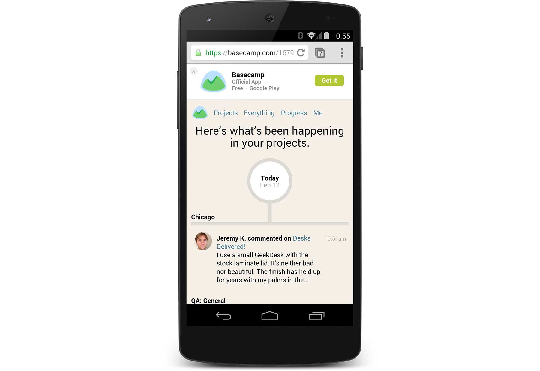
I uploaded a working version of the HTML to GitHub. Please feel free to use this design to promote your apps in Google Play. Thanks again to Vitaly’s Smart App Banner for the inspiration.
And if you’re an Android user get the Basecamp app on Google Play!
The 3 1/2” floppy disk as the go-to save icon gets a lot of play, but I don’t think enough attention is paid to the venerable trash can icon.
First of all, trash cans never looked like this while I was growing up in Denmark — I only knew what it was from American TV. Second, I don’t think there are any of these left even in the US.

Guess what these Google domain icons do. I’ll go first: Send a locksmith, Start a party, Call a handyman, Jump out the window, Put on your seatbelt, Use a lifeline, Start the machine.