You’re reading Signal v. Noise, a publication about the web by Basecamp since 1999. Happy !

Signal v. Noise: Design

Our Most Recent Posts on Design

The feature that almost wasn’t

Emily Triplett Lentz
Emily Triplett Lentz wrote this on 9 comments

It took more than a year and three distinct attempts to get Google Docs in Basecamp ... and still, the damn thing almost didn’t get built. Why was it so hard?

We knew we needed it. Integration with Google Docs was a super-popular feature request, and usage in general is on the rise. Since Basecamp is a repository for everything project-related, it made sense to show the same love to Google Docs we show to any other type of file you can store in a Basecamp project.

Problem was, we don’t really use Google Docs ourselves. And we’re kind of notorious for scratching our own itch and not building shit we don’t need. It’s absolutely the exception that we would create a feature we didn’t plan on using. (For years, to-dos in Basecamp Classic didn’t have due dates, because we just work on things until they’re shippable. It wasn’t until enough customers hollered at us that we eventually added them.)

“We know tons of our customers use Google Docs; they have to,” says Jason Z. “Everybody’s using Google Docs. So we know it’s useful, we know people are asking for it all the time. There just comes a point where we have to figure it out.”

Shortly after launching the new Basecamp in March 2012, a small team explored what it would take to link to Google Docs from Basecamp. “We started with a little experiment to see whether the tools Google provides are enough to do basic integration,” said Jeremy, the programmer on that first spike. The goal was to be able to “pick a file from Google without having to commit to deep integration that changes the way Basecamp works.”

Google’s file picker made integrating with Google Docs easy, but rendered switching between accounts (if you’re signed in as one user and need to sign in as someone else) nigh on impossible. And we got hung up on what to do about permissions: Our choices seemed to be either allowing anyone who had the link to edit the document, or letting Google handle permissions and suffer the nasty flow and UI that resulted (more on that later).

With the account switching problem, our choices were to wait for Google to improve their tools, or scrap that and find some other way to integrate — i.e., roll up our sleeves and build our own picker. “That led to a waiting game,” Jeremy recalled: “if Google’s own tools got good enough that we could use them, then we’d have an easier time integrating.” So we punted.

Nearly a year later, a different group took a second look. While there still wasn’t a straightforward path for switching accounts, Javan experimented with a ton of different parameters and landed on treating authentication as a separate, first step to lead into the file picker, using Google’s JavaScript client.

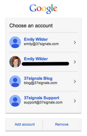
What a Basecamp user sees before signing into Google
When a user is signed into a different Google account, they can sign out and choose which account to link to Basecamp.

Managing the two steps separately gave us the flexibility we needed to resolve the account switching issue, but the permissions demon was still rearing its ugly head. We punted again until we’d have more time to explore it.

Each time we felt like we were getting close, we’d reach the same stalemate. No one knew which of the two options for handling permissions was the lesser of two evils:

  1. Allow anyone with the link to view the document. This route would have meant sharing a Google Doc in Basecamp = changing its permissions so anyone with the link could view and change it. Other tools handle permissions this way; it makes things pretty easy and keeps the UI clean. But it creates a pretty gnarly security concern, in that there’s no way to revoke access later. People no longer employed at an organization might be removed from its Basecamp account, but still have access to proprietary information stored in Google Docs. Or users might share the link with outsiders who could then access and edit the document anonymously. No bueno.
  2. Let Google be the gatekeeper. When permissions are set within the Google account and Basecamp doesn’t mess with them, we get to wash our hands of security concerns. Convenient for us! But it passes this potential morass of access seeking and granting onto our users: The viewer has to be signed into Google, and they need permission to view the document to see the preview in Basecamp. If they don’t have permission, they can request it through Basecamp. They’ll then be directed to a Google page, and from there, the request is emailed to the Google Doc’s owner. When the owner grants access to the document, Google sends an automated email to the viewer with a link to view it. “A lot of us were feeling like this leads to a pretty crappy experience,” Javan says, “because you click on the doc and then you hit this brick wall.”
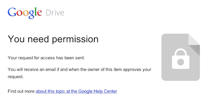
Step eleventy-bajillion-and-four in trying to preview a Google Doc in Basecamp that you haven’t been granted access to

“I was worried that people wouldn’t understand that, because I didn’t understand it,” recalls Ann from QA. “I did an experiment with the support team where I shared a Google Doc with them … I got all kinds of requests to view the document, because I hadn’t given them permission yet. I was afraid that oh my God, every customer was going to see that.” Adding a private file to a Basecamp project with 150 people on it might generate 150 email requests for access to the file. That was too big of a burden to pass along to customers.

The temptation was to punt a third time — only that was no longer an option. “We decided very clearly that if we don’t do it this time, if we don’t figure this out, we’re basically saying that Basecamp is not ever going to have this,” Jason Z. says. “Because why would we take a fourth attempt? That would be ridiculous.”

The pressure to “ship or get off the pot” led the team to explore other possibilities, like building a folder system that would copy Google Docs into a Basecamp project folder on Google Drive, or using Box.net’s Google Docs integration. We finally started to wonder whether the people who wanted Google Docs in Basecamp might already have the permissions thing dialed in. Jeremy chimed in at that point:

Companies switch to Google Apps from company Exchange email and central network fileservers. They “go Google.” Everyone at work is on Google, signed in, and has access to email, drive, calendar, contacts, etc. Google Apps recommends default sharing settings that are a lot like having a old-school central fileserver: newly created files are visible to others by default. There’s no sharing step or permissions-request dance: https://support.google.com/a/answer/60781. This is a golden path. It’s well-integrated and it’s the default when a company goes Google.

That perspective alleviated a lot of the trepidation we had about what users would see when they clicked on a Google Doc — the hope was that if people were already using Google Docs at work, they can probably already access all the links they need to be able to access by default. The access nightmare we envisioned wouldn’t occur if companies’ Google Apps admins were already setting up good defaults, the way Google recommends.

We still weren’t 100 percent convinced we had it right, but it felt good enough for v.1 — to be hands-off, and let the people who use it figure it out (with help, of course). “It’s funny how long the project went on, and in the end, it’s almost simpler than where we started,” Javan says. “But I guess that makes sense.”

“We made a bet on this permissions thing,” Jason Z. says. “We don’t use the feature, so we don’t know. We can’t anticipate what the pain points are going to be here.”

A month or so after shipping, it’s looking like we made the right bet. The majority of feedback has been of the thank-you-so-much-for-adding-this! variety. So far, 56 percent of users are logged into Google when trying to preview a document from within Basecamp, and of those, 91.5 percent already have access to the document they were trying to view. For how much concern there was over whether we were making the right call with permissions, it’s been super quiet. “We were really expecting more confusion, because we were confused,” Ann says. “The people who do use it know how to use it, and I guess we’ve fallen in with their expectations.”

“That’s a super important lesson just in product design in general,” Jason Z. concludes. “You can engineer all kinds of things, and they might be the wrong things if you don’t know. So it’s better to under-engineer and let the pain kind of bubble up organically, than to guess wrong.”

Evaluating a redesign

Jason Fried
Jason Fried wrote this on 14 comments

When evaluating a redesign, your first instinct is to compare the new design to the old design. But don’t do that.

The first step is to understand what you’re evaluating. If you just put the new design up against the old design, and compare the two, the old design will strongly influence your evaluation of the new design.

This is OK if nothing’s changed since the original design was launched. But it’s likely a lot has changed since then – especially if many months or years have passed.

Maybe there are new insights, maybe there’s new data, maybe there’s a new goal, maybe there’s a new hunch, or maybe there’s a whole new strategy at play. Maybe “make it readable” was important 3 years ago, while “help people see things they couldn’t see before” is more important today. Or maybe it’s both now.

But if the old design sets the tone about what’s important, then you may be losing out on an opportunity to make a significant leap forward. A design should never set the tone – ideas should set the tone. Ideas are independent of the design.

So, when evaluating a redesign you have to know what you’re looking for, not just what you’re looking at. How the new design compares to the old may be the least important thing to consider.

It’s a subtle thing, but it can make all the difference.

Behind the scenes: Designing the REMOTE book cover

Jamie
Jamie wrote this on 13 comments

Many months ago Jason Fried asked me to think about a cover idea for REMOTE, a new book that he and David Heinemeier Hansson were writing.
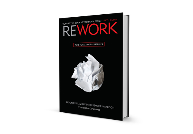
I thought REWORK, their previous book, had an iconic cover. The sole image of crumpled paper alluded to “back to the drawing board.” It’s a great cover.

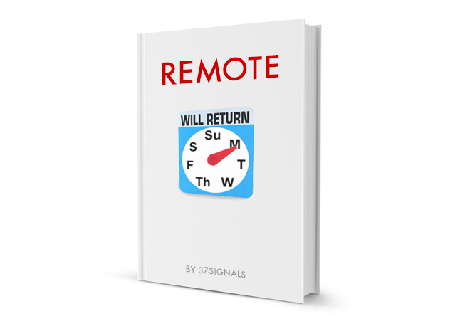
I decided early on to keep the main color scheme for the REMOTE cover: red, black, and white. I liked how the titles “REMOTE” and “REWORK” read like they’re part of a series. It made sense for them to have some relationship. I also wanted the book cover to be white. There was no meaning other than I wanted REMOTE to feel related but be visually different.
My first two covers were designed to be directly related to REWORK: title centered top with an image in the middle.

I also thought it’d be fun to try something similar in attitude to the crumpled paper.

During this time, I was reading a book by David Byrne called How Music Works. Like all (most?) designers, I’m always filing away graphics, signage, type I see every day into my brain somewhere. I appreciated the boldness of the cover design (still do).

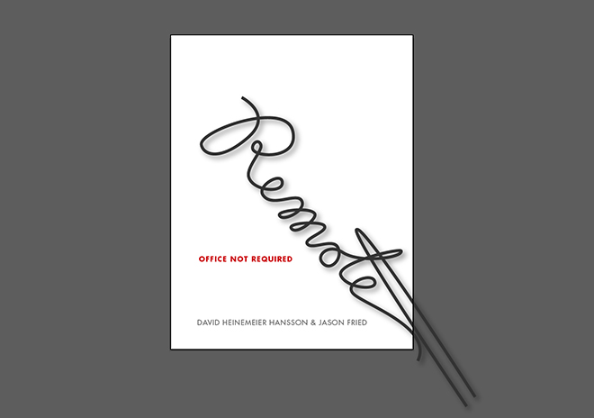
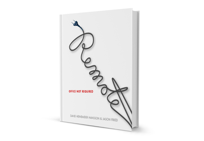
Could I make REMOTE typography that communicates remote? I imagined an unplugged electrical cord. So, I drew and scanned one spelling out the word “Remote”.

Then I traced it in Adobe Illustrator and set type around it.

I still like this cover idea.

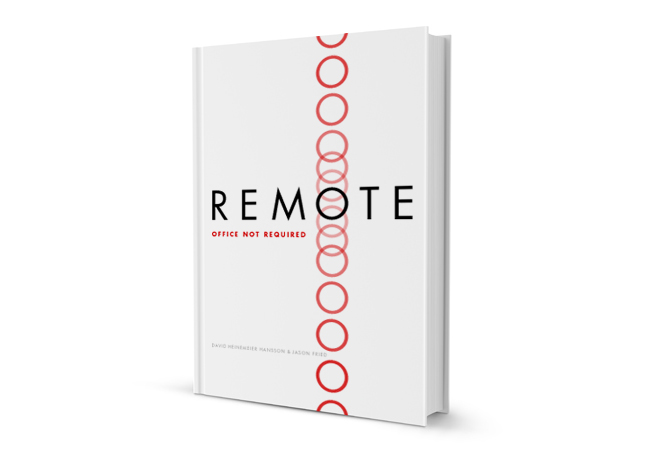
Then I thought about not alluding to any physical objects. Let’s not hold on to the crumpled paper. Let’s ditch cut neckties and electrical cords. Could I communicate “remote” with type in an abstract way?

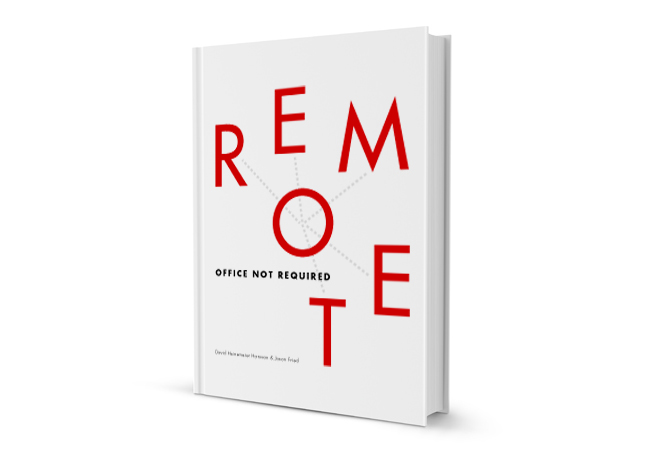
The “O” in REMOTE had a lot of potential. The perfect circle “O” (set in Futura) could act as an anchor.

I uploaded that to Basecamp and 5 minutes later Jason Fried texts me: “You are a genius.” Actually, he didn’t say that. I can’t remember what he said because I don’t have his text anymore. He liked it.
We showed the cover to the publisher and they weren’t crazy about it. The publisher showed the cover to bookseller buyers and they didn’t like it. All the while, Jason and David kept pushing my cover design.

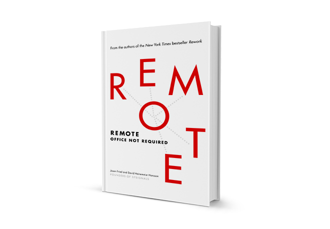
After a few tweaks and some uncertainty we had a cover for REMOTE. I’m honored that Jason and David advocated for my design. Thanks to Crown Business for going with the cover.
Pick up a copy of REMOTE if you don’t have it yet. I designed the cover.

Try, try again

Mig Reyes
Mig Reyes wrote this on 5 comments

I wonder how many people stop themselves short of making something new in fear of it failing.

Failure, sigh. It’s (still) overrated, and it’s given everyone the wrong lens to look at their craft. Why dissect post-mortem when we can imagine possibility? Why review mistakes when we can consider play?

The makers of our world would be better off mimicking scientists with their work. Harp on deliberate practice. Reinvent their processes daily. Share every discovery. And most importantly, try new things often.
All of a sudden punting on ideas—no matter how silly—seem like the real mistake. They’re lessons you didn’t learn, skills you didn’t exercise.
When everything’s an experiment, you shed the fear that comes with trying new things. And that sounds like a better way to grow and learn. Plus, no one has to even mention the f-word.

Design Decisions: Basecamp for iPhone iOS 7

Jason Z.
Jason Z. wrote this on 8 comments

Today iOS 7 arrived and along with it our freshly updated Basecamp for iPhone. Perhaps there were some existing apps that just worked on the beta releases of iOS 7 but Basecamp wasn’t among them. And while we knew some under-the-hood changes would be required to support the new system, we didn’t anticipate changes to the design or how much we’d like them.
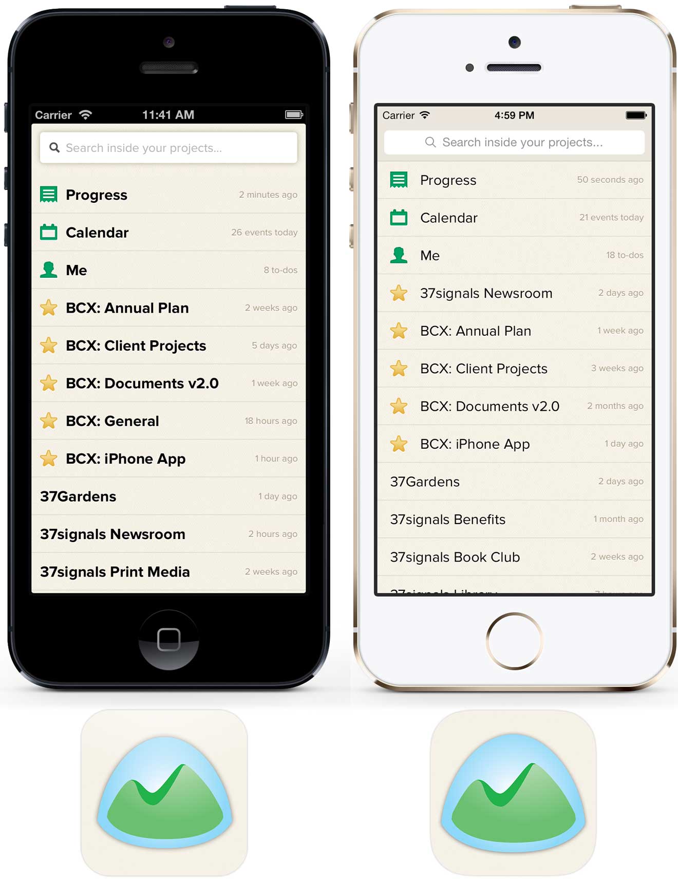
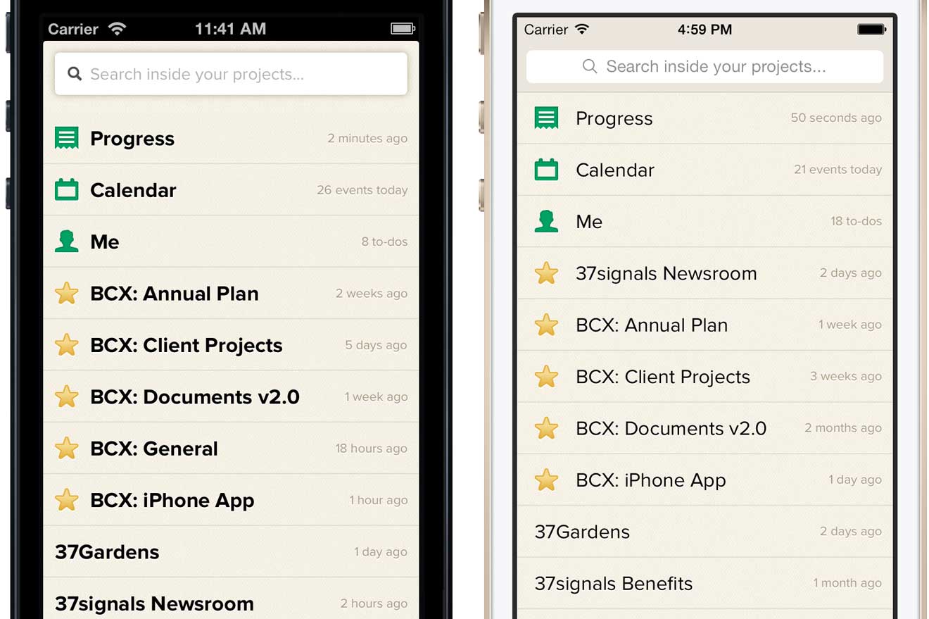
Here’s a quick before and after look at what’s changed.

Navigation bar

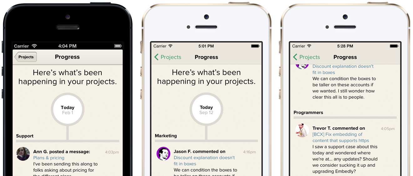
Basecamp was already using a tinted stock navbar so updating to iOS 7’s aesthetic meant embracing the flatter look and borderless “Projects” button. Tinting the button green was a nice opportunity to add some personality and expand our already-in-use color for tap highlights. We weren’t happy with the default opacity and blur effects when scrolling content up under the navbar so we created a custom background image with a very small amount of translucency. It’s a similar but subtler effect.

Page stacking

Arguably the most unique part of Basecamp for iPhone is the page stacking navigation. As you tap through projects, new sheets stack on top of the one you were looking at before. Getting back to where you were is simply a matter of swiping the sheets off the top of the stack. It’s a unique and intrinsic part of Basecamp.

In the iOS 6 app stacked sheets overlapped the navigation bar but that design didn’t work with the way content now scrolls underneath the navbar and status bar in iOS 7. Updating the design so that sheets tucked under the navbar felt like a compromise at first glance but we’ve come to realize that the page stacking metaphor is still intact—with the added benefit that you can now access the project menu anytime and jump to another section without first dismissing the stack.

Typography

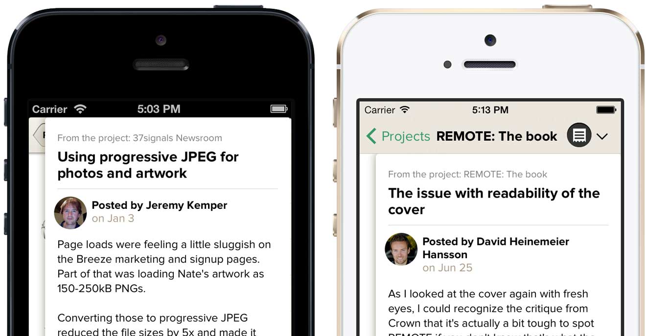
Proxima Nova is a strong part of Basecamp’s identity so there was no chance we were going to switch to iOS 7’s default Helvetica Neue, but that’s not to say we weren’t influenced by iOS 7’s lighter sensibilities. In general, the system seems to avoid multi-facet contrast by tending, for example, to rely on just type size or color when iOS 6 would have created contrast with size and color and weight. The lack of that heavy navbar, in particular, seemed to free us from the bolds we used on the project menu. Basecamp is improved by embracing these cues from the OS.

App icon

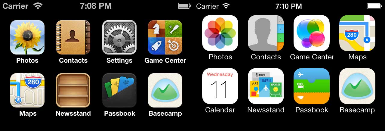
The new icon designs for Apple’s built-in apps might be the most discussed change in iOS 7. While we didn’t attempt to flatten the artwork or brighten the colors, we did enlarge Basecamp’s logo inside the icon bounds. The larger logo looks better inside the new rounded rectangle radius and feels more at scale with the built-in app icons—it just reads better. A very small change that makes Basecamp feel more at home on the new OS.

We’re still getting cozy with Apple’s newest OS, but right now everything feels fresh, light and new. The newly updated Basecamp for iPhone was released today alongside iOS 7. Be sure to get the latest version when you upgrade or when your shiny iPhone 5s/5c arrives on Friday!

Download on the App Store

What I cannot create, I do not understand.


Richard Feynman
Travis Jeffery on Jul 31 2013 2 comments

[On Apple’s integrated organizational structure]

Normally, in well-functioning markets, vertical integration is suboptimal. However, if transaction costs in the vertical chain outweigh the losses due the inefficiencies of being vertically integrated, then vertical integration could be the correct course of action.

Apple thinks the exact same way, but not about monetary cost; instead, the transaction costs they consider are the tax that modularization places on the user experience, and it is a cost they are not willing to bear.

A design has to start with some initial conditions, and then adapt to the boundary conditions – the conditions it encounters as it evolves. This can only happen through recursion, which is how our design achieves adaptive evolution and a much better “fit” with the problem. We might have a very good intuition of what the design has to embody – Steve Jobs, for instance, was famous for his intuition of the final qualities a design needed – but then large teams of people had to refine that initial vision and bring iterations to him to evaluate. He was setting the initial conditions (what he wanted the devices to be able to do for people), as they were adapting to the boundary conditions.


Michael Mehaffy and Nikos Salingaros in Unified Architectural Theory: Form, Language, Complexity. A companion to Christopher Alexander’s Nature of Order, Book 1

Designing App Store “screenshots”

Travis Jeffery
Travis Jeffery wrote this on 18 comments

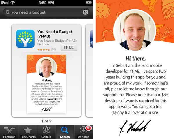
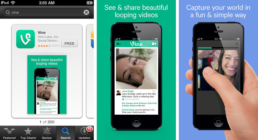
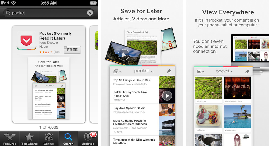
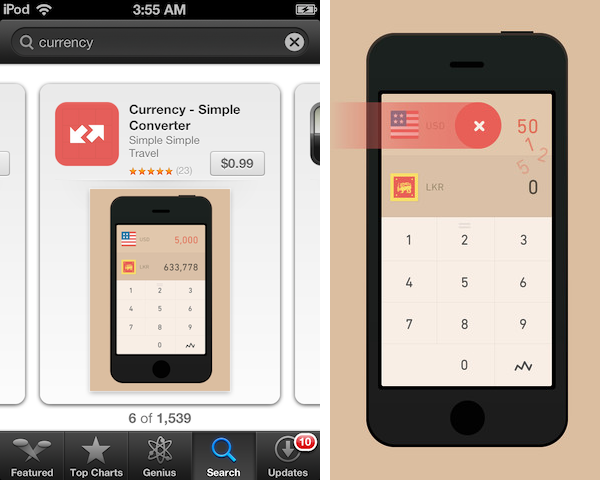
Hey iOS developers, App Store “screenshots” don’t actually have to be screenshots and they can communicate more than just how your apps looks.

They can communicate:

  • Who you are, how hard you worked, and prerequisites to using your app…

  • Your app’s job…
  • How to use your app…

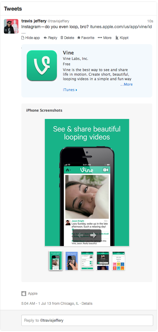
As an aside: keep in mind that these images will be seen outside of the App Store too, such as in Twitter cards…

What’s cool about these screenshots? They’re interesting—i.e. not boring lists! They communicate explicity, often using words. It’s cool seeing the apps from the perspective of being on a phone and in someone’s hand. They use colors outside of the typical app color pallete. They convince me that these apps will do the job. Most important, they convince me that the makers of these apps care.
The apps listed above, and other good examples: