You’re reading Signal v. Noise, a publication about the web by Basecamp since 1999. Happy !

Here’s what we’ve learned about doing UI for mobile web apps with WebKit

Jason Z.
Jason Z. wrote this on 32 comments

Lately, we’ve been exploring ways to offer web apps that perform like native apps on mobile devices. For this short sprint we targeted mobile WebKit browsers—especially the default browsers on iOS and Android—because of their widespread use and excellent support for HTML5 and CSS3.

Here are a few things we’ve learned along the way:

Browser differences

Targeting WebKit browsers specifically lets us make liberal use of -webkit extensions to CSS3 (as seen in the spinner animation we shared recently). Incompatibilities between the current browsers on iOS and Android devices has not been an issue so far.

Fonts

The biggest difference is the default installed fonts. We prefer Lucida Grande for our apps in desktop browsers, but the font isn’t available on any of the mobile devices we tried. iOS offers Verdana, Helvetica or Arial; Android devices have Droid Sans. Just like on the desktop, Verdana is large relative to other fonts. For that reason, we choose Helvetica on iPhone. Compared to Helvetica, Droid Sans appears a bit smaller and more condensed.

Form widgets

Form widgets are another distinct difference between the platforms, but because of the flexibility of WebKit are less of an issue. The native browser widgets on Android are ugly in some cases and unuseable in others.

For example the checkbox widget has a checkmark in both the checked and un-checked states—the checkmark turns green when “checked”. Using CSS we were able to create new widgets that look nearly identical on both platforms. Because of the differences in font rendering, however, it can be difficult to do things like align text inside a button. Web designers should not be surprised by this since it’s a common hassle between even desktop browsers and platforms.
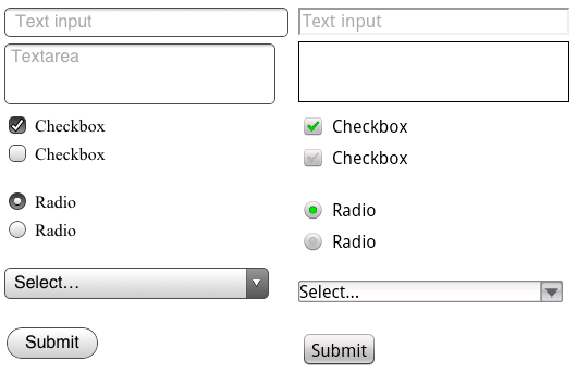

Default form inputs on iOS (left) and Android. Notice how the label on the submit button is positioned differently on each. Or imagine a long list of Android checkboxes where none is “checked”. Are they all checked or un-checked?

Testing

For the purposes of testing your app, both platforms offer desktop simulators. Testing on the iPhone SDK simulator is fast, convenient, and fairly representative of using the actual device—it actually looks like an iPhone.

The iPhone simulator supports the iPad, iPhone and iPhone 4 devices, but only on the latest OS version. Because of this, supporting older versions of Mobile Safari could be a challenge. While it’s possible to run multiple versions of the iPhone SDK, testing on older versions is best done on a physical device.

The Android SDK’s simulator, however, is a sluggish java app launched from the command line that gives no sense of the feel of the OS within the context of the hardware. It does account for the wide array of Android hardware and software versions/features in the wild, but in an obtuse way. You can’t, for example, launch an HTC Droid X profile but instead have to spin up a new virtual device and enter the hardware profile yourself.
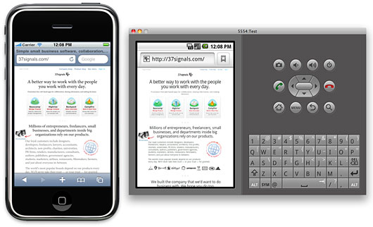

The iPhone and Android simulators running side-by-side. Click the image to see it larger

In fact, all testing is best done on real hardware. The simulators give a poor sense of the app on the actual devices. This is especially true in terms of scale. The much smaller pixel size on desktop computers means the simulated devices appear much larger than you’d expect on your computer screen. Much larger than the actual device. Type that looks great on the device can look horsey on the desktop.

For this reason we’ve also been testing on real phones. Using Dnsmasq we can serve requests for the app on our development machines to devices via a wifi network. Touching the UI is an important distinction from the desktop simulator. Real devices are also particularly useful for previewing on the iPhone 4’s retina display. And a real Nexus One is much faster than the simulated Adroid device.

Screen resolution

The iPhone’s retina display also revealed some additional challenges. Web pages in Mobile Safari on iPhone 4 are scaled at twice the resolution of the earlier iPhone models. This means that images created at 72dpi look fuzzy on iPhone 4 where they are zoomed to twice their size.

Fortunately, -webkit browser extensions to CSS handle this scenario well. Images in CSS targeted at Mobile Safari should be designed at exactly twice the intended display size. So a 16px x 16px icon rendered as a CSS background image should be built in Photoshop at 32px x 32px. Then, we can tell the browser the intended display size using the -webkit-background-size property like this:

background: url(images/icon_retina.png) no-repeat;
-webkit-background-size: 16px 16px;

That displays a high resolution image for iPhone 4 when it doubles the dimensions, and a shrunken version for the lower resolution devices. This appears to work similarly on Android though we haven’t tested a wide range of resolutions. We’ve used the convention of naming images that require this special handling with “_retina” in the file name.

Web app settings

We also explored the apple-mobile-web-app-capable settings which lets apps that are bookmarked to the home screen on iOS act more like native apps. These settings let you specify a loading screen image, allow for local caching of data (even the entire app), and hide the browser chrome. Unfortunately nothing like this yet exists on the Android platform, but it’s a great step for browser-based apps so hopefully the idea will catch on.

Final thoughts

Despite opinions to the contrary, mobile web apps still feel like an excellent opportunity to offer native-like performance without having to specialize in a particular platform, or be subject to the whims of an overlord.

Browser-based mobile apps clearly have the potential to offer user experience that is on-par with native apps. Of course designing that kind of experience is going to require more than emerging mark-up and style techniques—it’s not going to be enough to just serve a mobile stylesheet for your app. Offering a native-worthy mobile experience requires you to rethink the UI of your app and deliver it within an environment where touch is the rule. A big part of this exploration not covered here considered fast page rendering, touch interaction, and local asset storage. We hope to share some of the tech side in another post.

Bootstrapped, Profitable, & Proud: Envato

Matt Linderman
Matt Linderman wrote this on 33 comments

This is part of our “Bootstrapped, Profitable, & Proud” series which profiles profitable companies with over $1 million in revenues that never took VC.

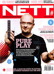
“Our outfit Envato was started by myself, my big brother, my wife and my best friend,” says Collis Ta’eed (pictured below on the cover of Nett magazine). “We put in a bit of money we each had and mostly just worked hard.” In this Q&A, Ta’eed answers questions about Envato and its path to success. He will also be answering reader questions today (Oct 7) in the comment thread so feel free to ask a question!

What does your company do?
We do two main things: First we run sites that help people earn an income. These are our biggest sites in revenue and include ThemeForest which is the largest marketplace for buying and selling website templates and WordPress themes. In the early days selling with us would just be a sort of hobby income. Then after a while there were a few people who actually could manage to earn a living. These days there are guys earning, quite literally, tens of thousands of dollars a month. These sites are called the Envato Marketplaces, and there are 7 of them, with an eighth launching three days from the time I am writing this :-)

nettThe second part of what we do is a set of sites to help people learn professional creative skills. These are our biggest sites in traffic and include Psdtuts+ which is the largest Photoshop tutorial site online. We also have tutorials published on a variety of other subjects including audio production, motion graphics, illustration, photography, mobile development and web development. The full network is called Tuts+ and there are nine sites with a tenth launching in a couple of months.
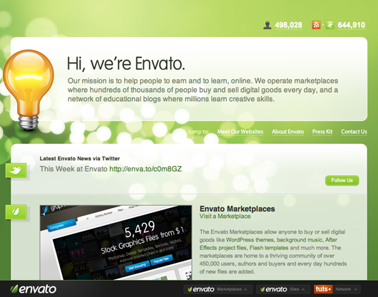
So learning and earning is what we do chiefly.

But we also operate a few other sites and services including Creattica which is one of the biggest design galleries online, FreelanceSwitch which is the biggest and oldest blog dedicated to freelancing, and AppStorm which is a very rapidly growing set of app review blogs that includes Mac.AppStorm, the largest blog dedicated to Mac Apps.

So basically, we do a lot of stuff :-) As you might imagine it’s difficult explaining to someone at a dinner party who casually asks what we do for a living.

envato

How did the business get started?
Back in 2006, our plans were much more modest. We actually just wanted to build a marketplace for buying and selling Adobe Flash. At that time I used to sell my files on iStockPhoto, but as you would assume from the name, they didn’t give a lot of attention to Flash guys.

So we planned out a marketplace called FlashDen, and I put up a job ad for a PHP developer. But instead we got an email from a developer I had briefly known at an old job whose email text was quite literally “Pick me, pick me!” When I called him he told me that PHP was really not what we should use, rather we should build the project in this thing called Ruby on Rails which he’d gotten into. Back in February of 2006, Rails was still pretty new, but I trusted Ryan and we went for it.

Using Ruby was one of the best cultural decisions we made as it brought us to using test driven development, version control, and a lot of agile techniques. These days here in Melbourne, Australia we operate one of the largest, most respected Ruby outfits.

How much cash did you need to get up and running?
So to get started we spent about $40,000 or so, plus a lot of sweat and hard work. The money came from the cofounders’ savings and was pretty much the sum total of those savings!

Early on the project didn’t go as we’d hoped. By July we’d burned through all the money, exhausted our credit cards, and were busy working our freelance design jobs as well as trying to build and work on FlashDen at night time. For a little while there I recall wondering if the whole thing was going to flop.

But happily by August we chopped out a lot of the ‘nice to have’ features, cleaned it all up a bit and managed to launch.

melbourne
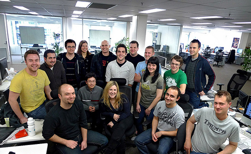
Ta’eed: “Back in late 2009 after we’d moved to the new office in Melbourne.” Back row, L to R: James, Naysan, Oz, Justine, Lucas, Stu, Rod, John, Skellie, Erin, Jordan. Front row seated, L to R: Collis, Fred, Cyan, Vahid, Ryan.”

Continued…

Q: What advice you have for somebody who wants to get started in programming?

A: Pay attention to that need of really doing something that interests you and solving a problem and using the programming language as a tool to solve that problem.

Something that I’ve seen among new programmers is dancing around that central piece of problem solving with the tool and worrying more about the libraries you choose or the tools that you ought to be using. It’s like going out to do carpentry and spending most of your time worrying about the tool belt you pick and the kind of screwdriver. Those are kind of irrelevant. If you’re into problem solving, solve the problem and just practice doing that.

Basecamp on Oct 6 2010 10 comments

Having big goals and stating them proudly

David
David wrote this on 126 comments

The first time you hear Gary Vaynerchuk talk about how he’s going to buy the New York Jets, you’ll probably let out a chuckle. The second time you hear it, you’re still in “suure” mode. The third time, you start to believe that Gary is fucking serious. By the fourth time, you know he is.

Once that realization sinks in, it’s a new day. Here’s a guy with such an outlandish goal, given where he is today. And he believes that it’s actually going to happen. He’s actually working towards making it happen. It might have a long horizon, but every day is a tiny bit of work going into making that happen.

That’s incredibly inspiring. If Gary can think it’s okay to work towards owning the Jets, then I can surely work towards turning 37signals into a $100 million/year company. Or race the 24 hours of Le Mans and stand on the podium at the end of it.

Now something magic happens when you believe that your big goals are achievable and you make those goals public. You start thinking, plotting, and doing all the little steps that are going to take you there.

Hey, if I’m going to stand on the podium of Le Mans, I better start racing a car that’ll be similar to that and in a series that’s going there. If we’re going to turn 37signals into a $100 million/year company, we better start thinking about how we can keep more customers from canceling during their trial.

So what’s your big goal? Make it public and we’ll egg you on.

Why are technical recruiters so clueless?

David
David wrote this on 149 comments

Are there any recruiters working in technology who get it? Anyone putting in just a minimum of effort to appear even half-way competent? If so, they need to speak up. The reputation of their profession is being soiled by completely clueless hacks.

Here’s a pitch I just got this morning:

Dave –

My name is Kelly ** and I am reaching out to you to see if you would be looking to make a career move. I am searching for creative and talented Ruby Developer to add to a rapidly growing team. The position is located in the San Francisco Bay Area. You do not need to be there now, but should be willing to relocated there within a short but realistic time frame. Relocation expenses will be shared by my client.

They are serious about bringing on the right talent, so they will pay for the right person. Base Salary is open and depends on your experience.

..snip…

About My client: They are a rapidly expanding, VC-funded tech startup positioned squarely on top of the social media marketing revolution. Their platform allows brand managers and marketers of all shapes and sizes to quickly create a variety of promotional campaigns to engage and interact with the users and fans of their brands.

You’d think that the job of the recruiter would be to narrow down the field of suitable candidates by actually doing some research on them. If they’re just going to spam people from emails they find on tech sites, why not just pay some shady Russians to do it?

The problem with this kind of hackery is that it has bred an outright animosity to recruiters in large parts of the tech world. The gut reaction of programmers to any recruiter interest is that they’re just as clueless as all the others that went before them. And that’s too bad, since I’m sure that there are companies out there who could actually use good recruiters to screen and find talent for them.

As things stand right now, though, I would never recommend the use of recruiters to anyone for a technical position. You’re much more likely to be associated with the incompetence of the recruiter than you are to find highly skilled technical talent.

Interview from Prague with Ryan. He discusses the creation of Basecamp, how designers/programmers at 37signals work together, where inspiration comes from, and more.

Basecamp on Oct 5 2010 4 comments

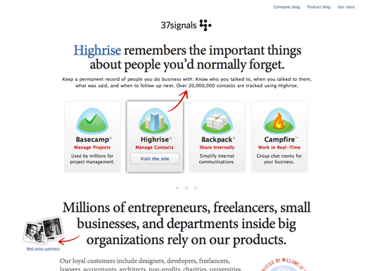
Redesigned: The new 37signals.com

Jason Fried
Jason Fried wrote this on 102 comments

This weekend we launched a redesign of 37signals.com.

We try to redesign 37signals.com at least once or twice a year. It’s not a stated goal, but it’s something we just like to do to keep things fresh — especially since our designs are often copied pretty quickly after we launch anything new.

This time around we wanted to go back to our roots. Our roots included simple, sparse, mostly text-based black and white designs. Our original site, which is now the 37signals Manifesto is the best example of this style. This design from 2002 is another example. Strong opinionated writing was also part of these early designs. It was time to return to that era.

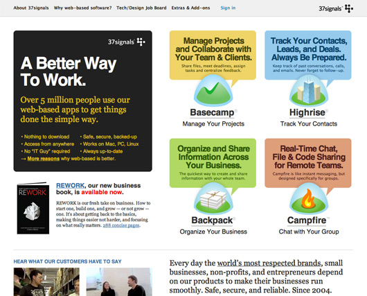
Our previous home page design looked like this:

It was a bold departure from our earlier designs. Full of color, shapes, and pretty dense newspaper-like columns of text. I still like the design, and it served us quite well, but in some ways just didn’t feel like 37signals.

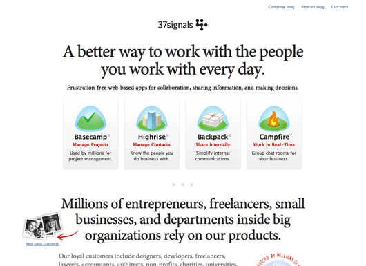
The goal for this redesign was to get back to being absolutely clear about what we do, what we offer, and what we believe in. A big part of that would be the straightforward presentation. Black, white, red, centered, big text, great writing, color for naturally colorful things like product icons instead of color for shape.

We also wanted to bring a bit of the manifesto back to the 37signals home page. Our strong opinions and vision for software and business are a key part of our company. We wanted to make sure some of these ideas were front and center.

A couple of weeks ago we began exploring some new designs for 37signals.com. We’ll share those iterations in a future post. We’ll also be sharing some of the copywriting process for the headlines and paragraphs that ended up on the home page.

The new design

The final design we came up with was a simple, straightforward approach. Big centered headlines, clear blocked sections (one for the products, one for our customers, one for our ideas, one for REWORK, etc). Tight copy, clear lists, and a few small visual flares to highlight key points we want to make. We used color to make a point, not to make a statement.

The only thing that’s a bit fancy on the page is revealing a more detailed description of a product when you hover over the product’s icon. On hover we switch out the main headline on the page with the product-specific headline. We also add a red arrow to make sure the connection between new headline and product is absolutely clear.

The whole new design is live at 37signals.com. The new design also introduces our new customer page with faces, locations, and stories from some of our customers around the world.

We hope you like the new design. Thanks for listening.

This week in Twitter

Basecamp
Basecamp wrote this on 1 comment

A few of this week’s 37signals staff posts at Twitter.


Jason Fried@jasonfried: Mike Rohde (@rohdesign) played with chalk at our office yesterday: http://bit.ly/9kOUDo


Jeffrey Hardy@packagethief: I was wondering why I felt so calm today. Then I realized Mail.app wasn’t running.


Matt Linderman@mattlinderman: How to Cook Everything iPhone app. “Mark Bittman’s bestselling cookbook w/ 2,000 recipes & 400 how-to illustrations.” http://bit.ly/dvcZg8


Jason Fried@jasonfried: Did you know Kingsford-brand charcoal briquets were a by-product of the Model T? http://bit.ly/bKAEwR


Jamis Buck@jamis: “Catalog Living” is one of the funniest blogs on the Internet: http://catalogliving.net/


DHH@dhh: Facebook is supposedly worth more than FedEx, Dell, Capital One, Sony, Lockheed Martin, and MasterCard. #whatajoke


uptonic@uptonic: Man, I wish I had a Swiss Army knife to open this Swiss Army knife package.


Jason Fried@jasonfried: There’s great copywriting all over this site: http://optimohats.com


DHH@dhh: Secondary Suckers: http://bit.ly/aiLbYb—What if you.. pushed it to the extreme: a small float with nearly no reliable information?


Official pictures of our new office

Jason Fried
Jason Fried wrote this on 97 comments

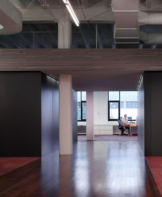
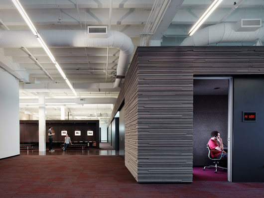
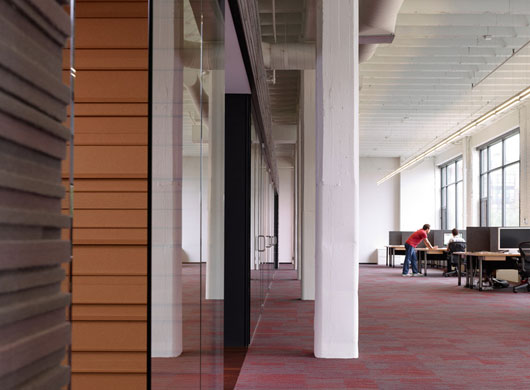
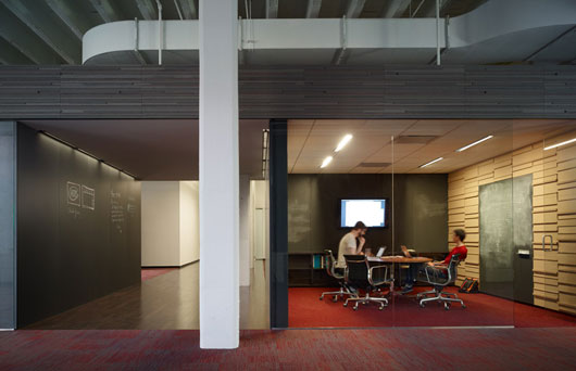
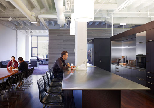
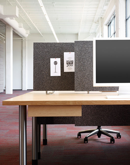
Just got the official shots of the new office back from the photographer. There are a few more coming, but we couldn’t wait to share these.

The chief architect was Brad Lynch from Brininstool, Kerwin and Lynch. The general contractor was Goldberg General Contracting. The wood millwork, cork and felt walls, desks, and blackboard walls and doors were built by hand by the incredible crew at Stay-Straight Manufacturing. The photographer was Chris Barrett. Down the road I’ll write up a more detailed post about the people who worked on this project. They were all incredible to work with.

And here’s a rough video of some moving pictures:

Product Blog update: New extras for Basecamp, WebGreek's use of Highrise, and more

Basecamp
Basecamp wrote this on 2 comments

Some recent posts at the 37signals Product Blog:

Basecamp
Web and print design Extras for Basecamp
We’ve added a new section to the Basecamp Extras page: Design Tools For Web And Print.

Design_tools

Time Hawk adds timekeeping framework for logging and tracking time to Basecamp
“With Time Hawk™, your employees and vendors easily track time invested to specific project tasks. Your Project Managers can turn a keen eye to details, monitoring budgets in real-time, entering project estimates and billable rates, and generating comprehensive reports — all easily exported directly to Excel. No installation is required. Time Hawk™ is easy to use and requires little to no training…Users are assured a secure network for all data, with backups daily. Time entries are also pushed directly into users Basecamp accounts.”

Time-Entry

Roadmap is a strategic reporting engine for your Basecamp account
“Roadmap is the most complete portfolio management tool for Basecamp. Interactive Gantt charts, programs, drag-and-drop dates, custom reports…”


UK-based flight simulation business takes off with Basecamp
Virtual Aviation is a UK-based flight simulation specialist, operating a fleet of $20-million Boeing and Airbus full-motion flight simulators from bases at London Heathrow and London Gatwick. “We’ve just developed a new product called ‘Mayday’, which is a talent development course for business people, and Basecamp has been invaluable throughout the year-long development process. It has allowed the numerous people involved with developing Mayday to share messages, ideas files, and documents. Without Basecamp, I doubt we would have been able to complete the project so quickly and efficiently.”

Continued…