You’re reading Signal v. Noise, a publication about the web by Basecamp since 1999. Happy !

Ultimately, the best test of any product is to go to your target market and pretend like it’s a real business. You’ll find out soon enough if it is or not. You have to take some risks. You can sit and analyze these different markets forever and ever and ever, and you’d get all these wonderful answers, and they still may be wrong. The problem with the businessman type is they spend a lot of time with all their great wisdom and all their spreadsheets and all their Harvard Business Review people, and they’d either become convinced that there’s no market at all or that they have the market nailed.


One of the entrepreneurs profiled by Saras Sarasvathy in “How Great Entrepreneurs Think.” Among Inc. 500 CEOs, 60 percent had not written business plans before launching their companies and just 12 percent had done market research, according to the article.
Matt Linderman on Feb 21 2011 7 comments

Design Decisions: Basecamp mobile UI

Jason Z.
Jason Z. wrote this on 23 comments

With the launch of Basecamp Mobile just a couple of weeks behind us, we wanted to take a look back at some of the design decisions we made along the way.

One of the first challenges was simply how to take the Basecamp design and make it work on a much smaller screen. It needed to look like Basecamp and be familiar to people who have been using the desktop version for years. We wanted it to perform like a native app but we didn’t want it to look like one, it was far more important that it looked like Basecamp. This was a big factor in the decision to avoid using one of the existing mobile Javascript UI frameworks.

Early inspiration: iOS

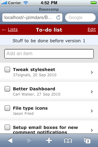
For the earliest mock-ups it was easy to rely on the excellent UI conventions of the iPhone; most of us are iPhone users at 37signals (as are many of our customers), we did a lot of testing on the devices, and frankly the UI is very good. It was a great place to start. That meant the first version had an iOS-like navigation bar at the top of the screen with the title of the screen in the center. A button on the left navigated up one level in the hierarchy (backward). A button on the right worked in the context of the current screen. This was pretty much stock from the iOS Human Interface Guidelines. Here is one of the very first screenshots of Basecamp Mobile:

First look at Basecamp Mobile

This early mock-up was just static HTML. We used the iPhone SDK simulator even at this stage to make it seem as real as possible.

Finding our own way

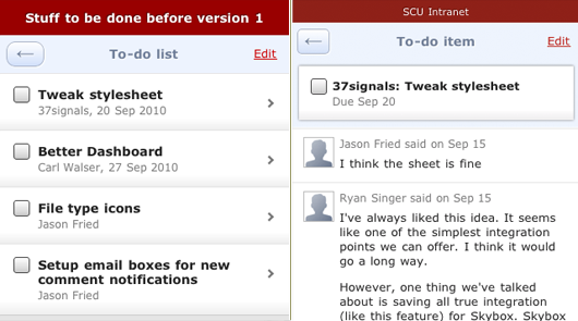
We continued with this design for some time but a few problems kept coming up. We’d used the item type instead of it’s title in the navigation bar because titles can be very long. So now we had two bars that both titled the screen, but in different ways. And even using all that space it still wasn’t clear where you were. Where does the back button go? Which project is this list in?

Header variations

After a few more iterations we knew something wasn’t right. We were trying too hard to squeeze our app into a navigation idea that wasn’t the right fit.

Starting over

Right about this time I happened to be in Chicago so I sat down with Ryan and Jason Fried to brainstorm some new ideas. We were sure that the iOS style navigation bar wasn’t going to work. We had to be able to show a lot more information than it was capable of—especially since titles were often much longer than the available space offered (usually just a word or two). Here are the pieces that needed to be included:

  1. Back button
  2. Title of the screen or item
  3. Name of the project
  4. Context actions (Add and Edit)
  5. Account theme (header color)

I went immediately to work quickly sketching a single header with more dense information.

Continued…

On Writing: The 1972 Chouinard Catalog that changed a business – and climbing – forever

Matt Linderman
Matt Linderman wrote this on 13 comments

While talking to Grant Petersen from Rivendell, he mentioned his love of decades old Chouinard climbing catalogs.

I grew up reading catalogs. The Herter’s catalogue* was the most opinionated one out there, but it was also the most entertaining. Sometimes I’ll read an online comment that, “Rivendell (or Grant) is so opinionated” and it’s supposed to be a criticism. It’s not a criticism. If you want to criticize me, there are way better ways to do it. Tell me I don’t have my facts right, or I don’t give credit where it is due, or my grammar is bad, or my jokes are stupid. That will do the job of hurting my feelings, but being accused of being opinionated is a compliment.

The best catalogues ever were the 1972 and 1973 Chouinard Equipment/Great Pacific Iron Works climbing catalogs. There will never be catalogues like those again. Everybody who writes copy or catalogs or online stuff or reads at all should read those.

coverStrong praise. Turns out the 1972 Chouinard Catalog is online. Copies of the original catalog fetch $200+ on eBay. But to understand its impact, you first need to know the context around it.

The Chouinard backstory
The backstory to the company is a “scratch your own itch” tale. It starts with pitons, the metal spikes climbers drive into cracks. They used to be made of soft iron. Climbers placed them once and left them in the rock.

But in 1957, a young climber named Yvon Chouinard decided to make his own reusable hardware. He went to a junkyard and bought a used coal-fired forge, a 138-pound anvil, some tongs and hammers, and started teaching himself how to blacksmith. He made his first chrome-molybdenum steel pitons and word spread. Soon, he was in business and selling them for $1.50 each to other climbers. By 1970, Chouinard Equipment had become the largest supplier of climbing hardware in the U.S.

But there was a problem. The company’s gear was damaging the rock. The same routes were being used over and over and the same fragile cracks had to endure repeated hammering of pitons. The disfiguring was severe. So Chouinard and his business partner Tom Frost decided to phase out of the piton business, despite the fact that it comprised 70% of the company’s business. Chouinard introduced an alternative: aluminum chocks that could be wedged by hand rather than hammered in and out of cracks. They were introduced in that 1972 catalog, the company’s first. The bold move worked. Within a few months, the piton business atrophied and chocks sold faster than they could be made.

Looking at the catalog
So what kind of catalog do you put out when you’re reversing your entire business? Chouinard went with a mix of product descriptions, climbing advice, inspirational quotes, and essays that served as a “clean climbing” manifesto. It opens with a statement on the deterioration of both the physical aspect of the mountains and the moral integrity of climbers.

No longer can we assume the earth’s resources are limitless; that there are ranges of unclimbed peaks extending endlessly beyond the horizon. Mountains are finite, and despite their massive appearance, they are fragile…

We believe the only way to ensure the climbing experience for ourselves and future generations is to preserve (1) the vertical wilderness, and (2) the adventure inherent in the experience. Really, the only insurance to guarantee this adventure and the safest insurance to maintain it is exercise of moral restraint and individual responsibility.

Thus, it is the style of the climb, not attainment of the summit, which is the measure of personal success. Traditionally stated, each of us must consider whether the end is more important than the means. Given the vital importance of style we suggest that the keynote is simplicity. The fewer gadgets between the climber and the climb, the greater is the chance to attain the desired communication with oneself—and nature.

The equipment offered in this catalog attempts to support this ethic.

art of
A guide for clean climbers.

A few pages later, there is a guide for clean climbers.

There is a word for it, and the word is clean. Climbing with only nuts and runners for protection is clean climbing. Clean because the rock is left unaltered by the passing climber. Clean because nothing is hammered into the rock and then hammered back out, leaving the rock scarred and next climber’s experience less natural. Clean is climbing the rock without changing it; a step closer to organic climbing for the natural man.

Continued…

Providing great user experience with feedback

Jason Z.
Jason Z. wrote this on 22 comments

Feedback is an essential part of software user interface design. It’s especially true when designing applications for current mobile devices. Tapping a touch screen is less precise than clicking with a mouse. Touch screens also lack the tactile and auditory feedback of a physical key or button. Slow, unreliable cellular data access adds to the confusion. A user might wonder: Is the app broken or do I have a poor connection? Was my tap registered or did my fingers miss that tiny button? Making sure users get clear feedback in response to their actions and to changes in state or conditions is key to a great software experience.

When we designed Basecamp Mobile we decided to use a variety of methods to keep people informed about the current state of the app. Different conditions can require different feedback, so we had to carefully consider multiple types of feedback. Here are some examples:

Touch

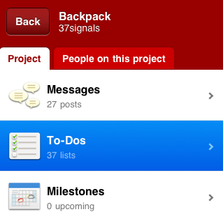
It was important for us to make taps in the app feel responsive. Even if there could be a delay before the associated action executed it was essential that the user knew the tap was successful. Anything that can be tapped in Basecamp Mobile has a selected state that highlights the item immediately when the user touches the screen. Here you can see how a selected item on the project screen:

Touched state

Loading states

Basecamp Mobile is an HTML5 app that uses local storage to cache both content and the app itself. The app runs entirely in the browser, rendering HTML with Javascript and loading only your account content from the server when needed. Each screen has a number of states depending on the status of the screen’s content. A single loading indicator wouldn’t cut it—the feedback had to be appropriate to each situation. Here are some of the states we had to consider in the design:

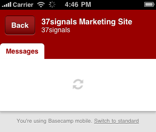
Initial load

Basecamp Mobile is loading assets the first time you run it or when the local cache is empty. The large animation is the only element on the screen making it the focus. The lack of any other UI elements makes it clear that the only option here is to wait. Because people see this before they see the app, it’s even more important that we let them know what is happening.

App loading state

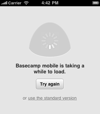
If this initial load is taking too long we let the user know. After a short wait, the app reassures people that it’s still working.

Slow loading state

If the screen still doesn’t load after a few more seconds the app offers some other options: Refresh the browser and try again or try the standard version. The latter option is useful for users who may be attempting to load the mobile optimized version on an unsupported device and need the option to switch back to the normal version.

Very slow loading

Loading content

In the next state, the app has loaded and the UI is now available, the app is only loading content now. The user can always cancel the action and go back to the previous screen. You’ll see this the first time you load a screen that you haven’t loaded before like a newly posted message.

Cold cache loading

Refreshing content

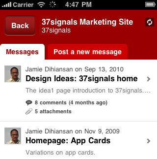
Basecamp Mobile caches screens as you visit them so going back and forth between them is nearly instant. Because the data could be old we need to check the server for changes, new items, new comments, etc. The screen might be perfectly fine, or it might need to load in changes. While this is happening we show a small, less prominent indicator. The page is fully functional but we want to let the user know that we’re talking to the server. This indicator isn’t in the user’s face or in the way of what they’re doing. It’s just a notice that the app is working and if you’re expecting something new, we’re checking. You can see the spinning icon in the upper-right of this screenshot:

Syncing indicator

The icon actually duplicates the functionality of the browser’s own loading spinner (visible in the top toolbar in the screenshot above) but we felt like people were likely to ignore or completely miss it. The approach brings the loading indicator a little closer to the action without making it more intrusive.

Loading previews

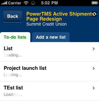
We took a similar approach with the To-do Lists screen. For each list we wanted to show the first few items on it. This makes it clear these are to-do lists and helps people identify the one they need. The previews load after the page is available because the content is helpful but not essential. A very subtle effect doesn’t distract but makes it clear something is happening. A series of spinners would have overwhelmed this screen, but the subtle gradient shine moving over the word “loading” informs without distracting.

List preview loading

Final thoughts

Presented like this it may appear that the app is just a series of waits, it’s not. Most of these indicators are actually on the screen for just seconds, but that is sufficient time to quiet a user’s doubts and ensure they know things are working. It feels great to click through the app and always feel like you know what’s happening, that things are working.

We use prominence of these indicators to tell people how important it is that they wait. The amount of surrounding UI is a clue about what else they can do if they don’t want to. You certainly have to wait for the app, itself, to load. But you can pass right by a To-do list that’s fetching a preview of it’s items. Just the right UI feedback makes sure users know this without having to think about it.

Four new people join the 37signals family

Jason Fried
Jason Fried wrote this on 24 comments

We’ve just added four new people to our 37signals team. This brings us to 25 people which is both a little scary and also incredibly comforting. We’re growing without having to sacrifice quality. Being able to work with 25 world-class people every day really is an honor and a pleasure.

Merissa Dawson, Support

Merissa joins us from Austin, Texas. Merissa will be working with Michael, Jason, and Ann to make our support team the best in the universe. Merissa is one of those people who loves helping people with a smile. She wants to make everyone around her happy. It’s great to have her on the team. She’s in Chicago for the next couple weeks for training.

Andrea LaRowe, Assistant

We’ve been looking for months, and we’re beyond thrilled to have someone of Andrea’s caliber joining our team. Andrea will be helping everyone out with administrative tasks, research projects, basic HR, event planning, general organization, and keeping everything at the company running smoothly. Before 37signals Andrea worked as a executive assistant at a non-profit here in Chicago. She starts on February 28th.

Javan Makhmali, Programmer

Javan is based in beautiful Ann Arbor, MI. We really enjoyed getting to know him when he came to Chicago for his interview. He’s going to fit in perfectly here. Really curious guy who asks all the right questions and is focused on all the right problems. Before 37signals, Javan was a rails developer at Inkling Markets. Javan starts on March 7th.

Will Jessop, System administrator

Will has increased the European wing of 37signals to three people. He joins us from Manchester, UK and has been working with Joshua, John, and Taylor since December. He came from Engine Yard with deep knowledge of running Rails applications and we’re thrilled to have him.

Smiley goes public: Now everyone can see how our customers feel about our customer support

Jason Fried
Jason Fried wrote this on 48 comments

Back in September we launched Smiley, an internal tool we built to measure customer happiness as it relates to our customer service and support.

Smiley has had a tremendous positive impact on our overall customer service. We’ve learned a lot about what it takes to make a customer happy. And our customers are happier as a result. As it goes, if you want to improve something, measure it.

Inside 37signals, everyone can see our customer service ratings. We have a dashboard that shows how we’re doing. It’s great. I look at the page a dozen times a day to see how we’re doing. When I pitch in on support I’m very conscious of my ratings. Knowing how you’re doing helps you do better.

Going public

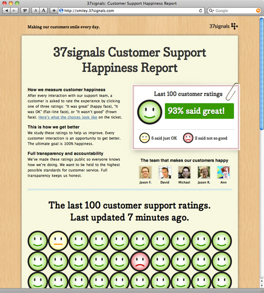
However, we want to go even further. We want to be held to even higher standards of excellence when it comes to our customer service. So we’ve decided to expose our customer service ratings to the world. If you want to see how we’re doing, visit http://smiley.37signals.com. It’s a real-time scorecard of our last 100 ratings.

Smiley scorecard

Please keep an eye on us and keep us honest. We’re working hard every day to try to make 100% of our customers happy.

Bootstrapped, Profitable, & Proud: Rivendell

Matt Linderman
Matt Linderman wrote this on 57 comments

A while back, we posted about the no-nonsense, opinionated, shopping/educational content at Rivendell, a small specialty bicycle business based in San Francisco. Recently, we talked with Rivendell owner Grant Petersen to find out more about his business. (Grant also answers some reader questions in the comments.)

What custom means
When Grant Petersen was 19, he ordered a custom bamboo fly rod made by Doug Merrick of the Winston Rod Company. “I wanted red winding on the guides — ‘Like a Leonard rod,’ I said — and a cork grip shaped like a Payne rod. They were two other fancy rods,” explains Peterson. Merrick refused. “I won’t do it,” he told Petersen. “It wouldn’t be my rod, then.”

Petersen says, “I felt ashamed for having asked, but glad to have been told that. And it made me appreciate the details that made a Winston a Winston.” Decades later, Petersen points to that interaction as inspiration for how he deals with customers at Rivendell, his biking business. “I don’t want anybody to feel ashamed for asking us to drill holes in forks or make a bike with low ‘trail,’ but I’m resolved not to do it for the same reason Doug Merrick held his ground.

“To a customer, a custom frame can mean ‘I pay you money and you let me design the bike,’ but that’s not what custom means here. We’ve turned down ‘custom’ orders when it’s meant all we do is collect the money and facilitate the customer’s own design. It can be seen as not customer-friendly, but in the end it means I know that every custom has the qualities I value and a certain amount of integrity. If you stand for something and are committed to it, then you dilute it if you introduce something that’s less pure or hard-core.”

If you stand for something and are committed to it, then you dilute it if you introduce something that’s less pure or hard-core.

Opinions are mandatory
Rivendell sells the kinds of bikes and bike gear you can’t get in a normal bike shop. According to Petersen, “99 percent of the bike market — designers, buiders, distributers, retailers, buyers, and riders — are selling the wrong bikes to the wrong people for the wrong reasons.”

Strong opinions are at the heart of Rivendell’s mission. “Specs are fine, but they take two seconds, and opinions, if they’re based on experience, are more interesting. If you know about something, you have an opinion about it.

“There’s always a story behind the pure specs of something. Does it mean anything to anybody that a Nitto handlebar may be made from 2014 T6 aluminum? If you leave it at that, it doesn’t. It not only doesn’t, it’s a bad thing to just say that, because it’s really saying, ‘I read that this is true. It sounds important. I don’t know what it means. But I hope you think that I do.’ But I can add that Nitto handlebars are the strongest and safest and most rigidly tested in the world and if Nitto says it can’t make a strong enough bar that weighs less than 265g, then you can believe nobody else can.’”

Petersen
Grant Petersen (photo by Martin Sundberg)

The opinionated path is one that has long appealed to Petersen. “In the ‘70s and early ‘80s, I worked at REI in Berkeley and there was a rule: No Handwritten Signs. We had a sign-making machine, and the store wanted a consistent look in all the signs. There’d be a sign for ‘Camping Books’. It was yellow-brown with dark brown letters and that’s all it said. But there was one book with the unfortunate title of ‘Pleasure Packing’ that seemed super soft-core by its title and cover, but was actually really radical inside with stuff I didn’t even know. And I thought I knew everything.

“I looked up sales on that book. Berkeley sold about 10 a year; Seattle (the only other REI at the time) sold about 20. I wrote a note about the book on a piece of cardboard, put clear packing tape over it so it wouldn’t smear, installed a grommet in the corner of it, and hung it in the book section. The first year after that we sold 215 of them. To me, it wasn’t about the sales. It was about getting the information out there.

Continued…

I didn’t go along with the cash-shredding of [the dot-com boom]. I didn’t take venture capital, hire 200 people, and spend money like crazy. I had the mentality of, “I don’t care if I’m running a lemonade stand or a dot-com, it’s the same thing. How much do the lemons cost and how much are people buying? Maybe I’d better find some cheaper lemons or make less lemonade. Maybe I need to improve the quality of my lemonade.”

Matt Linderman on Feb 9 2011 7 comments

Behind the scenes: Fun little Basecamp Mobile video

Jamie
Jamie wrote this on 32 comments

Sam Stephenson asked if I could shoot a fun little video announcing Basecamp Mobile. This was on a Tuesday, and the mobile app was scheduled (at the time) to launch on Friday.

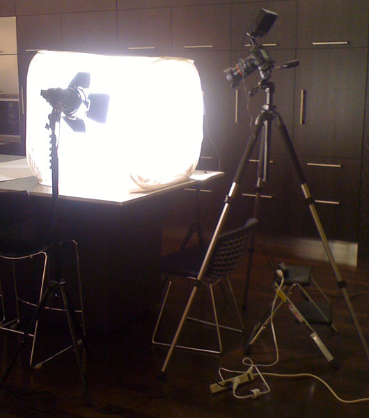
We have a Canon 5d Mark II at the office for general photo and video. Steve Delahoyde (video genius) at Coudal Partners graciously lent us his lights and light tent for the shoot. Here’s what the rig looked like (set up in our kitchen).

The direction

I wanted the video to be more about Bascamp Mobile supporting many devices rather than showing off the interface. The video had to be short and it had to tell what I thought was the most important story: You can use Basecamp on your iPhone, Android, Blackberry Torch, and Palm Pre 2.

First take

An initial idea we had was to show a hand passing a different phone across the screen: iPhone, Blackberry, Nexus One, etc. The idea that Basecamp could run on all these devices took too long to get across.

Out of focus

The better idea was to focus on the iPhone — make it seem like this is a Basecamp for iPhone spot. Then at the end we would show that Basecamp was also available on these other devices. Jason Fried had the idea to show different hands showing all of the phones.

The only problem was that the other phones were out of focus. No matter we had the idea down, we just needed to reshoot it.

Continued…
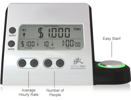
slide1-meeting-cost-calculator-clock.jpg

Bring TIM! (Time Is Money) is a clock that tallies the dollars spent in meetings (The Meeting Ticker is an online version). The TIM clock is mentioned in this WSJ article which describes how NYC Mayor Bloomberg, who wrote in his autobiography of his appreciation for stand-up meetings, has ordered the installation of a different model of count-up clocks in meeting rooms throughout City Hall. The reason: “To make staffers mindful of how much time they’re spending jawing with one another.” [via MH]

Matt Linderman on Feb 8 2011 6 comments