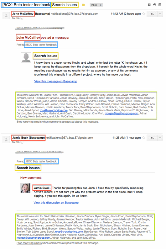
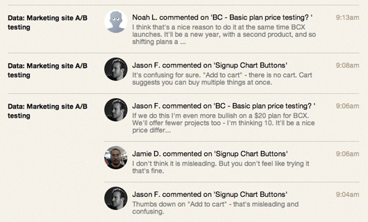
One of the joys of building the new Basecamp was using the new Basecamp to quickly iterate on a design problem. Because I’m in Colorado and the rest of the team lives elsewhere, we rely on a combination of tools to share files and work through ideas. And while we might have used Campfire in the past, we now use Basecamp messages to quickly work through ideas and keep the conversation focused.
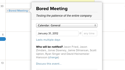
During one design session, I worked with Jason and Ryan on a particularly thorny problem on the calendar: notifying people about a new event.

Continued…
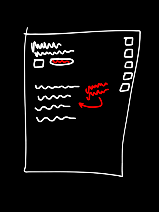
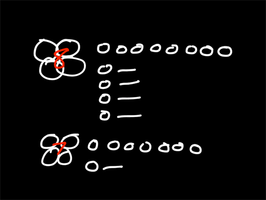
For those who like the behind-the-scenes stuff, here are 10 early sketches of UI elements/concepts for the new Basecamp.

Early concept for the project blank slate (empty project, no content yet).

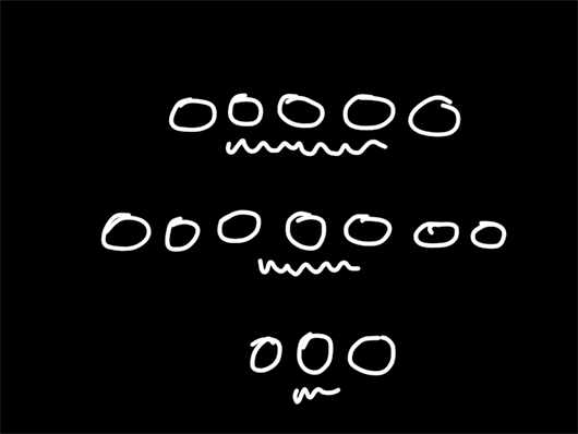
Companies and people, take 1 (discarded).

Companies, people, and groups, take 2 (discarded).
Continued…
After a flurry of scrapped ideas and illustrations that may never see the light of day, I survived my first month designing at 37signals.
Joining the team in the heat of relaunching our flagship product, it comes as no surprise that everything has been hands-on and fast-paced.
My first week
- Monday → New computer day. (13” MacBook Air + Thunderbolt Display)
- Tuesday → Remove my Git and Ruby training wheels with Trevor.
- Wednesday → Screenshare with JZ, brush up on SCSS and CoffeeScript.
- Thursday → Redesign SvN for mobile. Commit code. Beer.
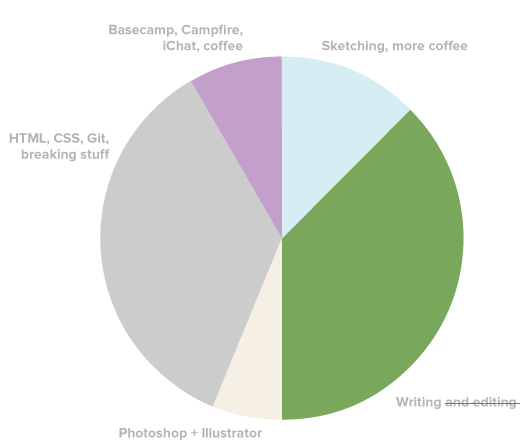
A typical day

Continued…
Today, Jeffrey Zeldman shared a new alternative to the venerable Phark CSS image replacement method better known by its surely-that’s-far-enough negative 9999 pixel indent. I’ve long since found my own way so it is with a touch of nostalgia and a humble bow to Messrs Fahrner and Phark that I share my favorite alternative.
The idea is still based on a fixed size element (that matches the dimensions of the image to be displayed instead of it’s text equivalent. Overflow:hidden reliably ensures that whatever we push outside the box is invisible. The difference is in how it’s pushed. Instead of a negative index, I prefer to set the height of the element to zero and instead set the top padding to the desired height. The element still ends up the right size and the text is gently nudged from view via padding. Here’s an example:
.replaceme {
  width: 100px; /* image width */
  height: 0;
  padding-top: 50px; /* image height */
  display: inline-block;
  overflow: hidden;
  background: url(images/image.png);
}
Curious to hear what method you use.
Over the last year, we’ve spent a ton of time on little details that really make using the all new Basecamp a real pleasure. That’s not to say it’s perfect – we still have a lot of work to do to realize our full vision – but we’re very happy with what we’ll be launching with. And launch is literally right around the corner.
Here’s a video showcasing some of the little details and power user features we’ve baked in. We think you’re really going to enjoy exploring these little corners once you start using the all new Basecamp.
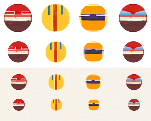
There are thousands of pieces of work on the Basecamp cutting room floor. Here are 37 random ones from October 2011 until now.
Some of these were ideas in progress. Some of them never left the sketch phase. Some were in production for awhile before we decided to change, redesign, remove, or tweak. And others are still there.


Continued…
Mig is a designer. That’s how he describes himself. We’d add “damn fine” to that description. Please welcome Mig Reyes to the 37signals crew.
He’s been making beautiful useful things at Threadless for the last few years. I’ve long admired his work, his work ethic, his interest in learning, his blossoming writing skills, and his dedication to the Chicago design scene. We’re super lucky to have him on our team.
Soon enough you’ll be seeing his creativity make its way to the surface on our sites and in our apps. We’re looking forward to seeing how he influences us.
Welcome aboard, Mig!
