You’re reading Signal v. Noise, a publication about the web by Basecamp since 1999. Happy !

Signal v. Noise: Design

Our Most Recent Posts on Design

A peek at the all new Basecamp calendar

Jason Fried
Jason Fried wrote this on 56 comments

It’s hard to believe we didn’t have a proper calendar in Basecamp until June of 2011. Before that we had a list-based view which worked exceptionally well for nearly seven years, but people still like looking at dates and deadlines on grids. We get it! ;)

We’ve made a few calendars in our time. Backpack has a great one – it served as our exclusive company calendar up until we built this new one in Basecamp. Now we run all our schedules with the new Basecamp calendar.

We wanted to make sure the calendar for the all new Basecamp was the best one we ever made. And the best one around, period. It’s not going to launch with everything we want, but all the basics are covered real well. We put a lot of time into the interaction details so it’s fast, smooth, intuitive, and flexible. We’ll continue to improve it and refine in over the coming months, post launch.

Here’s a video peek at what it looks like and how it works. There’s more to it than this – there’s a list view inside projects, and each event has a discussion page as well – but we’ll be saving those details for a future video.

Basecamp Next: UI preview

Jason Fried
Jason Fried wrote this on 182 comments

When we started thinking about the design of the all new Basecamp, we had three key things in mind:

  1. Speed
  2. Big picture
  3. Focus

With that in mind, and many experiments later, we came up with a unique interface that is crazy fast, excellent for big picture broad overviews, and perfectly tailored for quick focus with no distractions.

We call it page stacking and we think you’re going to love it. Here’s a brief video I just put together to show you how it works (it looks best in full screen mode, BTW).


We’re just a few weeks out from the official launch. Sign up for a chance at an early beta invite prior to launch. We’ll also use this list to announce the launch.

Basecamp Next: The goodbye list and the hello list

Jason Fried
Jason Fried wrote this on 117 comments

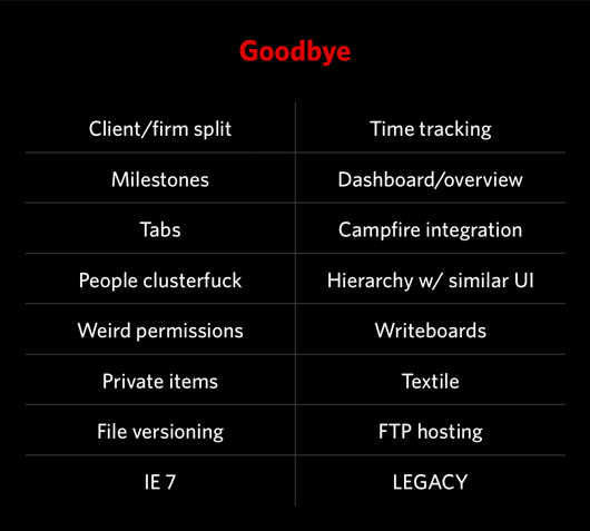
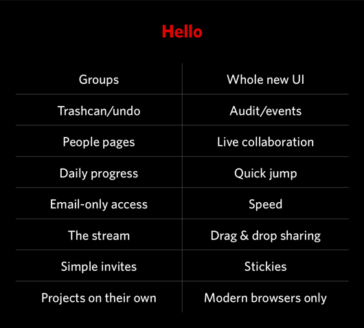
Back in July when we first presented the idea of Basecamp Next (called BCX internally) at our company-wide meetup in Chicago, we put together two lists: Goodbye and Hello.

Goodbye was a sample of some of the things that Next wouldn’t have that Classic did have. Hello was a sample of some of the things that Next would have that Classic didn’t have.

“Have” is a relative term. Some stuff on the Goodbye list is completely gone from Next, while other things are just executed differently enough that they don’t resemble the way things worked in Classic.

It’s interesting to look back at the two lists now and see how well our original predictions worked out. There’s some stuff on Goodbye that we ended up keeping and there’s some stuff on Hello that we didn’t do (or did completely differently than we originally anticipated). And then there’s a bunch of stuff not on either list that you’ll ultimately find in Basecamp Next.

We’re only a few short weeks away from launch, and we’re still making calls on what’s in and out and how some key features work. It’s a good reminder that lists are moments in time, they aren’t golden rules.

Behind the scenes: Reinventing our Default Profile Pictures

Jamie
Jamie wrote this on 77 comments

Default Avatar

Mister Default

Here he is: our default profile picture. You may know him as “Generic Avatar”. He’s the picture you get when you create a new account and profile on Basecamp, Highrise, Backpack, and Campfire. Mr. Default is a standard guy. He’s found everywhere on the web (in variations): message boards, comments, activity streams.

He forces everyone to look like him regardless of gender, race, and physicality. He’s also very boring.
Time for a change

People don’t usually have a picture on hand to change the default avatar. What happens is none of the default pictures ever get changed. Basecamp looks boring when everyone is Mr. Default. Splashes of color and personality from peoples’ pictures bring life to a product.

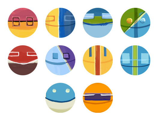
We want your first experience with Basecamp to be colorful, welcoming, and friendly. First, we’ve improved the flow for replacing the default avatar. Additionally, we’ve improved the default profile pictures. Say goodbye to Mr. Default.

Literal Icons

Initially I thought about approaching the pictures like the game Monopoly. Everyone has a different icon much like the pieces in that board game: an iron, a thimble, a race car, etc. Here are some sketches from that session.
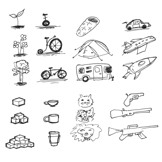
I had been experimenting with a painterly style for a different project, so I tried that with this literal icon imagery.
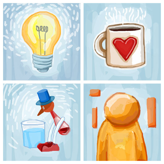
Jason Fried’s feedback: Having literal and distinct icons might cause people to want to switch one out with another, or not find a suitable match. Would we need to build an interface to “choose your default icon”? Too complicated. Maybe we should go abstract.

37signals Office Surface Textures

Another idea I had was to try our office surface textures. The 37signals office is made of so many great materials. Basecamp is basically our office. Perhaps it was worth a try.

Jason Fried’s feedback: We want people to see Basecamp as theirs not ours. This isn’t about 37signals. Who wants to be represented by cork? Also the imagery feels too masculine. Let’s go softer and more cheerful.

Abstract Paintings

I liked the painterly style of the first batch of icons. They were colorful and cheerful. What if I tried some abstract shapes and patterns?
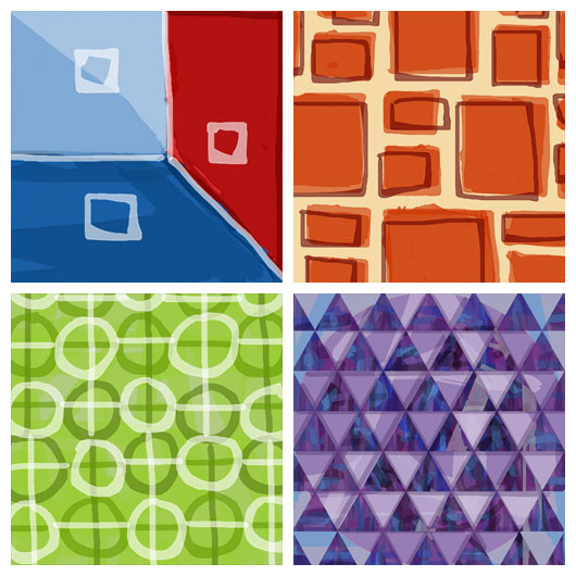
Jason Fried’s feedback: These are closer. The patterns might be too distracting. Try shapes and lines like that one on the upper left.

Refining the Abstract Paintings

Concentrating on shapes instead of patterns was a big breakthrough. The shapes started to take on face-like features.
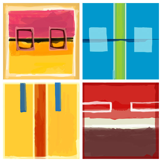
Jason Fried’s feedback: Loving these. These are great!

Jason Zimdars’ feedback: When I see these I think of cars. The headlights and grill make a face. I wonder how they’d look with a slight smile?
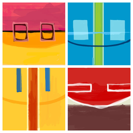
I’m very happy with the way these default profile pictures turned out. When someone creates a new Basecamp account they will be randomly assigned one of these custom painted pictures. As you’d expect, each picture can be easily swapped with their own personal photo.

The difference now is straight away, out of the box, Basecamp will have color, personality, and vibrancy as you start managing and completing your projects.
What's your answer?

Jason Fried
Jason Fried wrote this on 7 comments

“If a customer asked you why, how would you answer?” This is a question I’ve been asking a lot lately. Why could be “why does it work this way?” or “why can’t I do that?” or some variation on that theme.

I think your answer to those questions is a great way to measure your product. Are you happy with your answers? Are they fair answers? Are they clear answers? Would you be happy with the answer if you were the one asking the question?

The goal isn’t to get to “Yes” on every answer. The goal is to listen to your answer and ask yourself what it really means about how you approach product development.

If the answer is something like “well, because it was too hard for us to make it work the way it should” or “because we couldn’t figure it out” or “because we didn’t spend the time to think about the problem thoroughly enough” or “we just didn’t feel like putting in the work to make this easy for you” it may be a red flag.

Now, sometimes those are just truthful answers. Every decision involves a sacrifice. You may have had to sacrifice some thoroughness here so you could be more thorough there. But when answers like that pile up it’s worth looking yourself in the mirror and ask why you’re satisfied with answers like that.

This approach is especially helpful during product development, prior to launch, when many things are still in flux. This is the moment when you should be asking these questions repeatedly. The more you ask, the more you have to consider, and ultimately the better decisions you’ll end up making.

Basecamp Next: A peek at early iterations of the Projects screen

Jason Fried
Jason Fried wrote this on 48 comments

We’ve been working on Basecamp Next since March 2011 and we’re getting close to the public release. The private beta is now in full swing.

Early iterations on the Projects screen

We thought it might be fun to share some of the early design explorations for one particular screen, the Projects screen. Basically, the projects screen is a list of your projects. You can create new projects there as well. We explored hundreds iterations of the screen – from small tweaks to fundamental shifts in the feature itself. Only a fraction of the explorations are shown in the video below.

What you’re seeing here are discarded ideas. But new ideas are often built on old ideas, so you may recognize some of the design concepts you see here in the actual final product.

There’s a movement in the art world called Outsider Art. Art that’s produced by people outside of the “mainstream” art world. It rejects common art conventions established by popular artists of the past. It is raw.

Web design is at a similar point as the art world when Outsider Art broke. Mainstream web design lately is so clean and glossy. So pixel perfect. And yet so homogenous. Think it’s time for an Outsider Web Design movement?

The Documentation Dilemma

Ryan
Ryan wrote this on 34 comments

Back when 37signals was consulting, we gradually weaned ourselves off of documentation. It’s normal practice in the design world to produce lots of artifacts. You see IA diagrams, flow charts, OmniGraffles, and all kinds of illustrations of what the final product will be. In the early 2000s we noticed that our clients only cared about the deliverable, so we dropped nearly all of the paperwork.

Since then we’ve often advised other companies to spend less time on paperwork artifacts and more time on real prototypes. But just saying that isn’t enough. How does a team that is accustomed to a heavy paper flow wean themselves off of it?

I used to think design teams made so many diagrams and documents because… well, they like that sort of thing. Now I’m suspecting there’s more to it.

A symptom of a bottleneck

I’m suspecting documentation is a symptom of something else: a bottleneck in the value chain. Think about it. Design ideas are perishable. They have to be acted on right after they appear, or they fade away. So what happens when your development process can’t absorb design ideas at the rate you produce them?

It looks like a dilemma. You either:

  1. Produce design ideas at the pace of development (which is far slower, by definition of the bottleneck) or
  2. Freeze ideas in the form of documents, diagrams and requirements until they are ready to be thawed and consumed later.

I suspect #2 is what happens in a lot of firms. The throughput from design to implementation in those places is so low that pacing design with development doesn’t seem feasible.

At 37signals we’re firmly in the #1 camp. Designs go from concept to HTML (often in-app) without any deliverables in-between, and then from HTML mock to fully implemented feature in Ruby or JavaScript again without intermediate artifacts.

Healthy pressures on design, programming and scope

Pacing design with development puts a few pressures on the company that we think are healthy.

First it means all the designers should be proficient enough with code to implement their ideas, at least statically.

Second, the programmers should have enough skill and leverage from their tools (an important factor) to produce meaningful work in short periods.

The third point concerns how we manage and define scope. In order for design, implementation, and review to all happen while the plate is still hot, each piece has to be small. If we bite off too much work at once, then design will go on too long before development can join in. When there’s too much to build at once, review becomes unfocused because the set of variables to evaluate is too large. So whether the project is small or large, we factor the scope into smaller component scopes, build them one at a time based on their dependencies to each other, and evaluate the results step by step using the app ourselves.

The ideal loop

The ideal loop is short enough that you can still feel the spark of your idea and you’re still curious to find out if the decision was right or not as you click through the implementation. You can’t fully judge a design until you’ve tried it in action. The clothes simply look different when they’re on. If there are too many changes to evaluate at once, we can’t tell which of the changes contribute to the improvement or regression and how those changes suggest future steps. Moving in one direction in one feedback cycle is easy. Moving in ten directions in the same cycle is too hard.

I hope this look at our process gives you a clearer picture than a bare statement like “documentation is bad.” Documentation may be necessary when your throughput is low, and that’s an opportunity to see documents not as charming deliverables but as warning signs of a deeper problem in your process.

Where are the great UI teachers and consultants?

Ryan
Ryan wrote this on 71 comments

Yesterday I spoke with a software company that is strongly motivated to improve their interface design. They asked me where good software UI designers come from and who could I recommend to help them out.

From my little bubble, I couldn’t think of anyone to recommend outright. I know some good folks who are already employed. But a “go to” consultant? Not really. A school with good curriculum to scout at? Couldn’t think of one of those either.

So I tweeted to a sizable circle on Twitter. In response, I got less than ten actionable leads. I figure it’s time to cast a wider net.

Who out there is doing great UI consulting for software businesses? Who is doing UI training? Where is the good UI curriculum?

If you know of somebody, help me out and post a comment here—preferably with a personal experience. Thanks.