You’re reading Signal v. Noise, a publication about the web by Basecamp since 1999. Happy !

Signal v. Noise: Design

Our Most Recent Posts on Design

Interface inspiration at the office

Jason Fried
Jason Fried wrote this on 34 comments

When you design for the screen, it’s easy to think the screen is where you should go for inspiration. It’s definitely one place – there are some amazing people doing some amazing work in pixels. But you’d be cheating yourself if you only looked to your own industry, or medium, for inspiration.

I’ve always found inspiration looking at parallel industries. I love looking at physical objects for interface design inpsiration. Designing interfaces for physical interfaces requires more discipline because, unlike the virtual world which has no shape, edges, or boundaries, the physical world has strict limitations. How designers deal with those limitations and tough choices makes for a wonderful library of ideas.

I wanted to start our own 37signals library of physical interfaces from which we could draw inspiration. So I hired Object Design League here in Chicago to seek out, source, and begin building our physical interface library.

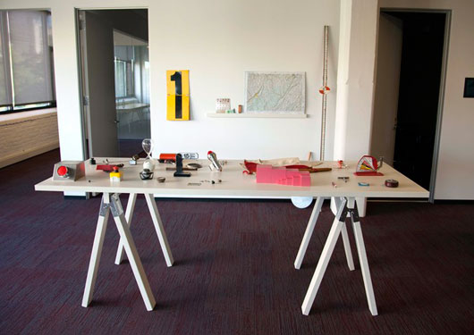
The initial collection was just installed last week. It’s near the entrance of our office so you can’t miss it when you walk in:

There are buttons, measuring tools, indicators, timers, and lots of other interesting physical interfaces.

We put together a short video highlighting the start of the collection. Over time we hope to expand the collection and find more inspiration for manipulating the physical, and virtual, world.

The Mercedes 300SL Gullwing. An instant classic for 58 years and running.

Jason Fried on May 31 2012 7 comments

The Art of Computer Typography

Jason Z.
Jason Z. wrote this on 27 comments

Ever since I came across Jürg Lehni’s essay on typographic technology and digital fonts, Typeface As Programme, I’ve been fascinated with the story of Donald E. Knuth and his unexpected contributions to typography.

You see, Knuth is a professor and computer scientist well known to programmers as the author of The Art of Computer Programming, widely regarded as the definitive treatise on the subject. The first of the four current volumes was published in 1968 and Knuth continues to work on it to this day. Truly his life’s work.

Where this story gets interesting for designers like me is what happened in 1977. Knuth was obsessed with making The Art of Computer Programming perfect in every way right down to the print and type.

We didn’t want our papers just to be there, we wanted them to be beautiful. I wouldn’t have wanted to write The Art of Computer Programming if it was going to look ugly.

The first three volumes were stunning. It wasn’t until a new edition of Volume 2 was to be reset with primitive digital type instead of the traditional metal type of the earlier editions that there was a problem. Horrified by the inferior results, Knuth took it upon himself to improve things. After all, digital type was software, right? Determined to develop a solution, Knuth stopped work on his books and devoted himself to typography for the next 10 years. The result: The TeX typesetting system and the Metafont font description language. The combination of the two offered powerful typographic control that hasn’t been matched (even today), especially for complex typesetting like mathematical formulas.

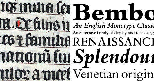
What’s interesting about Metafont is its unique approach to digital fonts. Most fonts are described programmatically as a series of outlines and then filled with a solid color. This allows for perfectly precise and accurate representation but Metafont takes a more fundamental approach. Knuth discovered what every student of typography eventually learns, that the roots of type are in handwriting. Before the invention of printing, documents were written and copied by scribes using a broad nib pen. These flat metal tips, held at an angle resulted in the thick and thin strokes we associate with calligraphy. The typefaces used in the first printed books were meant to mimic the familiar handwritten books they replaced and even today many typefaces owe their thick and thin lines to the tradition of hand drawn letterforms.

Comparing type
Calligraphy in a Latin Bible of AD 1407 compared to Bembo, a modern typeface with roots in hand written lettering.

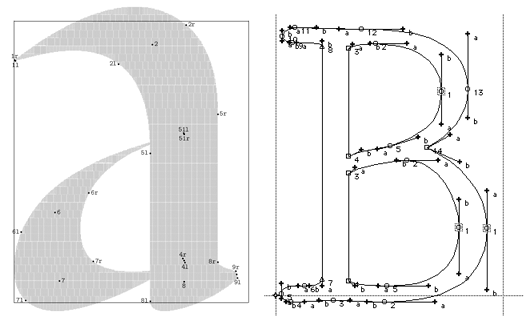
While fonts in other systems consist of outlined letterforms Metafont “draws” each letter, simulating the broad nib pen and the actual strokes you’d use to write them by hand. The resulting fonts are not only beautiful but their construction allows for greater control and variation. Rather than simply scaling to different sizes, fonts in this system can be further optimized for things like contrast, stroke, and x-height – essentially redrawn at each size like earlier metal type.

Comparing systems
Compare glyphs rendered with Metafont (left) and Postscript.

Knuth created TeX and Metafont because he wanted to extend the care he took in his writing to the design and printing of the physical books. He shared them with the rest of the academic community by putting them into the public domain and they’re still popular today, especially in the publication of mathematic and scientific journals.

I’m impressed by Knuth’s refusal to accept the status quo. When it didn’t meet his standards, he simply made something better. But even more I’m inspired by the focused dedication to his life’s work that led him to put down the familiar and immerse himself in a completely different field for an entire decade in order to realize his art.

New in the all new Basecamp: Email-in!

Jason Fried
Jason Fried wrote this on 64 comments

This is going to be a big one. Now you can post messages, to-do lists, files, and text documents to the all new Basecamp just by sending an email.

First, some background

In Basecamp Classic, you can post a new message by sending an email directly to Basecamp. This feature is especially useful if you’re on the road and want to post a message to the project from your phone. Just fire up your email app, address the email to Basecamp, and it’s immediately posted as a message to the project.

Initially, the all new Basecamp didn’t launch with this feature. Like everything else in the new Basecamp, we wanted to approach it fresh, take our time to think it through, explore a variety of ideas, and make it even better than before.

Better than before

In Classic you could only post a message via email. You couldn’t make a to-do list, start a text document (called Writeboards in Classic), or upload a file via email.

But in the all new Basecamp, you can do all these things and more. Plus, it’s easier, clearer, and more powerful than before.

Here’s how it works

At the bottom right corner of every project you’ll see a link that says “Email content to this project”.

When you click that link, you’ll see a sheet pop up that looks like this:
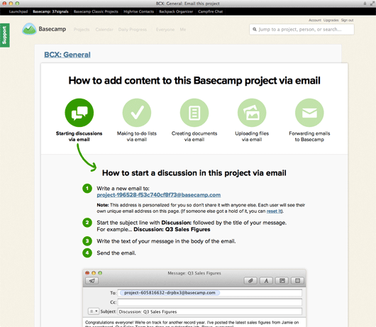
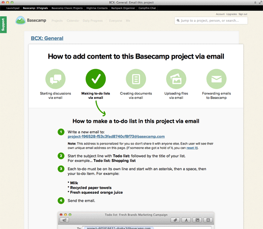
You’ll see five icons at the top of the page. Each icon describes a different email-in feature. Starting discussions, making to-do lists, creating documents, uploading files, and forwarding emails. Clicking any one of those icons shows you the simple steps to follow for each feature.
Below the steps we show an example of an email and how that content will look when it’s posted to Basecamp.
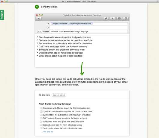
When Basecamp receives your email and posts your content to the project, it immediately sends you an email receipt letting you know it worked.
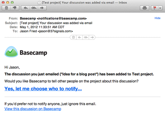
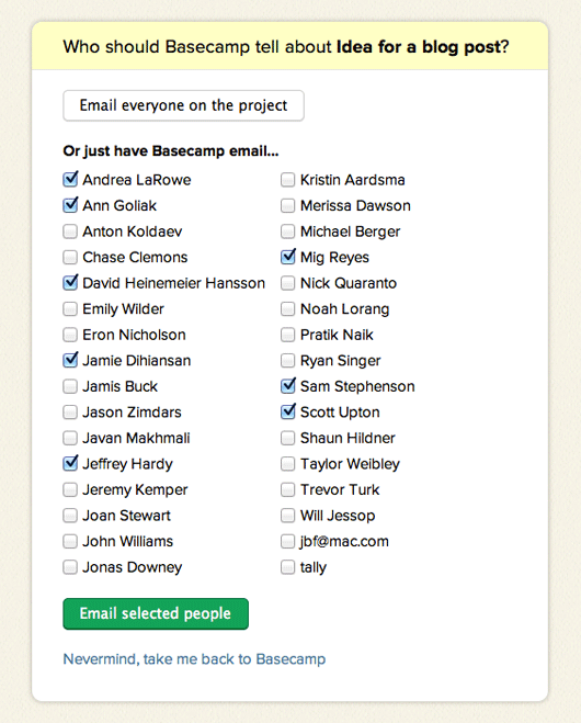
For most content types, the email also includes a link to let you notify others on the project letting them know that you just added something to the project. If you click that link you’ll see:
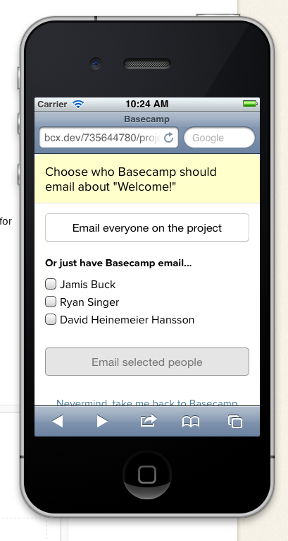
Since we expect a lot of people to email in from their mobile phones, we made a mobile optimized version of the notifications screen too:
And a bonus feature

In addition to allowing you to start discussions, make to-do lists, create text documents, and upload files via email, we also allow you to forward in any existing email to Basecamp. This is especially useful if there was a conversation going on outside of Basecamp. Just forward that email thread into Basecamp and it’s stored along with everything else on the project. Easy peasy.

Forwarded emails get collected into a “Forwarded emails” section at the bottom of the project.
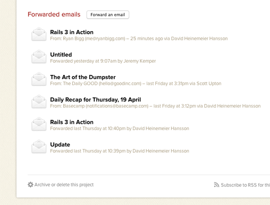
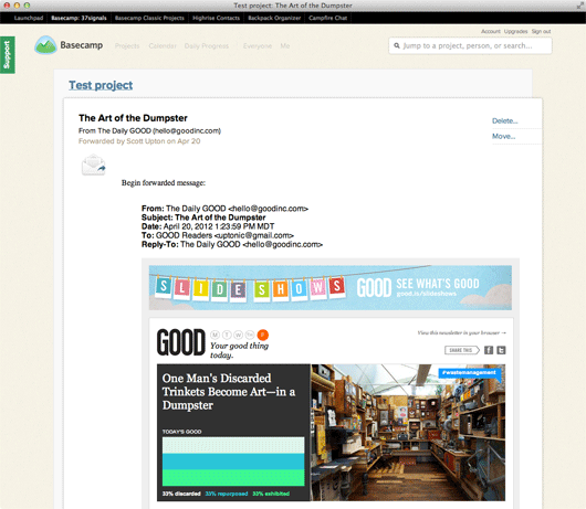
And if the email was an HTML email, we show the full HTML email, too:
So many uses

There are so many interesting ways to use this new email-in feature in Basecamp.

One of the things I’ve loved about it so far is that I can sketch an idea on the whiteboard/chalkboard in a meeting room in our office, take a picture of it with my iPhone, and email it directly to a Basecamp project. It’s such a great way to get the physical results of a brainstorm, meeting, or sketch session right into Basecamp. And now that it’s in Basecamp, I can erase the whiteboard and not worry about ever losing that idea.

Email-in is also a great little “poor-man’s API”. You can have your apps send emails direct into Basecamp whenever you make a sale, get survey results from a customer, or who knows what. The opportunities are endless. We’re eager to see what sorts of things people come up with.

Thanks again

We’re thrilled with the feature and we think you’ll feel the same way. Thanks again for using Basecamp!
"Sign up in seconds" ... and then what?

Ryan
Ryan wrote this on 34 comments

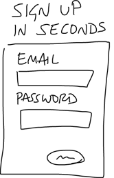
Today I saw a familiar pattern on a website for an analytics product. The home page pitched the product, and then above the signup form there was a headline: “Sign up in seconds.”

I see this all the time on signup forms and it makes me wonder: why did the designer put that there? My best guess is that they were trying to relieve some anxiety the customer might have. Like, “don’t worry, it’ll be over soon!”

I’ll bet that the time-to-signup isn’t an important anxiety factor. When’s the last time you shopped for a software product under intense time pressure, where every second counts?

When I evaluate web products I often feel uncertain about what will happen after the quick signup. Sure it takes seconds to create an account, but then what?

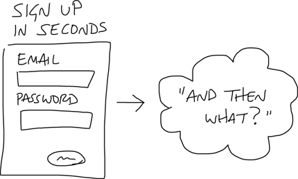
I had an idea to address this uncertainty. You could preview the workflow steps that come after the signup so it’s clear how much of a gap there is between signing up and getting value out of the product.

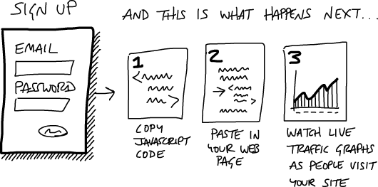
Check out this sketch. It shows “what happens” after you signup. Once you sign up, you get a Javascript code, paste it into your website, and then you can watch real live graphics of traffic come to your website. Sounds pretty easy right? Why not try it?

I haven’t tested this approach on any sites. Intuitively I like how it integrates the call to action with the sales pitch in a single flow. What do you think?

New in the all new Basecamp: Move items between projects

Jason Fried
Jason Fried wrote this on 38 comments

We just launched a brand new feature in the all new Basecamp that is handy in a bunch of different ways. Now you can move to-do lists, discussions, text documents, files, and calendar items between projects or into a brand new project.

Moving items between projects is especially useful in a few specific cases (and probably many we’ve never thought of). For one, people put things in the wrong place from time to time. Now it’s no big deal – just move it to where it should be.

And then there are other times when you want to break a bigger project into a couple smaller projects. Now you can take a list or a message or anything from one project and start an entirely new project from that item. It’s great.

Here’s a video showing you how it works. We think you’re going to love it.

Thanks for using Basecamp! Wait, you aren’t using Basecamp? What are you waiting for?.

New in the all new Basecamp: To-dos on the calendar

Jason Fried
Jason Fried wrote this on 22 comments

It’s always satisfying to announce the release of one of the top Basecamp feature requests. Today is one of those days. We’re glad to announce that to-dos with due dates now show up on the all new Basecamp calendar.

Prior to this update, only events that were directly added to the calendar showed up on the calendar. But as of today, any to-dos with due dates also show up on the calendar. And just like events, you can drag and drop to reschedule a to-do. Very handy.

Now you have a much better view of everything that’s due in a project. To-dos, events, meetings, project phases, etc. – now you can see them all at the same time on a single calendar.

We’re really happy with how it turned out. We hope you love it.

Here’s a quick video showing you how it works.

I’m starting to believe nothing should be designed in a day. Working a full-night’s sleep into your design process is as important as anything else you do. Morning tells the truth.

Jason Fried on Apr 10 2012 7 comments

Designer Aaron Draplin lays down 50 points in 50 minutes the only way he knows how – bullshit free. Lots of great advice in here wrapped in great fun. Definitely worth your time.

Jason Fried on Apr 9 2012 9 comments

Fantastic insight from Neil deGrasse Tyson about how important it is to be sensitive to someone’s current state of mind when you are trying to teach or persuade. You don’t teach with facts alone. You have to understand how those facts/thoughts are received by the person on the other end. And to do that, you have to understand what’s already in their head and how those ideas got there. Teaching is about bringing facts and external sensitivity together to have impact. This is powerful stuff and a great lesson for everyone.

Jason Fried on Apr 5 2012 22 comments