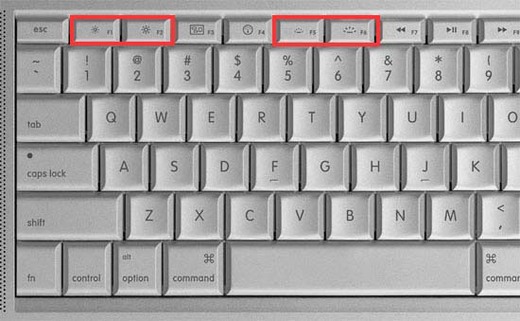
Macbook Pro keyboard. Two icons right next to each other that are exactly the same, except one is ~15% larger than the other. Does this qualify as effective difference?
You’re reading Signal v. Noise, a publication about the web by Basecamp since 1999. Happy !

Macbook Pro keyboard. Two icons right next to each other that are exactly the same, except one is ~15% larger than the other. Does this qualify as effective difference?
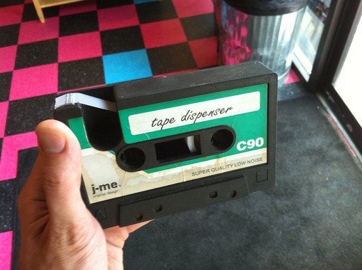
I saw this awesome tape dispenser by j-me yesterday at New Wave Coffee in Logan Square.
If it’s been done “except for this one thing” for days, there’s likely a design problem with that one thing.
Time: 19:14 | 07/15/2010 | Download MP3
Summary
In the final part of our design roundtable discussion, Jamie Dihiansan, Jason Fried, and Ryan Singer answer questions from readers at Signal vs. Noise.
More episodes
Subscribe to the podcast via iTunes or RSS. Related links and previous episodes available at 37signals.com/podcast.
Spread the word
Like this episode? Please share it with your friends:
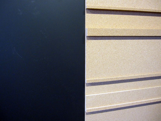
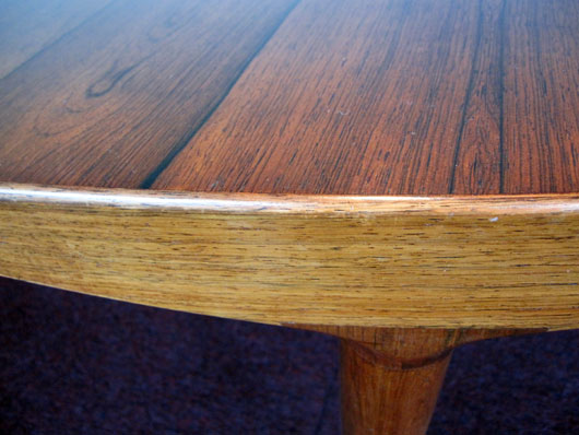
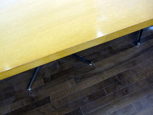
Five days to go until we begin working in the new office. It won’t be completely done for another 10 days or so, but it’s workable so we’re going to work it.
Here are some details of some of the materials in the space.

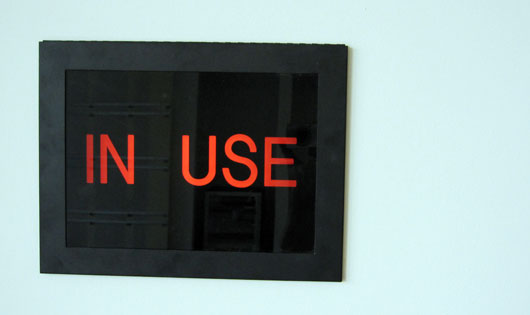
Recently in our Campfire room…
Here’s a quick anti-pattern (an anti-pattern is something you want to avoid) that I occasionally catch in our markup and CSS.
I opened some code for a new user management screen we’re working on. This excerpt of the users screen shows an avatar, the user’s name, their email address and a reset password link.
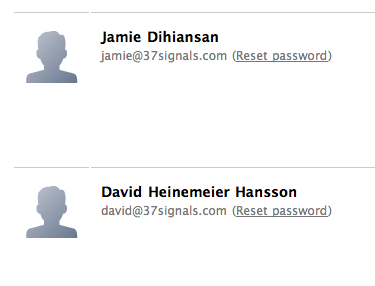
The avatar is in a container, and the user info is in a container.
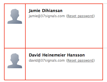
I wasn’t familiar with the code when I opened it, so I assumed the interior white space came from padding on the container. I wanted to add an “admin” checkbox below the user info on the right, and I expected it to align flush left with the name and email. But that’s not what happened.

The checkbox didn’t line up with the text above it. It turned out that the container didn’t have any padding. The text was in its own nested container with a left margin.
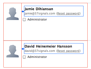
This is one of those cases where “it worked” at the time, but as soon as the design needed to change, it broke. This kind of thing makes change painful because you can’t just pop in an element. You pop in an element, but then you have to dig around to see what the margins are supposed to be, move the margins in the right place, and shuffle styles around until the block looks how it should.
To prevent this, I advise thinking about styles as “rules” and “exceptions.” If an element inside a container has padding or margin assigned to it via a CSS selector, that implementation is telling me that the element is a special case. It’s not following the default flow. For some special reason, it needs different spacing. On the other hand, if no elements inside a container are going to look right without the spacing adjustment, that styling should be a “rule” on the container. It should be a constraint for whatever goes inside that container so the design naturally handles additions and future changes.
It also helps to think: which parts of this design are the “room” and which parts are the “furniture”? You should be able to move furniture around without worrying about the walls and volumes of the space. The CSS should be set up in such a way that your space is a constant and you can easily move elements around as you improvise and improve a design.
Back to my project, a quick refactoring moved padding to the container, and going forward this element will handle anything we put into it. Future designers won’t have to think about the containers.
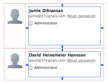
Try keeping these distinctions in mind the next time you’re styling a layout so that future changes are easier to make.
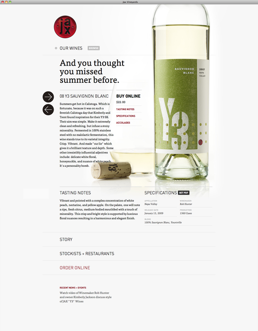
We’re digging the pretty imagery and big type at the Jax wines site. If you go to the site, click an arrow and a new wine slides in.
The danger in relying on [sophisticated virtual design tools] too much is that we can end up isolated from the physical world. In our quest to quickly make three-dimensional objects, we can miss out on the experience of making something that helps give us our first understandings of form and material, of the way a material behaves—’I press too hard here, and it breaks here’ and so on…It’s very hard to learn about materials academically, by reading about them or watching videos about them; the only way you truly understand a material is by making things with it.
A few weeks ago we decided to take a stab at redesigning the Basecamp home page. We liked the current design, but we wanted to see if we could do better. Specifically we were interested in more visuals, less text, and a generally simpler and less dense presentation.
As we usually do, we start with a very low-fi sketch of the big idea behind the design. No details, no words. Just a very rough idea. In this case the idea was a series of scenarios all pointing back at the Basecamp logo. The original sketch, done in Draft and shared in Campfire:
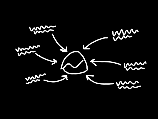
From this sketch we ended up with something that looked like this:
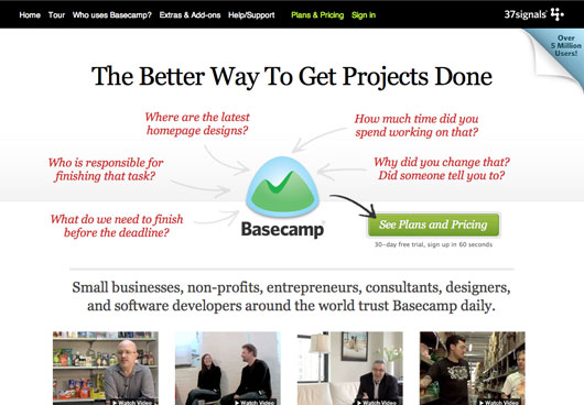
We messed around with the words, subheads, and other copy. We tweaked a few small things, but while we loved the general concept we still felt like it wasn’t communicating clearly enough at first glance.
So we decided to replace the phrases with icons representing the major features/benefits of Basecamp.
After a few rounds of tweaks, we ended up with this:
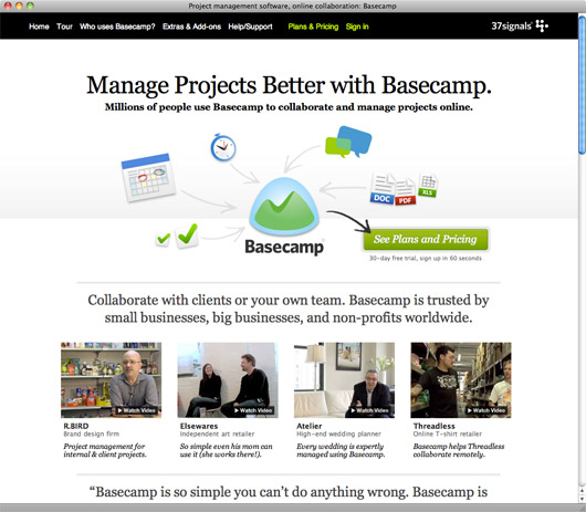
After we were pretty happy with the top, we moved down the page and redesigned the rest. We can talk about those decisions in a future post.
Once the page was ready, we decided to run an A/B test against the current (now the old) design. The test wasn’t sophisticated – we just wanted to test clickthroughs to the sign-up page. That’s where most people land on their second hop, so we wanted to see if the new design took more people to that page. We didn’t test actual signup numbers – just clicks to the signup page. We know how the signup page converts (and continues to convert) and we didn’t change anything there.
The new design sent 14% more people to the signup page. We were thrilled with that performance. We recognize it’s not absolutely definitive (signups are more important than clicks to the sign up page), but it was enough evidence for us to put the new design into production.
Continued…