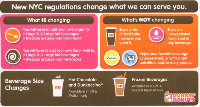
Graphic design is visual communication. Can you design a better graphic that communicates NYC “sugary beverage” law changes? (via Charles Go)
You’re reading Signal v. Noise, a publication about the web by Basecamp since 1999. Happy !

Graphic design is visual communication. Can you design a better graphic that communicates NYC “sugary beverage” law changes? (via Charles Go)
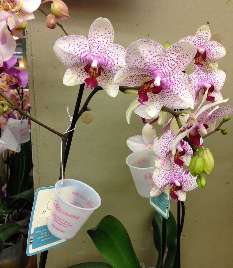
My green thumb is often challenged by the grocery store orchid. I never quite know how much water to give these things. So I was really happy to see this solution recently. The orchid comes with a cup! How much water? This much water. Nicely done.
There are sites, books, feeds, magazines, and movies about “design.” Thousands of people call themselves “designers.”
But have you noticed … “design” never means the same thing?
When I click on some “design” link, I feel like I’m spinning a roulette wheel. Will it be about:
I just saw a cool link on Hacker News. http://color.hailpixel.com/
What is it?
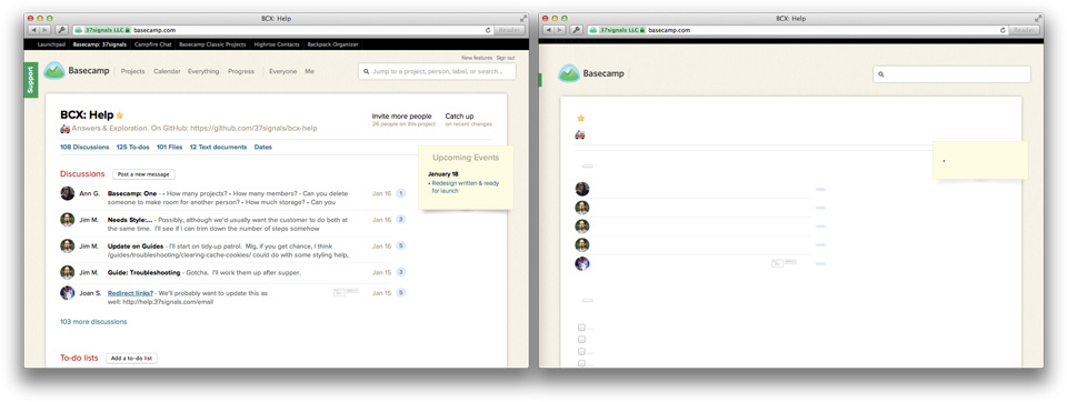
The fundamental concept of the new Basecamp is this: a project on a single page. Projects resemble a nicely organized paper document with wide margins, familiar proportions and plenty of white-space. In a glance you can see what’s happened in the project, what’s left to be done, and any relevant files. You can almost imagine peeling the sheet off the screen and handing it to a co-worker to get them up to speed. It’s an iconic design.
We knew that this design would be instrumental in making Basecamp for iPhone feel like Basecamp so it’s no surprise that we attempted a very literal reproduction in an early version of the app.
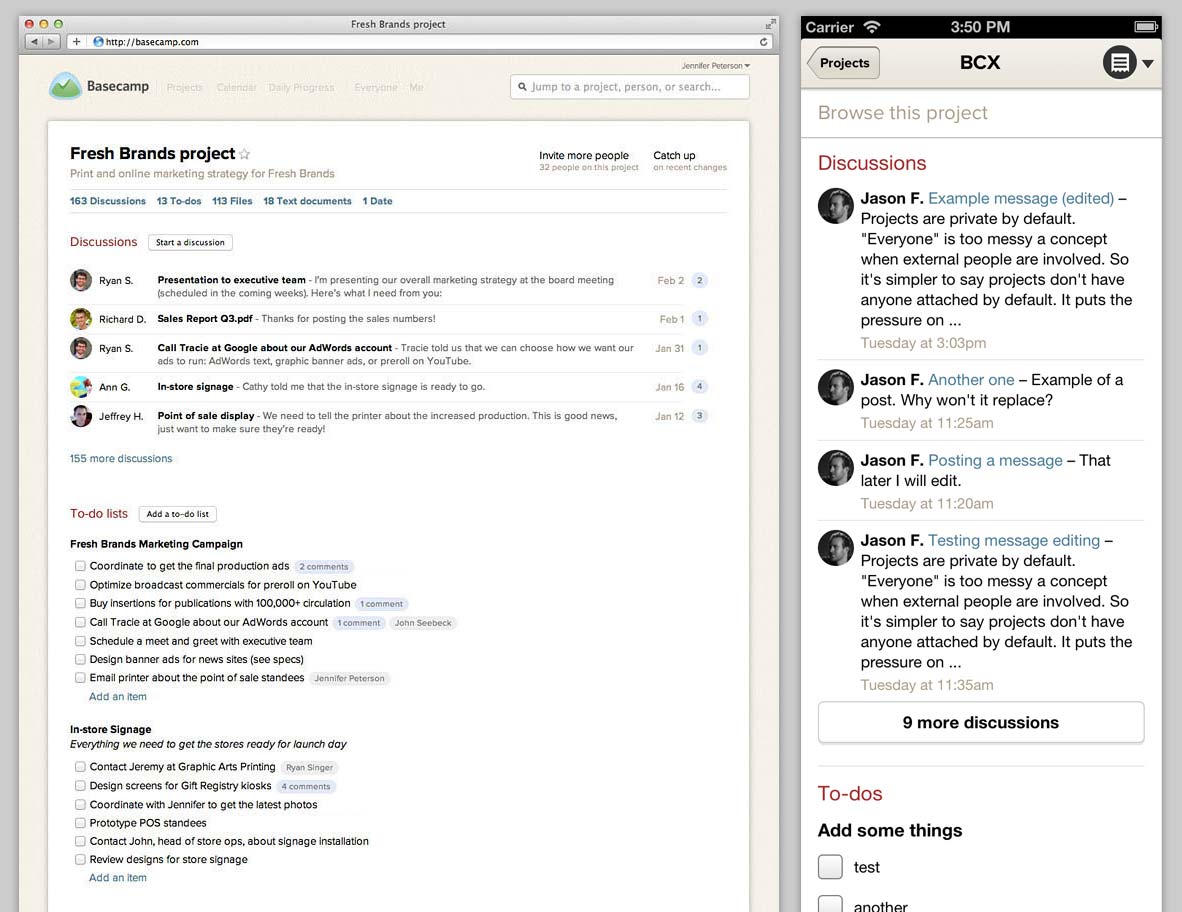
It’s all here: the clean, white sheet topped with the project’s name followed by sections with snapshots of the latest Discussions, To-dos, Files, etc. A virtual clone in smaller package. We were pretty happy with this mini-me design for awhile, but the story doesn’t start here.
Continued…He also introduced the white dot inside each finger hole that later became a fixture of rotary phones. After the phone was redesigned at midcentury, with the letters and numbers moved outside the finger holes, users, to AT&T’s bewilderment, could no longer dial as quickly… With blank space at the center of the holes, Mr. Karlin found, callers no longer had a target at which to aim their fingers. The dot restored the speed.. (via df)
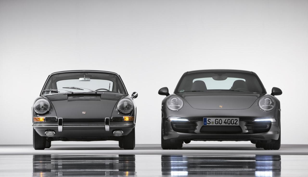
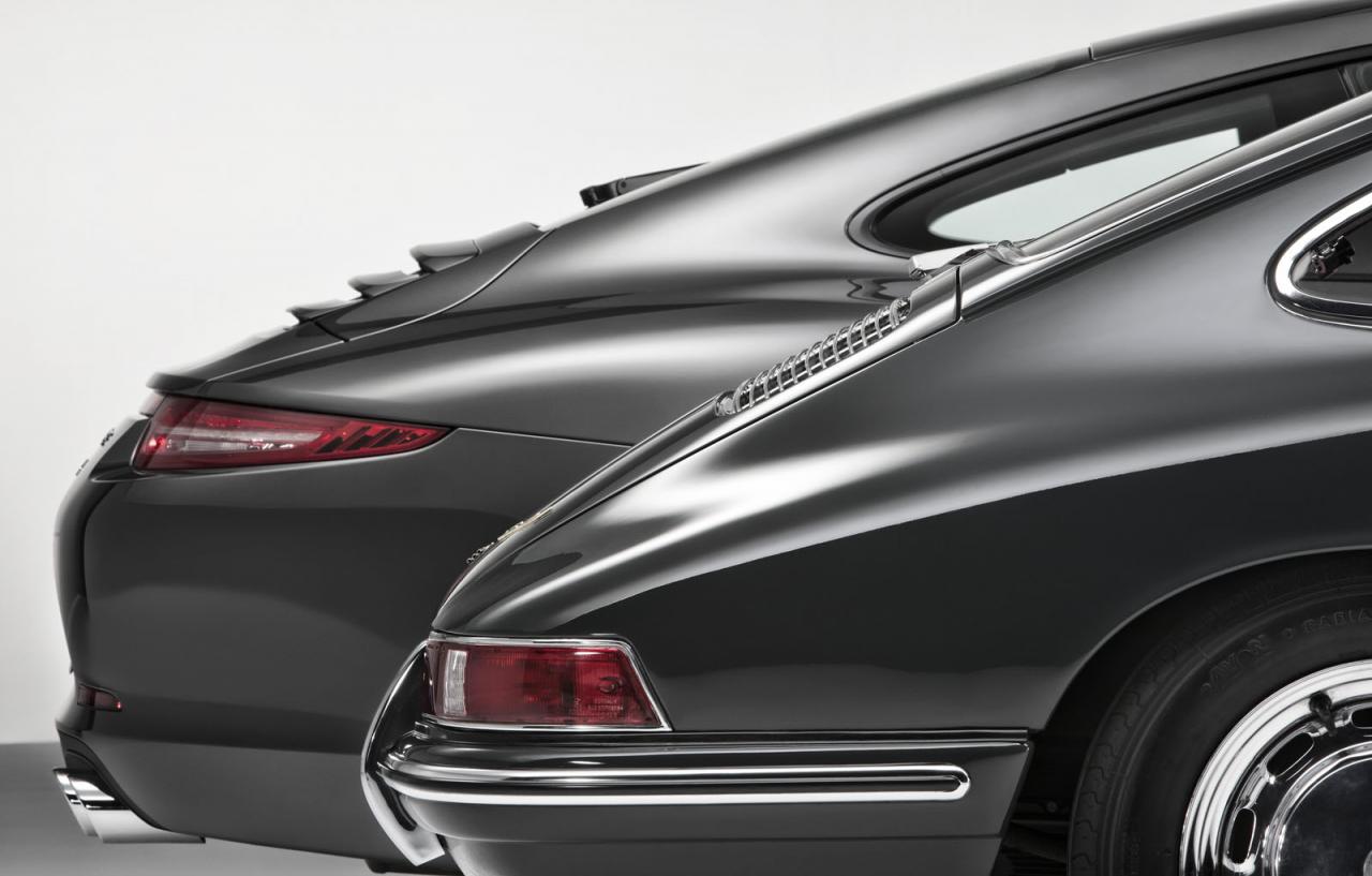
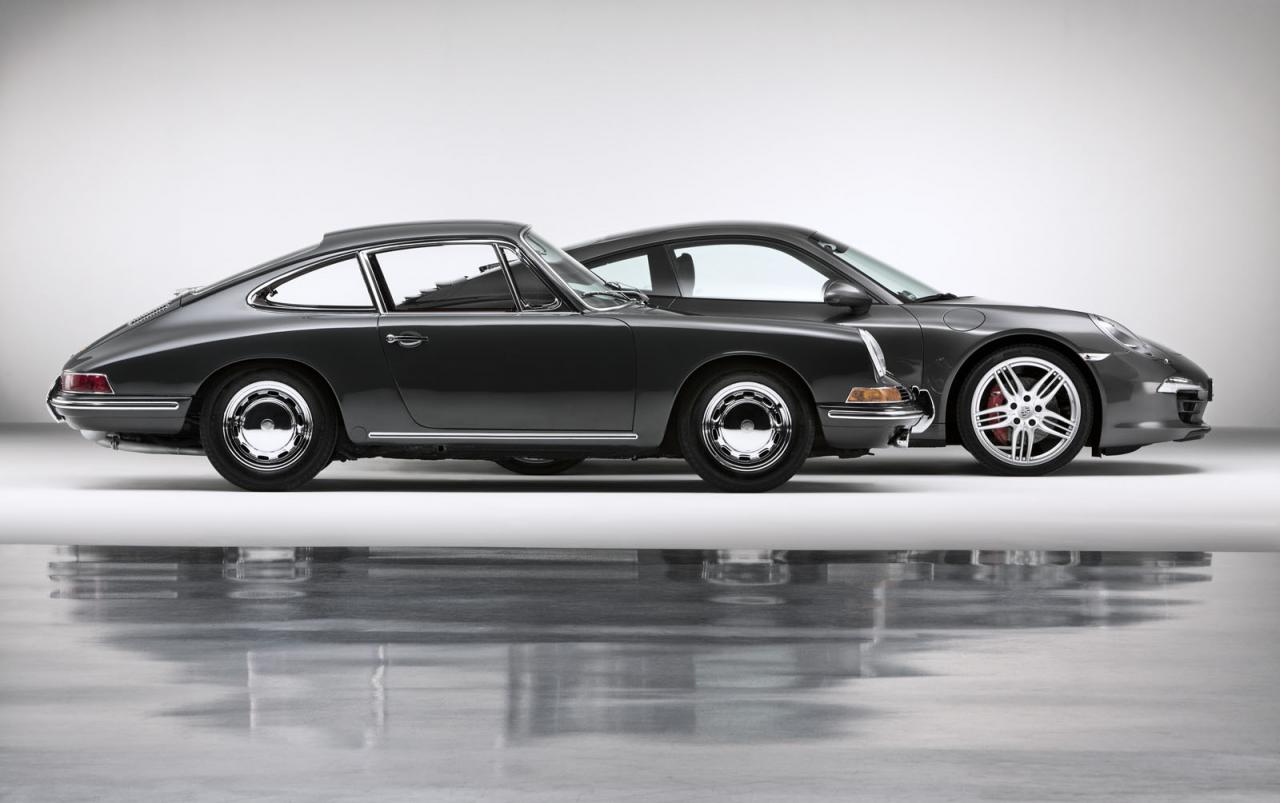
The Porsche 911 celebrates its 50th anniversary. What an incredible run. The 911 has always served as special inspiration to those who believe in long-term iteration. Excellence takes its time.

Click away from the pen tool…
Put down your Pantone book…
Stop rearranging your layers…
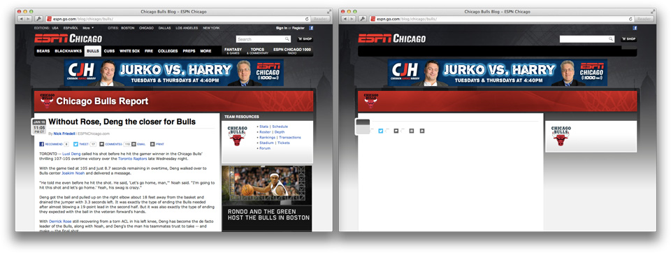
Close your stock texture folder…
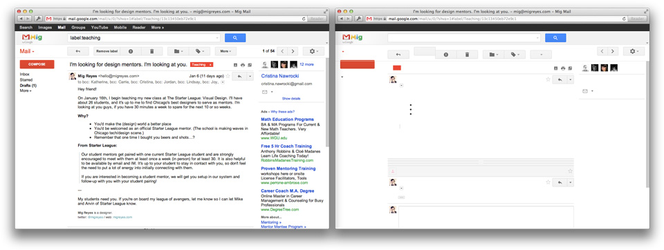
Log out of your Dribbble…
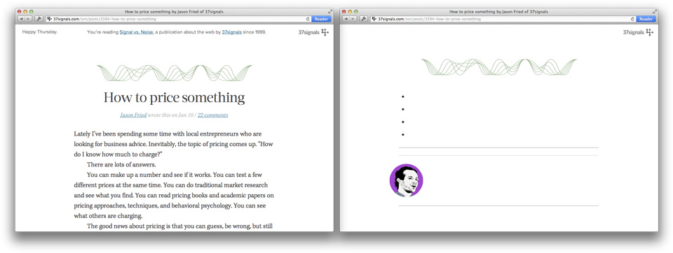
And god dammit, hug your copywriter…
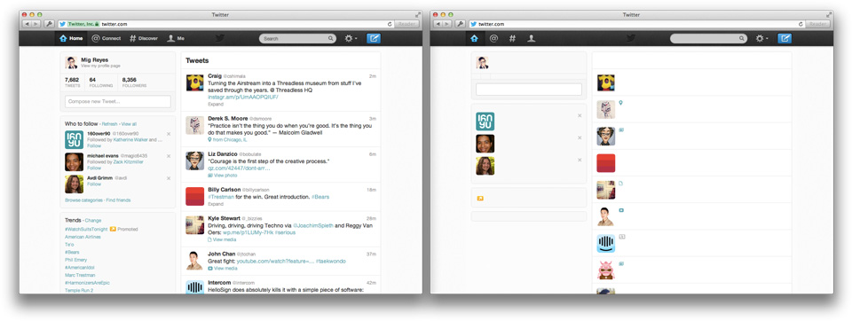
Designing for the web is still about words.
THAT’S THE THING ABOUT ALL OF THIS. IT’S ABOUT CHOICES. YOU CAN DO ANYTHING YOU WANT WITH A CAMERA, BUT WHEN HULK ASKS THAT ALL IMPORTANT QUESTION OF “WHY?” THERE BETTER BE A REASON FOR IT. AND WHEN YOU GET THAT ANSWER, IT BETTER SPEAK TO THE ACTUAL DESIGN OF WHAT PEOPLE ARE GOING TO FEEL FROM IT. OTHERWISE, YOU ARE NOT IN COMMAND OF YOUR MOVIE. YOU ARE NOT IN COMMAND OF YOUR CRAFT.

Why Neckbeard? At first it was a joke—picking up on that Internet meme. But now he’s quickly become one of our most beloved emojis in Campfire. He’s also the unofficial mascot for our neckbeardiest co-worker’s pet projects. Neckbeard also made his way into GitHub and Turntable.fm (thanks guys—shout out to Emoji Cheat Sheet too).
I like Neckbeard so much, and I don’t want him to be limited. I want you and your friends to use Neckbeard in ways that we can’t. I want you to modify him and improve him as you see fit.
Here’s the downloadable vector illustration. The Creative Commons license is below. Thanks for downloading Neckbeard. I hope you have fun with him as much as we do!
License: Creative Commons Attribution 3.0 Unported. You are free to Share—to copy, distribute and transmit the work, to Remix—to adapt the work, and to make commercial use of the work. Please attribute this Neckbeard depiction to 37signals.