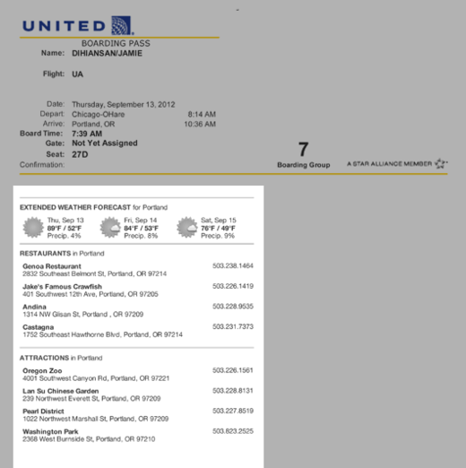
Great detail on the United Airlines “print at home” boarding pass. They show you the destination’s weather and attractions. I’m impressed.
You’re reading Signal v. Noise, a publication about the web by Basecamp since 1999. Happy !
Great detail on the United Airlines “print at home” boarding pass. They show you the destination’s weather and attractions. I’m impressed.

Nice design detail on the Audi A7. The distinctive up-sloped shape of the rear side window is echoed inside on the door handle trim.
I recently ordered some stuff from Nuts.com.
During checkout, they offered upgraded heat-resistant packaging to help prevent melting due to the hot weather. That was a great step. That alone is more than most would do.
However, then they went the extra mile.
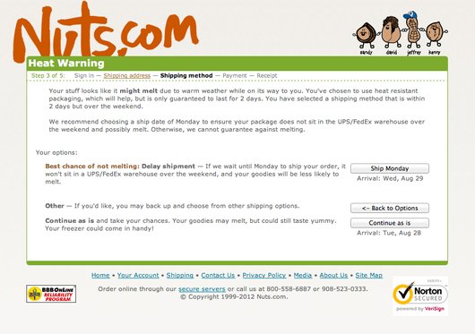
Right before the final checkout step, they explained that the upgraded packaging is good for about two days, but since I ordered on a Friday, my shipment might sit at the UPS/Fedex warehouse over the weekend which would push it out beyond two days. Then they made it really easy for me to change my ship date to Monday to help prevent the melt.
That’s great defensive design. You rarely see it done so well – especially with the collision of all these special conditions (product type, weather factor, packaging type, weekend factor).
Great copywriting, too.
Very well done.
To clarify, add detail. Imagine that, to clarify, add detail. Clutter and overload are not attributes of information, they are failures of design. If the information is in chaos, don’t start throwing out information, instead fix the design.
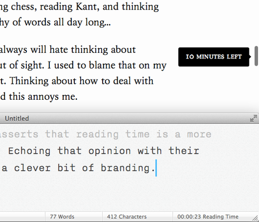
Neat detail on the iA blog (iA are the makers of iA Writer): When you scroll the page while reading an article, a small call-out tells you how much reading time is left – a subtle hat tip to the reading time feature in the app.
iA Writer is opinionated. It asserts that reading time is a more useful measurement than pages. Echoing that opinion with their blog is a charming detail and a clever bit of branding.
Last week I dropped into an online auction to see what was for sale.
The auction house uses the LiveAuctioneers software/service to conduct the online auctions.
This is what I saw:
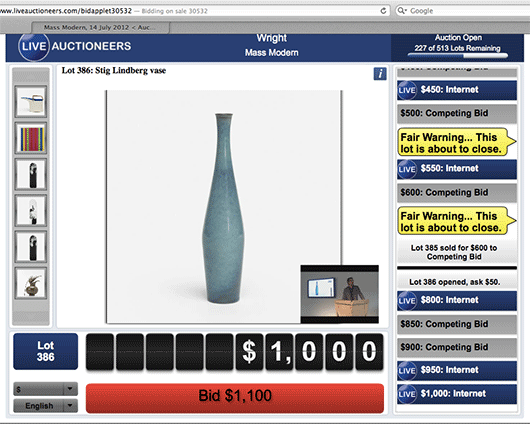
At first, it’s easy to unfairly judge this UI by its cover. There are a lot of font sizes, colors, and shapes competing for your attention. It’s also clear that this design isn’t going to win any type direction awards.
But I ripped off my designer hat, gave it five minutes, and followed along as dozens of items were auctioned off live. I even jumped in on a few and ended up winning a couple.
And I have to tell you, this is really good interface design.
You may not be able to tell from looking at the still image I posted above, but if you’re in there, watching the items go up for bid, watching the bids flow by on the right in real-time, watching the auctioneer on live video, seeing the big yellow flags pop up when an item is about to close, and having a big fat red button that you can click to instantly place your bid, it’s all very clear. There’s a lot going on, but it’s all in the right place at the right time, and it worked flawlessly. I was very impressed.
Yes, it could look better, but it works great. And the works great part is the harder part of the UI to get right. A real-time live auction is a complicated task, and LiveAuctioneers made it work well with no learning curve. I look forward to using this service again.
Today we announced a brand new feature in the all new Basecamp called “Everything”.
Everything lets you see all the discussions, to-dos, files, text docs, and forwarded emails across all your projects on a single page.
It’s especially useful for those times when you know a file was uploaded, or a discussion was going on, but you don’t remember which project it was in.
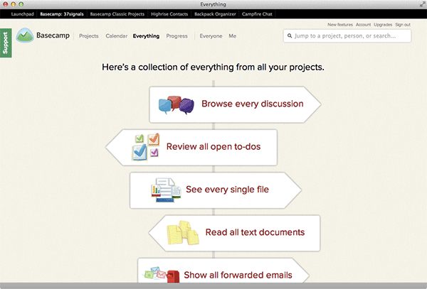
Now you can just go to Everything, click “See every single file”, and now you can see all the files across all your projects in your entire Basecamp account on a single page. Huge time saver.
Here’s a link to the discussion where we discussed the design. You’ll see a variety of directions, feedback, revisions, more feedback, and then the final batch of ideas from which we picked the winner.
Here we made a quick decision regarding how this feature impacted the navigation.
Here’s a thread where Ryan, David, and I are discussing where to include project names. There were some different opinions, we ended up trying the design without the project names, but in the end their absence was too much, so we added them back in.
When the feature was done, David made the formal announcement to the whole company so everyone know what was coming.
Here’s a link to the whole project. Is yours to browse.
We hope you’re enjoying these backstage looks at how we use Basecamp to design and develop Basecamp. More soon!
Back in 2003, I wrote a post about designing the blank slate. BTW: The web-based application mentioned in the post was the original version of Basecamp which wasn’t released until 2004.
The blank slate is the initial state of an application right after someone signs up. It’s blank, there’s no data, no photos, no content at all. A bad blank slate is like someone opening the door and just staring at you uncomfortably. A great blank slate is like someone opening the door, smiling, and warmly welcoming you inside.
We’ve been obsessed with the blank slate since the first version of Basecamp back in 2004. So when we designed the all new Basecamp (the 2012 version), we wanted to make sure we paid close attention to the blank slates.
We captured all the work that went into the blank slate designs in a Basecamp project called “Blank Slates”. We’ve made it entirely public so feel free to poke round. I’ll be highlighting some interesting parts below.
Here we discuss what the projects list should look like when there are no projects. We referenced the rough sketch concept we liked from Sortfolio (then called Haystack). And here’s a related discussion about what the page should look like when you have a single project, no more, no less.
Here’s a discussion we had about a “painterly-style” brush stroke on the blank slates. We saw the blank slate as an opportunity to “smile” at our customers with friendly colors and comfortable shapes. A brushstroke felt good, but we wanted to try on a few different styles.
We struggled with how a blank project should look. In fact, we didn’t come up with the final design you see today until a few weeks before launch. But, here’s a particularly meaty discussion that shows a bunch of early design concepts.
What should it look like if someone doesn’t have any to-dos? Here, Scott and I discuss a few ideas and designs.
Want to see every design, iteration, and concept we discussed? They’re all on one page in the all new Basecamp.
One of the great new features of the all new Basecamp is the ability to page through an entire project one day at a time. This is especially useful if you’re out of the office, out sick, or otherwise too occupied to pay close attention to a project every day. Just sign in to Basecamp, click the Catch Up link, and page through the days you missed.
We hope you’re enjoying these Backstage looks at how we used Basecamp to build Basecamp. We’ll try to post one a week for as many weeks as we have projects to share.
Basecamp is pitched as a project management tool, but it’s super useful in a variety of other applications, too.
Projects aren’t just things with beginning and ends. Sometimes, a project is perpetual activity – something that starts but continues instead of ends. At 37signals we have a number of never-ending projects in Basecamp including a company “Newsroom” where we post and discuss company-wide announcements.
We started a Basecamp project to be the definitive place for designers at 37signals to share inspirational things they’ve run across. It could be great copywriting, a fantastic advertisement, an interesting animation, a beautiful object, whatever – if it inspires one of us we want to share it with all of us.
We keep these things in our Designers Clubhouse project. It’s a little project for our design team to share the things we see that make us go “wow”.
A few weeks ago Mig was putting a presentation together about the design culture at 37signals, so he posted a message in the project asking each of us a series of questions. We all responded with individual comments, and now all that feedback is gathered up in a single place, centralized and stored forever. Imagine having to keep all these answers as separate emails… What a mess! Basecamp cleans things up and keeps it all together.
We’ve made the Designers Clubhouse project public so anyone can follow along. It’s a living, breathing project so check back often to see what we’re sharing.
If you don’t have a Basecamp account, sign up today for a free 45-day unlimited trial. Take it for a spin, start up a few projects, and see just how creative you can be.
Last week we shared a behind the scenes look at how we used Basecamp to design the new export feature. This week we wanted to share the Basecamp project we used to design and develop the Basecamp calendar.
The Basecamp calendar was the last major feature we designed before releasing the all new Basecamp to the world. I wrote a bit about this in the April issue of my my monthly Inc. column.
We kicked off the project back in December with a series of sketches on the chalkboard. We then uploaded those sketches to Basecamp so those who weren’t in the initial kick off session could see what was discussed/sketched.
Here’s a post from Scott sharing some of his initial design ideas for the new event bubble. As you scroll down you’ll see the discussion involves feedback from a few different designers. Some feedback is purely text, some are questions, and others are design “volleys”.
Here’s a thread that starts off with a screencast showing how the UI would work. We often share screencasts when designing UIs so people don’t have to imagine an interaction. The fewer abstractions the better. A screencast is direct and direct is better.
One of the trickier parts of the calendar UI was figuring out how to add people to an event. And did adding someone to an event mean they were notified about the event or were they responsible for the event? Here’s a discussion where we started to hash this out.
Since the calendar is a “global” item (not part of any specific project), we discussed if it should live flat on the background or if it should live on a white sheet like a project. This discussion ended with punting the decision down the road – we wanted to see real content on the calendar before making the final call.
Here’s a meaty discussion with ideas, screenshots, copywriting tweaks, and sketches relating to the UI for creating a new calendar. You’ll see how most discussions about design include a design. Design discussions always benefit from show and tell.
One of the great things about the all new Basecamp is that it keeps all the discussions about a project on a single page. It doesn’t matter if the discussion starts as a message, or a comment on a to-do, or a new design idea, or an event on the calendar – if there’s discussion about it it shows up in the Discussions area. In this project there were 116 separate discussions in all.
Here are all 208 file attachments in the calendar project. You’ll find screenshots, prototypes, screencasts, and sketches.
And lastly, here’s the nitty gritty – 180 completed to-dos across 29 lists.
We have dozens of additional projects we’ll be sharing with everyone over the next few months. Stay tuned for more inside looks at how we used the all new Basecamp to make the all new Basecamp.