You’re reading Signal v. Noise, a publication about the web by Basecamp since 1999. Happy !

Counterpoint: 200,000 apps is what they want

Jason Fried
Jason Fried wrote this on 51 comments

Yesterday David posted Ten apps is all I need. The crux of his argument was that the platform doesn’t matter as long as the basics are spot on.

I have a different take on the topic.

First, here’s where we agree: The basics absolutely matter. If the basics aren’t right then worrying about the other stuff is futile. This is why Apple put years of thoughtful work into getting the basics right. Then they released the iOS and the iPhone. Then, a year later, they turned the iOS into a platform for third party developers. And today that platform is available on tens of millions of iPhones, iPod Touches, and iPads. Apple got their priorities straight.

Now, here’s where we disagree: This isn’t about need, it’s about want. The iOS platform cooks up a hot tasty plate of want. That makes it smart for Apple, lucrative for developers, satisfying for existing customers, and lustful for potential customers.

What fraction of the 200,000 apps do I use? It would round down to zero. Same as on my Mac – I just use a few apps. On the iPhone home screens of 18 37signals employees, I counted over 50 unique apps. But counting apps and debating which ones matter is the small picture.

The big picture is why people buy.

In Why We Buy: The Science of Shopping, Paco Underhill argues that if we all bought just what we needed, the economy would collapse. Once our basic needs are taken care of, we move on to buy what we want. Anyone who can afford an iPhone is well into the buying-what-they-want stage.

So what do people want when they buy a smartphone? Quality? Entertainment? Coolness? Utility? It depends who you are. Different people want a different mix of those things. Imagine if you could buy one thing and turn it into just about anything in a matter of seconds. That’s the iOS platform pitch and it’s a hard one to resist. That’s why 200,000 apps matter.

But let’s go deeper. When people spend a few hundred bucks on a phone, and sign a long term contract, they want something more fundamental: They want to know they’re making a decision they won’t regret over the next two years. What are they going to want to do with this phone over the next two years? They aren’t sure. Maybe they’ll want to play some games. Maybe they’ll want to store some recipes. Maybe they’ll want to make a movie. That’s why 200,000 apps matter.

Now you could argue that they could do all these things if the platform only had 50,000, 10,000, 5,000 apps. And maybe they could. You could do a lot on your Mac in the 90s, but a shitload of people bought Windows machines instead because there was more software available on Windows. They wanted to know that if they walked into the computer store, just about anything they bought would work on their Windows machine. Rational or not, people buy into safety. That’s why 200,000 apps matter. Windows had the moat. Now Apple has the moat.

There are more points to be made, but that’s enough for now. The platform matters because it makes you feel confident about spending a few hundred dollars on a phone that you’ll have for the next two years. 200,000 apps have you covered. And as the TV spots remind you every day… “If you don’t have an iPhone you don’t have…an iPhone.”

RELATED: iPhone SDK, Apple’s Touch Platform, and The Next Two Decades.

Really well done: iA Writer video

Jason Fried
Jason Fried wrote this on 20 comments

I love iA Writer. I mostly use the Mac version, but they also have an iPad version. It’s a great example of focusing on the right things and executing them carefully and thoughtfully.

Equally impressive is the video that promotes iA Writer. It’s flat-out fantastic. There’s an idea, a vision, a storyline, and flawless execution. I love how it playfully picks a fight with bloated word processors and then uses the interface to explain itself.

There are a million ways to make a boring video about software that lets you type, write, format, and save a document. They went in the other direction.

I aspire to be able to produce something this good. Well done.

iA Writer for Mac from Oliver Reichenstein on Vimeo.

Tech journalists who make no sense

David
David wrote this on 49 comments

I’m sure all fields have terrible reporting, but the shit that’s coming out of the tech world must be eligible for some sort of cake. Taste this slice of delicious nonsense that made the Forbes site today in Salesforce CEO Marc Benioff: We’ve Moved Past The Cloud:

Salesforce.com remains a stock with much upside, according to analysts at RBC Capital Markets, as the company continues to control larger quantities of customer data and leads the way to a post cloud world.

WTF does that mean?! So $CRM, which is trading at 416 P/E, is apparently heading to greater heights because it’ll control more data tomorrow? Control it how? What do you mean control?

They have a hosted software service that they charge a monthly subscription for. Presumably they’re not looking at customer data for a step 1: mining, step 2: ???, step 3: profit scheme?

What is a “post cloud world”? Is Salesforce not going to sell subscriptions to hosted software any more? Are they going to go back to shrink-wrapped software? WHAT’S GOING TO HAPPEN?

This concept uses social media to gain knowledge of internal activities and externally about customers to ultimately help increase customer loyalty and foster interaction between employees and between the company and its customers.

Again, WTF?! I can hardly parse that sentence and even when I do, it makes no sense. I thought journalism was the process of researching and clarifying topics such that mere mortals could understand it.

I’ll tell you what happened. The guy writing this piece had no idea what any of any of this means, so he just selected a paragraph at random and pasted it in. The editors saw “social media” and “customer loyalty” and it made the grade for buzzword bingo.

Let’s end with this one:

Benoiff even told customers to beware of false clouds, making a clear reference to Oracle and its Exadata server.

Benoiff rambling about false clouds and moving beyond the cloud is just Benoiff doing what he does best: Selling buzzword bingo at a markup. It’s hard to fault the man for staying true to that game when it’s served the stock so well for so long.

But the “journalists” at Forbes are supposed to at least make an attempt at processing the nonsense before they regurgitate it. For shame, Forbes, for shame.

New page layout for Highrise contacts

Basecamp
Basecamp wrote this on 18 comments

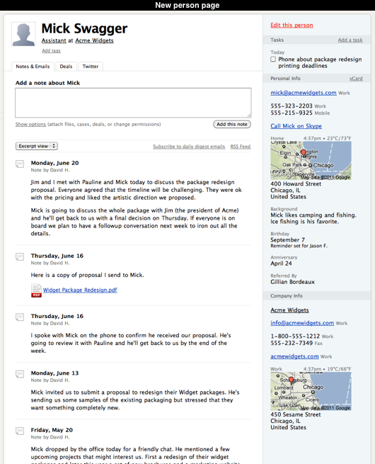
This week we updated Highrise with a revised layout for the people and company pages.

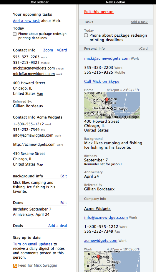
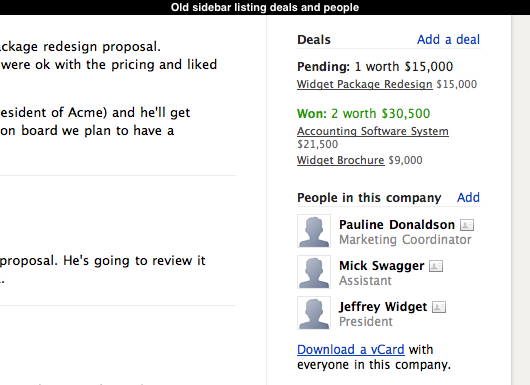
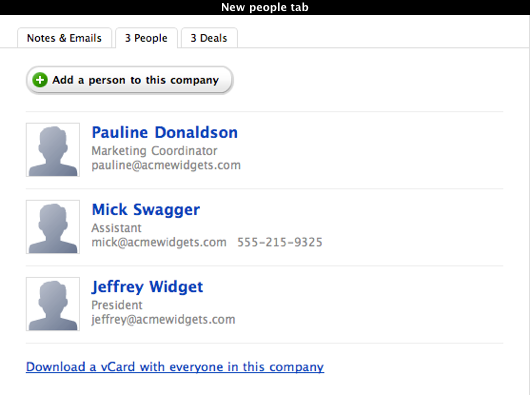
We decided to change these pages because we thought the existing sidebar had become too cluttered. The old sidebar contained tasks, contact info, custom fields, dates, deals, background info, a list of people on company pages, a twitter stream, an email notification toggle and an RSS link. It was a bit of junk drawer. Many items were constrained by the small space afforded by the narrow sidebar and it was difficult to see where one section ended and another one started.

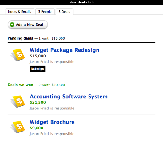
To help reduce the clutter we introduced tabbed sections for deals, the list of people in each company and the optional twitter stream. In the old sidebar the list of deals and people was often cramped and the twitter stream was limited to three entries. We wanted to give these sections dedicated spaces outside of the sidebar so that there was enough room to show more data like a person’s email address or details about each deal. We also wanted to make the appearance of deals and people consistent with other pages in Highrise.

The old sidebar had a seperate section for dates. We decided to merge these into the new Personal Info section because their presentation makes it obvious that they are dates. We also introduced a line of text that indicates which dates are configured with reminders. Previously you had to visit into the date editing pages to find out which dates had were setup with a reminder which was a bit of a hassle.

At the bottom of the old sidebar we had links to toggle daily digest emails and a link to the RSS feed. Both of these items provide a way to stay up to the date with the notes and emails that are added to a contact but their position at the bottom of the sidebar didn’t communicate that relationship very well. We moved them to the top of the stream of notes and emails to make it more obvious that these features were related.

The contact pages in Highrise have always been a challenge for us. They can contain many different combinations of data and everyone uses them in their own unique ways. We hope this round of changes makes these pages more useful and a little easier on the eyes for everyone who uses Highrise. As always, we’ll continue to review and revise as time goes on.

Ten apps is all I need

David
David wrote this on 100 comments

Nokia’s new N9 phone based on MeeGo looks wonderful and according to Engadget, it’s a delight to use as well. But supposedly it’s dead on arrival because it’s not going to have a massive platform. Excuse my french, but fuck the platform.

For all the 200,000 apps in Apple’s app store, I use two on a regular basis: Echofon and Bloomberg. Once in a while, I use Instapaper and play Civilization. And yet I use my iPhone all the time. It’s my favorite piece of technology and has been for years.

Do you know why? Because Apple nailed the basics. Safari, Camera, iPod, Clock, Weather, Photos, Messages, Mail, and Maps are the apps that I use 95% of the time. Those are the ones that made me buy the phone and stick with it. If I had to read Bloomberg on the web and couldn’t play Civilization, I’d be sad, but my day would surely go on.

I know I’m not alone. The pattern I’ve seen for many people new to iOS is a rush to try a bunch of apps and then never use most of them again. There’s a large market for people who just want the core ten apps executed even better. I’d be happy to trade my iPhone for a N9, if that core experience was stronger.

But the established wisdom now is that you cannot win without hundreds of thousands of apps. And unfortunately Nokia bought that “wisdom” and now they’re just going to become a WinPhone distributor with benefits. Woopedidoo.

Chicago-style

Ryan
Ryan wrote this on 17 comments

Here’s a great little copy bit from the SecondConf website. The headline on the home page says:

“Three-day, Chicago-style, single-track conference”

I can easily imagine a more mundane version:

“Three-day, single-track conference in Chicago”

I don’t know what “Chicago-style” means, but it sure beats the mundane version. It’s more interesting and unique than merely stating that the conference happens in Chicago.

I like stuff like this because I personally struggle with making my writing interesting. It’s hard enough to be clear and get your point across. Being clear and interesting—that’s a goal to shoot for.

Welcome Chase & Joan!

Ann
Ann wrote this on 6 comments

Chase Clemons & Joan Stewart joined the support team on May 31. It’s only been 3 weeks, but they’re already making customers happy!

Chase had lots of experience with customer support in his role as manager at Jason’s Deli (he recommends the Chicago Club). He impressed us with his writing skills, and his advice on teamwork & customer support:

Only happy people can make other people happy. Make sure to treat your team great because they’re the ones who make the difference with the customer.

You can read more on his blog. A native of Nashville, Chase is very loyal to Tennessee whiskies.

Joan comes to us from Rapid City, South Dakota, where she worked at the Rapid City Public Library. Her advice on customer support:

Slow down and ask a few questions. Sometimes I’m too eager to solve the problem and it’s not really the problem they want solved. Just asking a few questions as nicely as possible to get more clarity helps a lot.

Joan proves, once again, that librarians are awesome. You can read her application & see for yourself!

Bootstrapped, Profitable, & Proud: GeekDesk

Matt Linderman
Matt Linderman wrote this on 18 comments

Donovan McNutt, Founder & President of GeekDesk, on his company’s story:

The beginning

This business started when I was a 17-year-old kid — I went innertubing in the snow with a friend of mine, the snow was icy, we got off course and ended up flying across a ravine in an accident bad enough that it broke her pelvis and darn near broke my back. I ended up with a rib broken loose from my sternum, and the vertebrae connected to that rib pretty much knocked silly. It didn’t affect me that much until I was older, but by the time I was in my 30s, back pain was a fairly recurring problem for me. That was what drove me to look for a better way to work as a programmer.

When I first started looking for better ways of working (in terms of sitting/standing), I kept coming across these fixed diagram pictures showing “the proper way to sit at a computer” — usually spouted by supposed ergonomic experts. You know the type I’m talking about — feet flat on the floor, elbows at perfect right angles, etc. For me, my body was saying something much simpler: “MOVE!” It was telling me to change position once in a while. I pretty much had to ignore the experts at the time to trust that intuition.

GeekDesk started with around $20,000 and some well-leveraged relationships. I already had a reasonably steady stream of income from a small consulting business, and long ago learned how to live pretty modestly. So we didn’t need to make a whole lot of money right out of the gate. We don’t share revenues or employee count figures, but we qualified for this profile (profitable and over $1M in revenues) last year with significant room to spare. And so far this year, sales are averaging between two and three times what they were last year.

I love who we sell our products to. Every week, it seems like somebody I’ve heard of buys a desk or we get some great feedback from someone whose life was changed by just being able to stand up once in a while. I can’t really name names but some of my personal programming superheroes have purchased desks from us. It’s all I can do to not reach out and say “Hey, thanks! We think you are really cool!” It’s fun to be able to produce something that people you greatly admire find useful.


How we work

We don’t have a conventional “office” of any kind. Our work environment is what I’d describe as flexible, down-to-earth, and human. I’ve been self-employed most of my adult life (I’m in my mid-40s now) and never cared much for the typical corporate environment. Our culture reflects that. I’d like to think Scott Adams wouldn’t find very much fodder for his Dilbert cartoon strip here.

In general, we try to give our team a lot of room to move and encourage people to think for themselves, focusing on the overarching values and vision more than policy and procedure. I’m not much of a taskmaster — in fact, I actually hate telling people what to do all day — so I have found that it helps if I surround myself with people who “get it,” are generally proactive, and can think for themselves. They can take my occasional “sidelines coaching” input and run with it in such a way that, given their specific gifts and talents, they completely blow out of the water anything I would ever be able to do by myself.

I like to keep the organization as “flat” as possible. Wherever possible, I like to see people working side-by-side rather than over/under. Sometimes this frustrates people, because they want positional authority; It’s more “efficient.” I prefer relational authority. It’s more effective.

Continued…

Lessons learned from implementing Highrise's custom fields feature

Basecamp
Basecamp wrote this on 20 comments

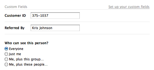
We recently added custom fields to Highrise (below) which allow you to keep track of extra details beyond standard contact information like phone, email, address, etc.

After the launch, we had a “looking back” conversation to see what lessons could be learned from the process. Three of our findings:

1. Add to an existing design before trying a new one.

When you begin work on a new feature, try to add it within the context of the existing design, evaluate it, and then make a decision about how to proceed based on that experience. That way, you quickly get a good sense of what works in the existing design and what doesn’t. You might even discover that the new feature fits into the existing design without any further work required. (Huzzah!)

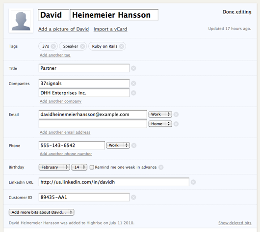
We started with a different approach when we tackled the custom fields project. We began with a completely new design for the contact edit page and pursued that design (below) for most of the project.

In the end, we decided to discard this design because it wasn’t the right solution and it introduced a bunch of new problems. It took us a long time to make that decision because there was a lot of work involved in developing the new design. And most of that work was not giving us good feedback about the nature of the problem we were trying to solve.

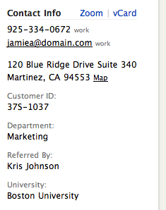
When we reset, we discovered that some of our assumptions about custom fields were wrong. For example we assumed that shoehorning custom data into the contact page sidebar (right) would make the page too cluttered and inconvenient for people. But we failed to actually try it out to confirm this assumption. When we finally did try it, we discovered it wasn’t bad at all.
2. Resist the urge to make something special out of something boring.

Custom fields aren’t the sexiest feature we could have worked on. Plus, we were building them based on customer requests instead of our own internal needs. Because of that, we mistakingly tried to make the project more interesting with indirectly-related work, like a redesign of the contact pages, streamlined contact dates, bigger avatars, and fancier ways to save data. None of these things were required for us to launch custom fields, but we were tempted to tackle them because they were more fun.

Adopting all those extra concerns obscured the reality that custom fields could actually be a very tiny project. When we finally threw out all the extras, the feature seemed embarrassingly simple. Nonetheless, our customers love it. The lesson here is the tiniest version can be good enough.

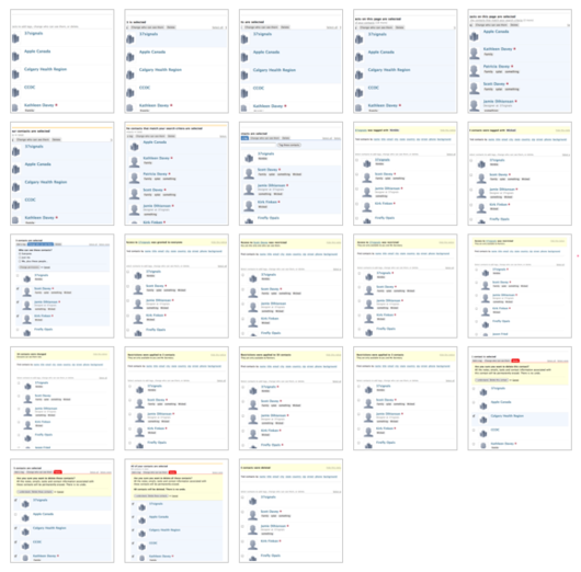
3. Storyboard complex interactions instead of building them immediately.

We tried to build out the redesigned edit page so that every interaction could be demonstrated for real and then evaluated. Since there was a lot of complex interaction on the page, most of the work involved in this process was Javascript programming which took a long time to complete. And programming the interface early made it difficult to change the design as we learned more about the problem.

Creating a storyboard of all the states is a more efficient approach for developing pages with complex interactions. It takes much less time to generate storyboards and they are easy to share and discuss with everyone. We used this approach when we worked on bulk operations and it worked well. Everyone was able to see the design early and understand how it should work. From there it was much simpler to divide up the work and build the feature quickly.

Our storyboard for all the screens for the Highrise Bulk Operations project. Storyboards like this illustrate the complete flow so everyone’s on the same page.

Jim Watson's interesting design observations

Matt Linderman
Matt Linderman wrote this on 12 comments

During the NBA playoffs, OKC resident Jason Zimdars pointed out design professor Jim Watson’s post on The Oklahoma City Thunder’s logo and why it’s a poor identity (no relation to thunder/Oklahoma, poor typography, etc.). Here he explains why that’s so frustrating for the city:

The logo was unveiled and we realized the opportunity to convey excellence was blown. The stereotyped image of Oklahoma might remain a little longer.

Unfortunately, the more bad design the public sees (Thunder, Walmart, La Quinta, Holiday Inn, to name a few), the more numb the public gets to bad design. The average person doesn’t understand nor discriminate enough without the guidance of corporations, cities, and the design community. If the corporate and design communities accept work such as the Thunder logo, then, heck, anyone can become a designer. One doesn’t even need much training or a design sense.

When questioned, almost all Oklahoma designers agreed that its an awful logo but were unwilling to do anything about it. Mantras in Oklahoma include If it ain’t broke, don’t fix it, Let sleeping dogs lie, Don’t rock the boat, Don’t make waves, Its good enough. All of these attitudes result in low standards of design. Maybe we got exactly what we deserved.

Watson’s site is filled with other interesting, strongly worded observations on design. Improvements to signs at rest areas points out how existing signs are poorly designed…

...suggests an improved version…

...and then compares the two.

Please print the day of the week along with the date also offers a nice A/B comparison.

Lots of other interesting nooks and crannies — design and otherwise — at Watson’s site. (And yes, his site could probably use a UI overhaul itself. Cobbler’s shoes and all that. Nonetheless, worth a visit if you’re into this kind of stuff.)