A few months ago I was invited to join Project Fi, Google’s wireless carrier experiment. International Data (certain countries) is included with your plan. There are no extra fees for SMS or data usage.
Project Fi reminds you of this benefit with a nice notification once you turn off Airplane Mode after landing.
Here’s what I got when I landed at Ninoy Aquino International Airport in the Philippines.
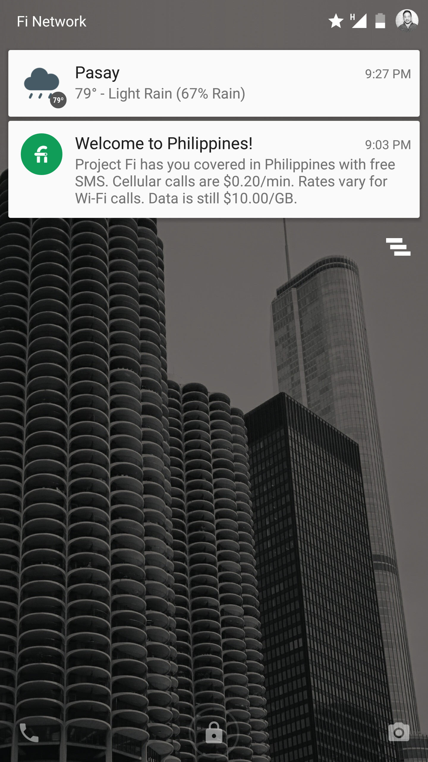
The Welcome to [Country]! is a nice way to start off the notification. Here’s what I got when I landed at Narita International Airport in Japan.
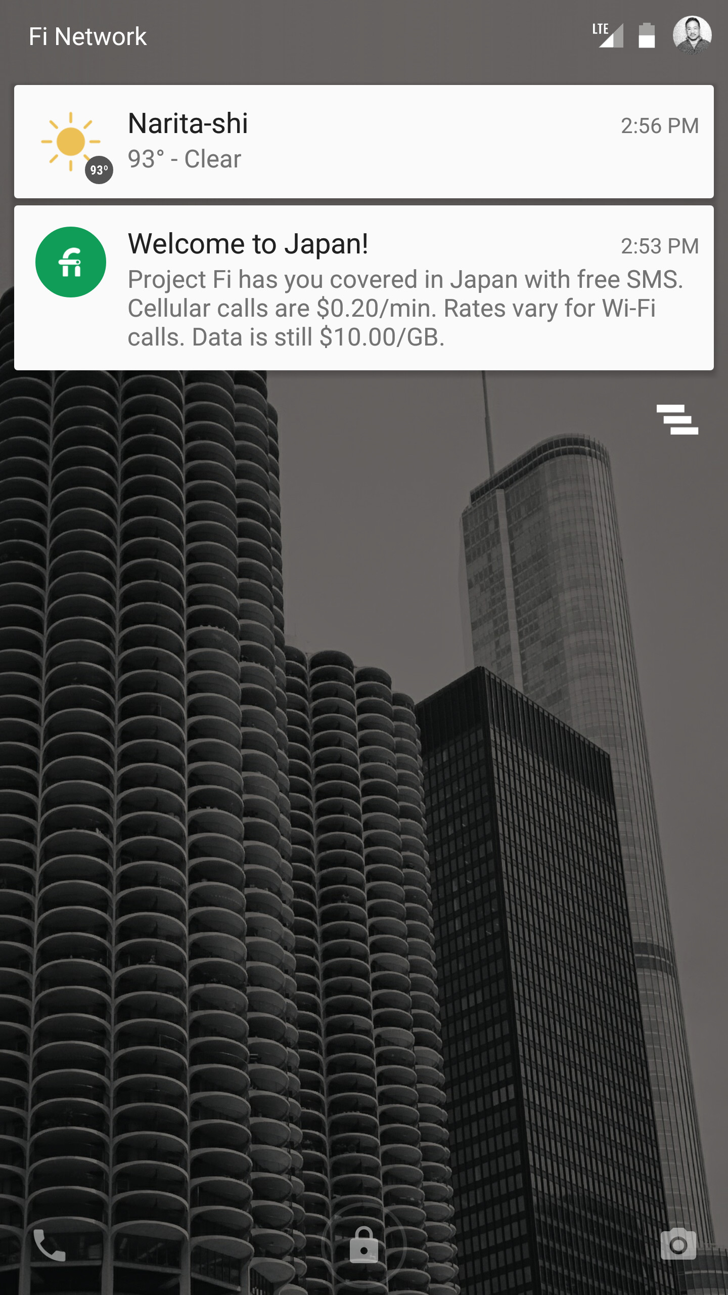
The folks at Project Fi know I’ll be taking my phone out of Airplane Mode. They know I’m in a different country. A notification is small thing, but context and timing is everything.
Signal v. Noise: Design
Start with our Best Hits on Design
- ⋆ Reminder: Design is still about words
- ⋆ The Typography and Layout behind the new Signal vs. Noise redesign
- ⋆ Backstage: How we use Basecamp to collect, share, and discuss inspiration
- ⋆ Backstage: Using Basecamp to build the Basecamp calendar
- ⋆ Behind the scenes: Reinventing our Default Profile Pictures
- ⋆ Behind the scenes: Highrise marketing site A/B testing part 1
- ⋆ What happens to user experience in a minimum viable product?
- ⋆ Lessons learned from implementing Highrise's custom fields feature
- ⋆ Ten design lessons from Frederick Law Olmsted, the father of American landscape architecture
- ⋆ Flashback: Every time you add something you take something away
Our Most Recent Posts on Design
How an idea comes together for me
First the idea hits.

Then I think about it some more and it takes a direction.
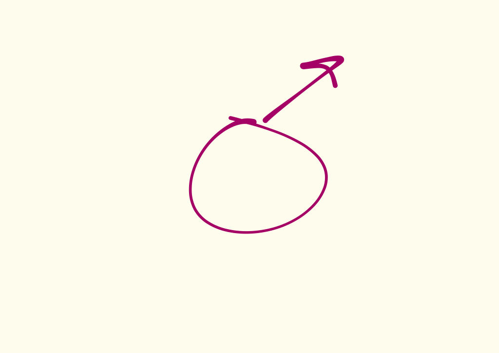
As I work through the direction, I’ll see another direction. Usually relatively similar, but different enough that it demands its own exploration.
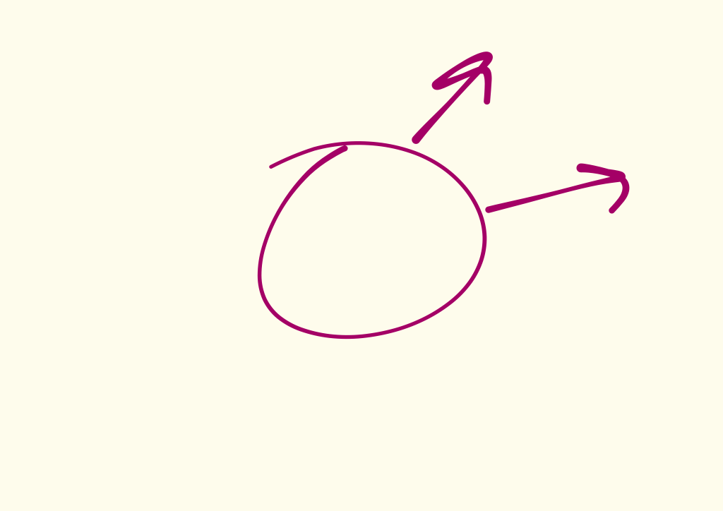
As I dig in into the problem, more layers and possibilities reveal themselves. Sometimes they point in entirely different directions. Some seem like big possibilities, others seem smaller.
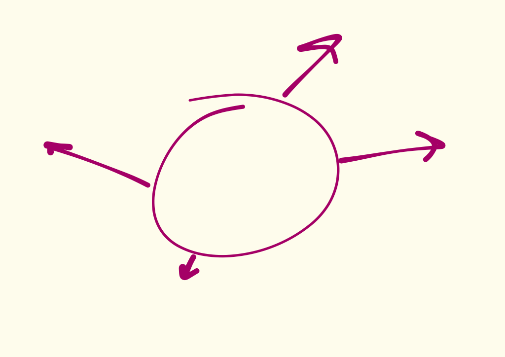
As I keep exploring, some more options emerge. Some independent of the ones I’ve already explored, but others branch off from an existing exploration.
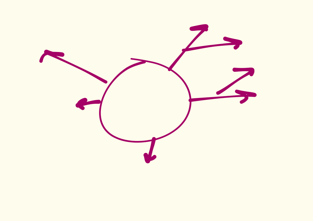
As I keep sketching and thinking and mocking and working through variations and conditions in my head, on paper, or in code, a few strong possibilities take the lead. I begin to follow those.
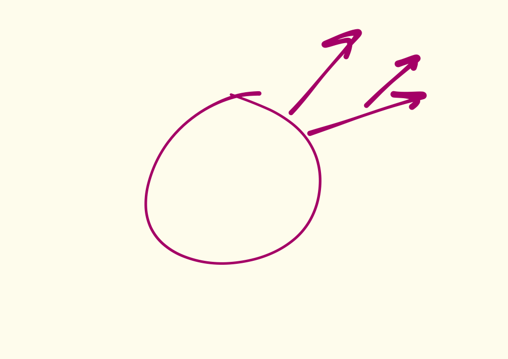
One primary direction becomes the most obvious, but there are still variations on that idea.
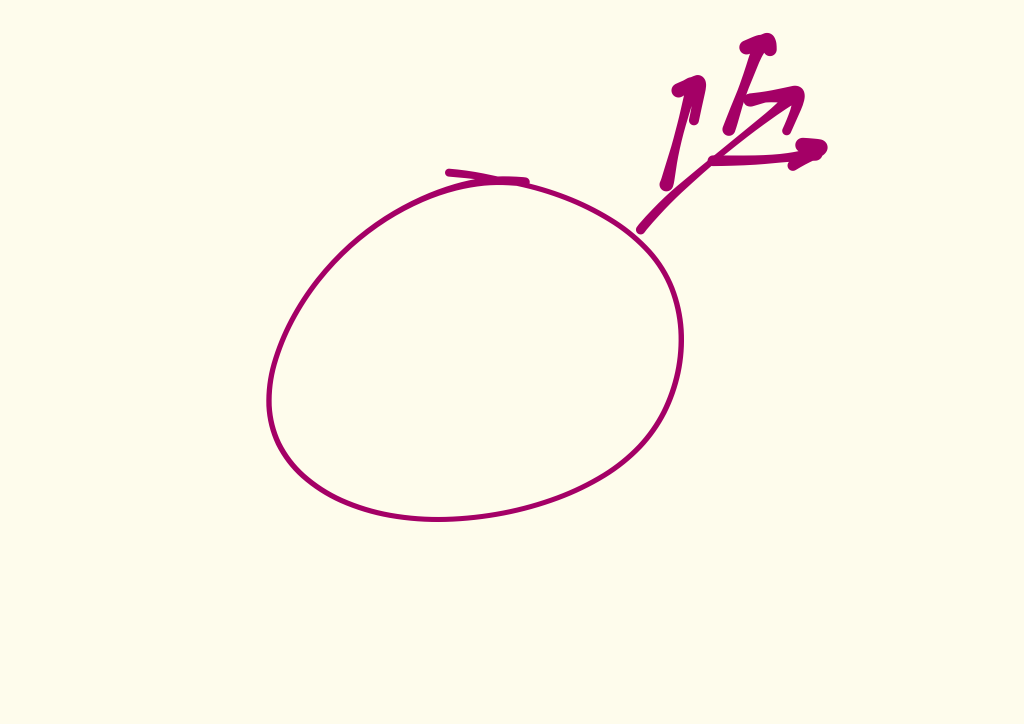
As I dig into the variations, I realize they aren’t direct descendants of that primary direction. Instead they’re closely related offshoots, but smaller. They usually fade away.
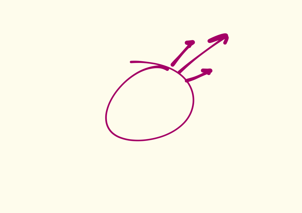
And finally the solution becomes clear.
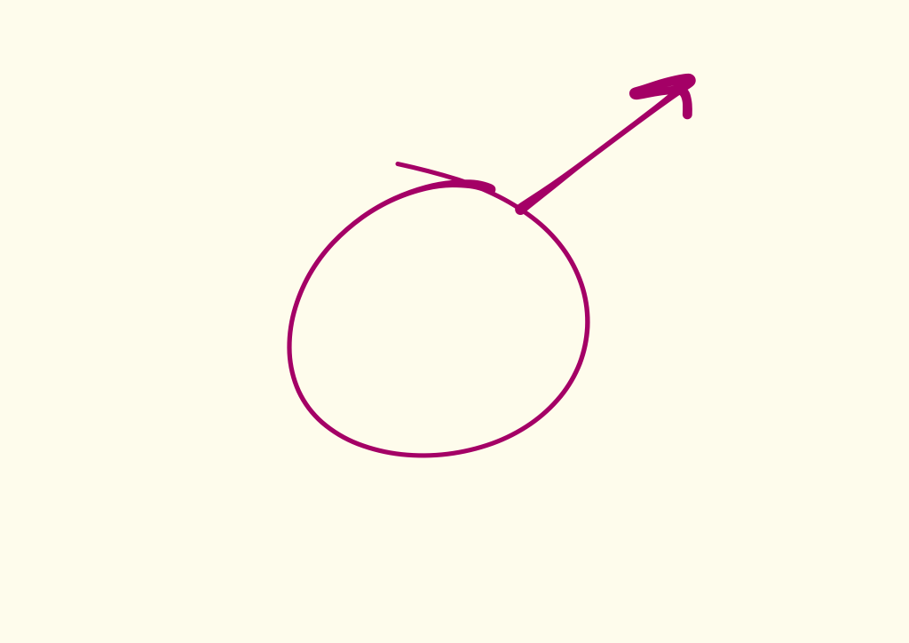
Then I check my thinking by going through the process again.
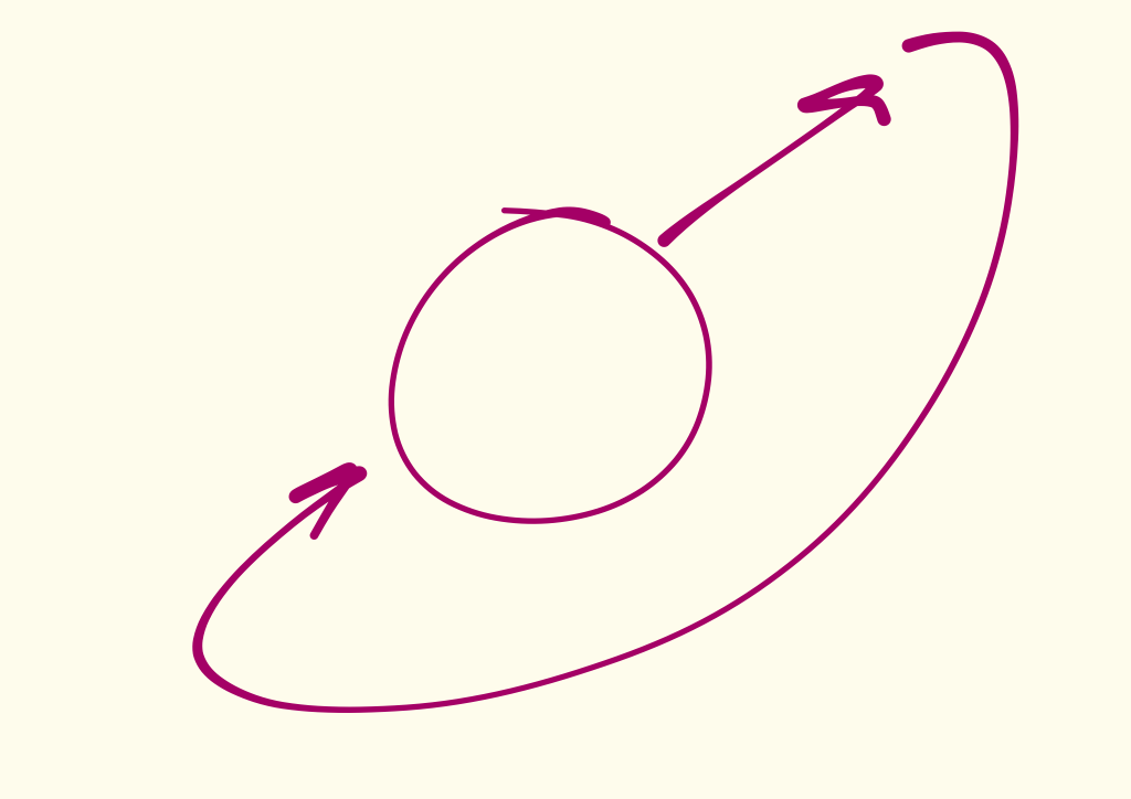
Where it goes from here depends on what it is, but hopefully at the end I’ve enjoyed figuring something out.
Poison
How do we get better at making things people want?
We strive to better discern the needs of our customers, so we reach for a number of tools. Surveys. User testing. 'Jobs to be done' interviews (an interview process I highly recommend). But in our effort to understand our customers, we often miss sight of something much more basic and integral to those things working well.
The University of Edinburgh Medical School, one of the best medical schools in the United Kingdom, was created in 1726, also making it one of the oldest medical schools in the English speaking world. Given its age, it has quite an interesting group of alumni. Like Joseph Bell.
He was a graduate and professor at the school in the 1800s. Bell had an uncanny ability to determine things about his patients from what seemed to be unrelated and insignificant details. For example, without even talking to the man, Bell determined one patient was a soldier, a non-commissioned officer, and served in Bermuda. How'd achieve such a feat? Bell had observed the patient walking into the room without taking his hat off, as a soldier would. His authoritative posture and age gave him a clue that he was a non-commissioned officer. And the rash on his head? Could only have come from Bermuda.
Joseph Bell's name probably still doesn't sound familiar. But you know his alias – Sherlock Holmes.
Sherlock Holmes wasn't pure fiction. Sir Arthur Conan Doyle, the author of the Sherlock Holmes stories, was also an alumnus of The University of Edinburgh Medical School where he trained as a physician. Sherlock Holmes was an amalgamation of people he'd crossed paths with, especially his medical school professors Joseph Bell and Sir Robert Christison.
Christison was an early forefather of forensic medicine. In 1828, there was a string of murders in Edinburgh, Scotland. Christison helped prove that William Burke and William Hare had been suffocating their victims and then selling the corpses to medical schools.
But Christison was also known for calabar beans. Calabar beans are poisonous, and were used as a justice system in African tribes. They would crush the beans into a milk-like drink for prisoners. Those who died from the drink were "guilty". Those who lived – innocent.
Researchers today find this form of justice might be more accurate than it at first sounds. People who believed in their innocence and the system would probably drink the poison instantly, causing their stomach to immediately vomit and regurgitate the poison, sparing their life. Guilty people, however, believing the drink would kill them, drank slowly trying to elongate their life, but instead dampened their stomach's ability to reject the poison.
Christison knew of the calabar beans' danger, and yet one day, he took a lethal dose and ingested them. Why? Was he trying to kill himself? Was he trying to prove his innocence of something?
If you were anywhere near Facebook or Twitter at the end of February 2015, you've seen this photo. 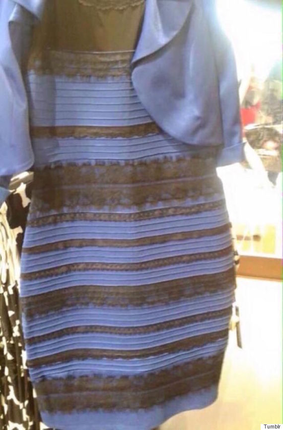 The photo of #thedress was taken by Cecilia Bleasdale, the mother of a bride-to-be, who wanted to show her daughter and bridal party what she'd be wearing at her daughter's wedding.
But they couldn't tell. People split into two camps: you saw blue and black or you saw white and gold. The entire internet broke into debate. I watched friends, designers, photographers, neuroscientists, engineers, even magicians dissecting the photo, trying to explain what we were seeing.
In the end, a representative of the company that makes the dress put an end to the debate: it was blue and black. They don't make a white and gold one. (They probably will, now.) And here's another photo of Cecilia, with the newly married couple:
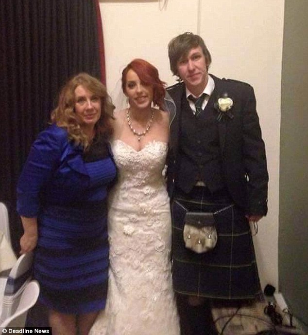
What I found most interesting about the original photo is the gap it shows between explicit and tacit knowledge.
Explicit knowledge is: "knowledge that can be readily articulated, codified, accessed and verbalized. It can be easily transmitted to others."
The photograph codified what Grace's mom saw that day of her dress, and it was easily sent across the globe to millions of people. But so many of us were wrong about what the information actually described. We saw one thing, and it described another.
Scientist and philosopher, Michael Polanyi, invented the term "tacit knowledge" in 1958. Tacit knowledge is: "knowledge that is difficult to transfer to another person by means of writing it down or verbalizing it." It's knowledge that we can only experience ourselves.
Polanyi would describe riding a bike as an example of tacit knowledge. I couldn't show you how to ride one by teaching you about gravity and centripetal force. I couldn't even give you step by step directions on the mechanics of how the body needs to pedal a bike for you to succeed. Only after you get on that bike and fall, try again, and fall, will you eventually gain the tacit knowledge you need to ride.
We experience this world, but we can't transmit all of it to others. Even the simple stuff, like a photograph of a dress, can be misinterpreted.
Professor Stephen Westland, is an expert in color science at the University of Leeds who the BBC consulted with when writing about #thedress. He explained: "It is possible that people could literally be seeing different colours but it's impossible to know what is in someone's head."
Exactly what Polanyi said about tacit knowledge:
We can know more than we can tell.
After Christison ingested the poisonous beans, he began feeling the symptoms. Paralysis. He started going blind. He began to die.
But Christison grabbed a bowl of water he used to clean his shaving razor and face, and drank it. He immediately began vomiting, which saved himself from the rest of the poison's effects. Christison lived.
Christison wasn't trying to kill himself. He was trying to bridge the gap between explicit and tacit knowledge. As a doctor, all he's given is what a patient tells him, or what he can see. Like the photograph of the dress. But he couldn't read a patient's mind. He couldn't tell if a patient was describing correctly how they feel or the history of what they've gone through.
Christison needed to experience what the actual symptoms were of being poisoned. He needed tacit knowledge to reach his full potential as a physician.
Mike Markkula gave two guys $250,000 to fund a business they were running out of their garage, Apple. But Markkula wasn't just a source of funds. In an interview, Steve Wozniak says Markkula was probably more responsible for the early success of Apple than Wozniak was himself. He chased down more capital. He found the first CEO and become the second CEO when the first left. He was even the one who approved the original plan for the Macintosh.
One of the most interesting contributions Markkula made to Apple was a marketing philosophy that appears to still guide Apple today. Just 3 points he wrote up in 1977:
1) Focus. In order to do a good job of those things that we decide to do, we must eliminate all of the unimportant opportunities.
You especially see this play out in Apple's revival when Jobs returned in 1997. Jobs re-focused the company from dozens of different products and variations (Apple once made printers and game consoles) to just 4 product lines: consumer, pro, desktop and mobile.
2) Impute. People DO judge a book by its cover. We may have the best product, the highest quality, the most useful software etc.; if we present them in a slipshod manner, they will be perceived as slipshod; if we present them in a creative, professional manner, we will impute the desired qualities.
The time and attention Apple spends presenting its products is often unheard of, and the results speak for themselves.
But the point on Markkula's list that I think should draw more attention from people making products is:
3) Empathy. We will truly understand their needs better than any other company.
Markkula chose his words wisely. Just like Christison, he knew that to truly understand a customer's needs better than anyone else, we need to empathize with them – not sympathize. Listening with sympathetic ears to our customers isn't enough. Why? That photo shows us why. People can't communicate everything they experience. Even if they present us with a photo, we easily misinterpret it. And we can't read their minds.
It's of course not always easy. Some things are difficult to mirror. But if we want to be able to gain the deepest insights from the interviews we have with customers, if we want to reach our full potential as a designer, as a listener, as a human being, we need to improve our ability to empathize. This isn't just "dogfooding" our products. We need to share the actual life experiences of our customers and neighbors. It's up to us to poison ourselves.
P.S. You should follow me on Twitter: here for more articles.
Imagining Basecamp on Apple Watch
Over the last day or so I spent some time learning about the different Apple Watch components (notifications, glances, WatchKit app) and imagined how Basecamp might work on the upcoming device. Here’s what I came up with.
Notifications are a given for Apple Watch. The ability to see what’s new in your projects simply by raising your wrist sounds fantastic.
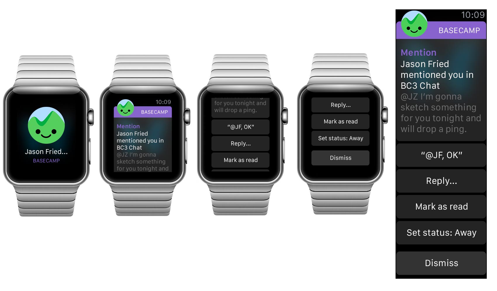
Canned, quick-reply options could be great. I also like the idea of setting your status as an option when notifications start piling up.
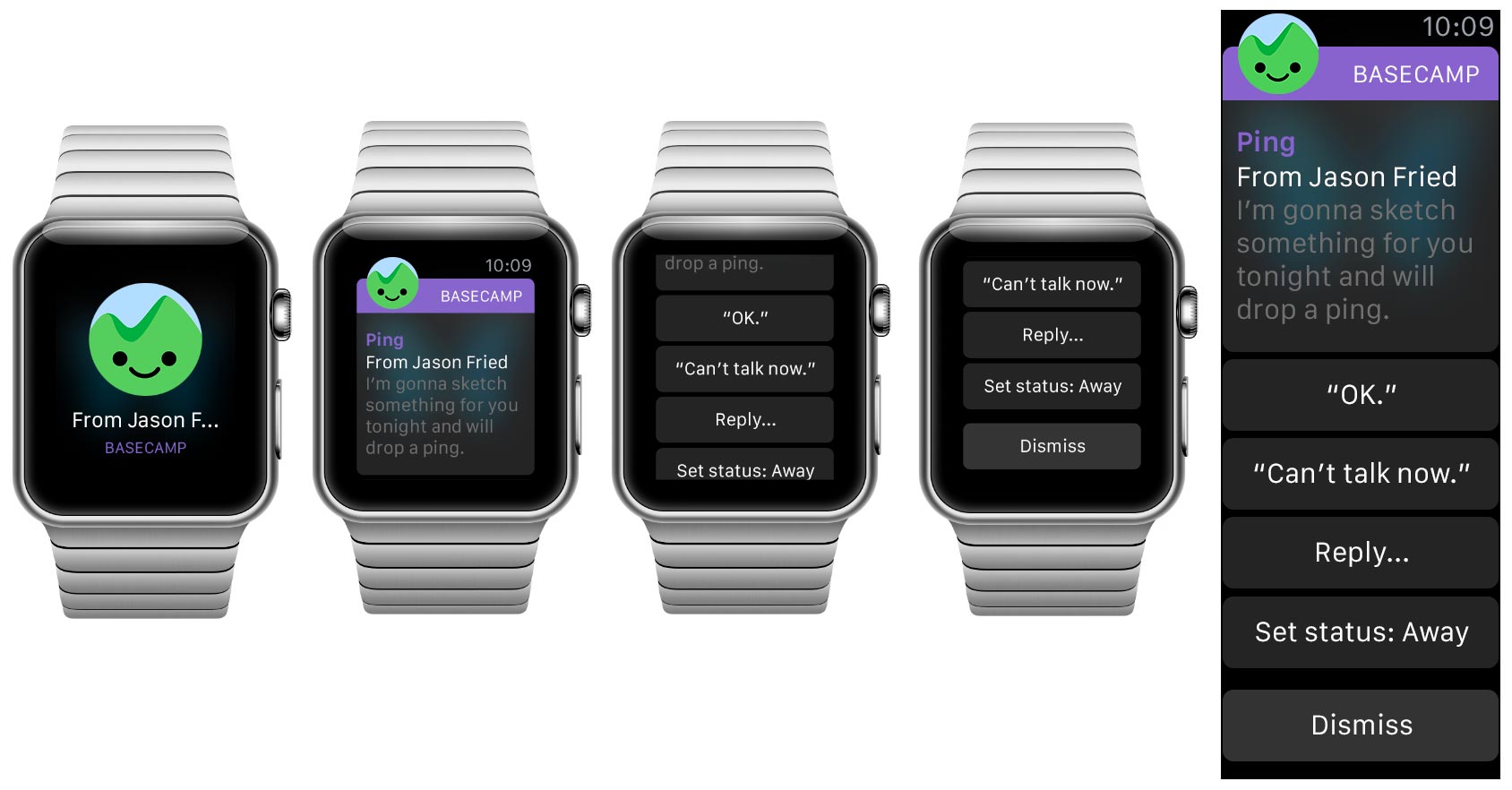
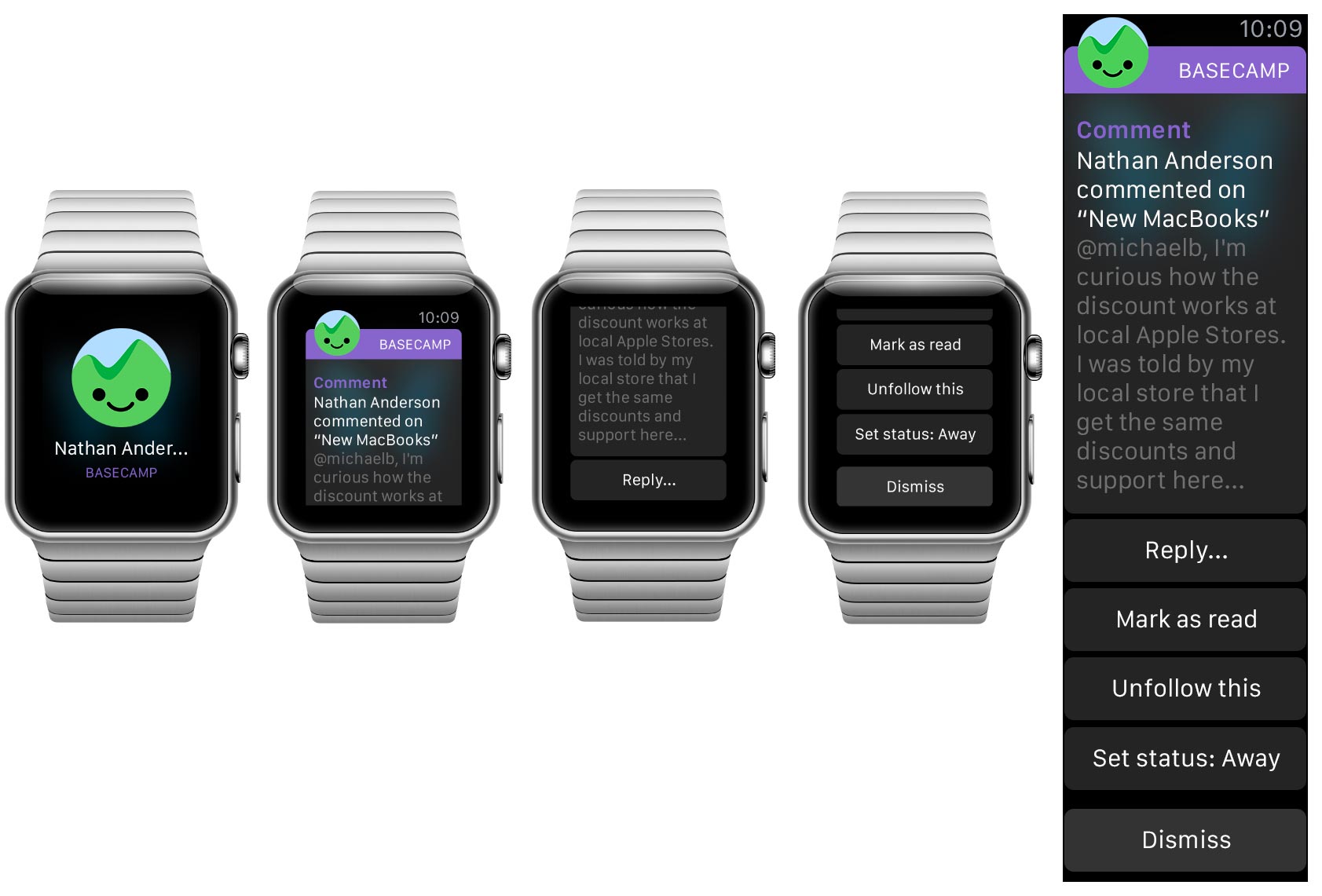
It’s interesting how the actions can change depending on what kind of communication it is—there are a ton of possibilities. Comments, for example, could offer “Stop following” or “Bookmark” (not shown).
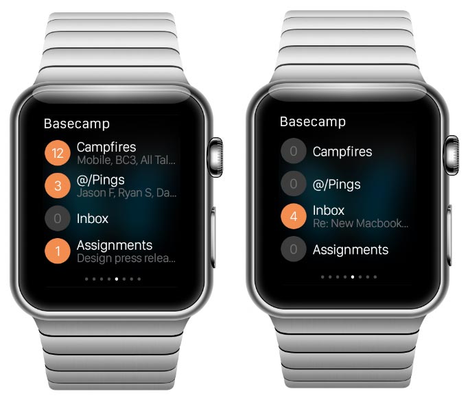
Glances are for quick information display, a great place for state-of-the-world type content. This glance answers the question, “Is anything new in Basecamp?” by showing what’s new for you by bucket and how many items are in each.
Notifications and Glances are outside the WatchKit app, itself. Here are some additional sketches showing how full a WatchKit app could look:
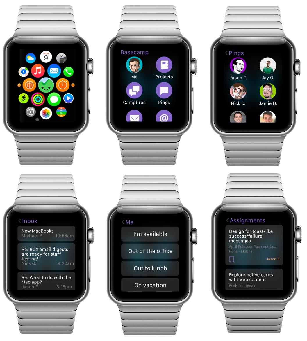
I went into this skeptical but came out convinced there is a lot in Basecamp that could be useful on a watch. Notifications seem natural, in particular, but any kind of communication has potential. These simple designs use mostly stock UI widgets until we have a better idea what can or should be customized further. We’re certain to have new ideas once we have the device on our wrists.
Look and Feel and Feel
Designers often talk about the look and feel of a product, an app, an object, etc. These are good concepts to be talking about, but how the thing feels isn’t really the important feel. The important feel is how it makes you feel. That feeling isn’t usually covered by look and feel discussions.
This has recently come into focus for me. The trigger? Instagram.
I’ve been on Twitter (@jasonfried) for years. Since I don’t have a Facebook account, Twitter has been my only social networking outlet. I mostly use it for sharing novel or interesting things I’ve seen or read, the occasional quote, or a point of view, perspective, or epiphany about something business related.
I follow just under 200 people. Some of them I know personally, others I’ve never met, some are brands, some are individuals, some are because of hobbies or special interests, some are dead serious, others funny or silly. It’s a healthy mix, and I try to pay attention to everything that shows up in my feed.
Twitter’s an amazing thing, no question. I think it’s one of the most important products ever, and it’s absolutely changed the way ideas, news, insights, complaints, and casual communications happen.
A few months ago I signed up for Instagram (@jason.fried). I started following a few people – some of the same people I follow on Twitter. Almost immediately I felt something – I felt good! Instagram makes me feel good. I enjoy thumbing through Instagram.
Since then, every time I’ve gone back to Twitter, I’ve noticed I’ve felt anxious, unhappy, uncomfortable. I didn’t notice this before I started using Instagram, because I didn’t have anything to contrast it with. It was just the way it was, and I didn’t think much about how it made me feel.
Every scroll through Twitter puts at least one person’s bad day, shitty experience, or moment of snark in front of me. These are good happy people – I know many of them in real life – but for whatever reason, Twitter is the place they let their shit loose. And while it’s easy to do, it’s not comfortable to be around. I don’t enjoy it.
Every scroll through Instagram puts someone’s good day in front of me. A vacation picture, something new they got that they love, pictures of nature, pictures of people they love, places they’ve been, and stuff they want to cheer about. It’s just flat out harder to be negative when sharing a picture. This isn’t a small thing – it’s a very big deal. I feel good when I browse Instagram. That’s the feel that matters.
So now I have a choice… When I have a few minutes to kill, and my phone is in front of me, I almost always reach for Instagram. I never regret it. I come away feeling the same or better. When I occasionally reach for Twitter, I discover someone’s pissed about something. I often come away feeling worse, feeling anxious, or just generally not feeling great about the world. Twitter actually gives me a negative impression of my friends. I know it’s not Twitter doing it, but it’s happening on Twitter. that’s how Twitter feels to me.
None of this has anything to do with how the apps look or feel. It’s not the buttons, it’s not the animations, it’s not the interface or visual design. It’s not the colors, it’s not the font, it’s not the transitions. It’s how using the apps make me feel before, during, and after. The sense of anticipation (am I about to see something wonderful vs. am I about to get a dose of someone’s bad day?), the things I experience as I scroll through (a butterfly vs. an injustice), and how I feel once I’m done (that was nice vs. fuck that – ugh).
The Twitter vs. Instagram experience is really reinforcing what matters when designing a product. What kind of behavior can we encourage? What kind of moments can we create for people? What do people anticipate before they use something? How does it leave them feeling when they’re done? These are now some of the most important questions for me when working on a design.
BTW: You can follow me on Twitter at @jasonfried or on Instagram at @jason.fried. I promise to keep both positive.
Taking off the developer goggles
One of the very best things about working at Basecamp is “Everyone on support (EOS)”. That’s our policy where everyone on the team—no matter what their normal job is—spends one day per month as a customer support agent.
Each time my turn comes around I marvel at the truly excellent service our team provides every single day in what is a very tough job. Our team’s ratings and response time are insanely good even with dead weight like me pulling down their averages one day a month. I have no idea how they all remain so positive in a role where it feels like all day you’re saying “no”. Let’s face it, many customers know the answer to the question they’re asking. They’ve looked everywhere and tried everything so they’re frustrated, defeated, and sometimes grumpy by the time they reach out to a support agent— one who is understanding, empathetic, but often powerless to fix the problem. They have work to do and all this tech stuff just gets it the way.
While I’m glad to gain in appreciation for my coworkers what’s even more important about those stints on support is that I always learn something.
I know a lot about Basecamp already. I’ve been working on the current version of Basecamp almost exclusively since before the first commit back in 2011, from the first napkin sketches to its launch on iPad. What that means is I have internalized a very intricate mental model of Basecamp. I know every feature inside-out—and not just that, but code, domain models and all the decisions and debates and history that lead to why things are the way they are, why they aren’t another way and what compromises fit in-between. That’s not to brag, many of us who make products can say the same thing. These apps are built from our passions, they’re our babies. We can feel them. We notice when an interaction takes a beat too long, when a button is a few pixels out of alignment.
All of this blinds us. We’re wearing developer goggles.
Continued…Behind the scenes: From Herding Cats to Finishing a Project Together
Nate Otto and I made a new Basecamp homepage illustration based on a vector drawing I made in Adobe Illustrator. Initially I didn’t intend it to be hand drawn. I thought I’d refine the vector drawing. Somewhere in the middle it turned into “herding cats”. In the end the spirit of the concept was intact, but the result very different from what I’d envisioned.
Here’s how we got to the final idea: Basecamp helps you wrangle people with different roles, responsibilities, and objectives toward a common goal: Finishing a project together.
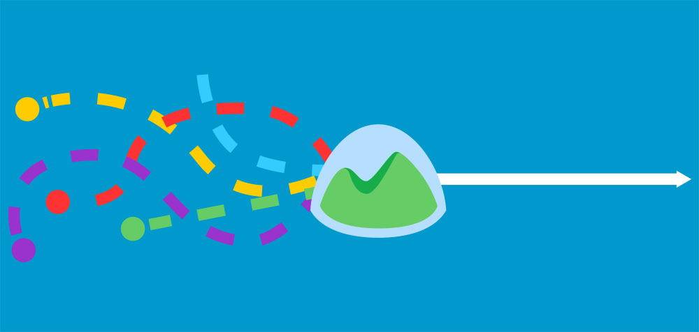
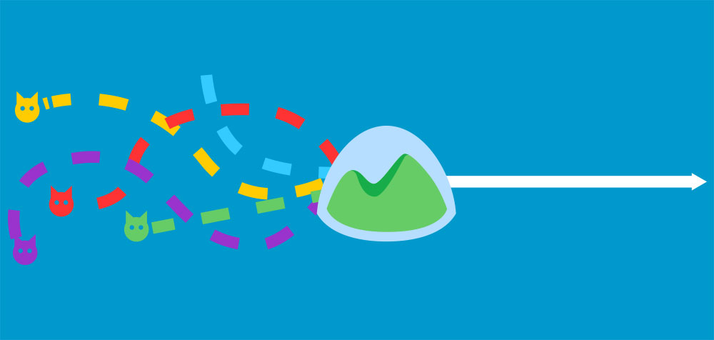
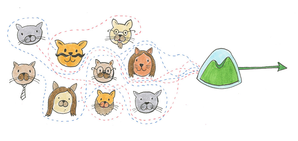
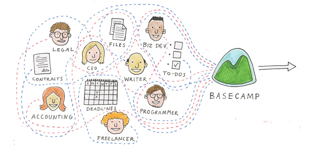
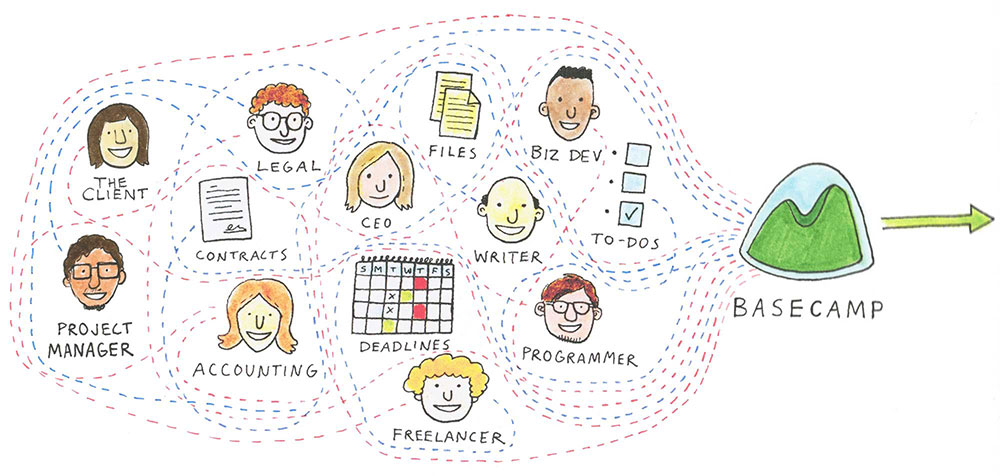
This process took about one day of back and forth (in Basecamp) between me and Nate. So, that’s how we made the illustration for the idea: Basecamp helps you wrangle people with different roles, responsibilities, and objectives toward a common goal: Finishing a project together.
Solo
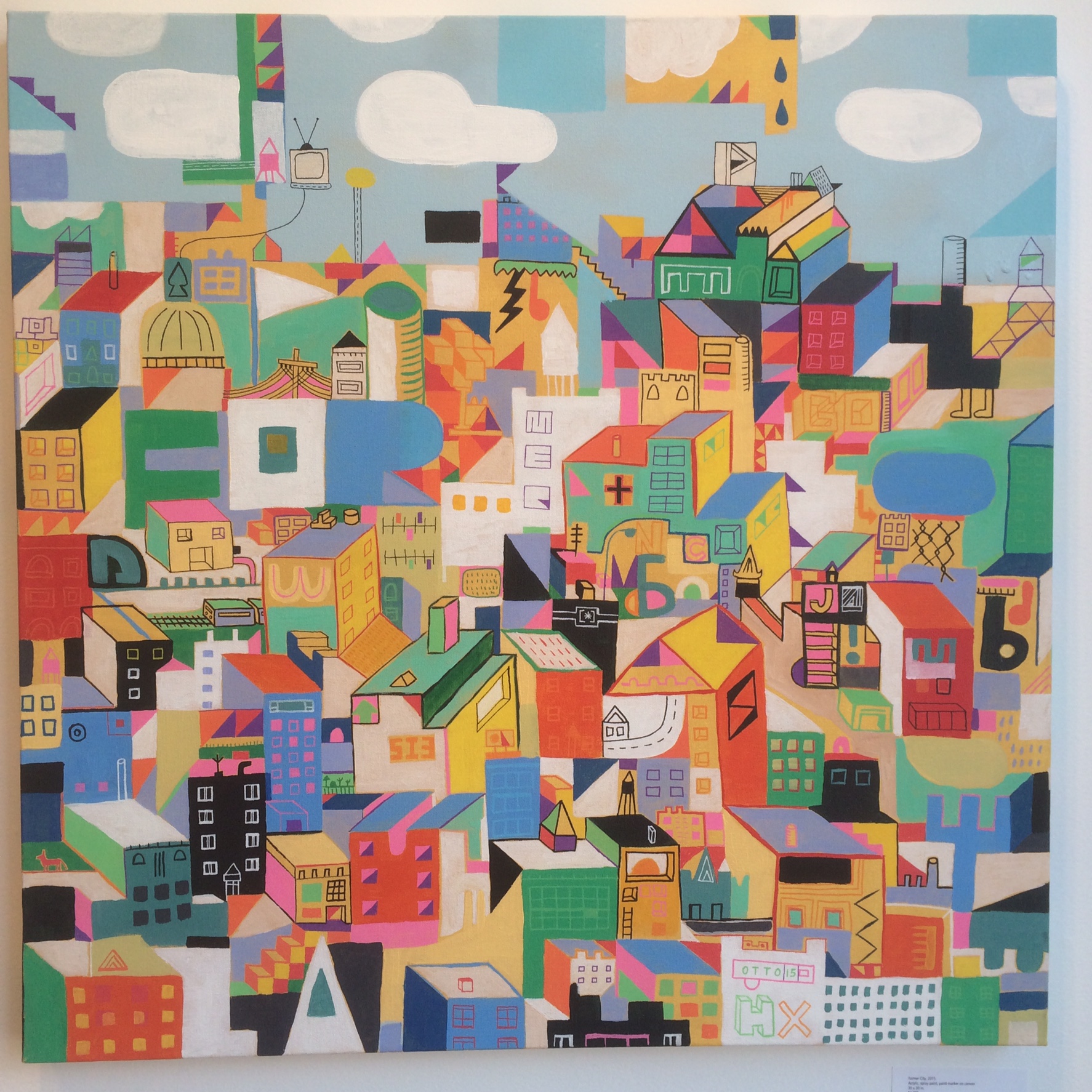
About five years ago I consciously willed an art career into existence. At that point I had been working a social services job for about five years. I initially took the job because it wasn’t specifically art related. It was a job I could feel good about — helping people with disabilities — but it wouldn’t tap my creative juices. I had learned many years before when I got a job doing graphic design that being creative at work drained my creative life bars during my down time. This social services job would leave me with enough creative energy to work on my art when I got home, but in reality that wasn’t really happening. Furthermore, the job itself was becoming a frustrating dead end. I had learned that working in a large organization with seven direct bosses wasn’t an environment in which I would thrive. What would my next move be? I was grown up and competent. I felt as though I could do pretty much anything.
Are we making it better?
A common approach to problem solving is to consider it binary. Either you’ve fixed the issue or you haven’t. Some problems fit that domain well: Either the calculator returns 2 on 1 + 1 or it doesn’t. There really isn’t much of a middle ground.
But many problems in product development aren’t like that. They’re far more hazy. Solving a problem in 100% of the cases for 100% of the people might very well not even be possible. So thinking of such problems as binary flips is not only futile, but harmful.
A better way to think of hazy problems, like “how easy is it to get started with Basecamp?” or “is the query interface for Active Record as readable as can be?”, is to focus on mere progress instead: Are we making it better?
That’s such a disarming question to pose of new initiatives. No longer does an idea have to contend with being The Solution, it simply has to contend with making things better.
It makes it so much easier to find consensus that way. Everyone sits with their own idea of The Solution, but most people can agree whether A is better than B, when both of those states are real.
Compare the concrete, make it better.
Basecamp is hiring another Marketing Designer
We’re looking to hire a Designer to join us at Basecamp to work on all sorts of fun, meaningful marketing projects. The last time we hired for this role was when I joined in 2012. The last time before that? It was Jamie in 2008. We don’t often have openings for design positions like this, so we’re really excited to bring someone new to the team.
Note: This is primarily a senior-level graphic design position. Applications were due on February 6, 2015. Thanks to everyone who applied!
Designers at Basecamp are a fun bunch, and we all do a bit of everything. We’re not just setting type, picking Pantone colors, or pushing pixels in Photoshop. In addition to graphic design, designers at Basecamp write tight copy, plan the user experience for marketing pages and apps, and craft the HTML and CSS to bring it all together. We don’t think this makes you a unicorn, or a ninja, or a rockstar. We just think it makes you a well-rounded designer. You may not have all these skills yet, but you’re looking for a place to learn and hone them.
Designers that work on marketing at Basecamp aren’t afraid to sell. Whether it’s getting your coworkers to buy in on a direction you’ve designed, or writing copy that makes it clear why customers should choose Basecamp, you don’t shy away from the role of marketing: selling something worthwhile.
If you were a marketing-focused Designer at Basecamp, here’s some of the work you might have done:
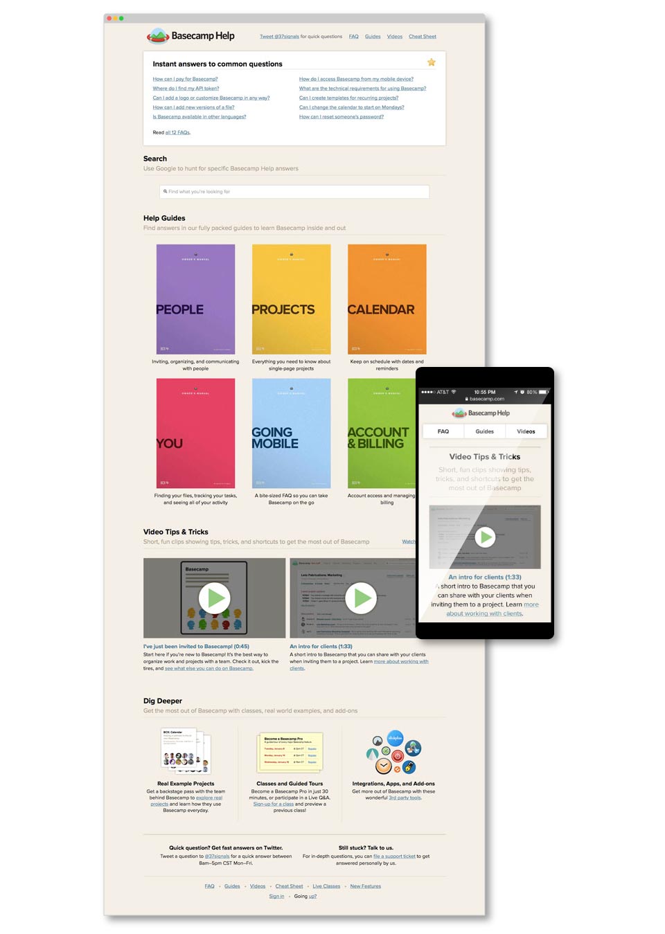
When the new version of the Basecamp app launched, you would have lead the charge on designing a new Help site while teaching the Support team how to write the documentation for it.
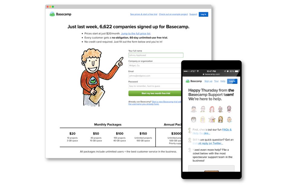
When we changed from 37signals to Basecamp, you would have worked on the brand new marketing site for our exciting company change.
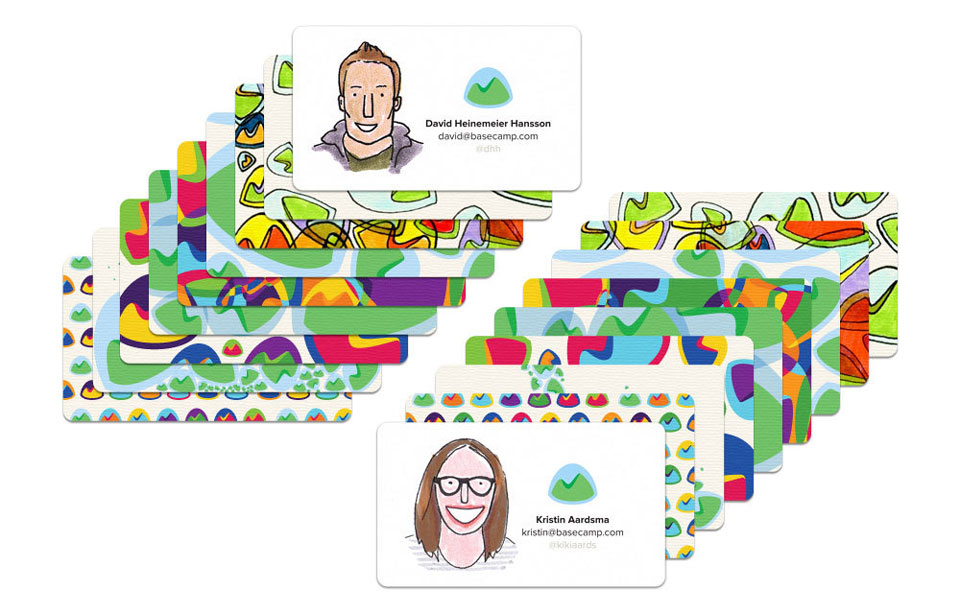
You would have suggested that the new name change, along with all of our new coworkers we hired in the last couple of years, warranted fresh business cards. So you made them.
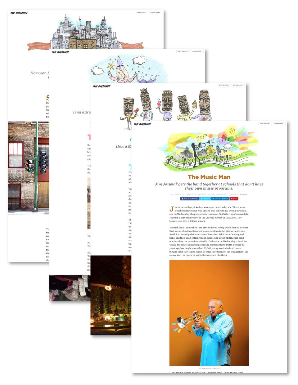
You believed in supporting businesses who have lasted for generations, so you volunteered to design The Distance.
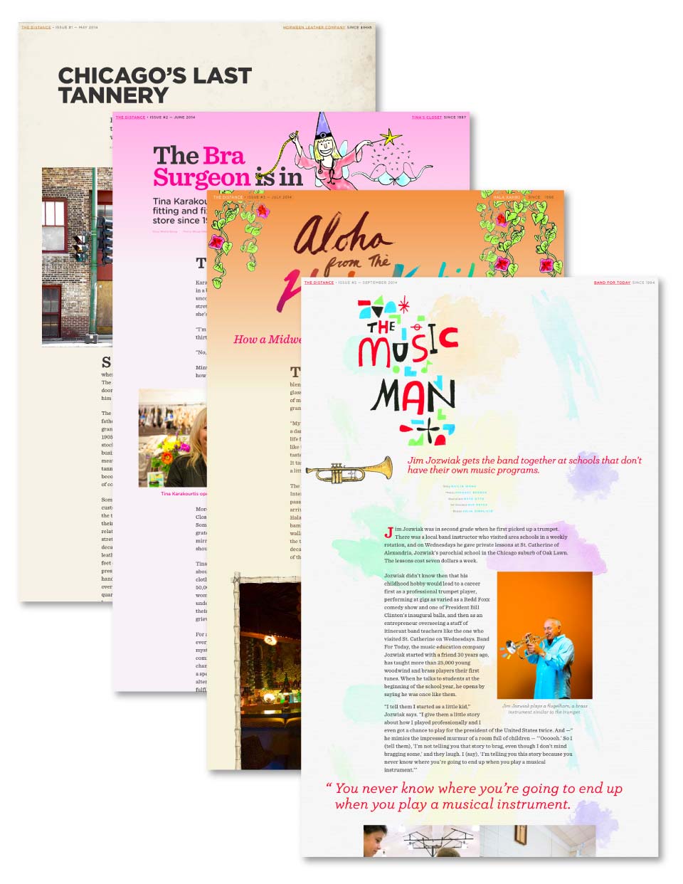
You would have found your own design’s shortcomings and months later, redesigned The Distance to make it faster to update and easier to read.
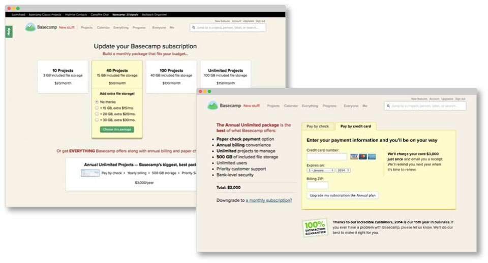
Over time and if you were feeling adventurous, you’d dive into the world of product design to add useful features including Annual Billing and storage upgrades, because making customers happy and having a positive impact on revenue is a win-win.
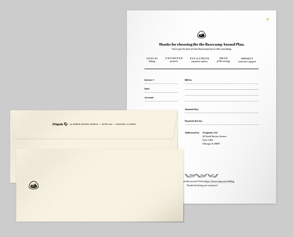
You’d go on to create beautiful letter-pressed invoices, because our customers deserve the best in every instance we get to talk to them.
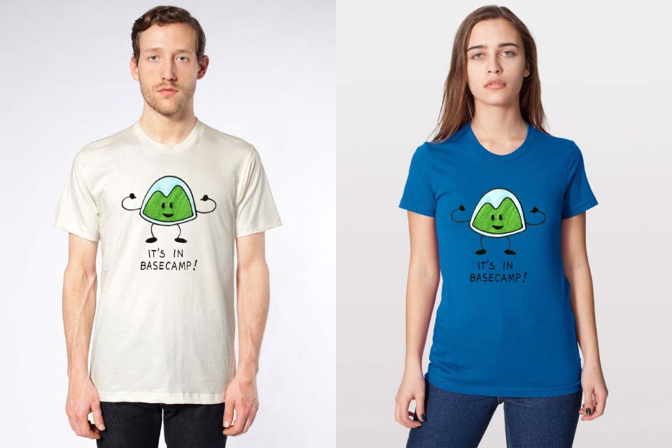
On a whim, you’d swoop in to help Dan and Merissa make t-shirts to hand out at the latest conference we’re sponsoring. Heck, you’d even think of other great conferences and initiatives we should be sponsoring, too.
You’d give our Support team fun ways to write personal notes to customers.
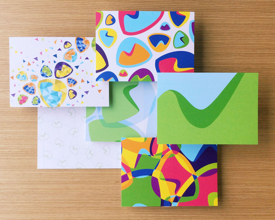
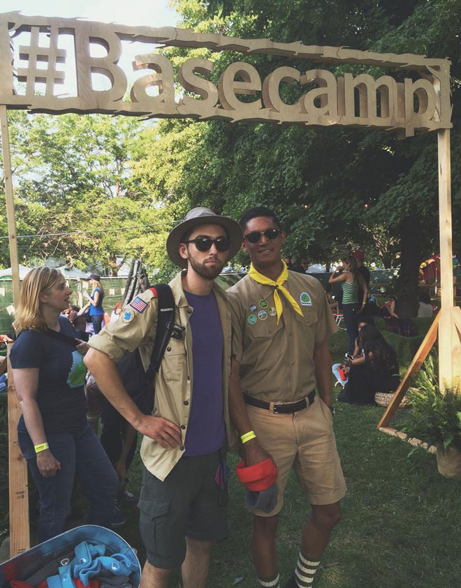
You’d help plan and design the materials that went into Basecamp sponsoring the Pitchfork Music Festival. Dressing up like a camper is both silly and optional. But we’re all fun here, so you wouldn’t have thought it was weird to do so.
Some work you might do once you get here:
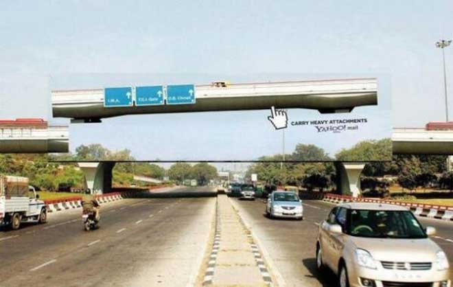
You’ll look at billboards like this and ask, “if Basecamp took out a billboard, what would ours say?”
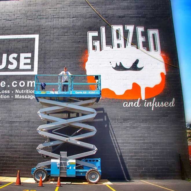
You’ll encounter beautiful wall murals like this and offer, “if donut shops can have great branding and advertising, why can’t Basecamp?”
You’ll also help us make Basecamp.com feel alive and relevant, you’ll learn the ropes of A/B testing and experiment with new designs often for our marketing sites, you’ll craft email campaigns about Basecamp that people actually want to sign up for, and you might even share everything you’ve learned on this blog.
And if you didn’t like anything I just shared with you above, you’d step in to find out ways to do things better and lead with real designs you make and put out into the world.
You’ll have some of the most talented, smart, and funny people all around the world to help you do this work.
If you’re working on a new Basecamp.com landing page and have a question about trends in Basecamp signups, Noah can offer plenty of insights. If you’re curious about what our customers actually want, the entire Support team can give you a top-three list of requests at the drop of a hat. If you think a campaign at Basecamp needs great photography and video to tell your story, our video producer Shaun can be right by your side to film and shoot. We think everyone here is awesome, and we’d love to see you on the Basecamp Team page with us.
About you
You might live in Chicago, and that’s great. But we work remotely, so we’ll give you a fair shake no matter where you live. We want to know that you’ve done this kind of work before. Whether you’re coming from a big tech company or a small mom-and-pop agency, your resume and pedigree don’t matter nearly as much as the real world work you’ve put out in the world.
You may have a copy of Bringhurst’s The Elements of Typographic Style laying next to your copy of Dan Ariely’s Predictably Irrational. You may also have a stack of design, marketing, and advertising books you’re just dying for us to check out, too.
You have a love for writing, an interest in selling, a soft spot for art, and a fascination with technology. We’re hoping you also have completely unrelated hobbies that will make us love you even more.
Ready to apply?
At Basecamp, we have a long standing history of favoring candidates who put in extra effort in their applications. Whether that’s a video of you introducing yourself or making us a custom website—that’s all up to you. We want to know if you’re qualified, a good fit, and most importantly, you want this job and not just any job.
When you’re ready, shoot an email to me at mig_at_basecamp_dot_com with your design portfolio and anything extra you’d like to send along. I’ll share everyone’s applications with the team. When we’ve narrowed down our list of candidates, we’ll reach out to you.
If this sounds like you, I’m encouraging you to apply. If this isn’t you and sounds like someone you know, please pass the word along for us!
Happy Friday!
