You’re reading Signal v. Noise, a publication about the web by Basecamp since 1999. Happy !

Signal v. Noise: Design

Our Most Recent Posts on Design

Thanks Simple.Honest.Work

Jason Fried
Jason Fried wrote this on 37 comments

When we needed a creative shop to help us with this year’s holiday gift, we turned to Scott Thomas and his crew at Simple.Honest.Work in Chicago. They did a fantastic job putting together the concept and building, printing, and assembling the final packages.

Shaun shot a behind-the-scenes film of the final stage of the project. Here’s how they put it all together:


We’re looking forward to getting some postcards.

A safe holiday season to everyone. Take care.

Morning tells the truth

Jason Fried
Jason Fried wrote this on 43 comments

We’re working on something new over here. We’re stuck on the design for a certain screen. Over many months we’ve probably been through a dozen concepts with dozens of minor tweaks to those concepts.

In all this work, and all the usage, and all the trials, and all the tweaks, I’ve spotted a pattern. Things that look good at the end of the day often don’t look good the next morning.

The end of the day has a way of convincing you what you’ve done is good. The next morning has a way of telling the you truth.

And that’s fine. Design is a process of experimentation and elimination. You should be excited to have your mind changed and throw things away.

This isn’t news, of course. “Sleep on it” has been great advice since forever. But it’s been a good reminder that the next morning isn’t just a block on the calendar, it’s a great design tool in itself. Use it to your advantage.

The Obvious, the Easy, and the Possible

Jason Fried
Jason Fried wrote this on 36 comments

Much of the tension in product development and interface design comes from trying to balance the obvious, the easy, and the possible. Figuring out which things go in which bucket is critical to fully understanding how to make something useful.

Shouldn’t everything be obvious? Unless you’re making a product that just does one thing – like a paperclip, for example – everything won’t be obvious. You have to make tough calls about what needs to be obvious, what should be easy, and what should be possible. The more things something (a product, a feature, a screen, etc) does, the more calls you have to make.

This isn’t the same as prioritizing things. High, medium, low priority doesn’t tell you enough about the problem. “What needs to be obvious?” is a better question to ask than “What’s high priority?” Further, priority doesn’t tell you anything about cost. And the first thing to internalize is that everything has a cost.

Making something obvious has a cost. You can’t make everything obvious because you have limited resources. I’m not talking money—although that may be part of it too. I’m primarily talking screen real estate, attention span, comprehension, etc.

Making something obvious is expensive because it often means you have to make a whole bunch of other things less obvious. Obvious dominates and only one thing can truly dominate at a time. It may be worth it to make that one thing completely obvious, but it’s still expensive.

Obvious is all about always. The thing(s) people do all the time, the always stuff, should be obvious. The core, the epicenter, the essence of the product should be obvious.

Beyond obvious, you’ll find easy. The things that should be easy are the things that people do frequently, but not always. It all depends on your product, and your customer, but when you build a product you should know the difference between the things people do all the time and the things they do often. This can be hard, and will often lead to the most internal debates, but it’s important to think deeply about the difference between always and often so you get this right.

And finally are the things that are possible. These are things people do sometimes. Rarely, even. So they don’t need to be front and center, but they need to be possible.

Possible is usually the trickiest category because the realistic list of things that should be possible will often be significantly longer than the list of things that should be obvious or easy. That means that some things on the possible list might be better off off the list completely. Instead of making them possible, maybe not making them at all is the right call.

Coming to know the difference between obvious, easy, and possible takes a lot of practice, deep thinking, critical analysis, and, often, debate. It’s a constant learning process. It helps you figure out what really matters.

But once you’re able to see the buckets clearly, and you begin to think about things in terms of obvious, easy, and possible instead of high, medium, and low priority, you’re on your way to building better products.

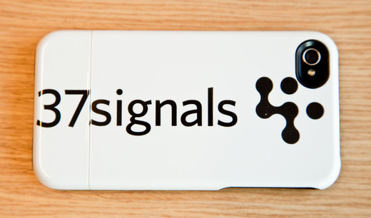
UNCOMMON CASE 1 LO.jpg

We’re long overdue on thanking our friends at Uncommon for sending over these awesome iPhone cases. If you’re not familiar with Uncommon, they specialize in custom designed cases for the iPhone, iPod Touch and iPad. Check ‘em out!

Michael Berger on Nov 28 2011 15 comments

Designing a product is keeping five thousand things in your brain and fitting them all together in new and different ways to get what you want. And every day you discover something new that is a new problem or a new opportunity to fit these things together a little differently.

And it’s that process that is the magic.


Steve Jobs (via Daring Fireball)

Quick little UI feedback tip

Jason Fried
Jason Fried wrote this on 19 comments

Sometimes when I’m giving feedback on a UI, and I’m pointing out a spacing detail, I upload a little screenshot to Basecamp or Campfire to help make sure the feedback is clear.

I wanted to share a little tweak to the feedback which I think is ultimately more useful. In this example I’m pointing out that the space above and below an element is not equal (and I think it should be).

I used to do it like this:

Two lines. One line above the element (text, in this case) extending to the next element above it, and one line below the element extending to the next element below it. The length of the lines shows the different spacing. That works, but the difference – especially when we’re talking about small units of pixels – isn’t as clear as it could be.

Then I switched to doing it like this:

Blocks like this are easier to see than thin one pixels lines. This is an improvement. But it’s still not as clear as it could be because it’s not as easy to judge the comparative volume of a rectangle as it is a square. So…

This is how I do it now:

The same vertical distance is covered, but now, since both blocks are perfect squares, we have related horizontal distance which helps you see how much bigger the difference is.

Why not just say 24px vs 35px? Because I want to point out the physical difference, not the exact number of pixels. If we’re just talking numbers then it’s easy to assume 24px or 35px is right. But maybe the final size is 27px or 31px. I don’t want to get stuck on numbers when I provide feedback like this. The final number isn’t important as long as it’s the same (and it looks right).

I hope this was helpful.

Who is the star of your product? Do you want people to think your product is awesome, or would you rather they felt awesome about themselves because they used your product? Does the UI say “Look at how beautiful this app is” or “Look at how beautiful your content is”?

Jason Z. on Oct 20 2011 13 comments

Watch Ryan sketch and code a UI from scratch on PeepCode

Ryan
Ryan wrote this on 15 comments

Last month the folks from PeepCode visited our office and asked to record my design process. Geoffrey told me not to prepare anything. He said he’d show up with a sample problem and simply record whatever I did with it. The result is two 75-minute videos (Part One, Part Two) that show my thought process step-by-step, starting with paper sketches and then moving on to HTML/CSS.

The hard thing about demonstrating design is the sample problem. The problem should be simple enough that the details don’t bog down the audience, but complicated enough that you run into real-life conflicts and constraints.

Fortunately Geoffrey picked a really good sample domain. He asked me to design a UI for picking the top five finishers out of 200 participants in a pro bicycling race. The task was rich and interesting enough that we spent the first 75 minutes purely sketching and analyzing the approach.

The first video, Part One, covers the sketching process. A lot of good material came out of this section, including:

  • How to tackle a UI problem by dividing it into tasks that each have a beginning, middle and end
  • How to use sketching as a response to uncertainty, and when to stop sketching and move on to HTML
  • How to focus on the most natural solution so that people will intuitively grasp a design
  • How to focus your design process on conflicts and friction points, attacking them one by one until the design works

This video also gave me a chance to explain the UI design process through an analogy to software testing. Kent Beck’s Test-Driven Development had a huge influence on me, and I’ve always had trouble explaining the connection. In both videos I continually refer to setting up “tests” — specific things in the design that aren’t working or aren’t resolved — and then design against those tests until they “pass” (that is, until the problem goes away). This loose analogy articulates that tricky and hard-to-pin-down process where a designer continually moves their focus among pieces of a problem and along the way settles conflicts step-by-step in a constructive sequence.

I think the process will be interesting to both designers and coders. Designers can compare the process to their own, while coders can use the analogies to software testing to see design as an extension of concepts they already know.

In the second video, Part Two, I take the sketches and ideas from the first session and build them out in HTML and CSS. Along the way I dip in and out of Photoshop, explaining the time and place for each tool.

Part Two especially focuses on getting quick results in the browser. I sketch out dom elements, give them classes to communicate their purpose, and gradually decorate them with inline styles until the design comes together in the browser.

I would prefer videos like this to be free. But Geoffrey had the idea to begin with and his PeepCode team did all the hard work. I just showed up one Friday morning for a couple hours of design practice. So if the material is useful to you I hope you’ll support their effort and buy the videos at $12/each.

Here are the links:

  1. PeepCode Play by Play: Ryan Singer Part One
  2. PeepCode Play by Play: Ryan Singer Part Two

There’s also a 10 minute preview on the Part One page.

I hope they’re useful!