Some designs are evil – you know they’re bad right away. Others are like love at first sight. And some you just need to live with for a while before making up your mind.
Signal v. Noise: Design
Start with our Best Hits on Design
- ⋆ Reminder: Design is still about words
- ⋆ The Typography and Layout behind the new Signal vs. Noise redesign
- ⋆ Backstage: How we use Basecamp to collect, share, and discuss inspiration
- ⋆ Backstage: Using Basecamp to build the Basecamp calendar
- ⋆ Behind the scenes: Reinventing our Default Profile Pictures
- ⋆ Behind the scenes: Highrise marketing site A/B testing part 1
- ⋆ What happens to user experience in a minimum viable product?
- ⋆ Lessons learned from implementing Highrise's custom fields feature
- ⋆ Ten design lessons from Frederick Law Olmsted, the father of American landscape architecture
- ⋆ Flashback: Every time you add something you take something away
Our Most Recent Posts on Design
37colors
This weekend during the Ravenswood Art Walk, I visited Lorna’s Laces. They hand-dye yarns in some really beautiful color combinations. I took some photos to share, because sometimes it’s nice to look at pretty things!
Designers, how do you put colors together? Where do you find inspiration?
CSS: Taking control of the cascade
One of the best things about CSS is the cascade, itself. It can also be one of the worst things about CSS. Styles applied to an HTML element are automatically inherited by their children. Cascading is what allows web designers to set styles and keep them consistent throughout a website without repeating themselves. With a single line of CSS you can, for example, set the typeface that will be applied to every element on every page of your website:
body {
    font-family: Helvetica;
}
Because every element is a child of the body, those elements will inherit the font style unless that property is otherwise overridden with a more specific rule. That’s where things get tricky. We might want to use Helvetica throughout the website except in the sidebar, where we’ll use Georgia. To reset the font-family rule for the sidebar element we must write something like this:
body aside {
    font-family: Georgia;
}
This is how we write CSS. We set styles at the top level and then proceed to override the inherited rules with increasingly specific selectors. There are esoteric rules of inheritance built into the CSS cascade that let designers target elements by id, class, or by relative position in the document. Each time you reset a style using specificity, overriding that style on a subsequent child element requires an even more specific selector.
Within complex website designs this can begin to feel like an arms race. You add classes and containers to your mark-up and more elements to your selectors. As you add increasingly specific (and increasingly long) selectors it becomes equally difficult to override them later. This problem is compounded after the initial composition of the CSS is completed and you begin to edit, maintain, or add new styles later in the life of the website. Even in the most carefully composed stylesheet it can be difficult to completely grasp the overall scheme – especially if you’re coming in behind the original developer to make changes. The safe thing – we’ve all done it – is to write a very specific selector for any new styles so you’re certain yours take precedence. Each round a salvo in the specificity arms race.
So what can be done? We’ve been experimenting with a few techniques that we think make a big difference. There are three parts to this formula: compiled CSS, structured mark-up, and a neglected CSS selector.
Continued…The Economist on the iPad: Perfect
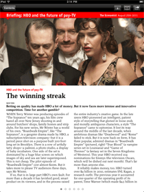
I was just reading the Economist on my iPad at lunch, and I’ll be damned if that’s not one of the best-executed apps on the platform. I’m impressed over and over by how simple and perfect it is.
The experience is massively superior to print. No issues piling up, no guilt when you only read half an issue, nothing extra to stuff in your bag, new issues available to download the second they are released, and so on.
And the app doesn’t have any of the downsides of other magazine apps. The typography and layout and illustrations look beautiful and they exactly match the print magazine. It feels 100% like the real Economist, not a digital imitation. The app is lightning fast and just the tiniest amount of chrome frames the page for navigating.
I don’t get to say this often: it’s a perfect execution.
Link: The Economist on the App Store.
Behind the scenes: A/B testing part 3: Finalé
I was an A/B test skeptic. Maybe we don’t want to be second-guessed. Maybe we don’t want to cater to the lowest common denominator. Designers are taught—explicitly and implicitly—to follow certain visual rules and the final design will work great. The whole A/B testing concept probably came from from “strategy analysts” or “MBAsses”. Anyway, now I’m a believer in A/B testing.
How I Learned to Stop Worrying and Love the Bomb
Designers, you’ve been in critiques where Clients, Art Directors, Creative Directors, Project Managers, Copywriters, Executive Assistants, and other Designers have picked apart your work. You listened with agony when they questioned your choice of this shade of red or this typeface. You winced when they said that photograph wasn’t “right”. Your vision is already changing based on a series of opinions!
Next time say, “I hear your concern about the shade of red. Why don’t we test that? I feel strongly about the color red, but it sounds like you need to be convinced it won’t affect X.”
Increasing our Signups through A/B Testing
A few weeks ago Noah and I talked about the testing we’ve been doing with the Highrise marketing site. Here’s a summary of the findings we posted:
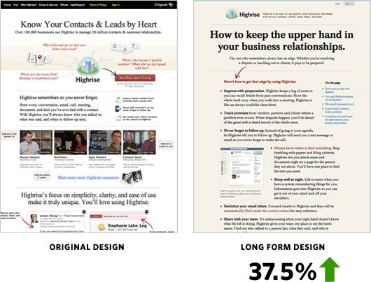
37.5% more people signed up for Highrise with the Long Form design.
Jason Fried’s mantra while testing was: We need to test radically different things. We don’t know what works. Destroy all assumptions. We need to find what works and keep iterating—keep learning. (I’m paraphrasing here…) We tried out a radically different design with these results:
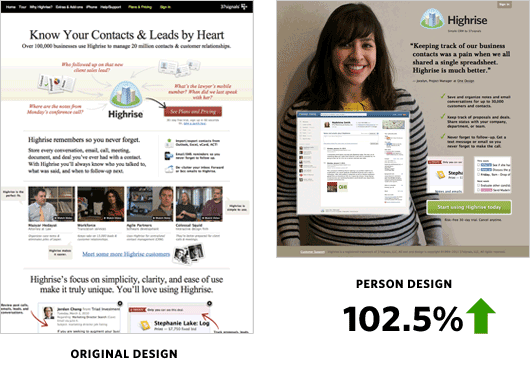
The Person Page was far shorter. There was less information about Highrise. However it had a 47% percent increase in paid signups than the Long Form design. Why exactly was the Person Page working? What might happen if we added more information to the bottom?
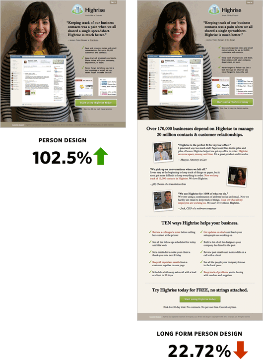
The crazy thing was when we added more information to the bottom of the Person Page it performed over 22% worse than the original design!
Changing People
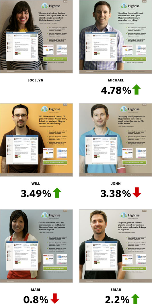
Jocelyn from One Design—a Chicago design company—could also be the secret sauce to the effectiveness of the design. Her quote is direct and simple. She looks friendly and very non-techie and approachable.
I got in touch with more of our wonderful Highrise customers to see if some would be interested in posing for our homepage. Michael, an accountant at MWC Accounting; Will, a programmer at Tall Green Tree; John, founder of Revolution Management; Mari, owner of Foiled Cupcakes; and Brian, owner of Nutphree’s were gracious enough to have me interview them for the site.
I was curious to see if Jocelyn was the key to the winning design. Here’s how she fared:
Conclusions
- Big photos of smiling customers work
- A specific person didn’t quite matter among the set of people we tested
I hope you gained some insight from our series of behind the scenes articles. Please try to roll in A/B testing into your schedule! If you work in an internal Design Department then this is a no brainer. It’d be interesting to see Interactive Agencies add testing to the design process.
We’re still testing too. You may not notice such drastic changes to the Highrise site anymore, but trust me we’re tweaking and measuring behind the scenes. We’ll also be applying some of these findings to future marketing efforts. However, as Jason says, we will always test, improve, and learn. I want to be the first to come up with a design that beats our Person Page. Thanks for reading!
Please note: What works for us may not work for you. Please do your own testing. Your conversion rates may suffer if you copy us.
I thought Internet Explorer 9 was supposed to be an awesome browser. Why does my markup and CSS look perfect in Safari, Chrome, and Firefox yet still manages to be “off” in IE? I still need to add conditional CSS. WTF.
I’m sorry for the rant, but it’s a legitimate question: Why can’t IE be as good as WebKit-based browsers?

I wonder if anyone knows the origin of the dreaded “2-weeks only” pattern for login cookies? We used to do that until we realized that we were cargo culting and that we couldn’t come up with a single solid reason for the time restriction (but plenty of reasons why not!).
Behind the scenes: Highrise marketing site A/B testing part 1
We’ve been testing design concepts at highrisehq.com since this past May. I want to share with you the different designs and their impact on Highrise paid signups (“conversions” for the jargon inclined).
We have assumptions about why some designs perform better than others. However we don’t know exactly why. Is it the color of the background? Is it the headline? We hope more iterative testing of the winners will help us get that information. If you have any theories please add them in the comments.
Note that designs that win for us may not necessarily win for you. I encourage you to do your own A/B testing. There are many tools online that make it easy to do.
The original page
The original design had served us well for the past year. Signups were going well, but we were worried that customers still couldn’t get the gist of what Highrise did and why they needed the product.
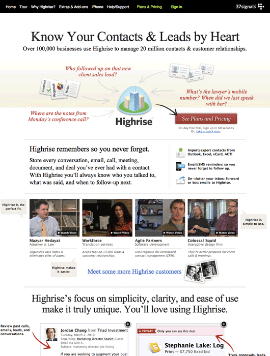
This page would be our baseline for the first round of A/B tests.
Long form sales letter
Ryan Singer posted a link to Visual Website Optimizer’s “Anatomy of long sales letter” blog post in our Campfire chat room one day. We were fascinated by this technique. If I remember correctly there was a heated debate about whether it would work for us.
We decided that in the amount of time we took to debate the technique we could have made an A/B test to prove it right or wrong. The original page had some long form sales letter techniques, but the copywriting wasn’t as strong as it could be.
Ryan and I worked together on the long form approach. Here’s what we came up with.
Continued…Bret Victor thinks math needs a new UI
I’ve been a fan of interface and software designer Bret Victor’s work since Craig (one of our designers) tipped me off about him. Bret made a splash a while back with his Magic Ink paper. Now Fast Company has profiled him and his Kill Math series. “Kill Math” is all about using smartly designed interfaces to make math tangible and playful, something you can experience instead of just think about.
Have you ever tried multiplying roman numerals? It’s incredibly, ridiculously difficult. That’s why, before the 14th century, everyone thought that multiplication was an incredibly difficult concept, and only for the mathematical elite. Then arabic numerals came along, with their nice place values, and we discovered that even seven-year-olds can handle multiplication just fine. There was nothing difficult about the concept of multiplication—the problem was that numbers, at the time, had a bad user interface.
It’s a nice piece (I only wish it was longer) and Bret surely deserves your attention if you are a fan of innovative UI design.
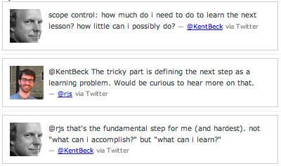
I love this about Kent Beck’s approach. Each step in a design removes uncertainty. Each step is a question of how to learn something you didn’t know before in order to move forward. That’s a totally different way of looking at it versus “What’s my next to-do?”


