You’re reading Signal v. Noise, a publication about the web by Basecamp since 1999. Happy !

Signal v. Noise: Design

Our Most Recent Posts on Design

[Podcast] Episode #17: Design roundtable (Part 2 of 3)

Matt Linderman
Matt Linderman wrote this on 10 comments

Time: 13:08 | 06/29/2010 | Download MP3


Summary
The roundtable discussion continues with Jamie Dihiansan, Jason Fried, and Ryan Singer. In this part, the trio discusses the difference between art and design, speed vs. aesthetics, cultural impact on design, architecture, and more.

More episodes
Subscribe to the podcast via iTunes or RSS. Related links and previous episodes available at 37signals.com/podcast.

Spread the word
Like this episode? Please share it with your friends:

Tweet this podcast  Post to Facebook

The boot that's "indispensable" to war correspondents

Matt Linderman
Matt Linderman wrote this on 26 comments

During the original intro to this Q&A about Gen. McChrystal’s dismissal, NY Times reporter John Burns mentions how R.M. Williams boots from Australia are now the standard boot of choice for war reporters.

...the band of brothers and sisters who have gone to war with their pens and notebooks, their flak jackets and helmets and R. M. Williams boots (from Australia, and by habit heavily scuffed; they are as indispensable to this generation of war correspondents and photographers as the dangling cigarette was to the generation of Ernie Pyle).

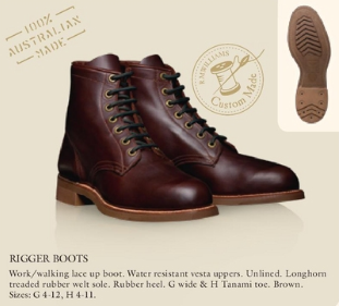
If a boot becomes the standard choice among war correspondents, I’m thinking it’s gotta be pretty damn good. Not sure if there’s a specific model these guys favor, but here’s a look at R.M. Williams’ Rigger Boot.

rigger

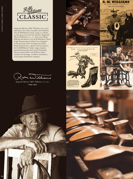
Unsurprisingly, the company seems pretty cool too. Like Saddleback Leather, R.M. Williams sells by using its history and educating customers. The founder’s backstory tells of his years in the bush and how he learned to build boots from a guy named Dollar Mick.

R.M. first went bush in his teens – lime burning and building in stone in Victoria and on the Western Australian goldfields. In the late 1920’s, he signed on as a camel boy with the missionary explorer, William Wade, in his treks across Australia’s central western deserts. He learned valuable bush lore and survival skills from the aboriginal peoples of the area, and honed his stock handling and bushcraft skills from the stockmen of the desert fringe cattle stations…

A self-taught genius in leatherworking, Dollar Mick passed on his skills to the 24 year old R.M. who made and sold his first pair of riding boots for 20 shillings to a man from Hilltaba Station whose name he can’t remember.

Having worked on some of the great pastoral runs of the interior, no one knew better than R.M. what men who were born in the saddle wanted when it came to footwear.

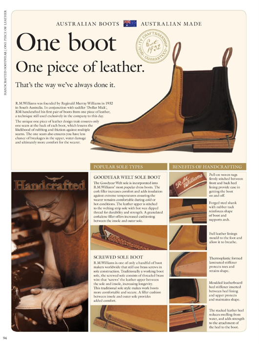
The catalog explains why the company builds boots from one piece of leather, the types of soles used, and the benefits of handcrafting.

one piece

rm

Related: RM Williams Boots – Everything You Wanted to Know [styleforum]

Design Decisions: Calling out to existing customers on signup

Ryan
Ryan wrote this on 49 comments

Last year we released a single sign-in system called 37signals ID. It was a massive project for us, and when you do big projects you can’t make every detail perfect. “37id” (as we called it internally) would never launch if it had to be perfect. So since launch we’ve been fixing rough spots as we identify them.

One rough spot had to do with sign-ups. When you sign up for our products, you can either create a new account from scratch or you can identify yourself as an existing customer. Existing customers can use the same username, see their 37signals apps in one place (Launchpad), re-use their avatar and so on. Basically it’s a big time saver and a big convenience. The problem was very few customers took advantage of the feature. Our support staff often heard from customers with multiple accounts who had no idea that they could link their accounts into a single 37signals ID. So we had a design problem on our hands. Why weren’t people logging in on the sign up screen?

Let’s have a look at the original signup screen. The form was completely geared for new customers, except there was a strip at the top of the screen just below the header. The strip called out to new customers with a link to “sign in” if they already use our products.

Screenshot of the original design

We figured there were two reasons why people weren’t signing in with this link. One: it could be that they didn’t notice the callout. And two: maybe people were noticing the link, but the language wasn’t compelling enough to make them click. We took these explanations one at a time and focused first on the placement of the callout.

Our basic intuition was that the callout should detach from the header block. When it’s attached to the header, the callout and header glom into a single unit and it’s easy to skip past both of them. Does detaching the callout help?

Continued…

Transcript of design roundtable podcast (part 1) now available

Basecamp
Basecamp wrote this on 6 comments

The podcast transcript of Episode #16: Design roundtable (Part 1 of 3) is now available. Here’s an excerpt:

Jamie: It was interesting coming to 37signals because they have a distinct style, right? Everybody knows that’s like a 37signals look. But then when you actually get down to it, it’s really hard to distill that look into words. I was a designer at Crate and Barrel for about seven years. And it was easy there because, Crate and Barrel, it’s all about the product, it’s all about white space, it’s all about Helvetica. So the product is hero.

When you come to 37signals, it’s sort of like, what’s the hero? Well over the time of working with Jason and Ryan, I’ve realized that the hero is making it clear. Clear about what we’re trying to sell, clear about what does this app do. So it’s almost like the language is far more important than visual design. Where visual design is really supporting the idea, which is the words or the UI…

Ryan: When we start to get into the heat of discussing something that was just marked up and we’re really going through feedback, it’s like we’re very rarely talking about, “That border should be four pixels instead of three pixels.” It’s much more, we’re pasting different phrases and quotations saying, “How could we say that differently? How could we say that more clearly?” And how does that piece of copy scan differently if you put a certain keyword at the front of the sentence or at the back of the sentence, if you make it two sentences, or if you make it half as long or twice as long. Not only what is the meaning of the sentence, but, also, when you look at the screen, does the sentence catch your eye, so that you notice that it’s talking about the thing that you’re interested in.

Jason: Yeah. A big part of that is recognizing that people probably aren’t going to finish a whole paragraph, so what can you front load? So if they finish 10 or 20 percent of the paragraph, can you actually explain the whole thing in the first 10 or 20 percent? Obviously, it probably shouldn’t be that long if we can explain it in the first 10 or 20 percent. But sometimes there are other details that are nice to know, but you don’t have to know them. So figuring out how can we get the information out there right up front, as soon as we can.

Read full transcript.

How do you turn inspiration into skill?

Ryan
Ryan wrote this on 32 comments

Over the last few months I’ve noticed a ton of inspiring websites. Camerion.io, Art Lebedev, n+1, Show of Force, and on and on. And everytime I look at one of these sites, I think to myself “Oh I’m so inspired. Look at how they did this. Look at that paragraph style. Look at that header. I feel so full of ideas.”

Then it’s time to work on a new project, and did all the inspiration make a difference? Actually, no. Most of the work I do is looking like all the other work I’ve done for months and months and years. Apparently looking at cool stuff isn’t enough to increase your skill. It’s easy to look at some stuff and say “oh that’s inspiring, that gives me ideas” without moving an inch.

So I got thinking. How did I develop the basic skills I have right now? Mostly by copying heroes. When you’re fresh starting out, you have no fear of diving in and copying something directly. It’s like playing guitar. When you start playing guitar all you want to do is play the first verse of your favorite song. Big success! You don’t need to write the next great guitar symphony or a hit single. It’s totally satisfying to learn to play something somebody else can already play. And you get better by doing it.

And it was the same way with design. I was totally psyched to copy a Müller-Brockmann poster, a Designgraphik composition, or an Apple UI. Merely executing the copy was a thrill. But now every design is supposed to be the next great thing. And as days and weeks and months go by, the design level stays the same while the aspiration goes higher and higher.

So maybe it’s time to take one of these Fridays off and just copy something.

cryptic.png

I have to think (and experiment) every single time I want to decipher one of these keyboard “shortcuts”. Why is it that only the command key (⌘) actually has the symbol printed on the key itself? And what’s up with the symbol for the option key (⌥)?

I have seen many people become good at copying, but then never think to apply what they learned to their own drawings. Applying something from what you study tests you to see if you actually understood what you copied.

[Podcast] Episode #16: Design roundtable (Part 1 of 3)

Matt Linderman
Matt Linderman wrote this on 6 comments

Time: 15:34 | 06/15/2010 | Download MP3


Summary
A roundtable discussion featuring three members of the 37signals design team: Jamie Dihiansan, Jason Fried, and Ryan Singer. In this part, the trio discusses their respective roles, working at 37signals vs. Crate and Barrel, copywriting in design, design inspiration, and more.

More episodes
Subscribe to the podcast via iTunes or RSS. Related links and previous episodes available at 37signals.com/podcast.

Spread the word
Like this episode? Please share it with your friends:

Tweet this podcast  Post to Facebook

Hovers (and power users) still have a healthy future

Ryan
Ryan wrote this on 12 comments

There’s been buzz in UI circles about the end of hovers since the iPad’s debut. I’ve mentioned in talks that touch tablets pose a design challenge for web apps that rely on hovering with a mouse. But the fact that hovers don’t work on touch devices doesn’t spell their doom. If we step back from hovers to the wider picture, comparing the desktop’s vocabulary with the limits of “tap, hold, and drag” can give us a handle on the gradually differentiating roles and equally bright futures of desktops and touch tablets.

As touch tablets wax in popularity, they illuminate the role and utility of desktops (including laptops, which belong on a desk anyway). Take the desktop’s arsenal of gestures. Besides click and right-click, you have shift-click, command-click, command-tab, command-space, ctrl-a, ctrl-e, command-~, command-w, and on and on and on to even include, yes, the hover.

I always felt like computers were meant to be used with at least a hand poised on the home row, because without that arsenal of verbs things just take too long. As a power user, watching someone who isn’t familiar with all the shortcuts can put your patience under observation. To some folks, everything about the desktop is a hindrance, like swimming in molasses.

But to the geeky or trained, the desktop is a fount of power and speed. Documents are side by side, text flies from here to there, IMs are answered and dismissed, mockups reloaded, batches processed, all with tiny movements of the fingers. For those of us who work all day on computers, touch interfaces are not an impending disruption.

While the future of the desktop is bright, like some maturing stars it also becomes more concentrated. If I place a bet, it’ll be that the desktop negotiates its place among tablets to settle on a role we haven’t seen in a while: the workstation. As for interface designers, we will sometimes shift out of the one-size-fits-all mindset to ask ourselves: Which device is this app really for? The workstation or the tablet?