You’re reading Signal v. Noise, a publication about the web by Basecamp since 1999. Happy !

Signal v. Noise: Design

Our Most Recent Posts on Design

Design Decisions: Paint vs. No Paint

Jason Fried
Jason Fried wrote this on 19 comments

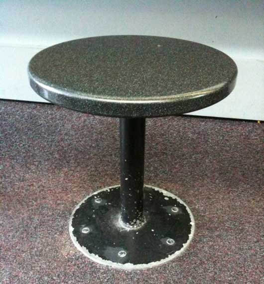
Here’s a stool at a gate at O’Hare (Chicago) airport:

Everything below the seat was black painted metal. I’m sure it looked nice when it was painted and originally installed, but it ages quickly. So here we have a material (metal) that will last forever, but a high-contrast finish (paint) that only lasts a fraction of forever. Probably not the best idea for a high traffic area – especially when a lot of people in airports have hard-soled shoes. A bad design decision.


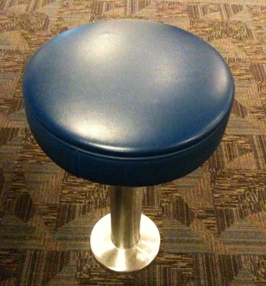
Here’s a stool at a gate at Hartsfield-Jackson (Atlanta) airport:

More comfy seat, but let’s look at the base. It’s either steel or aluminum. But it’s bare – no paint. It’ll hold up just as long as the metal base on the stool at O’Hare, but it’ll age more gracefully. No paint means nothing wears off. It looks new longer. Less maintenance means money saved and aesthetics maintained. Good design decision.

Design Decisions: New Basecamp blank slates

Jason Fried
Jason Fried wrote this on 36 comments

We’ve been talking about designing blank slates for a long time. In fact, here’s a post from September 2003 about blank slates that pre-dates Basecamp (the web-based application being developed/discussed in that post was, in fact, Basecamp).

What’s a blank slate?

The blank slate is a screen you see when a data-rich app has no data. For example, if you’re using a tool to manage your projects, but you don’t have any projects in the system yet, you’d be looking at a blank slate. It’s important that the application designer consider this state carefully — you don’t want people staring at an empty screen. A blank slate should help someone get started.

Basecamp’s blank slates have been through many iterations. Here are some screenshots from March 2004 (just about a month after Basecamp launched).

Blank slates, redesigned

A few weeks ago we decided to redesign the blank slates inside each Basecamp project. Each section in Basecamp (messages, to-dos, milestones, time tracking, etc.) has a blank slate. The blank slate lets you 1. know there are no messages, to-dos, milestones, etc. in a project, and 2. gives you an option to get started by adding the first one.

This is what the Milestones blank slate looked like before we rolled out the update last week:
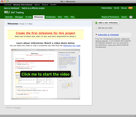
I think this design served us well, but it’s also pretty loud. In fact, it doesn’t look blank, it looks full which can be a little confusing. There are quite a few elements on the screen including:

  • The shadowed page
  • A “Milestones” header with today’s date
  • A yellow bar saying “Create the first milestone for this project” along with a brief list of features/benefits below the headline.
  • A second headline that says “Learn more about milestones…” with another line below that.
  • A big image with a “Click me to start the video” button.
  • An “Add a new milestone” button at the top of the sidebar.
  • A link to “Add ten at a time” below the button.
  • A “subscribe to iCalendar” link with a paragraph of text below (also containing four more links).

Nine links, lots of images, a main section, a sidebar, multiple headlines, a pile of different colors, numerous font sizes/treatments, etc. That’s a lot going on. There’s a lot to consider and absorb just to get started. All these elements make milestones feel hard. That’s not the message we want to send.

What we really want to do here is quickly let someone know 1. what milestones are, and 2. how to add their first milestone. There’s a better way to do this than to hit them over the head with a lot of visuals, headlines, descriptions, and links.

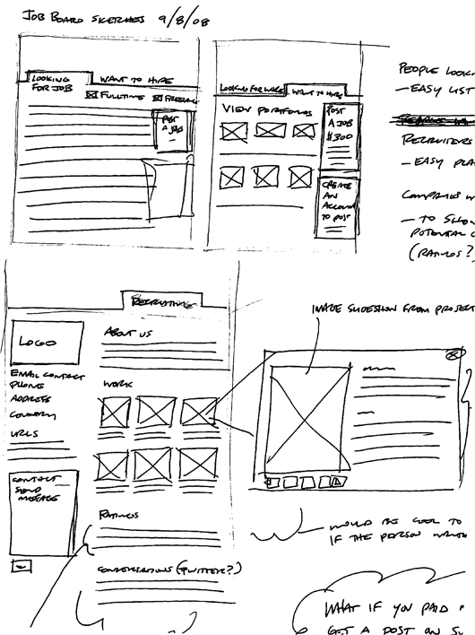
So we started with a sketch.
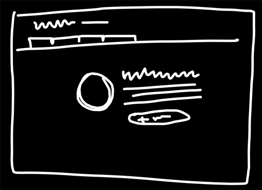
Continued…
"Designing with Forces" – How to apply Christopher Alexander in everyday work

Ryan
Ryan wrote this on 28 comments

A couple weeks ago I gave a talk at the MFA in Interaction Design program at the School of Visual Arts in NYC. The video for the talk and Q&A session is online now. When Liz Danzico invited me to speak at the SVA, I thought it would fit the university setting to share some theory behind our design process at 37signals.

One book that heavily influenced my approach to design is Christopher Alexander’s Notes on the Synthesis of Form. Many designers cite the book as an influence, but few really explain what it’s about or teach how to apply the ideas in everyday work. So I took the opportunity to explain the key points of the book and show how we use Alexander’s model to do design at 37signals.

Here’s the video of the talk:

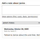
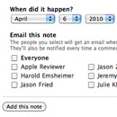
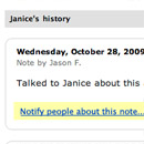
Some of the screenshots are hard to see around 38:30. Check the images below if you’d like to see those screens more clearly.

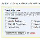
Highrise history Options behind a link A new link to notify Embedded notification form

The talk was followed by a Q&A session. The Q&A touches on customer feedback, design vs. evolutionary selection and trusting your intuition.

Here are some things to check out if you liked the talk.

I’d love to know if people are interested in this material. Post a comment here or write me at ryan at 37signals dot com with your thoughts.

I gave a talk on “UI Fundamentals for Programmers” at WindyCityRails in Chicago last month. The talk covered modeling, breaking apps into screens, visual techniques, flows, and a few coding tips.

WindyCityRails was an excellent conference with top-notch organization and really friendly people. I highly recommend visiting Chicago and attending next year. Thanks to Ray and the folks at WindyCityRails for having me.

A shorthand for designing UI flows

Ryan
Ryan wrote this on 30 comments

Flows are just as important to good interfaces as individual screens are. Customers don’t land on screens from out of nowhere. Specific sequences of actions lead customers through your app as they try to accomplish their tasks.

But as important as they are, flows are hard to communicate during the design process. Drawing out every state of a flow is too time-consuming. And drawings become instantly outdated as screens change. On the other extreme, flows written down into stories or paragraphs are hard to reference and they don’t easily decompose into checklists for design and review.

Working on 37signals Accounts has recently raised this issue of communicating flows for me. We have whole sets of flows that need to be properly designed, implemented, tested and retested. So I’ve scratched the itch with a simple shorthand.

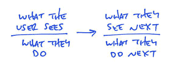
Flows are made out of individual interactions. A screen offers some possibilities and the user chooses one. Then something happens, and the screen changes. It’s an ongoing conversation. Each moment in a flow is like a coin with two sides. The screen is showing something on one side, and the user is reacting on the other side. My flow diagrams illustrate this two-sided nature with a bar. Above the bar is what the user sees. Below the bar is what they do. An arrow connects the user’s action to a new screen with yet another action.

Continued…

The different sketch styles of the designers at 37signals

Jason Fried
Jason Fried wrote this on 32 comments

Thought it would be fun to share the very different sketch styles of the designers at 37signals. They range from very neat to a mess (mine).

Jamie Dihiansan

Jamie’s sketches are neat, well organized, and readable. They’re fairly high resolution and anyone who’s looking at them can decipher them without assistance. They also often contain supporting materials – ideas, questions, explanations, and goals.

Continued…

The newest Signal: Jason Zimdars, designer

Jason Fried
Jason Fried wrote this on 54 comments

Today we announce the latest addition to the 37signals team: Jason Zimdars (“JZ”). Jason is a designer who lives in Oklahoma. You can find out more about him on his site.

JZ is going to be working closely with Ryan and me on app UI design while Jamie continues to kick ass on the marketing/public side of things. Mysteriously, Jason is the 7th person at 37signals to have a name that starts with J.

We’ve been talking to JZ on and off for the past year (here’s his original pitch). We considered hiring him before, but the timing and fit just wasn’t right. Now it is.

Why do we need another designer?

Even though we’re a design driven company, designers at 37signals are outnumbered about 2 to 1. Since we design interface first, this presents a problem.

There are often changes and improvements we want to make, but we don’t have enough slack on the design side to jump in and design the UI. This slows us down and makes it harder for the programmers to implement the features.

Having JZ on board will allow us to focus on improving our UIs, adding new features, polishing up existing features, and exploring new product concepts.

Why did we hire JZ?

Whenever we announce we’re hiring for a designer position, we get hundreds of responses and resumes. After evaluating people’s basic taste and skill level, we turn to other things. How do they think? What do they think about? How do they approach problems? Can they write? Do they enjoy writing? Can they express themselves concisely? How do they work when they aren’t given direction? Stuff like that.

We liked what we saw, heard, and read from JZ so we asked him to do a few paid contract projects for us. One was a quick one week exploration of variations on the Highrise Contacts screen. We gave him a week, barely any direction, and let him run with it. Jason had a full time job, so he had to squeeze in time after work. Here’s what he came up with. All things considered, we were very happy with the explorations, how he explained himself (although he’s a bit verbose — something he’ll have to work on), and the decisions he made.

After that we flew him into Chicago to meet with us for a day. We described another product we were thinking of building and asked him to mock up the UI for it based on a series of very rough sketches. Over the past few weeks he’s been working on that — also in his spare time. It was a challenging project that required a lot of problem solving. We were thrilled with what we saw. And if we decide to do this product in the next few months, you’ll see his fingerprints all over it.

So the skills were there, the thinking was there, the writing was there, the self-driven motivation was there. And to top it off, he’s a fine person and all around good guy. Character means a lot to us and it certainly helped JZ get this job.

JZ is coming to a 37signals app near you

Jason is starting in a few weeks. We have a really cool first 8 weeks for him. He’ll be exploring a variety of interface elements and screens in our existing apps in the style of the old 37express projects. Redesign one screen in one week (much like he did with the Highrise exploration). We plan on sharing many of these explorations right here on Signal vs. Noise. And hopefully we’ll be working his work into our products soon after.

So please welcome Jason Zimdars to our team! We’re pumped to have him.

Writing Decisions: Headline tests on the Highrise signup page

Jason Fried
Jason Fried wrote this on 83 comments

We’ve been rotating some headlines and subheads on the Highrise signup page to see if they have an effect on signups. Answer: They do, sometimes significantly.

The test

Here’s how the test works. We used Google Website Optimizer to randomly rotate five different headline and subhead combinations on the signup page. We’re measuring the number of clicks on any green “Sign Up” button. We’re not measuring any specific plan, just that “someone picked a paying plan.” We ran the test for 4000 page views. Why 4000? The numbers didn’t change much after about 3000 page views, so we stopped at 4000.

Note: We recognize that switching both the headline and the subhead isn’t quite as informative or scientific as just switching the headline or the subhead. We’re OK with this. This experiment was part learning how to use Google Website Optimzer, part curiosity, and part conversion research. More detailed tests will follow.

The original: Worst performer

This is the headline we launched with. The headline asked people to “Start a Highrise Account.” “30-day free trial” was centered bold in the subhead. The rest of the subhead highlighted that Highrise is a pay-as-you-go service and that there are no hidden fees.

The winner: 30% better conversion than the original

This combo put the emphasis on the 30-day free trial by making that the headline. The subhead let people know that signup was quick (less than 60 seconds). The second part of the subhead asked someone to “pick a plan.” This was also the only combo to feature an exclamation mark. Would be interesting to run this headline against itself — one with a period and one with an exclamation mark.

Second place: 27% better conversion than the original

This one also promoted the “30-day Free Trial” in the headline, but instead of highlighting signup speed, we highlighted other benefits: Pay as you go, no long term contracts, no hidden fees, no surprises.

Third place: 15% better conversion than the original

This combo went back to the original “Start a Highrise Account” headline, but tacked on “Today” at the end. The subhead was the same as the second place finisher: Pay as you go, no long term contracts, no hidden fees, no surprises.

Fourth place: 7% better conversion than the original

This combo featured the winning “30-day…” headline, but replaced plan information in the subhead with quick customer testimonials plus a link to the buzz page. Even though this was the only design with a link away from the signup page, it still performed better than the original design.

What did we learn

We have some theories, but we’re curious to hear from you. Why do you think these combinations finished the way they did? What other combinations would you like to see us try? What other tests would you like to see run on this page? How else do you think we could increase conversion?

Why we skip Photoshop

Jason Fried
Jason Fried wrote this on 205 comments

When designing a UI we usually go right from a quick paper sketch to HTML/CSS. We skip the static Photoshop mockup.

Here are a few reasons why we skip photoshop:

  1. You can’t click a Photoshop mockup. This is probably the number one reason we skip static mockups. They aren’t real. Paper isn’t real either, but paper doesn’t have that expectation. A Photoshop mockup is on your screen. If it’s on your screen it should work. You can’t pull down menus in a Photoshop mockup, you can’t enter text into a field in a Photoshop mockup, you can’t click a link in a Photoshop mockup. HTML/CSS, on the other hand, is the real experience.
  2. Photoshop gives you too many tools to focus on the details. When you use Photoshop you can’t help but pay attention to the details. The alignment, the specific colors, the exact shapes, the little details that may matter eventually but they certainly don’t matter now. The start is about the substance, not about the details. Details are for later.
  3. The text in Photoshop is not the text on the web. Once you’re looking at a static Photoshop mockup you can’t quickly change the text without going back into Photoshop, changing the text, saving the file, exporting it as a gif/png/jpg, etc. You can’t post it online and tell someone to “reload in 5 seconds” like you can when you quickly edit HTML. You have to say “Give me a few minutes…”. Also, type in Photoshop never seems to be the right size as type in HTML. It just never seems to feel the same. It doesn’t wrap the same, it doesn’t space out the same.
  4. Photoshop puts the focus on production, not productivity. Photoshop is about building something to look at, but about building something you can use. When you’re just worried about how it’s going to look, you spend too much time on production value. HTML/CSS lets you be productive. You’re constantly moving forward towards something more and more real with every change.
  5. Photoshop is repeating yourself. Ok, so you’ve spent 3 days on a mockup in Photoshop. Now what? Now I have to make it all over again in HTML/CSS. Wasted time. Just build it in HTML/CSS and spend that extra time iterating, not rebuilding. If you’re not fast enough in HTML/CSS, then spend the time learning how to create in HTML/CSS faster. It’s time well spent.
  6. Photoshop isn’t collaboration friendly. I sorta touched on this before, but let me hit this point again: HTML/CSS lets you make a change, save, and reload. That’s our collaboration flow. “Here, let me change this. Reload.” These changes take seconds. “Here, let me float this left instead of right. Reload.” Seconds. No selecting a tool, changing a few items around manually, saving, exporting, uploading, giving people the new file name, etc. HTML/CSS is build for rapid iterative prototyping while Photoshop… isn’t.
  7. Photoshop is awkward. You can’t help but know your way around Photoshop after working in it for 10 years, but I still find it awkward to get simple things done. Working with a pen feels so much more natural to me than going back to the toolbar over and over. A pen can draw anything, but in Photoshop you need to use the text tool to type, the shape tool to draw a shape, the menu bar to adjust this or that, etc.

None of this is to say we think Photoshop is bad or a waste of money or time, but for us we’ve found that going straight into HTML/CSS affords us the best iterative and creative experience. HTML/CSS is real in a way Photoshop will never be.

Microsoft System Center Ad

Matt Linderman
Matt Linderman wrote this on 86 comments

Brandon Kelly writes in:

Saw this ad in the latest issue of Information Week. Only Microsoft could possibly see a big panel of buttons and think “this must be what our customers want”. I just had to send it in to you guys.

ms ad