Jim Coudal talks about the history of Coudal, where they’ve been, where they’re going now, how they got there, and how to parlay one business into another business. Jim is a great teacher and we’re so lucky to have him and his crew in Chicago.
Signal v. Noise: Design
Start with our Best Hits on Design
- ⋆ Reminder: Design is still about words
- ⋆ The Typography and Layout behind the new Signal vs. Noise redesign
- ⋆ Backstage: How we use Basecamp to collect, share, and discuss inspiration
- ⋆ Backstage: Using Basecamp to build the Basecamp calendar
- ⋆ Behind the scenes: Reinventing our Default Profile Pictures
- ⋆ Behind the scenes: Highrise marketing site A/B testing part 1
- ⋆ What happens to user experience in a minimum viable product?
- ⋆ Lessons learned from implementing Highrise's custom fields feature
- ⋆ Ten design lessons from Frederick Law Olmsted, the father of American landscape architecture
- ⋆ Flashback: Every time you add something you take something away
Our Most Recent Posts on Design
One of my favorite things about designing software is that you can fuck something up real bad, but you’re always just a couple undos, redos, or tweaks away from a better solution. It’s amazing what a few steps forward or backwards can get you. Things can snap into place or out of place so quickly.
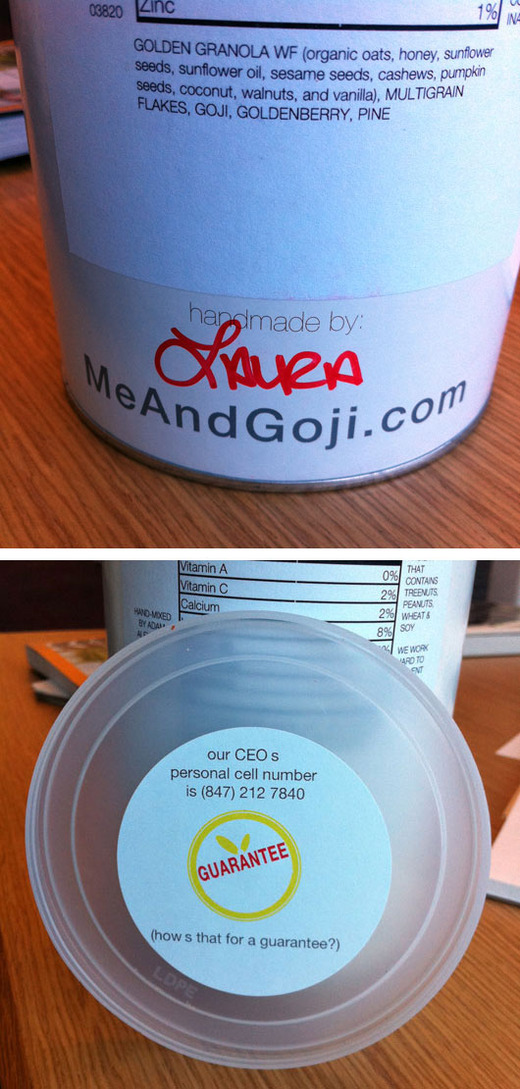
Two nice touches on Me & Goji cereal: The handwritten name of the person who made the mix and the CEOs cell phone number in the lid. Well done.
Make your own notebook
Batist Leman knew exactly what he wanted from a notebook:
- No lines: I get distracted by all those lines in most notebooks. I literally can’t read words on them. Or rather: there is no instant focus on the important stuff
- Pages should be fixed: For a while I used map full of regular printing paper, I liked it, but after a while it gets messy, the pages get scrambled up, etc.
- Every page must be the front page for a certain time. When I take the notebook out of my bag I don’t want to search for the page I’m focused on, it needs to be just there.
- Often I put my notebook in front of my laptop, the notebook needs to fit between the laptop and my belly. A horizontal A4 fits.
- A notebook should not be tiny. I need to make sketches, note miniature drawings. An A4 fits.
He couldn’t find anything on the market that fit the bill, so he decided to make his own at the local copy center. Here’s what he did:
- Buy a pack of paper, and take 50-60 pages from it (Max €/$ 1)
- Go to the local copy center
- Ask for 2 transparent covers. (Always use protection!) (Max €/$ 1)
- Ask to ring the bundle (Max €/$ 1)
A great idea. Check out his post for more details.
What happens to user experience in a minimum viable product?
I gave a talk at Refresh Chicago last week and afterwards a fellow came up to me with a question. He does UI on a team of mostly engineers, and the engineers are big fans of the “Minimum Viable Product” concept. MVP, if you aren’t familiar, is an idea from the Lean Startup scene. In a nutshell, it means to do as little as possible so you can learn if you did the right thing or not. The fellow who approached me after the talk was having a problem with MVP. It seemed like their product suffered from bad experience holes. Their team was trying to do the minimum possible to ship, but their definition of minimum didn’t include things like a smooth way to reset your password. Things like password-reset were “never important enough”, so they languished as swamps of bad experience among the dry hills of minimally viable features.
Does the minimum-viable approach lead to gaps in the user experience? It doesn’t have to. There’s a distinction to make: The set of features you choose to build is one thing. The level you choose to execute at is another. You can decide whether or not to include a feature like ‘reset password’. But if you decide to do it, you should live up to a basic standard of execution on the experience side.
Features can be different sizes with more or less complexity, but quality of experience should be constant across all features. That constant quality of experience is what gives your customers trust. It demonstrates to them that whatever you build, you build well.
I like to visualize software. Here’s an intuition that works for me. Feature complexity is like surface area and quality of execution is like height.
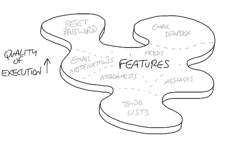
I want a base level of quality execution across all features. Whenever I commit to building or expanding a feature, I’m committing to a baseline of effort on the user experience. That way feature complexity — scope — is always the cost multiplier, not user experience. There aren’t debates about experience or how far to take it. The user experience simply has to be up to base standard in order to ship, no matter how trimmed down the feature is.
Minimum viable products are about learning what you need to build. They are matters of surface area. Whatever minimal feature set you decide to build, you can decide to build it properly. That commitment to quality at every step is the way to keep customers with you as you work upward from minimally viable to featureful and beyond.
Lessons learned from implementing Highrise's custom fields feature
We recently added custom fields to Highrise (below) which allow you to keep track of extra details beyond standard contact information like phone, email, address, etc.
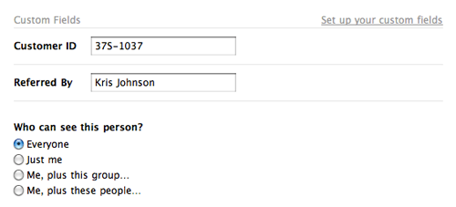
After the launch, we had a “looking back” conversation to see what lessons could be learned from the process. Three of our findings:
1. Add to an existing design before trying a new one.
When you begin work on a new feature, try to add it within the context of the existing design, evaluate it, and then make a decision about how to proceed based on that experience. That way, you quickly get a good sense of what works in the existing design and what doesn’t. You might even discover that the new feature fits into the existing design without any further work required. (Huzzah!)
We started with a different approach when we tackled the custom fields project. We began with a completely new design for the contact edit page and pursued that design (below) for most of the project.
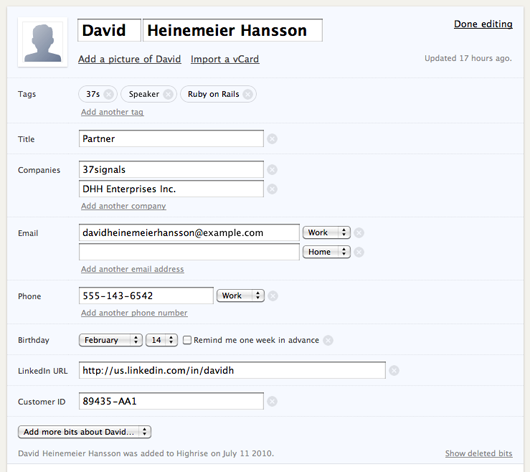
In the end, we decided to discard this design because it wasn’t the right solution and it introduced a bunch of new problems. It took us a long time to make that decision because there was a lot of work involved in developing the new design. And most of that work was not giving us good feedback about the nature of the problem we were trying to solve.
 When we reset, we discovered that some of our assumptions about custom fields were wrong. For example we assumed that shoehorning custom data into the contact page sidebar (right) would make the page too cluttered and inconvenient for people. But we failed to actually try it out to confirm this assumption. When we finally did try it, we discovered it wasn’t bad at all.
2. Resist the urge to make something special out of something boring.
Custom fields aren’t the sexiest feature we could have worked on. Plus, we were building them based on customer requests instead of our own internal needs. Because of that, we mistakingly tried to make the project more interesting with indirectly-related work, like a redesign of the contact pages, streamlined contact dates, bigger avatars, and fancier ways to save data. None of these things were required for us to launch custom fields, but we were tempted to tackle them because they were more fun.
Adopting all those extra concerns obscured the reality that custom fields could actually be a very tiny project. When we finally threw out all the extras, the feature seemed embarrassingly simple. Nonetheless, our customers love it. The lesson here is the tiniest version can be good enough.
3. Storyboard complex interactions instead of building them immediately.
We tried to build out the redesigned edit page so that every interaction could be demonstrated for real and then evaluated. Since there was a lot of complex interaction on the page, most of the work involved in this process was Javascript programming which took a long time to complete. And programming the interface early made it difficult to change the design as we learned more about the problem.
Creating a storyboard of all the states is a more efficient approach for developing pages with complex interactions. It takes much less time to generate storyboards and they are easy to share and discuss with everyone. We used this approach when we worked on bulk operations and it worked well. Everyone was able to see the design early and understand how it should work. From there it was much simpler to divide up the work and build the feature quickly.
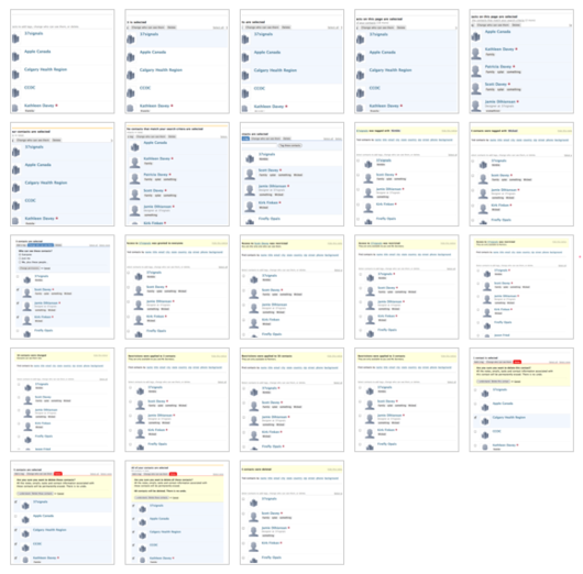 Our storyboard for all the screens for the Highrise Bulk Operations project. Storyboards like this illustrate the complete flow so everyone’s on the same page.
Jim Watson's interesting design observations
During the NBA playoffs, OKC resident Jason Zimdars pointed out design professor Jim Watson’s post on The Oklahoma City Thunder’s logo and why it’s a poor identity (no relation to thunder/Oklahoma, poor typography, etc.). Here he explains why that’s so frustrating for the city:
The logo was unveiled and we realized the opportunity to convey excellence was blown. The stereotyped image of Oklahoma might remain a little longer.
Unfortunately, the more bad design the public sees (Thunder, Walmart, La Quinta, Holiday Inn, to name a few), the more numb the public gets to bad design. The average person doesn’t understand nor discriminate enough without the guidance of corporations, cities, and the design community. If the corporate and design communities accept work such as the Thunder logo, then, heck, anyone can become a designer. One doesn’t even need much training or a design sense.
When questioned, almost all Oklahoma designers agreed that its an awful logo but were unwilling to do anything about it. Mantras in Oklahoma include If it ain’t broke, don’t fix it, Let sleeping dogs lie, Don’t rock the boat, Don’t make waves, Its good enough. All of these attitudes result in low standards of design. Maybe we got exactly what we deserved.
Watson’s site is filled with other interesting, strongly worded observations on design. Improvements to signs at rest areas points out how existing signs are poorly designed…

...suggests an improved version…

...and then compares the two.

Please print the day of the week along with the date also offers a nice A/B comparison.

Lots of other interesting nooks and crannies — design and otherwise — at Watson’s site. (And yes, his site could probably use a UI overhaul itself. Cobbler’s shoes and all that. Nonetheless, worth a visit if you’re into this kind of stuff.)
Product roast
At our last company-wide get together, we had our first “roast” of 37signals products. We invited everyone there to get up in front of the room and rip on something in a 37signals app: a flow that was confusing, a form that could be streamlined, a UI that was ugly, copy that didn’t make sense, etc.
It was enlightening. In large part, that’s because it forced a shift in perspective. Instead of feeling bad about pointing out a flaw, it became your job. And that gave everyone an excuse to rip on something without worrying about hurt feelings, seeming too negative, or the issue being something outside the scope of what you normally work on. Everyone understood the spirit of the roast and felt free to take a jab.
For example, there was a Javascript bug that came along with importing Writeboards into Basecamp. It had been around for a while, but we hadn’t gotten around to it since customers hadn’t complained about it. But the pain of seeing it in action during the roast spurred us to fix it anyway. Without that discussion, it might have just lingered on.
If you’re looking for an honest conversation that might reveal things you’re not seeing already, try a roast.


