You’re reading Signal v. Noise, a publication about the web by Basecamp since 1999. Happy !

Signal v. Noise: Design

Our Most Recent Posts on Design

Designing in the open

Ryan
Ryan wrote this on 44 comments

There’s a phase we go through in our maturity as designers. At first we don’t have a lot of confidence in our process, so we hide while we work. We take feedback from directors, programmers, customers, and say “Ok let me go away and work on that and I’ll get back to you.” Then we go away for a few days or a week and monkey around with our mysterious process until we feel good enough to show something again. We don’t like to show things that are still in progress. If somebody checks in we say “I’m still experimenting with a few things.” We design in secret.

When we get more confident a new phase opens up. We believe more in our process and we know that things are never perfect. So we start showing work earlier and start talking about our rationale at a given step. We’re excited for feedback on a clumsy design because we know feedback will steer us to a better one. We might even be unafraid to open our tools and do some real work in real time in front of people. This is designing in the open.

Is there anything we can do to speed the transition from designing in secret to designing in the open? My experience is yes, it can happen with a little help from the outside. Whoever is managing the project or directing it can ask for smaller, more frequent steps.

Instead of asking for 10 changes and waiting a week, you can ask for 1 change and wait 15 minutes. Evaluate the change, praise it or identify weaknesses, and suggest the next change. By asking for small changes, you take the pressure off the designer because you aren’t asking for miracles. You also take the pressure off the review process because the set of constraints and motivating concerns is smaller. The design is easier to talk about because there are a fewer factors involved.

By working hand in hand, reviewing small changes as they are made, designers gain confidence and learn to expose their process. And this technique is no training wheel. The better a designer is, the more open they are to discussing small changes and getting feedback. It’s a virtuous cycle leading out of secrecy and into productive openness.

Update: Pixar President Ed Catmull makes the same point in this quote on getting over embarrassment:

In the process of making the film [Toy Story], we reviewed the material every day. Now this is counter-intuitive for a lot of people. Most people—imagine this: you can’t draw very well, but even if you can draw very well, suppose you come in and you’ve got to put together animation or drawings and show it to a world-class, famous animator. Well, you don’t want to show something that is weak, or poor, so you want to hold off until you get it right. And the trick is to actually stop that behavior. We show it every day, when it’s incomplete. If everybody does it, every day, then you get over the embarrassment. And when you get over the embarrassment, you’re more creative.

As I say, that’s not obvious to people, but starting down that path helped everything we did. Show it in its incomplete form. There’s another advantage and that is, when you’re done, you’re done. That might seem silly, except a lot of people work on something and they want to hold it and want to show it, say two weeks later, to get done. Only it’s never right. So they’re not done. So you need to go through this iterative process, and the trick was to do it more frequently to change the dynamics.

Thank to Ben for pointing me to the Catmull quote.

Hiring: We're looking for another UI designer to join our team

Jason Fried
Jason Fried wrote this on 21 comments

Design matters

We believe you can’t be a great software company without great design. We believe in clarity, smooth user experiences, the right words in the right places, well organized and clean code, and all the little touches that make an interface feel just right. You should believe in these things too.

What you’ll be working on

Designers at 37signals are always working on different things. You may be working on polishing up an existing feature in Basecamp or designing the UI for a brand new feature in Highrise. You may be revamping Backpack or fundamentally rethinking some UI in Campfire. Or maybe you’re involved in designing a brand new product or a new marketing site. You may be asked to come up with something no one has ever seen before.

Besides having great visual taste and talent, you must code well-structured HTML/CSS. Basic Javascript or Rails skills are a plus, but not required. Great writing skills are required.

Work on products that define an industry

At 37signals you’ll be working on products that people rely every single day on to get their job done. Your work will impact millions of interactions. You’ll be working with some of the best designers, programmers, dev ops folks, and customer support people in the industry. Our team is top notch and we want you to make it even better.

Solve real problems

Our projects are always focused on solving real problems. When the problem goes away we know the design is right. Your job, as a designer at 37signals, is to make our customers’ problems go away.

Be a leader

At 37signals, designers lead the teams. Each development team is made of up three people – two programmers and one designer. The designer also manages the project. In addition to designing the screens/elements, you’ll keep the team focused and make calls about what’s important.

What we’re looking for

We’re not looking for a certain design style, we’re looking for a certain design approach and taste level. Simplicity isn’t enough – clarity is where it’s at. You think about how people interpret the objects on the screen. What they think about, what moves them, what frustrates them, what makes them happy. You know that the right design decision can make all the difference.

You’re excited to discover a better solution, even well into a project. You don’t mind throwing something out in favor of a better idea or implementation. Projects at 37signals start with real code. Feedback from an evolving prototype guides the team. While we’re very pragmatic about code, it is important that your design/code is easy to change in response to feedback.

You love to write, too

You understand that copywriting is design. The words matter as much as the pixels. Great visuals with weak words are poor designs. You should care about how things are phrased as much as you care about how they look.

Chicago or anywhere

We’re open to hiring the best person no matter where they are. If you’re in Chicago all the better (we have an open desk for you in our office), but if not that’s fine too – more than half of our company works remotely all over the world. If you do want to relocate to Chicago we’re open to that as well.

How to apply

Send relevant work samples, and anything else that will make you stand out, to [email protected]. Include [UI DESIGN] in the subject of the email.

It doesn’t matter where you went to school, or if you even graduated. It doesn’t matter if this is your first job or your fifth. Doing great work and being driven to improve yourself and everything you touch is what matters.

If we think you may be a good fit we’ll be back in touch with step two of the application process.

Application deadline

We’ll be accepting applications for this position until June 6, 2011.

We look forward to receiving yours.

Ten design lessons from Frederick Law Olmsted, the father of American landscape architecture

Matt Linderman
Matt Linderman wrote this on 23 comments

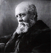
Frederick Law Olmsted (1822-1903), the father of American landscape architecture, may have more to do with the way America looks than anyone else. Beginning in 1857 with the design of Central Park in New York City, he created designs for thousands of landscapes, including many of the world’s most important parks.

His works include Prospect Park in Brooklyn, Boston’s Emerald Necklace, Biltmore Estate in North Carolina, Mount Royal in Montreal, the grounds of the U.S. Capitol and the White House, and Washington Park, Jackson Park and the World’s Columbian Exposition of 1893 in Chicago. (The last of those documented excellently in Erik Larson’s book The Devil in the White City.) Plus, many of the green spaces that define towns and cities across the country are influenced by Olmsted.

Below, ten lessons from Olmsted’s approach:

1) Respect “the genius of a place.”
Olmsted wanted his designs to stay true to the character of their natural surroundings. He referred to “the genius of a place,” a belief that every site has ecologically and spiritually unique qualities. The goal was to “access this genius” and let it infuse all design decisions.

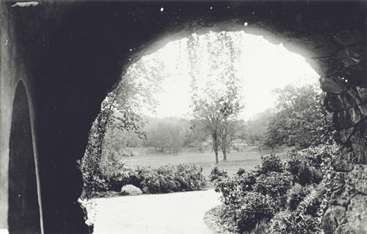
This meant taking advantage of unique characteristics of a site while also acknowledging disadvantages. For example, he was willing to abandon the rainfall-requiring scenery he loved most for landscapes more appropriate to climates he worked in. That meant a separate landscape style for the South while in the dryer, western parts of the country he used a water-conserving style (seen most visibly on the campus of Stanford University, design shown at right).
2) Subordinate details to the whole.
Olmsted felt that what separated his work from a gardener was “the elegance of design,” (i.e. one should subordinate all elements to the overall design and the effect it is intended to achieve). There was no room for details that were to be viewed as individual elements. He warned against thinking “of trees, of turf, water, rocks, bridges, as things of beauty in themselves.” In his work, they were threads in a larger fabric. That’s why he avoided decorative plantings and structures in favor of a landscapes that appeared organic and true.

3) The art is to conceal art.
Olmsted believed the goal wasn’t to make viewers see his work. It was to make them unaware of it. To him, the art was to conceal art. And the way to do this was to remove distractions and demands on the conscious mind. Viewers weren’t supposed to examine or analyze parts of the scene. They were supposed to be unaware of everything that was working.

He tried to recreate the beauty he saw in the Isle of Wight during his first trip to England in 1850: “Gradually and silently the charm comes over us; we know not exactly where or how.” Olmsted’s works appear so natural that one critic wrote, “One thinks of them as something not put there by artifice but merely preserved by happenstance.”

Continued…

Flashback: Every time you add something you take something away

Basecamp
Basecamp wrote this on 4 comments

Jason 04 Mar 2006 — What’s the most ignored paradox in software development? Every time you add something you take something away.

Screen real estate. Interface clarity. Simplified testing. Shorter development time. Certainty. Agility. Managability. Familiarity. Adding anything dilutes everything else. That’s not always a bad thing, just be aware of it. Be aware of the trade-offs.

The dilution effect is why maintaining a clear vision for your product is so important. Without a clear understanding of the limits and boundaries of your product, the product will morph into something you no longer recognize. Or worse, something you can no longer manage or control.

A product people loved can turn into a product people liked. Then the product people liked can turn into the product people can live with. Then the product people can live with can turn into the product people can live without.

Of course the reverse can also happen. A product people can live without can become a product people love, but once you’re at the love stage it can turn around on you just as fast.

This reality reveals itself on release day. The first thing you’ll hear from customers that love your product is how they’d love it even more if it did this or that also. How you handle the “also” is what separates greatness from mediocrity from failure.

Podcast with Ryan about managing design

Ryan
Ryan wrote this on 3 comments

Andrew Wicklander interviewed me for his Project Idealism podcast and our 45-minute chat is now online. Andrew’s background in software project management led to a lot of questions about how we work at 37signals. I was glad to dig into a number of topics including:

  • How we emulate our “cowboy days” with teams of three
  • How a growing company is like a cocktail party
  • Picking and choosing from XP and Agile, and why basic values are more important than methodologies
  • Why methodologies lose their meaning over time
  • Why features become bloated when they are made for cases you don’t understand
  • The overlap between UI design and product design
  • How programmers and designers should negotiate on cost
  • Who should manage projects: a designer or a programmer?
  • How to not get lost in a project and the central challenge of doing just one thing at a time
  • The costs of unfinished work
  • The power of working in small steps and being in a “known state” between steps
  • How doing less is still the hardest standard to keep
  • and Why 37signals won’t be competing with Cisco anytime soon

Thanks a lot to Andrew for interviewing me and asking such thoughtful questions. The podcast is on his website and also available as episode #11 on iTunes.

Jumping to a specific part of a long podcast (or other long audio/video file) can be a challenge on your iPhone. The controls work fine for a five minute song but lose accuracy when it’s an hourlong file.

This complainer explains: “For hour-plus podcasts, it’s absolutely ridiculous that you have a scrollbar that’s roughly half the vertical width of the iPhone. Every miniscule tick that the slider moves is 2-3 minutes! When you want to rewind 20 seconds or so, this is absolutely unacceptable.”

Turns out there’s a neat solution: Instead of going left/right, 1) touch the slider, 2) drag your finger down, and 3) then move it left or right. This lets you move the scroller with “fine point” precision and allows you to fast forward or rewind to just the right spot.

[via 16 Tips to Take Your iPhone to the Next Level]

Matt Linderman on May 5 2011 5 comments

It’s difficult to be open-minded. It’s really damn hard to be open-minded and a Graphic Designer. If a Graphic Designer claims to be open-minded they are bullshitting you.

Basically, if a Graphic Designer thinks those Amish Fireplace Mantle ads are beneath them — well then I’m afraid they aren’t open-minded.